Climate Change Communication & the IPCC
It has been a while, but I am pleased to say that an essay that I contributed to (Climate change communications and the IPCC) along with a few colleagues at the IPCC, was recently published in the Journal Climate Change. One of a series of papers and essays looking at science communication – Climate Change Communication and the IPCC. A really important subject…
From the abstract…
‘In its Sixth Assessment Report Cycle (AR6), the Intergovernmental Panel on Climate Change (IPCC) aims to strengthen the communication of its products. As the only mandatory part of IPCC reports specifically targeting a lay audience, the Frequently Asked Questions (FAQs) provide an opportunity for broader communication of key IPCC topics…
…we find that bringing together IPCC authors and communication specialists to jointly develop the text and graphics increases the accessibility and usefulness of the FAQs…
…we recommend involving communication experts from the beginning of the drafting process to share responsibility, which requires sufficient resources to be allocated to the FAQs…
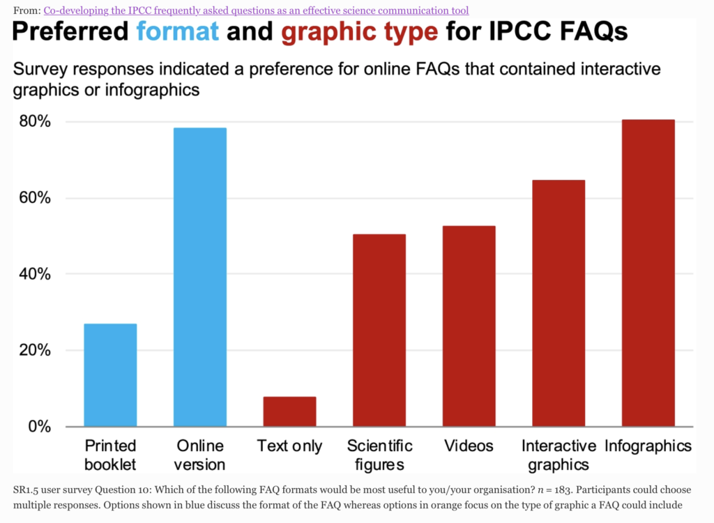
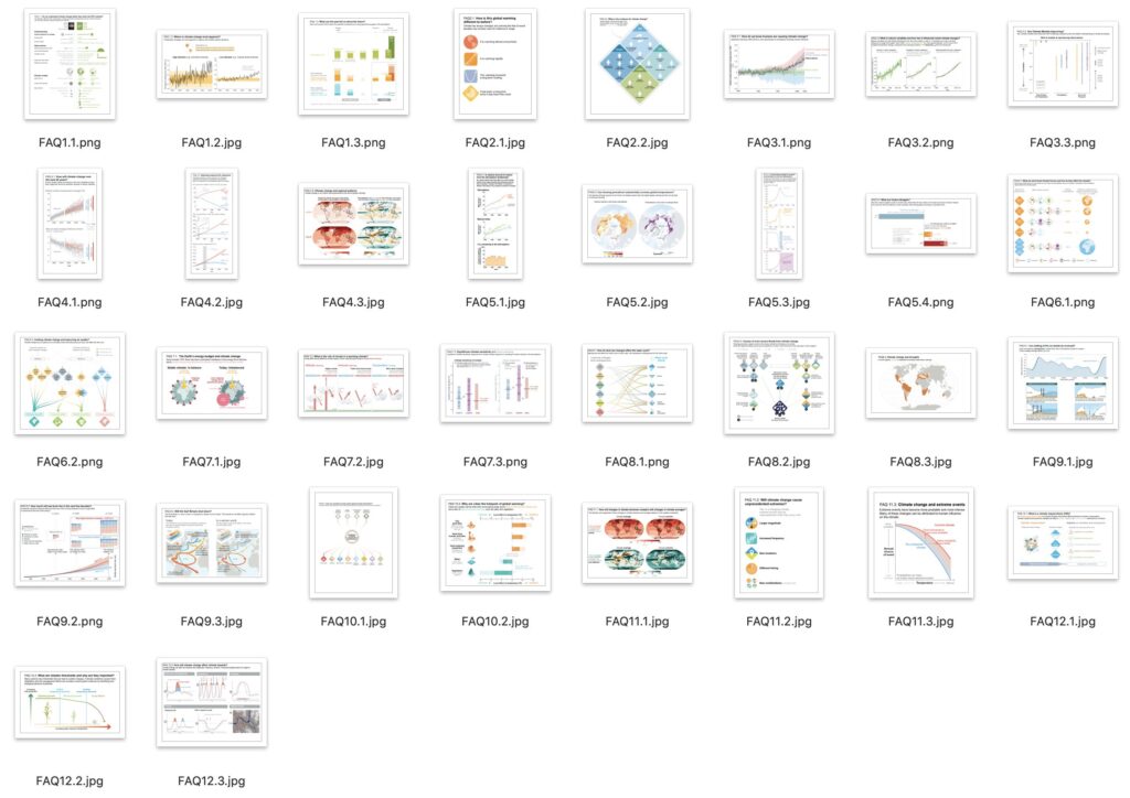
Enjoy reading along with the other papers and essays all looking at science communication. The report and all 32 FAQ graphics is here…
Many thanks to Sarah Connors and all the team at the IPCC
20 April 2022
FSO Safer report
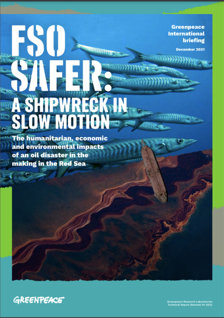 Was commissioned to produce a graphic for a report from Greenpeace science unit looking at how the rusting FSO Safer oil tanker could end up triggering a major environmental and humanitarian disaster in the Red Sea.
I produced the infographics in collaboration with Greenpeace UK and Kathryn Millar, an environmental researcher.
You can find the report here…
…and here are the graphics…
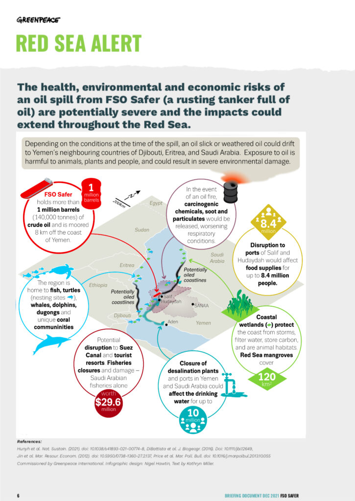
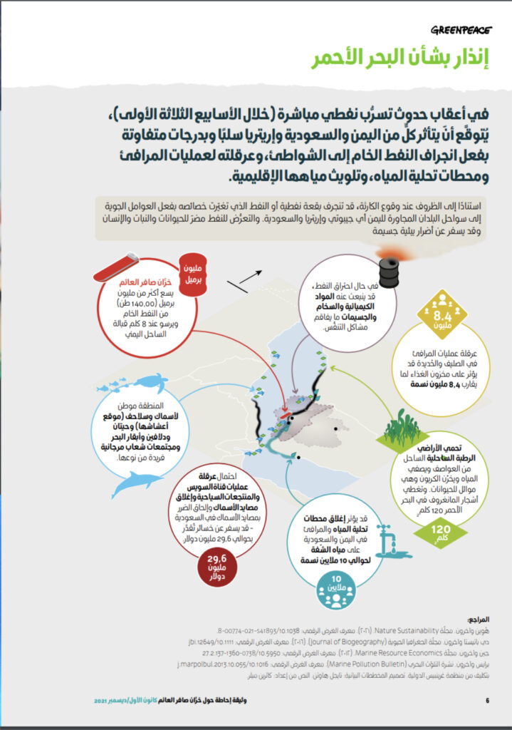
02 April 2022
When a story really needs a visual
Big Butterfly Count 2021 sees lowest ever number of butterflies recorded
from Butterfly Conservation
I saw this story recently and although it was well written and made me think about what I had seen over this summer in my garden as well as on my walks and travels around the UK, I really thought that a visual would help to get the message across on social media. It had a table of figures, which is always useful but that was it, no actual visual form of the numbers…so I made one. I edited it to be just the top 10 but you can see how a visual can help to get the point across easily and in a memorable form – just need to add the butterfly icons now!
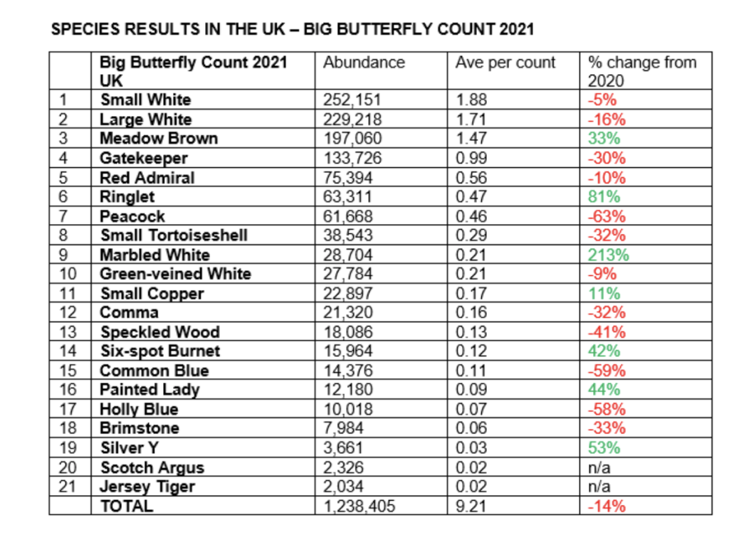
Thanks to datawrapper its easily done and shared.
21 October 2021
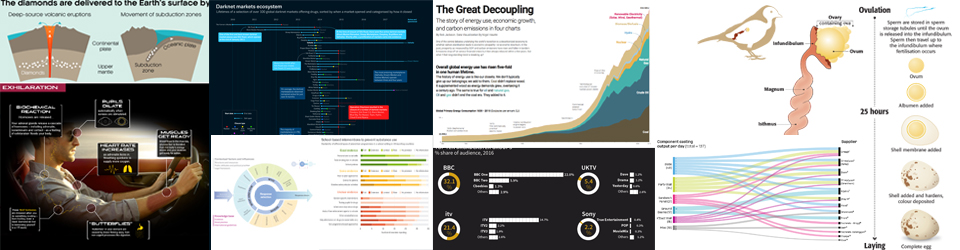
Recent work
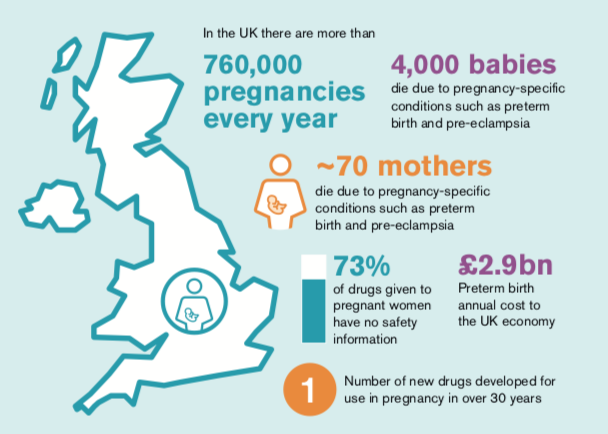
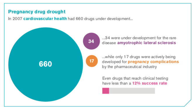
Some recent work, from a report I worked on in December last year and just published. Working with Shaoni Bhattachary and the medical experts at Birmingham Health Partners Centre for Regulatory Science and Innovation a fascinatingreport looking at medicines, or lack ot=f them, in pregnancy. Some shaking statistics
the report is here to download in pdf format:
and here are some of the graphics produced for the report.
21 January 2021
Updates on EMSA/Copernicus project
I worked with EMSA and the Copernicus project late 2018/19 on a series of graphics to be included in the Copernicus Project working brochure as well as other materials. Some of the static infographics are here.
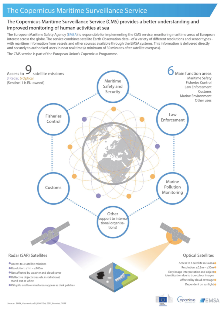
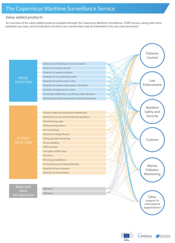
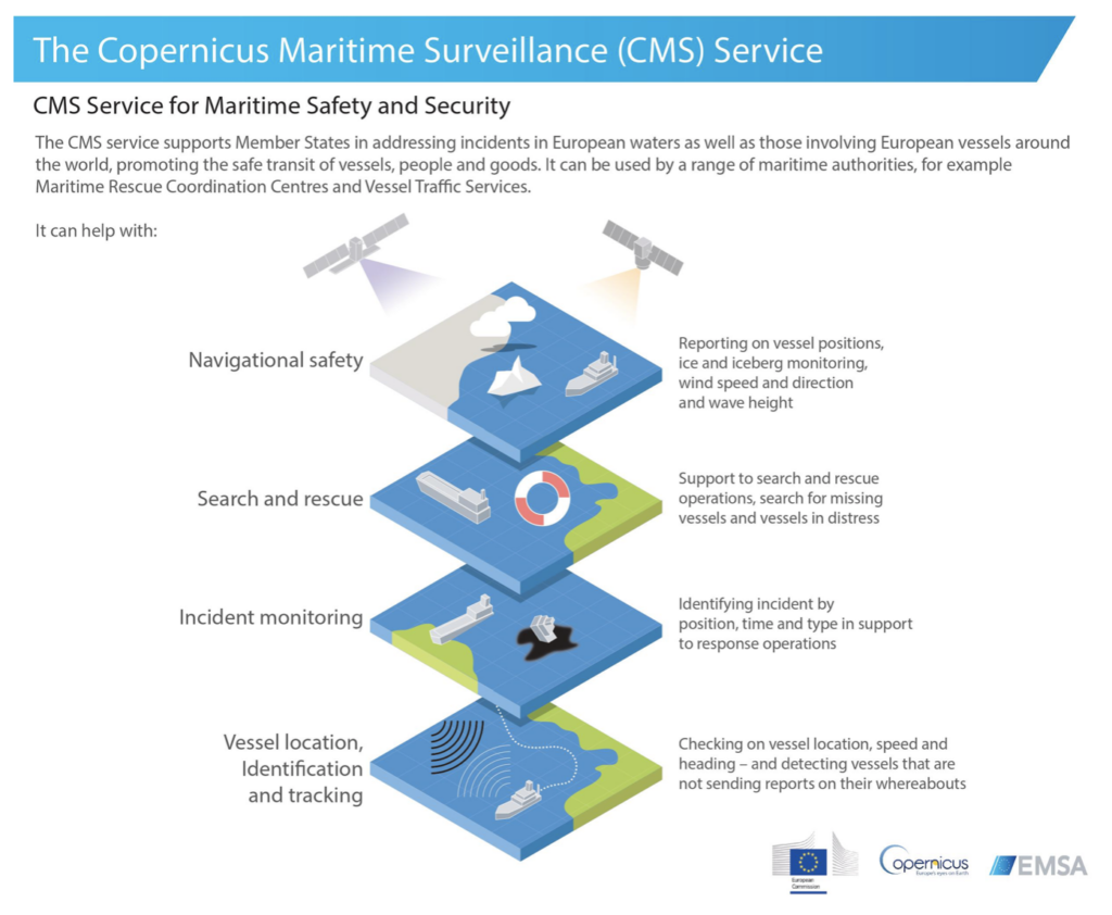
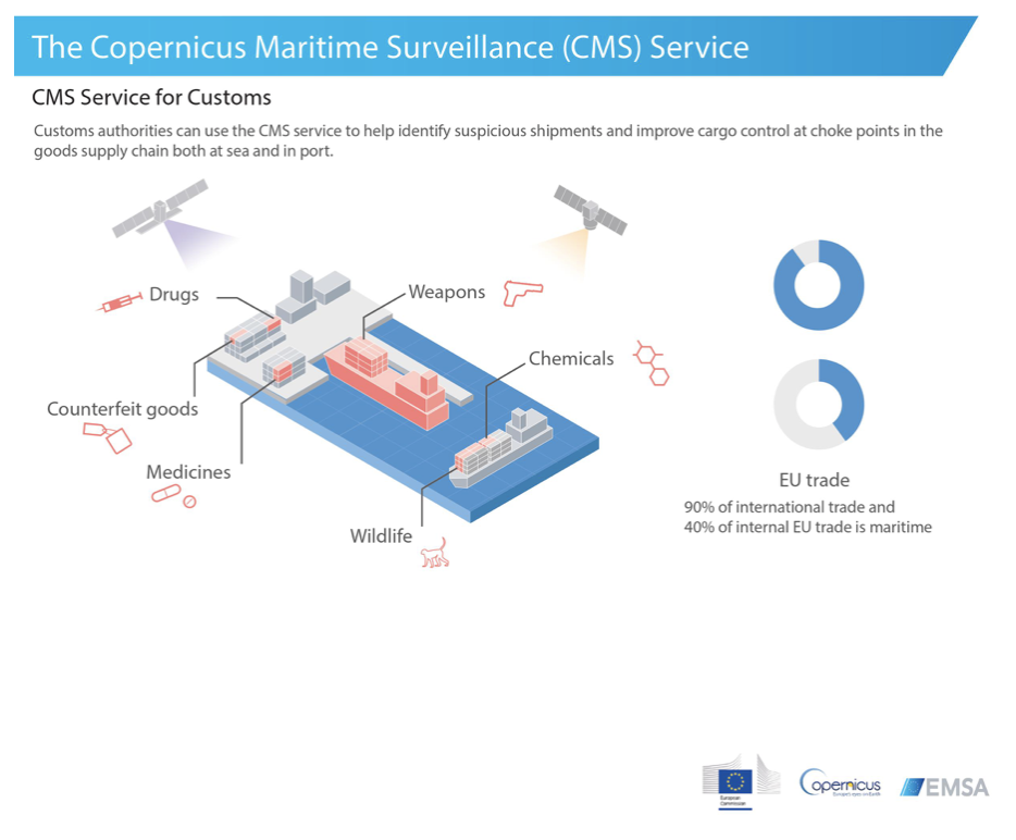
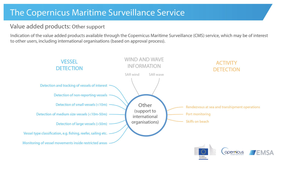
The Youtube channel from EMSA now includes some of the graphics in the explanatory videos.
Good to see the graphics being used in both media.
21 August 2020
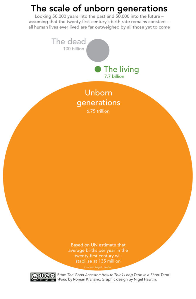
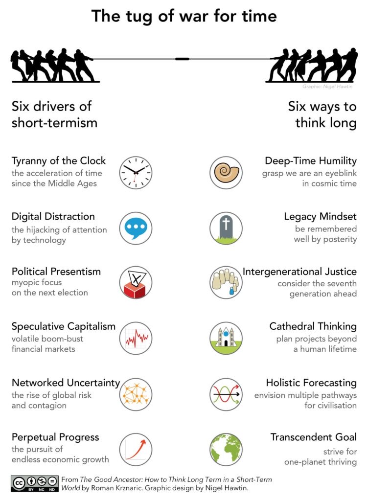
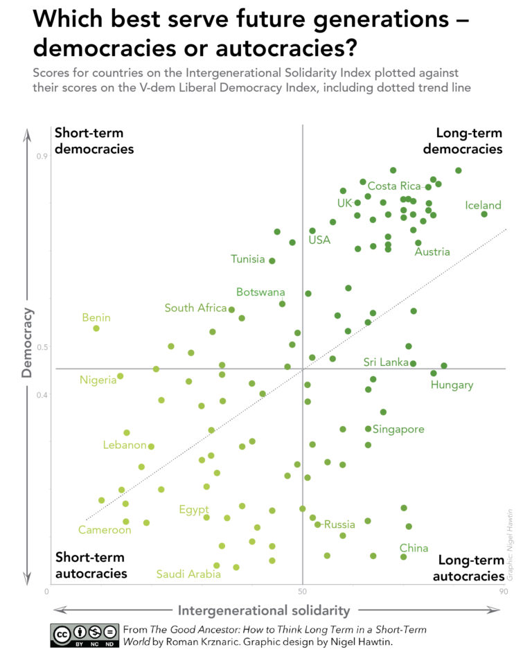
Book launched
I am pleased to announce that as of last week 'The Good Ancestor: How to think long term in a short-term world' by Roman Krznaric has been launched and is available to buy. It was project that Roman asked me to produce the graphics for some time ago and we have been waiting to release it for what seems like months now! A couple of the graphics are shown here...more in the book
20 July 2020
Nature paper infographic
A new paper published last week in Nature Communications features a graphic I worked on with Matt Jones of the Tyndall Centre.
12 June 2020
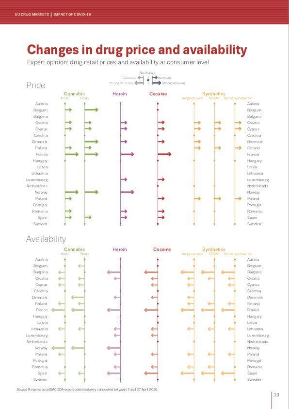
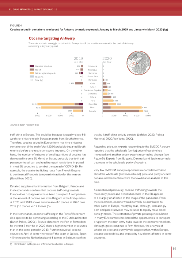
New report with EMCDDA and Europol
Last week the EMCDDA and Europol published their latest report on the impact Covid-19 is having on the drug markets. I worked with the agencies on the graphics side of the report. Click on the report cover to download it but here are a couple of the graphics in preview.
Scientific American - Sketching process
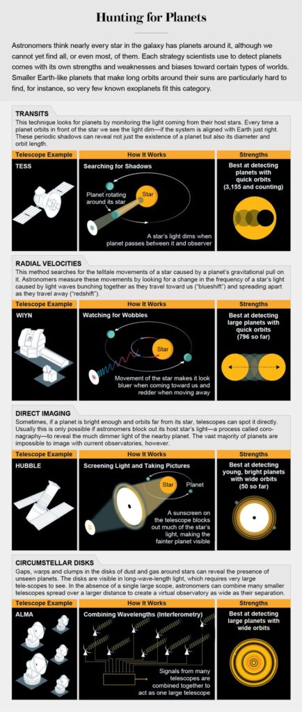
My latest infographic for Scientific American has been released and this month they are making the issue free to read. Go to https://lnkd.in/gVMCHtz to see my graphic looking at Planet Hunting. Always a pleasure to work with Jen Christiansen and Meredith MacGregor.
This month I thought I would share the video of the sketching process I went through after I had read the copy, re-read the copy, doodled and taken notes, finally asking many questions to Jen and Meredith. At that stage I was pretty certain about what we were all trying to achieve in the graphic.
The graphic and video are below. These show my sketching process and build up to the 'final sketch before committing to the final drawing completed in Illustrator.
23 May 2020
Timeline and icon design
I have been working remotely with the EMCDDA designing graphics for their 25th anniversary. The latest graphic has just been launched looking at the monitoring capabilities and innovation employed to keep up with their remit. I thought I would be interesting to show some earlier sketches showing some steps in the design process and how the icons have been used in the table that follows on...thanks to all the staff.
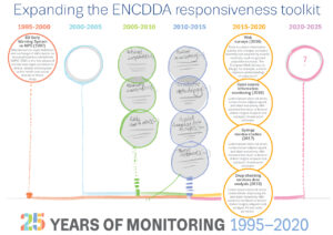
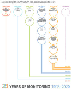
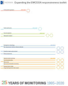
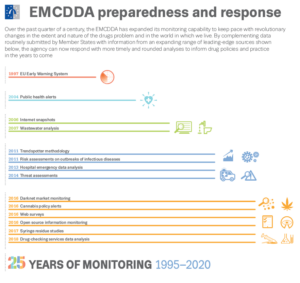
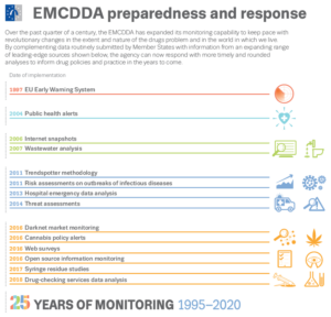
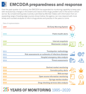
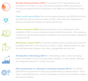
the final graphic is below with the icons being reused to help the flow of the table.
![]()
link is here http://www.emcdda.europa.eu/news/2020/emcdda-preparedness-and-response-fast-moving-drugs-problem
Monarch butterflies
Haven't posted much on this page recently, have I been busy with many projects. Unfortunately many of them are not for sharing, either ever or just for now as we are awaiting publication. But this was my latest for Scientific American magazine looking at the migration of the monarch butterfly .
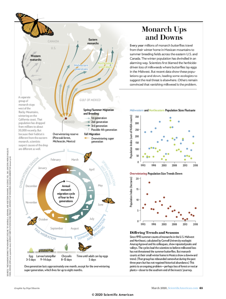
15 March 2020
From 1st to final iteration
Just thought I would share the 1st 'final graphic' to the final 'final graphic' of this years Global Carbon Budget. See the original here...
Not a graphic but writing...
It's not often I get the chance to write anything substantial, (writing, subbing and text editing is an integral part of my daily role) and so it was fun to have the time to write this piece for 'Nightingale', the Data Visualization Society's online magazine.
4 November 2019
Speaking opportunity
Really pleased and excited to announce that I will be one of the keynote speakers for 2019 ASA, CSSA and SSSA Annual Meeting in San Antonio, Texas. I am really pleased to have been asked and looking forward to meeting all the scientists and experts in the field and discussing research graphics amongst many other topics.
05 August 2019
BTO news latest graphic
Haven't received the latest copy of BTO news yet but thought I would share my graphic from sketch to finished artwork looking at how birds navigate.
Try sliding the white button to see how my sketch evolved into the finished artwork.
The perils of short-termism: BBC Future
My latest graphics working with Richard Fisher from BBC_Future. Richard wrote a fascinating piece looking at and thinking about the perils of short-termism.
18th January 2019
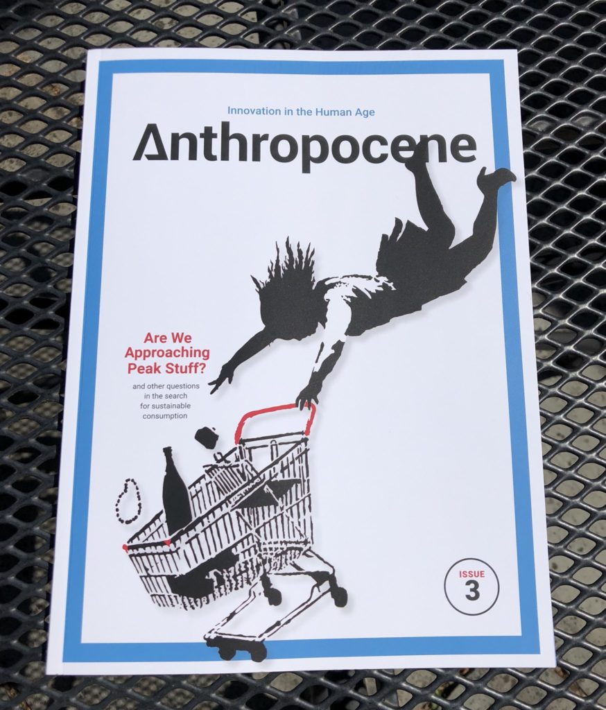
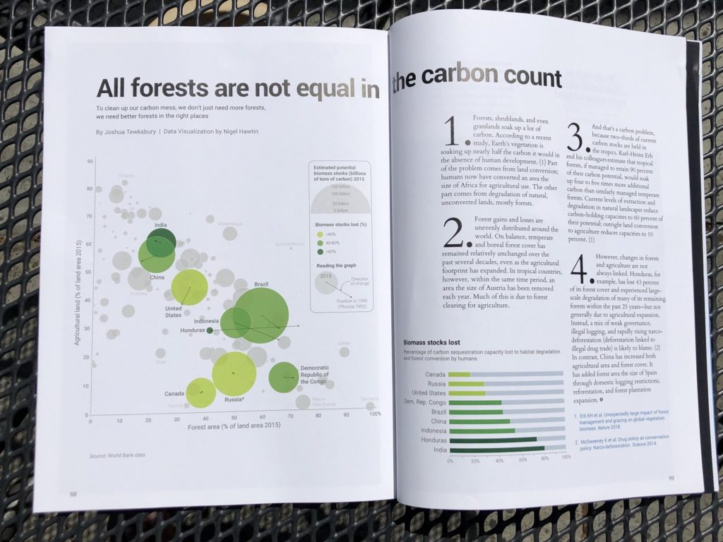
Anthropocene
Have been working with Kathy Kohm, Editor-in-Chief of Anthropocene magazine, and Josh Tewksbury, on a small project looking at land conversion and carbon stocks around the world. An interesting project that deserved an explanatory graphic. In the end, we decided on a scatter plot comparing agricultural land area and forest land area, but also wanted to show the biomass stock potential of each country as well as trying to show the stocks lost in the past 25 years.
30 July 2018
Stories from Flourish
I have been using Flourish.app for a few weeks now and thought I should showcase some of the chart types it has and what you can do with it using a small data set from the NHS, looking at hospital admissions from drug use.
Same data just different ways of using it and showing what is going on using the stories format.
Source: https://digital.nhs.uk/catalogue/PUB30210
12 February 2018
Flourish
Have been playing around with Flourish, recently. here are a couple of visualisations that I have produced using existing data...just playing around, but first impressions are really good.
08 February 2018
Totaljobs
TotalJobs have just published a couple of graphics that I had worked on recently, so go and take a look. Here's the page
01 February 2018
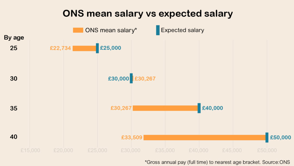
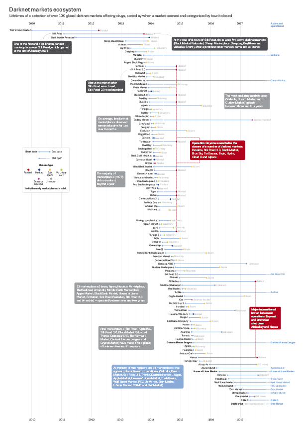
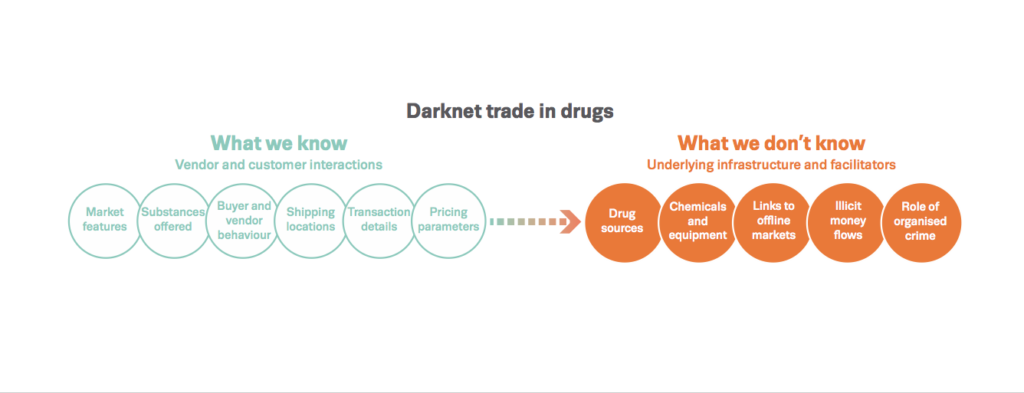
Drugs and the darknet: Report
28th November EMCDDA and EUROPOL launch a new report
“Drugs and the darknet”. Some of the graphics...
Global Carbon Budget 2017
Released yesterday (13 Nov), the latest version of the Global Carbon Budget from Global Carbon Project , Future Earth and the Tyndall Centre for Climate Research.
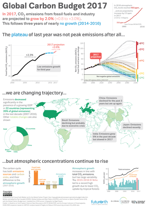
Global Carbon
14 November 2017
Spanish Flu graphic
In this age of full colour graphics and datavis, it was a pleasure and indeed, a challenge, to be asked to produce a map for Laura Spinneys' new book 'Pale Rider: The Spanish Flue of 1918 and How it Changed The World' published by Jonathan Cape.
This map concentrates on the second wave that had its origins in western France in August 1918. Using tints of black and grey radiating out and getting lighter from the origin and circles to visualise the percentage of the population that died.
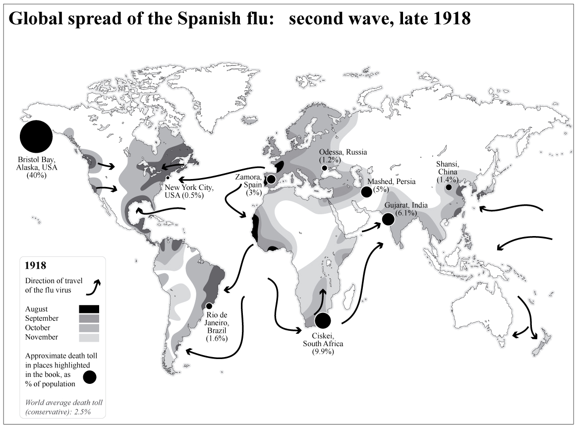
21 June 2017
BTO: Mating Masterclass
Latest graphics for BTO News magazine, Mating Masterclass
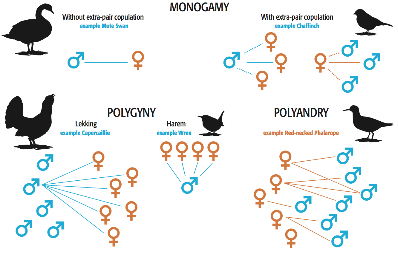
BTO Mating Masterclass
BTO Mating Masterclass
15 June 2017
Latest article published in Pharmaceutical Journal
"Presenting data visually for a poster or presentation" is my latest article published a couple of days ago in the Pharmaceutical Journal. It is aimed at scientists, researchers and students and those with questions about the best and most effective ways of presenting data in a visual way, so please go and have a look and let me know what your thoughts are.
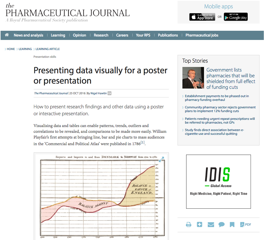
03 November 2016
Latest work for Scientific American
Once again I have just managed to get my hands on the latest SciAm issue for August.
Jen Christensen (Senior Graphics Editor) commissioned me to produce a couple of charts for the feature 'Health check for Humanity' looking at cancer rates and chronic kidney disease in the developing world. Pleased to see them in print and to be amongst other great illustrations, graphics and articles.
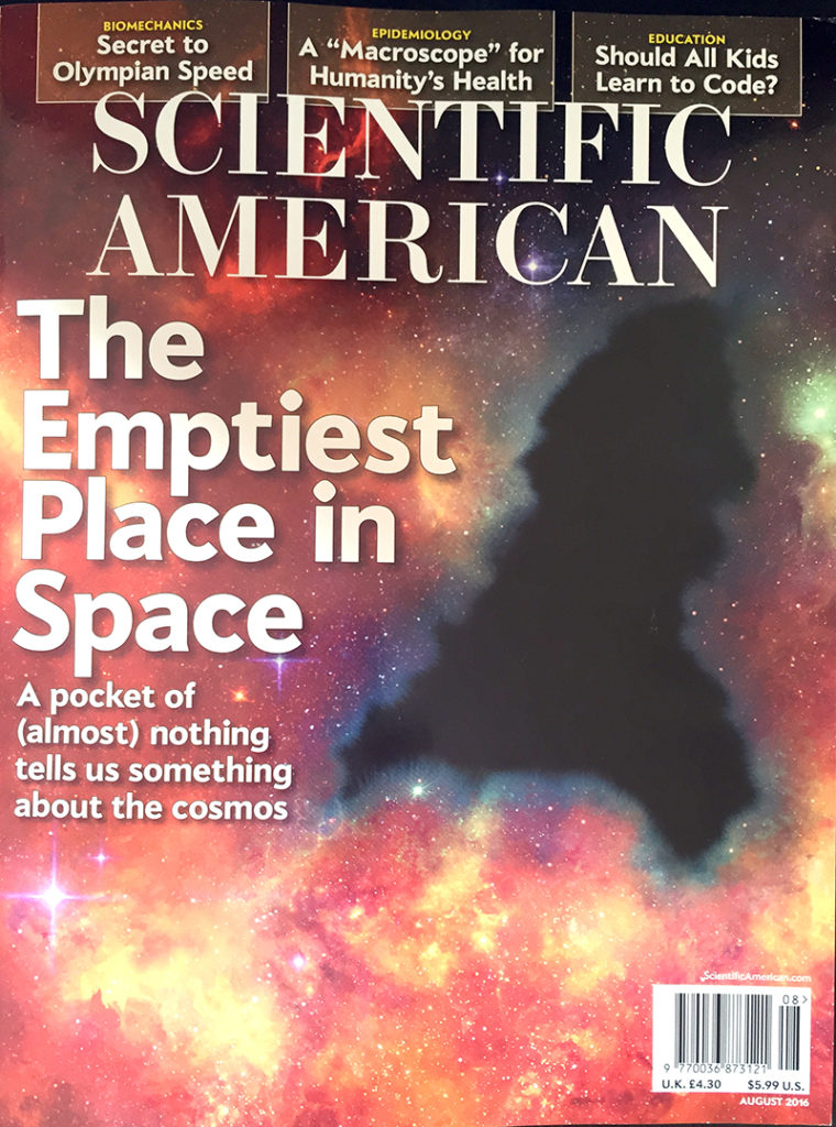
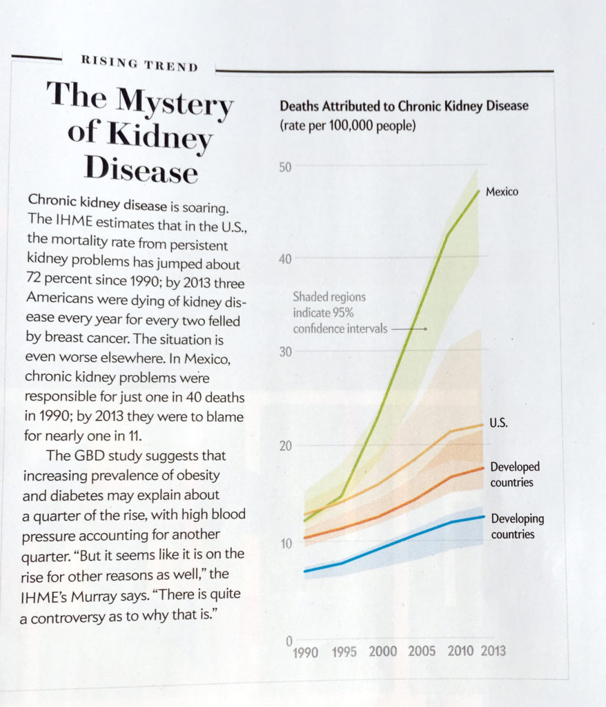
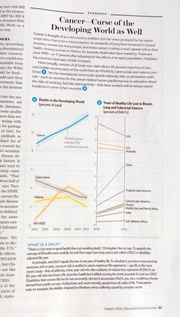
18 August 2016
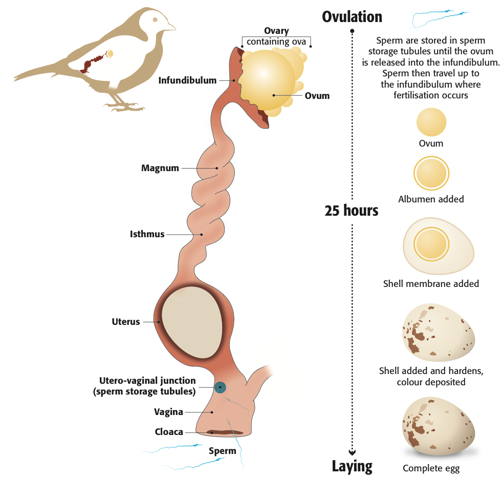
Cuckoo graphics
I am working with the good folks at the BTO (British Trust for Ornithology) on some of the graphics across their wide range of publications in print and online.
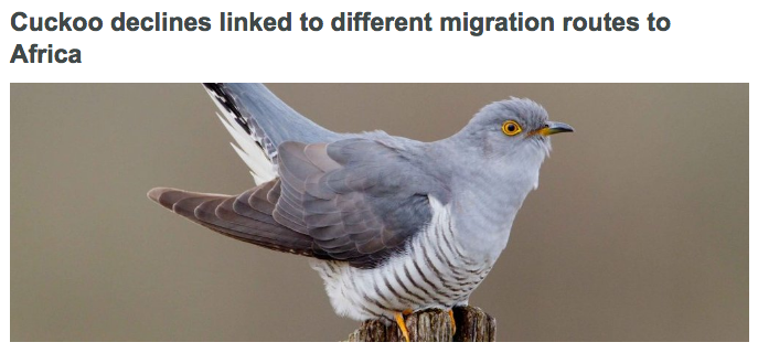
Yesterday their latest research 'Cuckoo declines linked to migration routes to Africa' was published in Nature Communications.
To coincide with the publication I produced a graphic for the publication online showing the different routes used by the tagged Cuckoos on their way to Africa and back.
For sharing on social media we also produced an animated gif showing the same information. This was produced to be readable on a mobile screen and a useful thing to do for promotional purposes.

See the animated version here pic.twitter.com/Fkj2dEP1lC
Thanks to all at the BTO including Mike Toms and Viola Ross-Smith for all their help and a great paper.
21 July 2016
D-Day 'Funny' Tanks graphic
For the 72nd anniversary of D-Day, BBC Future posted a story about the strange tanks that were converted to help the troops come ashore.
I was commissioned to produce a graphic showing the converted, and really quite wacky tanks.
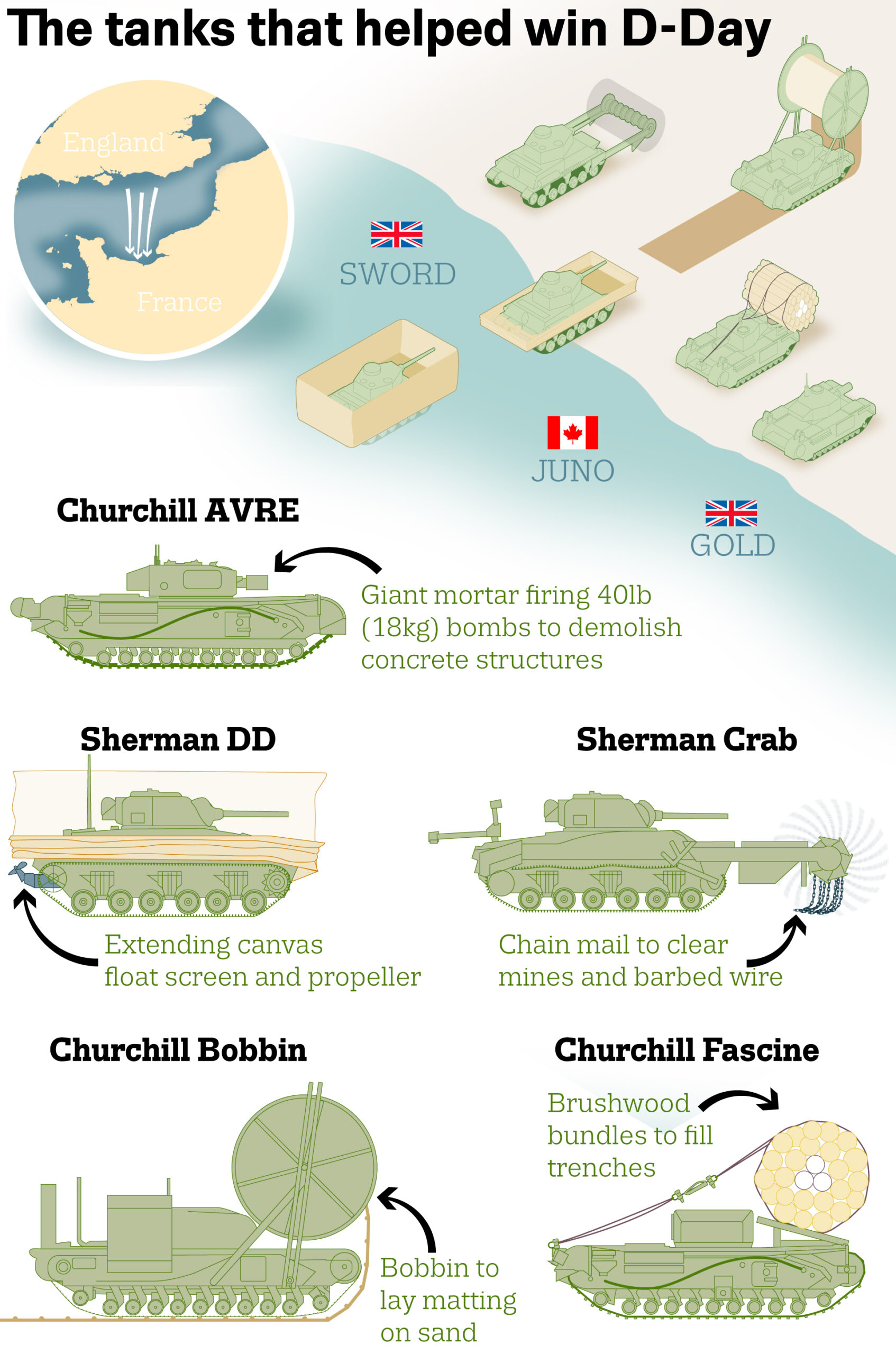
5th June 2016
More from Scientific American
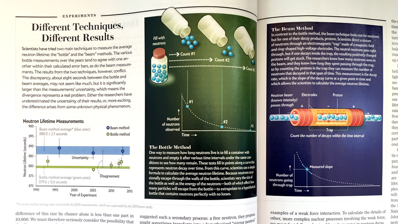
Latest graphics produced for Scientific American for a story on The Neutron Enigma and two experiments measuring the average neutron lifetime. More graphics in the story
28 April 2016
The 2015 annual results of the BTO Garden BirdWatch
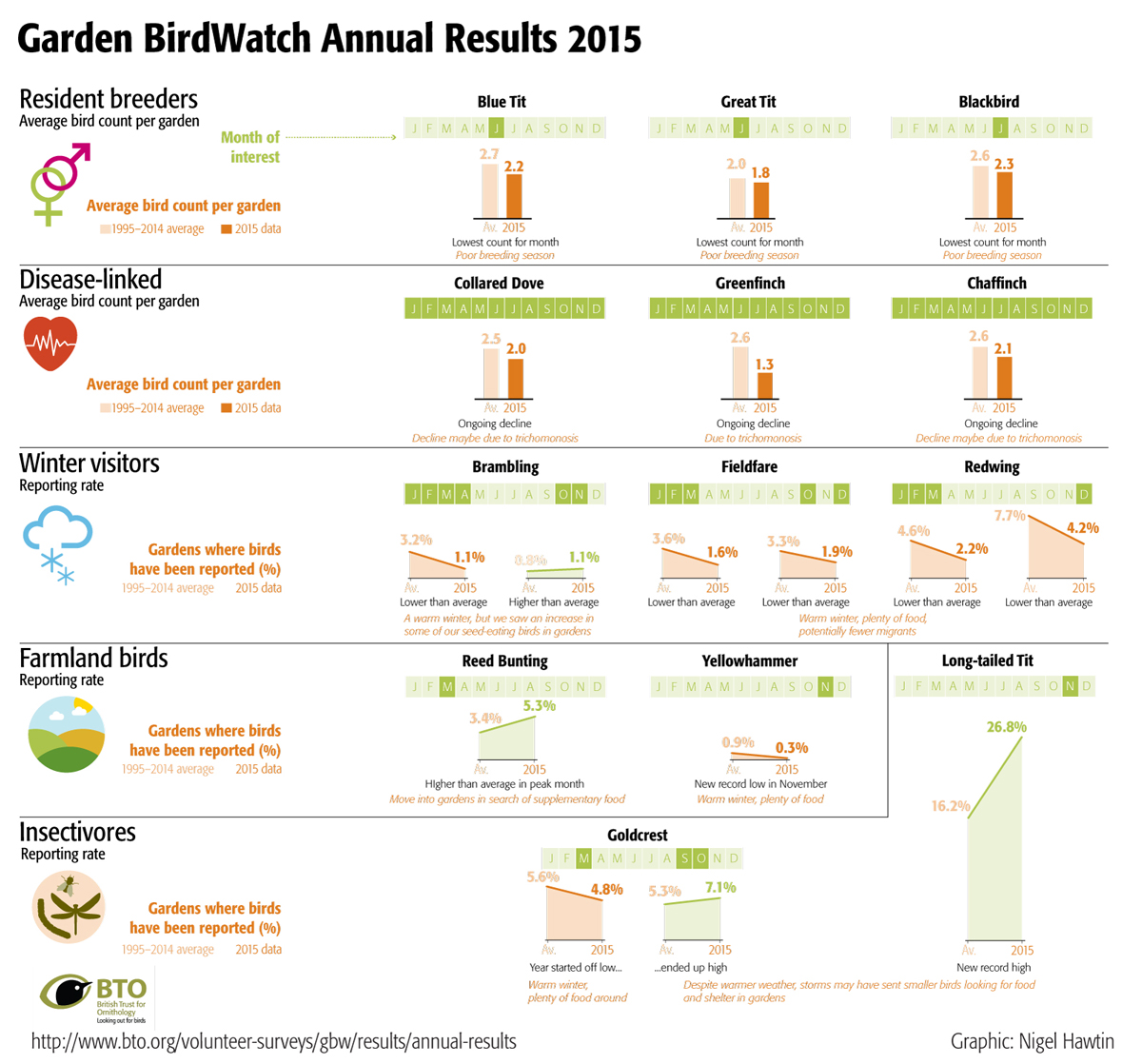
My first graphic for the BTO (British Trust for Ornithology) has just been released online.
The 2015 annual results of the BTO Garden BirdWatch.
29 March 2016
Supergun evolution graphic for BBC Future
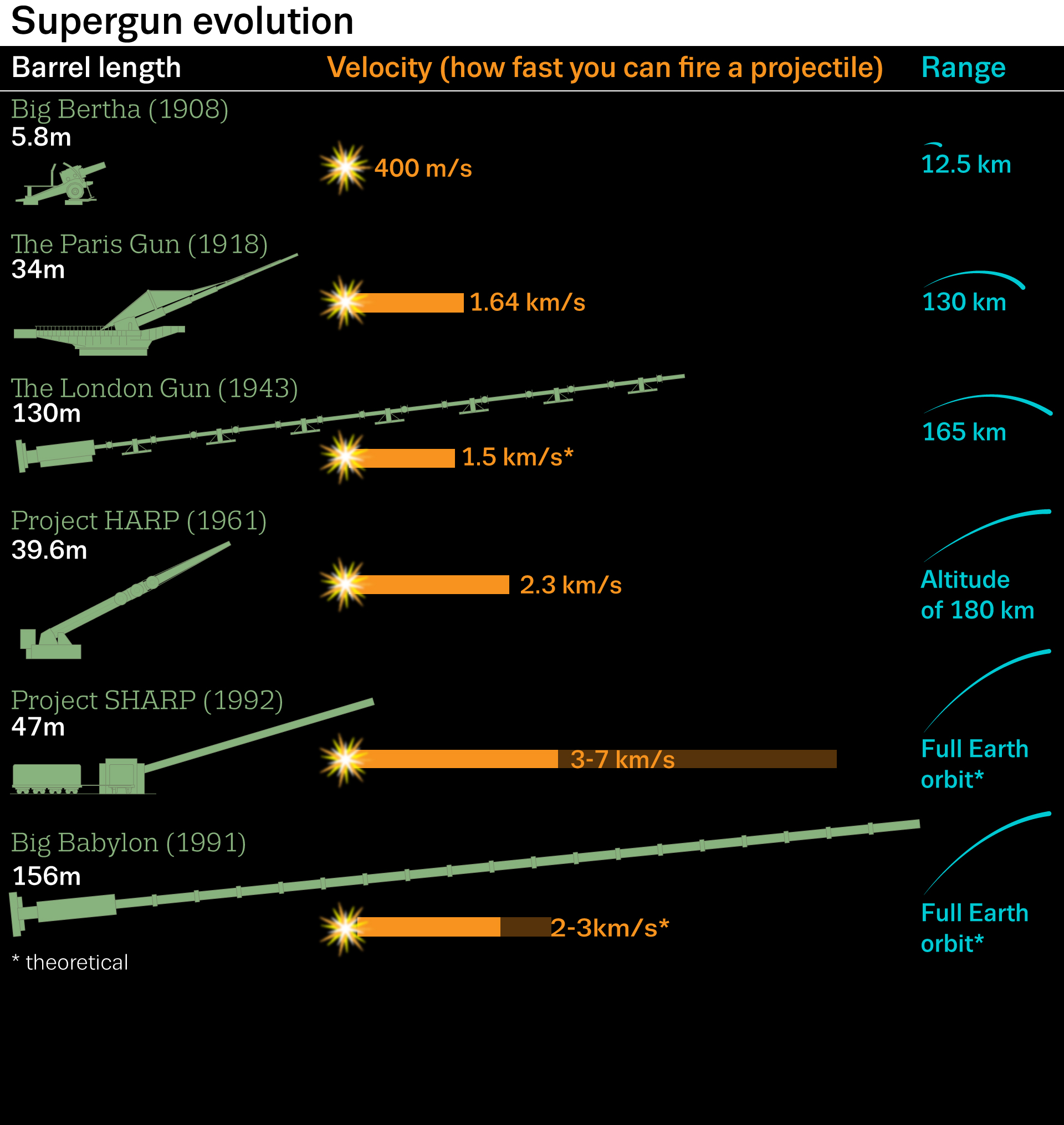
Supergun evolution
22 March 2016
Recent graphic for January issue of Scientific American
19 March 2016
A recent graphic for BBCEarth looking at the latest inclusions for the Periodic table. Elements 113, 115, 117 and 118. A quick turnaround overnight for this graphic as the news story was announced.
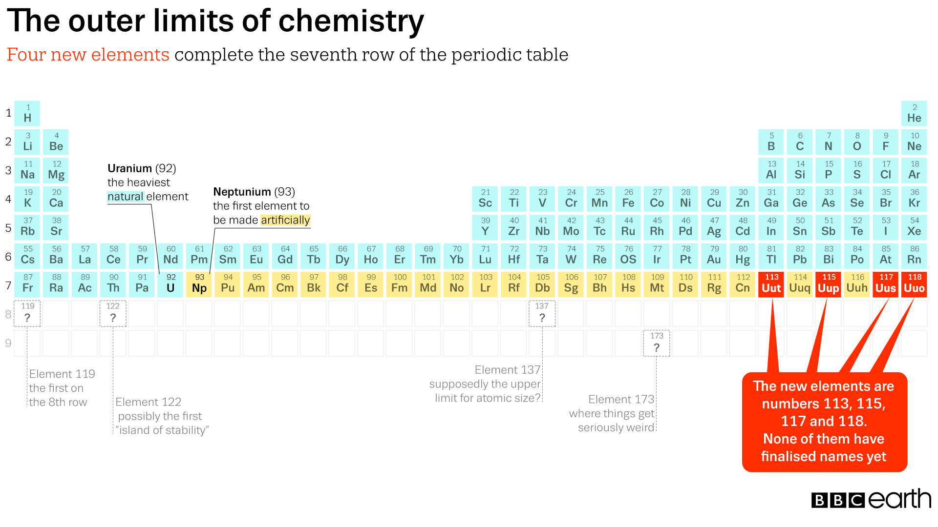
The outer limits of chemistry: BBC earth
16 February, 2016
Yesterday the Global Carbon Budget for 2015 was launched. Pleased to see my graphic explaining what has been going on over the past year
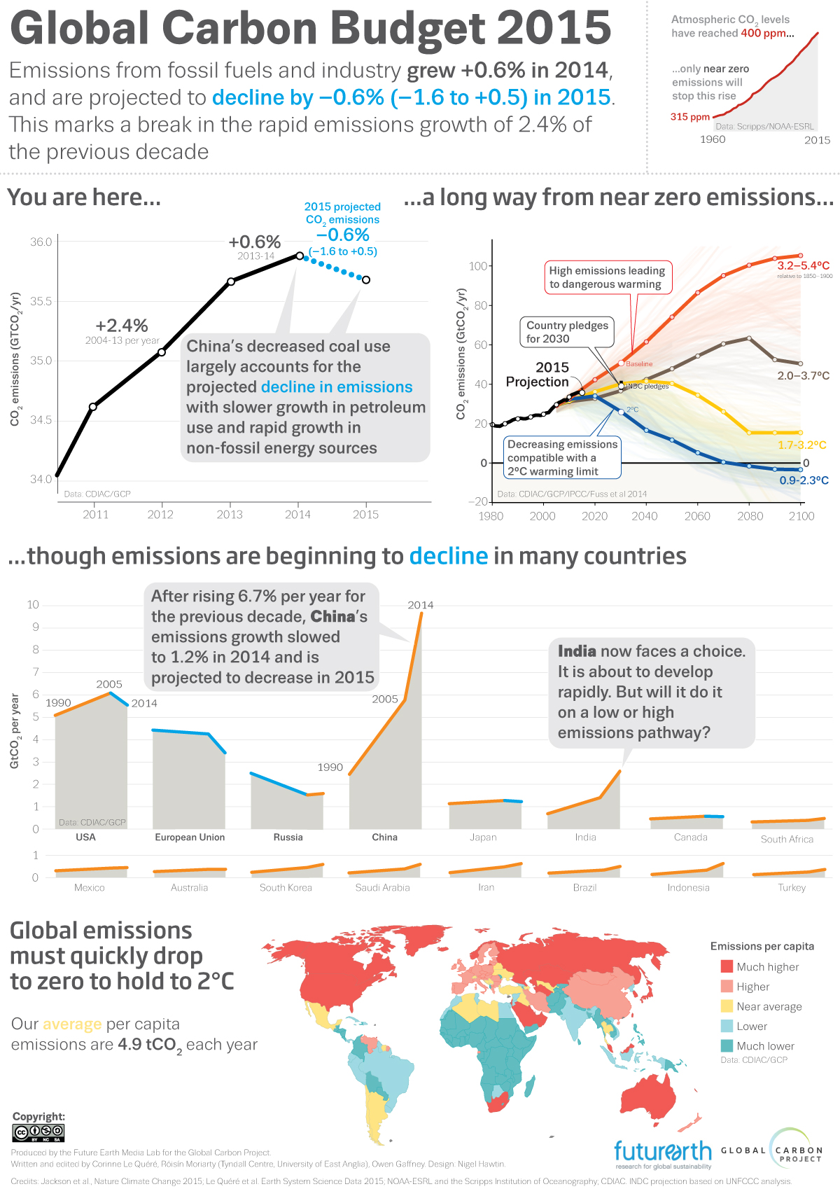
08 December, 2015
Latest graphics in Scientific American
...and Spectrumnews.org
24 November, 2015
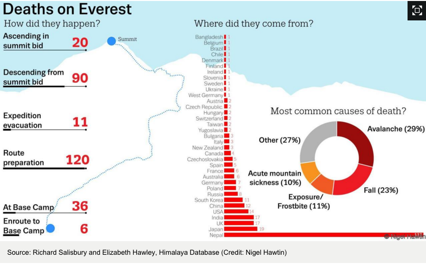
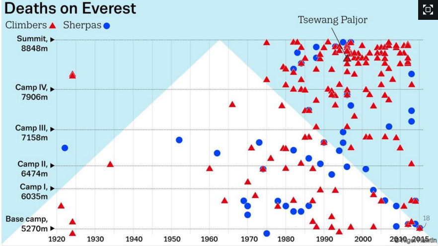
Graphics for BBC Future - Everest's 200+bodies
27 October, 2015
Some of my graphics now beginning to appear on the Spectrumnews website so go and have a read.
20 October, 2015
Updated graphics added to my gallery page
29 September, 2015
Double page graphic produced for Nature magazine Age of the Neutrino
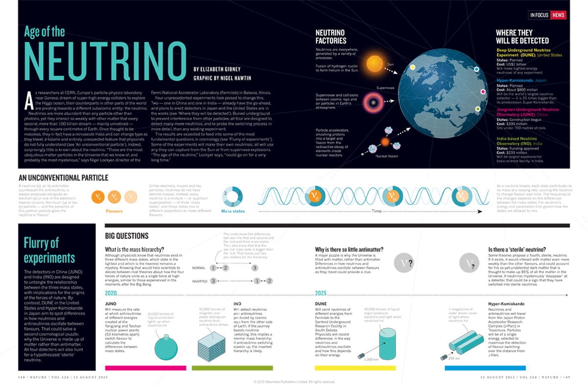
The Age of The Neutrino: Nature
26 August, 2015
Information graphic produced for Scientific American. Highly Contagious, Antibiotic-Resistant Food Poisoning Establishes U.S. Presence
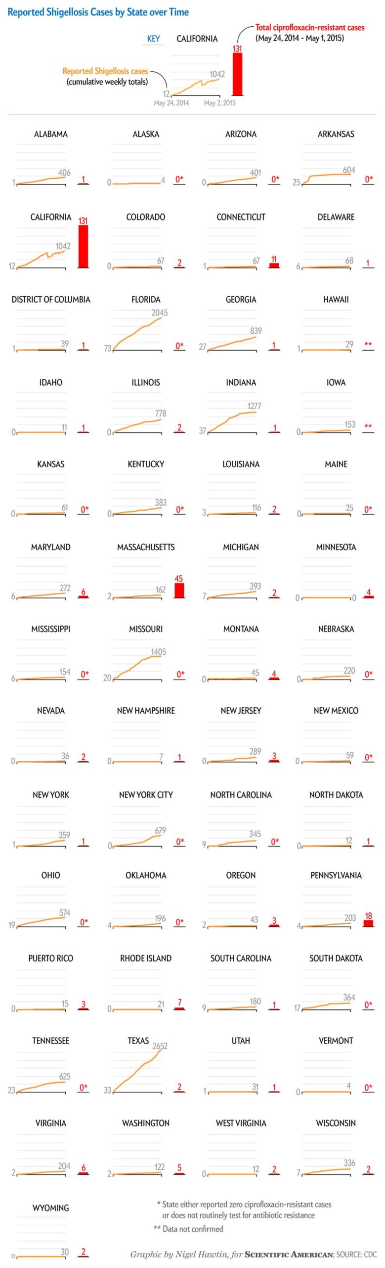
01 June, 2015
Information graphic produced for Scientific American. Countries Grab Farmland beyond Their Own Borders for graphic science page in the May 2015 issue
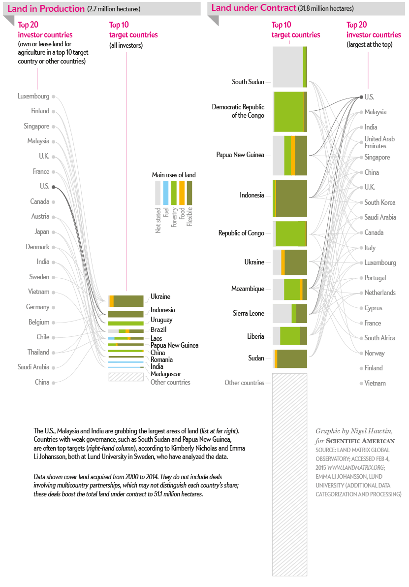
25 May, 2015
Pleased to see that a report I worked on in February has been released. Here's the press release and report. I advised and completed many of the graphics in the report. Thanks to Edward Peck co-founder of IAFN, and CEO of Asset Finance International.
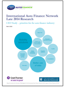
International Auto Finance Network (IAFN)’s long awaited major CEO research report, CEO Study – Priorities for the Auto Finance Industry produced in association with the University of Buckingham and Grant Thornton published today, has identified mobility solutions and better use of data as key opportunities for the auto finance industry but warns that the industry believes that it is slow to innovate, and can make poor use of its IT.
Lots of projects going on at the minute - will update this page when I can.
In the meantime have a look at the blog page
02 JANUARY, 2015