
An older post from 2017 showing a redesign following a discussion on the website for a Cochrane infographic.
Here is the original posting.

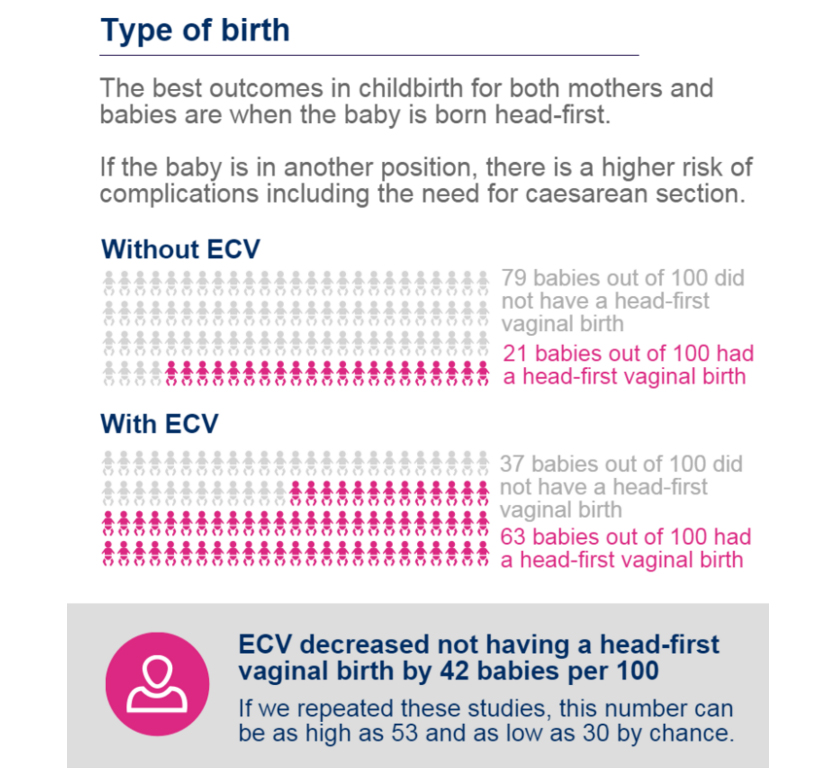
“one part of the graphic showing the number of head-first births and the box under the graphic saying ‘ECV decreased not having a head-first birth…’ was a bit difficult to comprehend at first, being a double negative and so, I have redesigned it a little to show the positive rather than the negative (although that may have been your purpose in this instance), I have also added coloured marking on the text, also to help the reader”
and my de-designed graphics
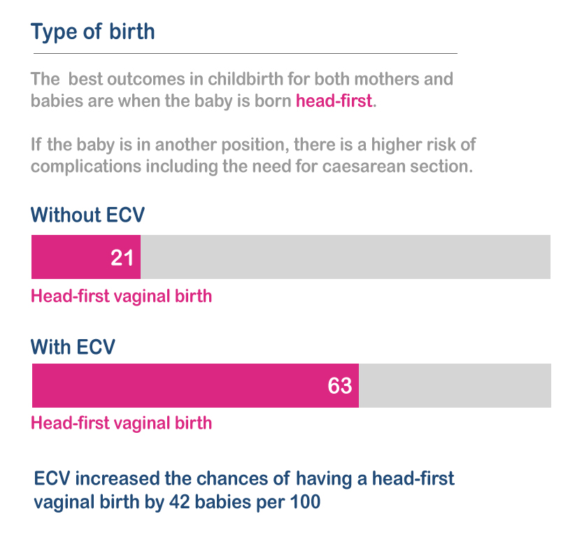
The comments were taken on-board and the redesigned graphic was produced here.
An improvement but still lots to do looking at other graphics on the page.