Tag Archives: infographic

The ‘State of Carbon Dioxide Removal’ report published

Late in January the 1st edition of the “State of Carbon Dioxide Removal” report was published.

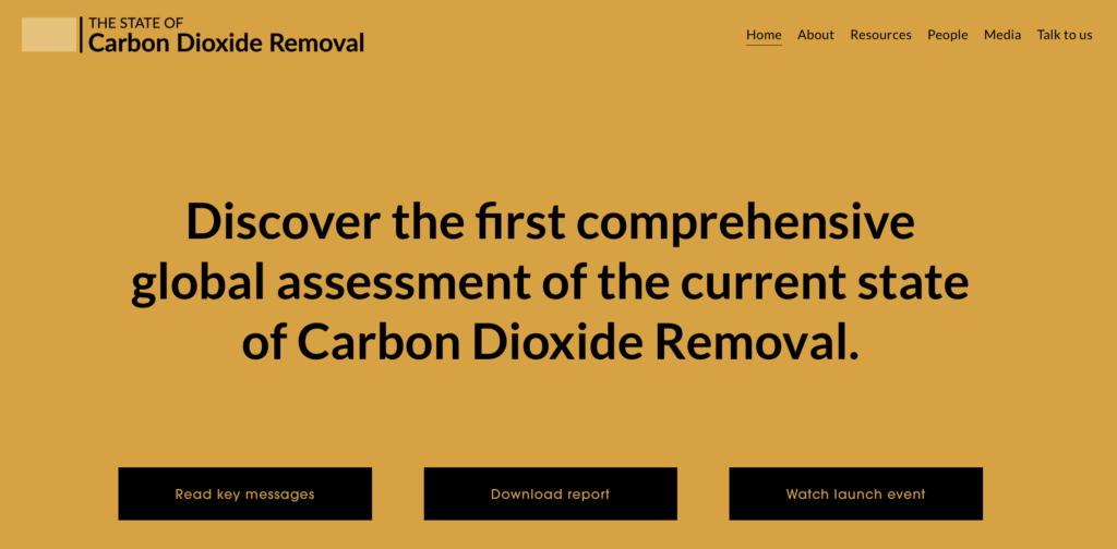
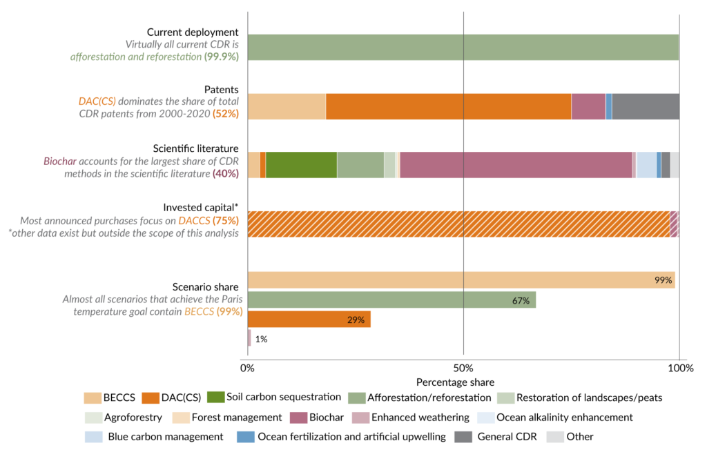
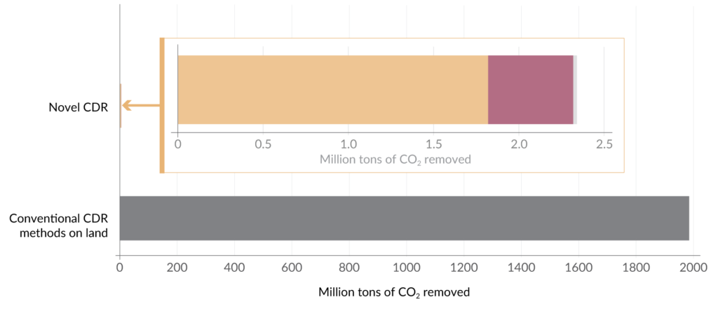
This report compiles a first estimate of the total CDR being deployed (2 GtCO2/yr), and is a global assessment of the current state of CDR and the gap we need to close to achieve the Paris temperature goal. Full report is here stateofcdr.org 

I has the privilege of working with the scientists and experts from all the institutions as well as Angela Morelli and getting this important information out there in an accessible and visual way.

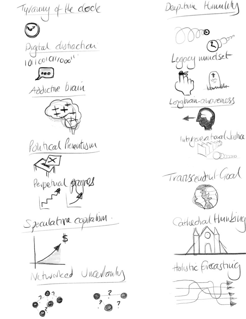
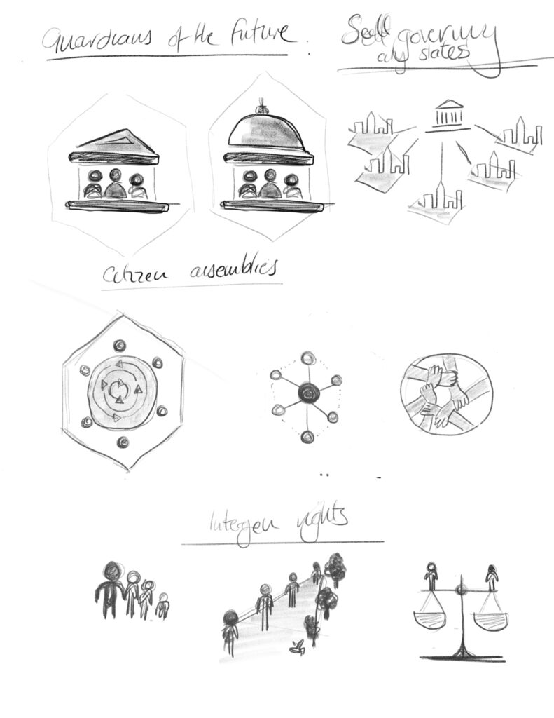
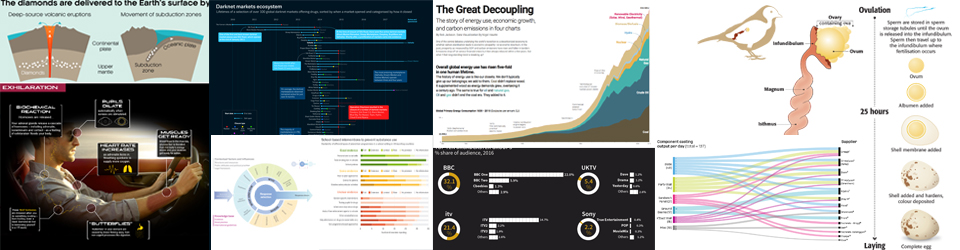
Here are a selection of the graphics from the report.

Many more in the report 

Many thanks for all the comments on social media about the graphics, including my favourite comment 😉

If you are the one who designed the graphics used today in the State of Carbon Dioxide Removal report launch then kudos for creating clear and compelling visual teaching tools”

Thank you!

04/03/2023

Looking back 10 years…update

For the past couple of years, I have been looking back on a monthly basis at graphics that I produced whilst at New Scientist 10 years ago.  I have had fun commenting on the good, bad and indifferent things that I find in the graphics. From colours and styles as well as the technology.  I have decided to change this monthly look back to a quarterly review. I did this first over the summer – link here – and think a quarterly look back will allow me to pick some howlers and well as -hopefully- showcase some stunners!

graphic showing images fro 2012

The next one will cover July, August and September 2012 and will be the autumn round-up…due end of September.

Thank you to all that have looked in the past and I hope that you carry on enjoying the round-up on a less frequent basis.


Climate Change Communication & the IPCC

Climate Change Communication & the IPCC

It has been a while, but I am pleased to say that an essay that I contributed to (Climate change communications and the IPCC) along with a few colleagues at the IPCC, has just been published in the Journal Climate Change. One of a series of papers and essays looking at science communication – Climate Change Communication and the IPCC.  A really important subject…

From the abstract…
‘In its Sixth Assessment Report Cycle (AR6), the Intergovernmental Panel on Climate Change (IPCC) aims to strengthen the communication of its products. As the only mandatory part of IPCC reports specifically targeting a lay audience, the Frequently Asked Questions (FAQs) provide an opportunity for broader communication of key IPCC topics…

…we find that bringing together IPCC authors and communication specialists to jointly develop the text and graphics increases the accessibility and usefulness of the FAQs…

…we recommend involving communication experts from the beginning of the drafting process to share responsibility, which requires sufficient resources to be allocated to the FAQs…

Enjoy reading along with the other papers and essays all looking at science communication. The report and all 32 FAQ graphics is here…

Many thanks to Sarah Connors, Sophie Berger, Malissa Walsh, Ros Pidcock and Maike Nicolai for putting up with all my questions and queries when producing the FAQs for the report.

14 March 2022

New report and graphic with Greenpeace science unit

A new report from Greenpeace science unit was launched recently looking at how a rusting oil tanker, the FSO Safer, could end up triggering a major environmental and humanitarian disaster in and around the Red Sea.

I produced the infographics in collaboration with Greenpeace and Kathryn Millar, an environmental researcher. You can find the report here…

…and here are the graphics…

Icon design

A couple of before and after for icons that I worked on for ‘The Good Ancestor: How to think long term in a short-term world’ by Roman Krznaric, launched this week.

Showing the ideas that were sketched out after discussions and brainstorming between Roman and myself.

icons for tog of war graphic showing long term and short-term thoughts

final icons for tug of war graphic

icon sketches for deep democracy

final graphic icons for deep democracy graphic

Always good to see how things develop and finalise at the final stage. More to come…

25 July 2020

The drug market during the Covid-19 pandemic

New report with EMCDDA and Europol

Last week the EMCDDA and Europol published their latest report on the impact Covid-19 is having on the drug markets. I worked with the agencies on the graphics side of the report. Click on the report cover to download it but here are a couple of the graphics in preview.


03 June 2020

Infographics and Illustrations: How they used to be done…#2

Following on from some of my black and white gardening illustrations here I thought I would also show some of my colour illustrations first produced for New Scientist in 1990!.

The process was very different and everything was hand drawn, or in this case hand drawn and then painted using watercolours onto watercolour paper…registration marks were placed on the paper…

…we then used an acetate overlay to draw on arrows showing water flow – specified to be 60% Cyan for the printer –  plus a front view drawn in ink – to be black. The text was typed and printed from a computer and stuck on this layer using Cow Gum. Registration marks to align with the layer below…

…another layer of acetate was used to show the water flow arrows (60% Cyan) over the top of the black lines black pointers for the text…

…any other particular instructions for the printer were then included on these layers. Only then was it sent off for proofing and printing, sometimes never to be seen until the magazine arrived in the office!

Here is a very bad image (only one I could find) of the printed version from February 1990 along with a hand drawn graphic showing transport costs.

Another example here, showing the same process just as a comparison…


Things seem much easier now…or do they?

05 March 2019


From sketch to infographic

I always sketch my ideas to help me to understand the subject matter, to come up with concepts and ideas for the visuals, and to be able to look back and see what my thoughts and ideas were. Here are a few from a recent commission from Scientific American, published in the November 2018 issue on the subject of gravitational lensing.


18 December 2018

Show the data

I see this many times a week when ‘infographics’ are shared on social media.

This was shared on LinkedIn recently..what’s missing?


What’s missing is the data, in a visual way. Too much time has been spent on producing the nice icons (which are important for context), making them stand out in white on a dark blue background and the text is white as well. The tile of the graphic is ‘Number of years it took for each product to reach 50 million users’ – so where is are the number of years? They are written numerically, which is ok, but are a smaller font size and produce in a lighter blue on a dark blue background.

The graphic is hiding the data, the important piece of the graphic. That data should be seen first, or at least, seen easily. So why hide it.

Infographic = information + graphic

Here’s the data produced in a visual form. IMHO a much neater way of seeing what the graphic is supposed to be showing.

The icons can be added to it to give context if needed, but the graphic should show the information (data) first.

24 January 2018


Global Carbon Budget 2016 – updated infographic

I recently had the opportunity to work again with Corinne Le Quere of the Tyndall Centre for Climate Change Research on updating an important graphic on the global carbon budget.

I worked on this last year and it was proposed to update the graphic to keep with the original style. Updating the data and storytelling between the signing of the Paris agreement last year and the Marrakesh plan of action this year. The graphic was launched at the Marrakesh COP22 conference on climate change.

Here’s 2016 version…

screen-shot-2016-12-06-at-10-42-41

plus last years version as a comparison

Global Carbon Budget 2015

Global Carbon Budget 2015

06 Dec 2016