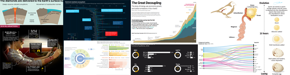
My latest infographic for Scientific American has been released and this month they are making the issue free to read. Go to https://lnkd.in/gVMCHtz to see my graphic looking at Planet Hunting. Always a pleasure to work with Jen Christiansen and Meredith MacGregor.
This month I thought I would share the video of the sketching process I went through after I had read the copy, re-read the copy, doodled and taken notes, finally asking many questions to Jen and Meredith. At that stage I was pretty certain about what we were all trying to achieve in the graphic.
The graphic and video are below. These show my sketching process and build up to the ‘final sketch before committing to the final drawing completed in Illustrator.
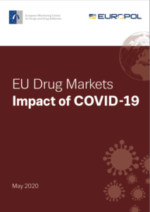
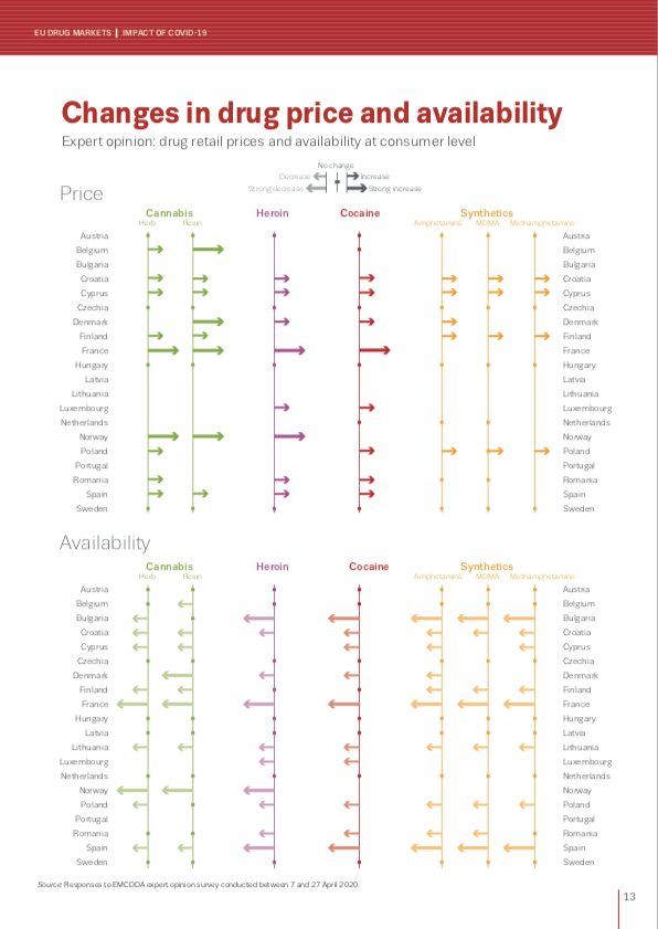
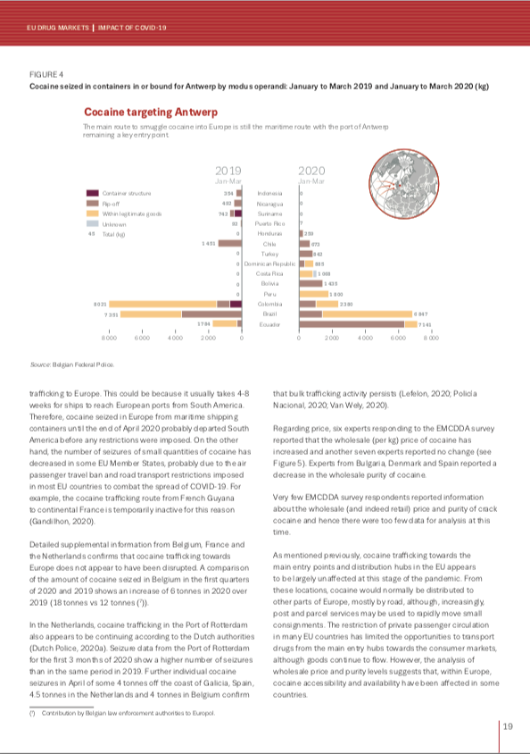
Last week the EMCDDA and Europol published their latest report on the impact Covid-19 is having on the drug markets. I worked with the agencies on the graphics side of the report. Click on the report cover to download it but here are a couple of the graphics in preview.
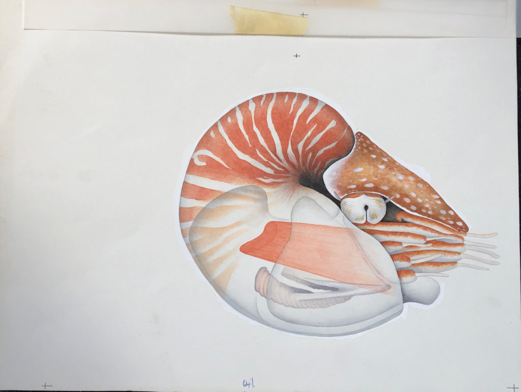
Following on from some of my black and white gardening illustrations here I thought I would also show some of my colour illustrations first produced for New Scientist in 1990!.
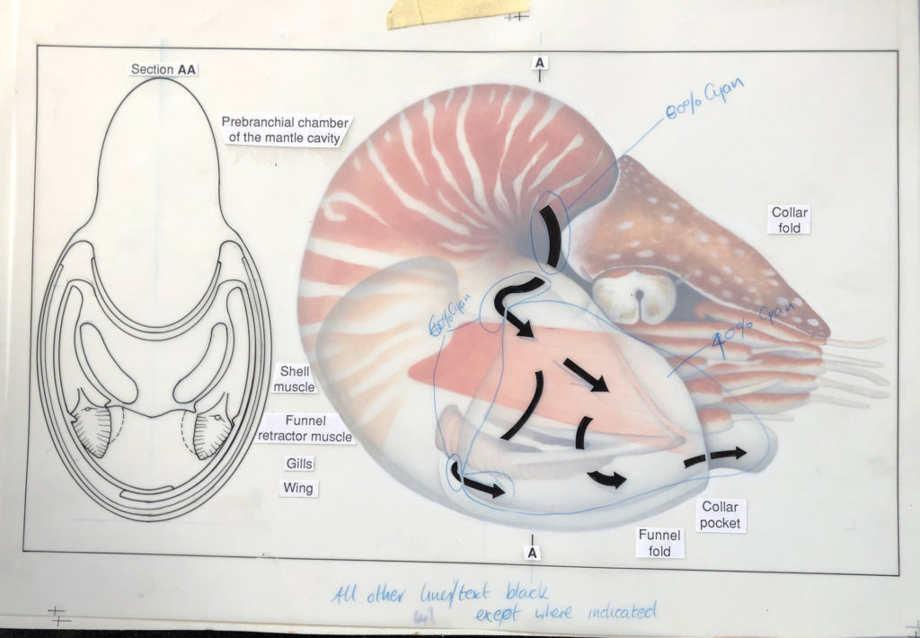
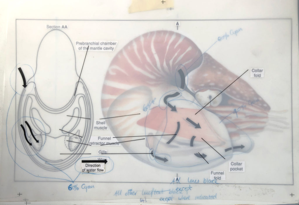
The process was very different and everything was hand drawn, or in this case hand drawn and then painted using watercolours onto watercolour paper…registration marks were placed on the paper…
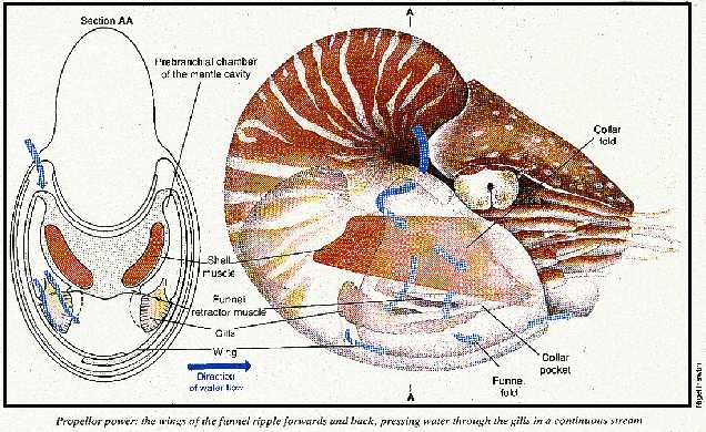
…we then used an acetate overlay to draw on arrows showing water flow – specified to be 60% Cyan for the printer – plus a front view drawn in ink – to be black. The text was typed and printed from a computer and stuck on this layer using Cow Gum. Registration marks to align with the layer below…
…another layer of acetate was used to show the water flow arrows (60% Cyan) over the top of the black lines black pointers for the text…
…any other particular instructions for the printer were then included on these layers. Only then was it sent off for proofing and printing, sometimes never to be seen until the magazine arrived in the office!
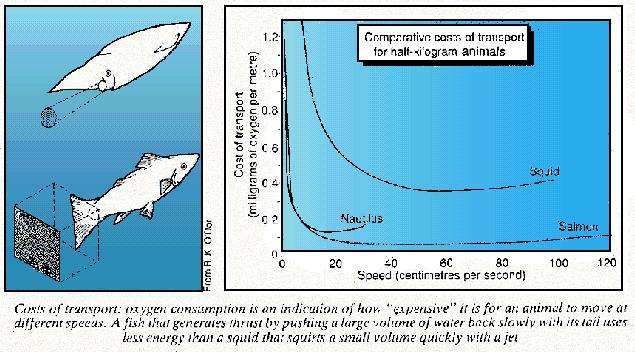
Here is a very bad image (only one I could find) of the printed version from February 1990 along with a hand drawn graphic showing transport costs.
Another example here, showing the same process just as a comparison…
Just an excuse to show some of my old work before the daily use of a Apple Mac was involved.
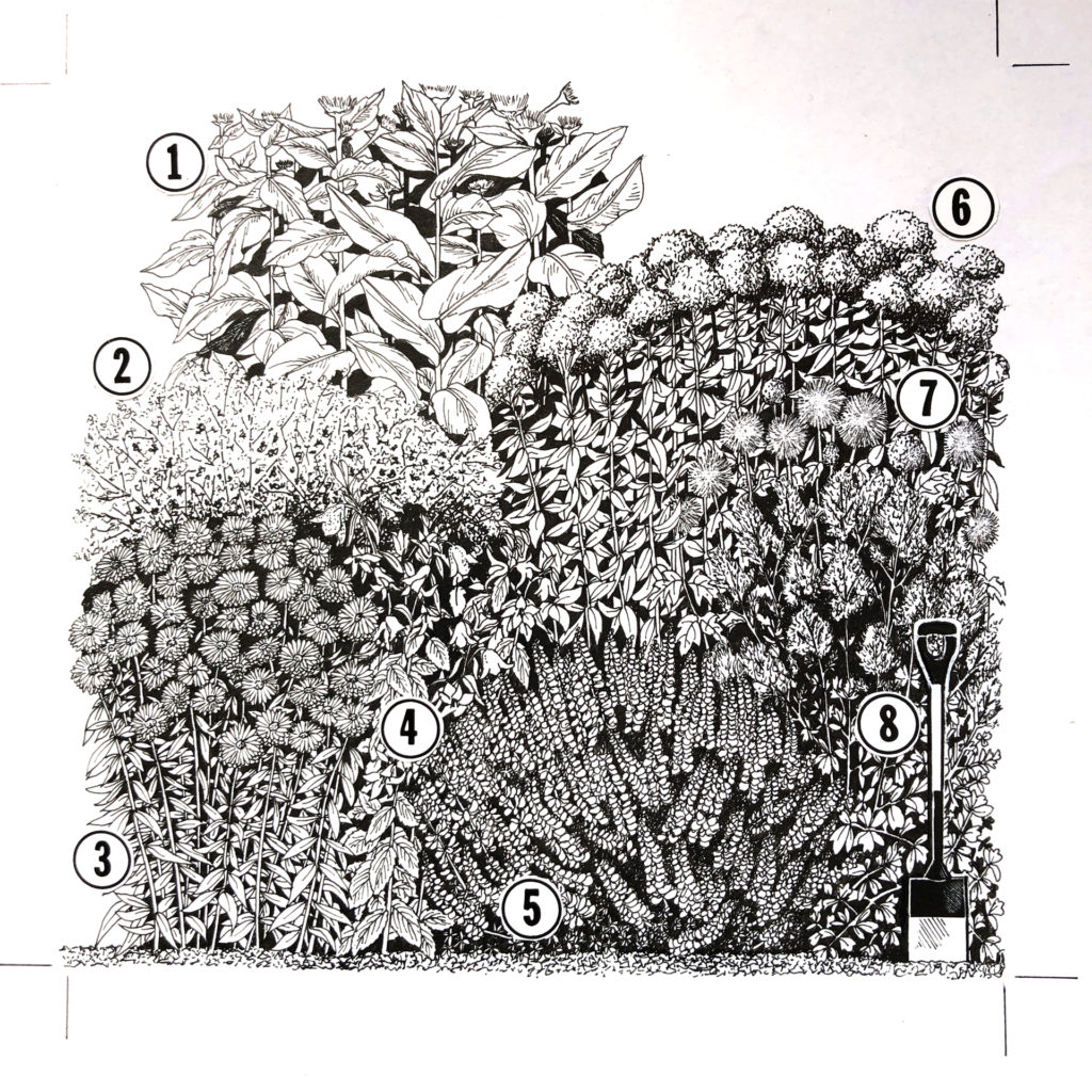
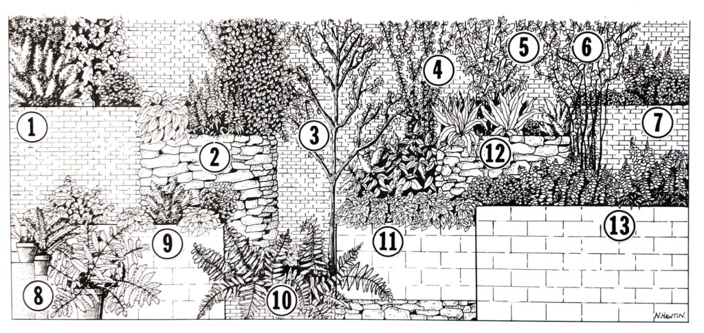
I was working as a freelancer when this was done and I was involved with the gardening section of the Sunday Times at the time. It was always good to see my illustrations on the back page of the garden section. My contact and gardening expert at the time was Graham Rose.
This was taken from sketches I made of actual gardens in-situ (mostly London based) and then drawn up to scale and design on CS10 paper and Rotring pens, with lots of scraping out of ink blots!. The numbers were glued on using the wonderful Cow Gum.
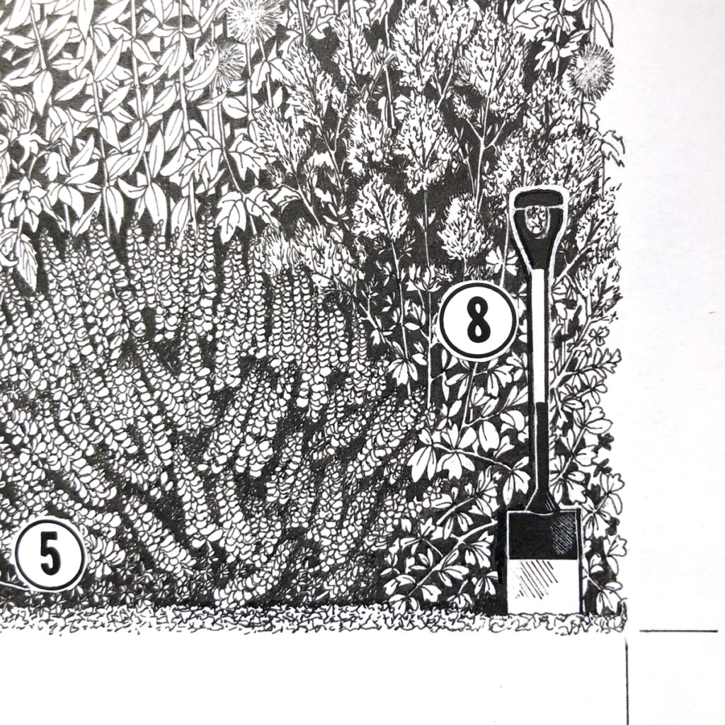
inset to show some of the detail…
One more…
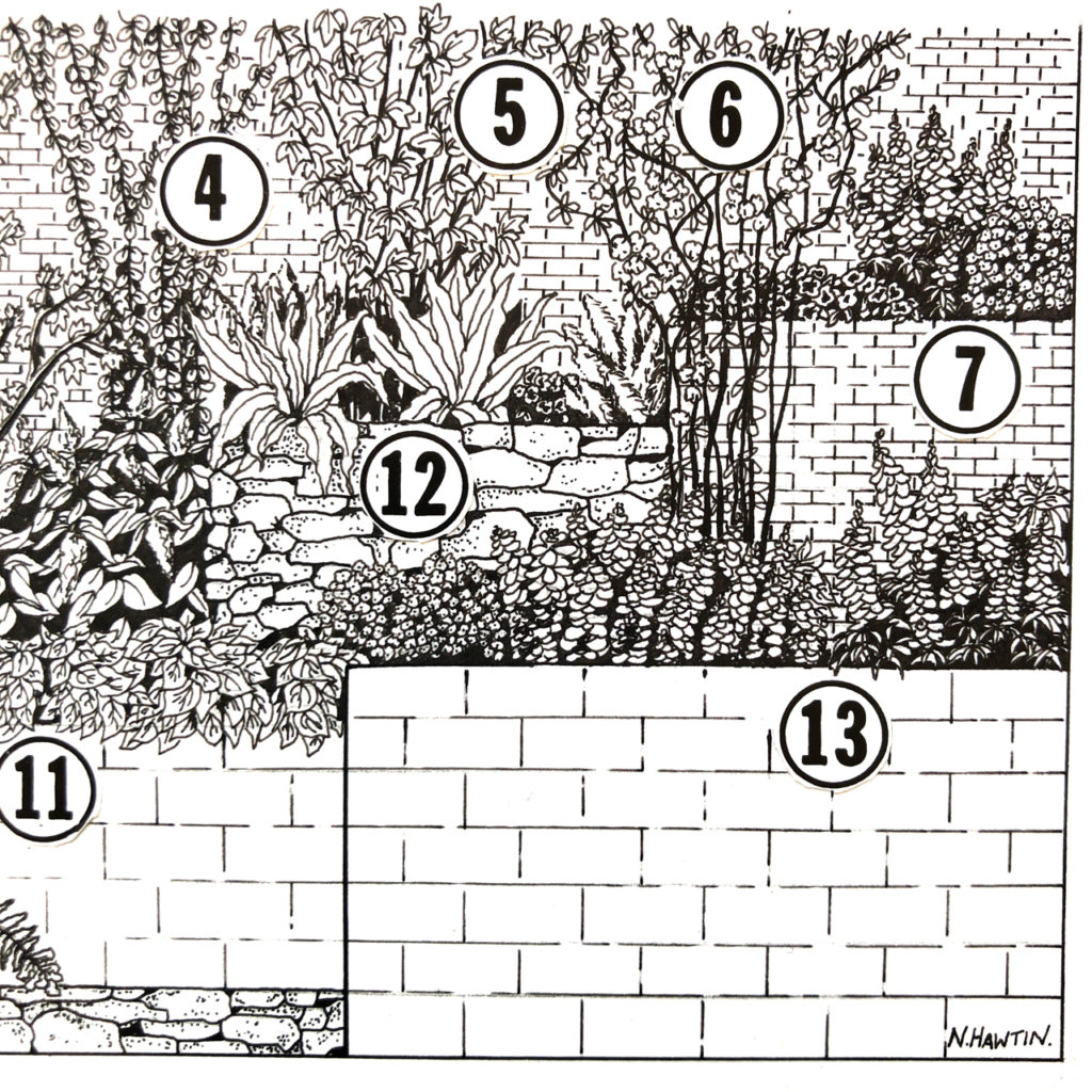
and again, an inset to show the detail.
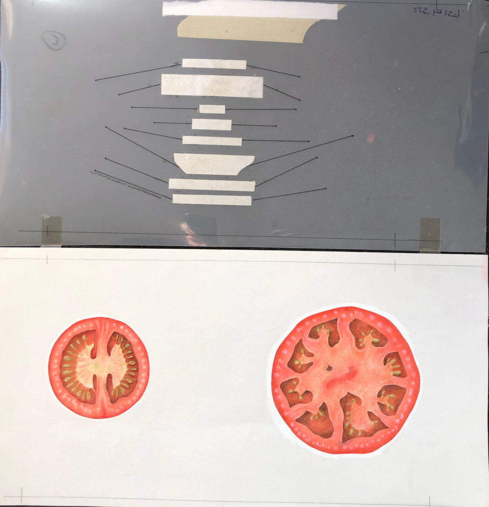
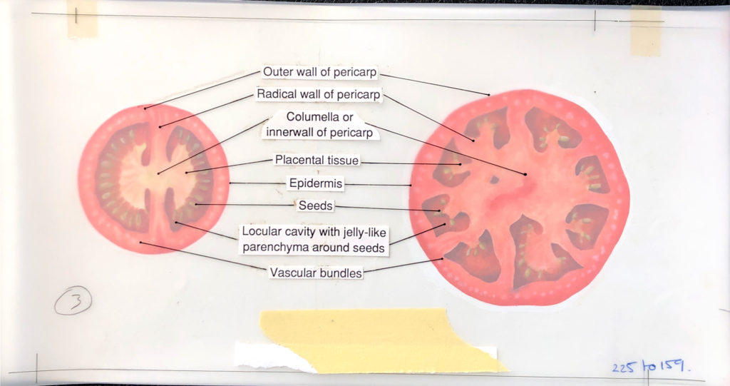
More to come in #2 with watercolours, Tomatoes, overlays, CMYK markups, and a Nautilus…
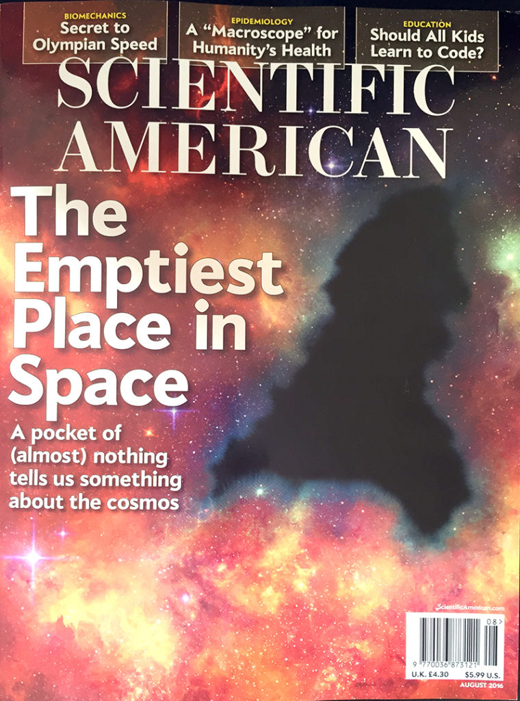
Once again I have just managed to get my hands on the latest SciAm issue for August.
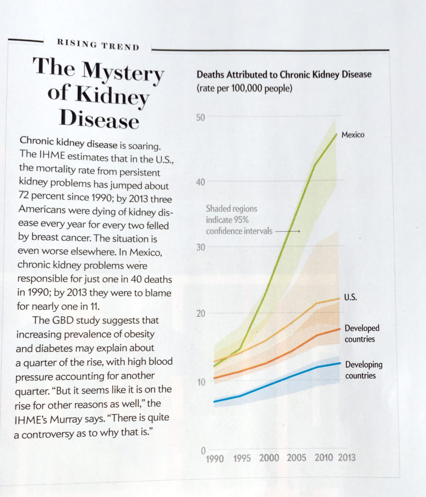
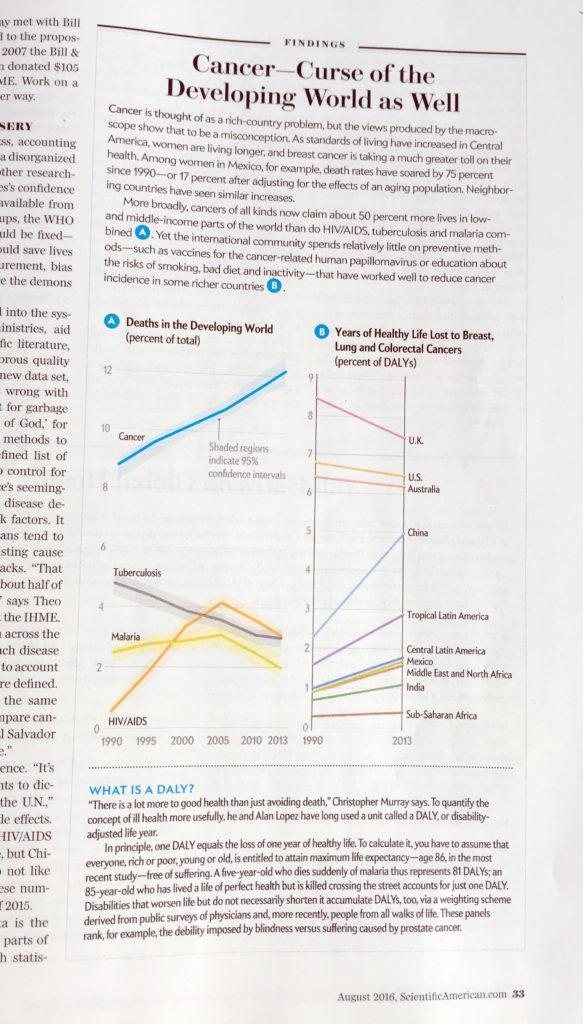
Jen Christensen (Senior Graphics Editor) commissioned me to produce a couple of charts for the feature ‘Health check for Humanity’ looking at cancer rates and chronic kidney disease int he developing world. Pleased to see them in print and to be amongst other great illustrations and graphics.
It’s always good to see innovation when it comes to data visualisation and infographics. We never stop learning and therefore looking and seeing what others are doing is a great way to learn and improve out own standards.
We should all be looking at what others are doing from all over the world every day. We can gain insights into how styles are changing and what the thought processes of others in the field are by looking at what has been done. I find it’s also good to wonder how I would have done anything differently to help me understand it better or easier.
This is one from last week posted by Ipsos MORI looking at the reactions to Brexit across Europe as well as a few other countries outside of the EU.
Nothing fundamentally wrong with the graphic. I could see that, as the header says, Spain is top when looking at whether they thought the decision was wrong or right for Britain. But looking more closely, and especially trying to compare those who thought it wrong to those who thought it was right, I found it hard to work out, because of the use of the stacked chart.
I wasn’t the only one who was thinking along these lines – a couple of us had a discussion about this on twitter!
I also felt the dark grey was rather off-putting as the colours used were of similar intensity.
So I had a go at it myself to see if I could make it easier for me to compare wrong with right.
I haven’t included all the numbers but I have put the ‘Don’t knows’ in the middle of the ‘Wrong’ and the ‘Right’. This allows me to see, more easily, the proportion who think it was the wrong decision AND the proportion who think it was the right decision. Making it easy to compare the two figures and therefore the majority decision. I also made the grey “Don’t know’ a lighter, less intrusive, grey colour to make the separation easier to see.
The text that accompanied the tweet was ‘Was Brexit right or wrong for Britain? Only majority of Russians say right’ , which is fine, but it’s difficult to see that in the original, whereas my version makes it clearer that Russia is the only country that has a majority that thought it was the right decision
There are other ways of showing the data as there are in many instances, such as this but this version excludes the ‘Don’t know’ data
We can all learn and so re-imagining or adjusting works by others is a great way of learning. I advise you all to go and have a try. Many thanks to ipsosMori for ‘supplying’ this one for me.
What do you think?
Added 10 August. Hannah Williams Ipsos MORI’s Creative Director and I discussed this yesterday after which, I have to add (and agree with her, here) that as with most polling questions, the ‘Don’t know’s are as important as the ‘Right’ and ‘Wrong’ or Yes and No’s. So my second attempt is really not relevant.
As with all stacked bars charts, actually trying to compare a specific element across a range of categories, will always be a compromised because of the stacking of the bars.
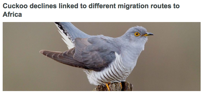
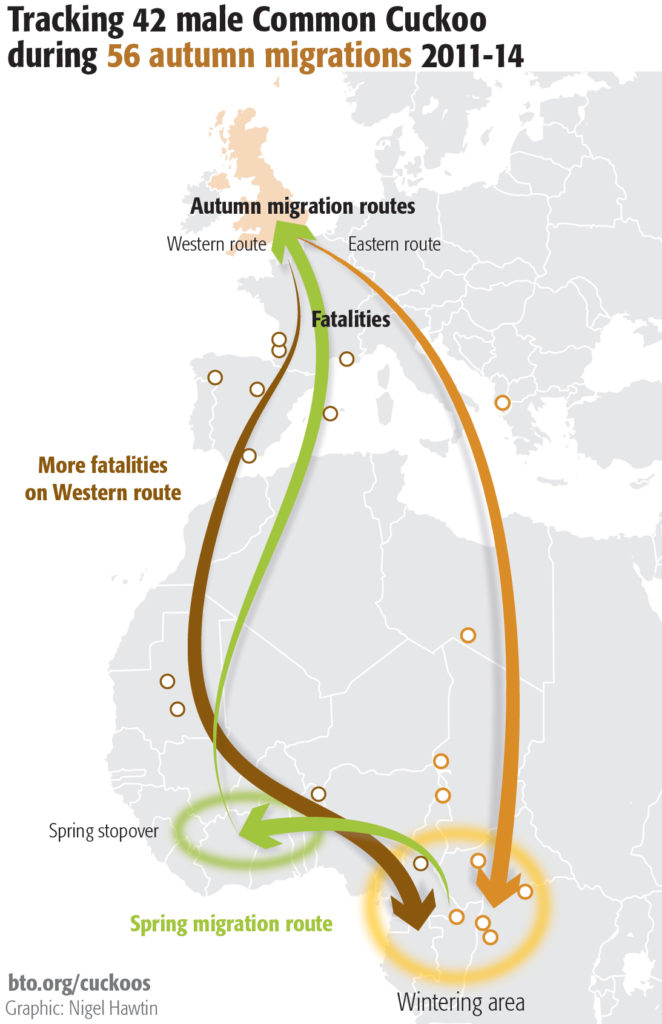
I am working with the good folks at the BTO (British Trust for Ornithology) on some of the graphics across their wide range of publications in print and online.
To coincide with the publication I produced a graphic for the publication online showing the different routes used by the tagged Cuckoos on their way to Africa and back.
For sharing on social media we also produced an animated gif showing the same information. This was produced to be readable on a mobile screen and a useful thing to do for promotional purposes. The animation doesn’t work here so please look at pic.twitter.com/Fkj2dEP1lC