Tag Archives: Datavis

Infographics and Illustrations: How they used to be done…#1

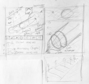
Just an excuse to show some of my old work before the daily use of a Apple Mac was involved.

I was working as a freelancer when this was done and I was involved with the gardening section of the Sunday Times at the time. It was always good to see my illustrations on the back page of the garden section. My contact and gardening expert at the time was Graham Rose.

This was taken from sketches I made of actual gardens in-situ (mostly London based) and then drawn up to scale and design on CS10 paper and Rotring pens, with lots of scraping out of ink blots!. The numbers were glued on using the wonderful Cow Gum.


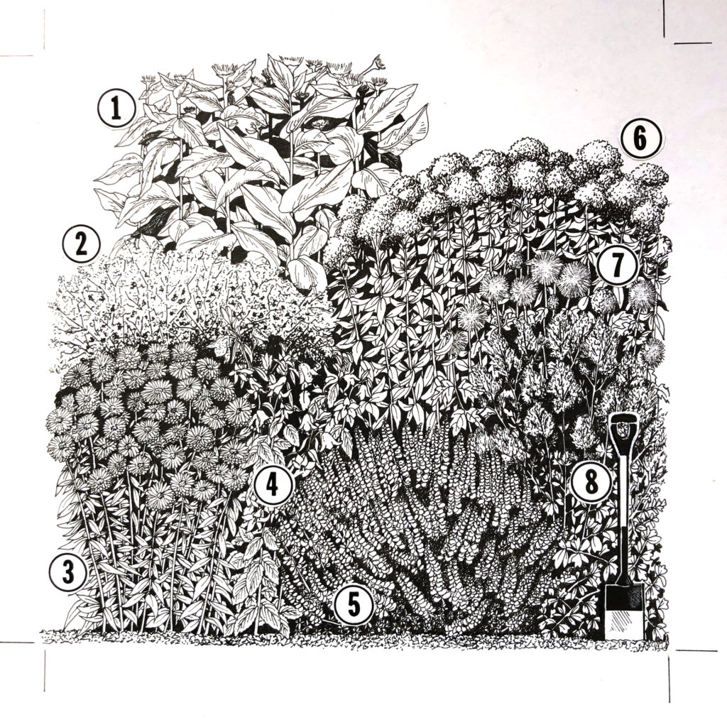
inset to show some of the detail…
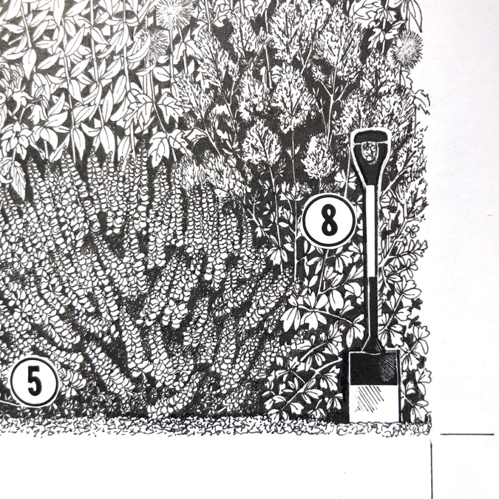
One more…

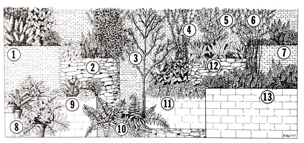
and again, an inset to show the detail.

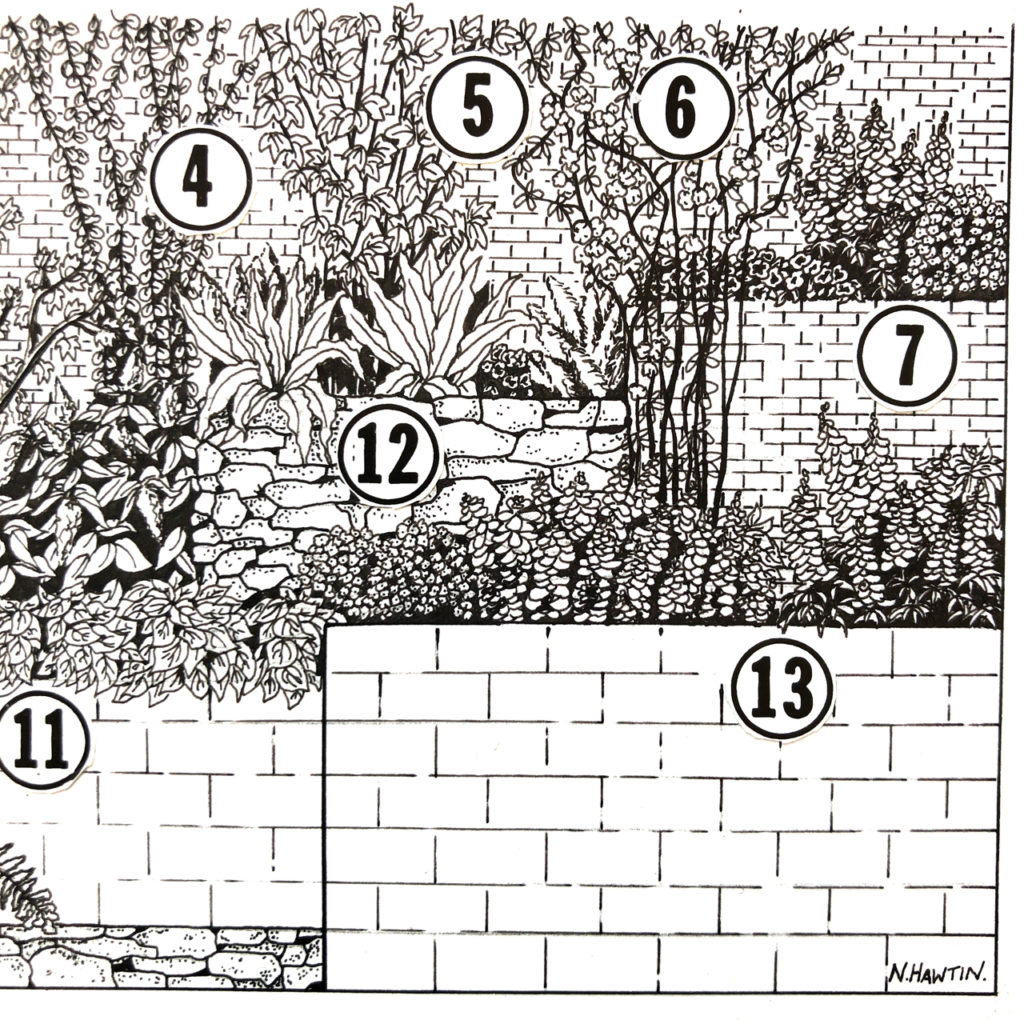
More to come in #2 with watercolours, Tomatoes, overlays, CMYK markups, and a Nautilus…

26 February 2019


From sketch to infographic

I always sketch my ideas to help me to understand the subject matter, to come up with concepts and ideas for the visuals, and to be able to look back and see what my thoughts and ideas were. Here are a few from a recent commission from Scientific American, published in the November 2018 issue on the subject of gravitational lensing.


18 December 2018

Show the data

I see this many times a week when ‘infographics’ are shared on social media.

This was shared on LinkedIn recently..what’s missing?


What’s missing is the data, in a visual way. Too much time has been spent on producing the nice icons (which are important for context), making them stand out in white on a dark blue background and the text is white as well. The tile of the graphic is ‘Number of years it took for each product to reach 50 million users’ – so where is are the number of years? They are written numerically, which is ok, but are a smaller font size and produce in a lighter blue on a dark blue background.

The graphic is hiding the data, the important piece of the graphic. That data should be seen first, or at least, seen easily. So why hide it.

Infographic = information + graphic

Here’s the data produced in a visual form. IMHO a much neater way of seeing what the graphic is supposed to be showing.

The icons can be added to it to give context if needed, but the graphic should show the information (data) first.

24 January 2018


Global Carbon Budget 2016 – updated infographic

I recently had the opportunity to work again with Corinne Le Quere of the Tyndall Centre for Climate Change Research on updating an important graphic on the global carbon budget.

I worked on this last year and it was proposed to update the graphic to keep with the original style. Updating the data and storytelling between the signing of the Paris agreement last year and the Marrakesh plan of action this year. The graphic was launched at the Marrakesh COP22 conference on climate change.

Here’s 2016 version…

screen-shot-2016-12-06-at-10-42-41

plus last years version as a comparison

Global Carbon Budget 2015

Global Carbon Budget 2015

06 Dec 2016