For the past couple of years, I have been looking back on a monthly basis at graphics that I produced whilst at New Scientist 10 years ago. I have had fun commenting on the good, bad and indifferent things that I find in the graphics. From colours and styles as well as the technology. I have decided to change this monthly look back to a quarterly review. I did this first over the summer – link here – and think a quarterly look back will allow me to pick some howlers and well as -hopefully- showcase some stunners!
The next one will cover July, August and September 2012 and will be the autumn round-up…due end of September.
Thank you to all that have looked in the past and I hope that you carry on enjoying the round-up on a less frequent basis.
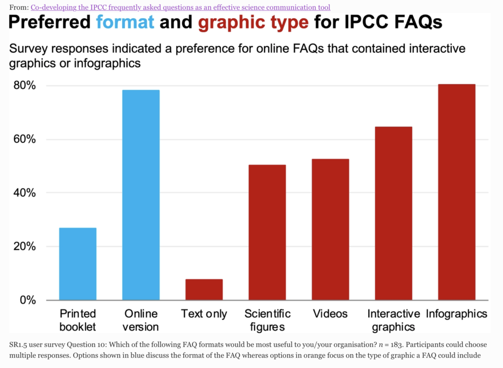
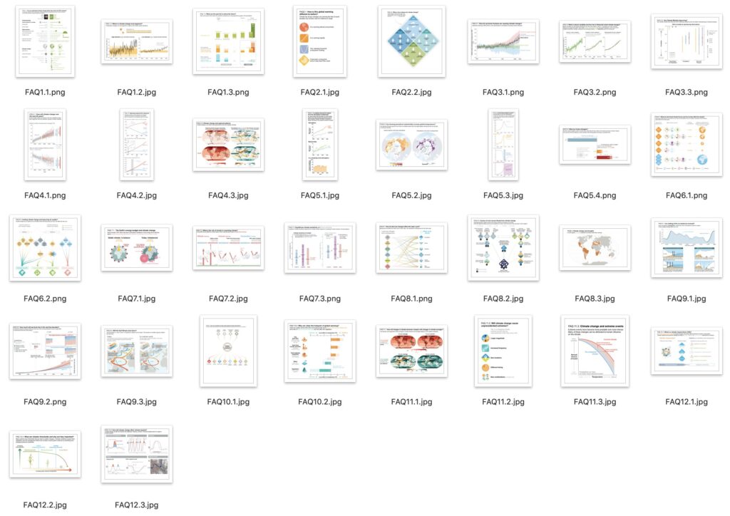
It has been a while, but I am pleased to say that an essay that I contributed to (Climate change communications and the IPCC) along with a few colleagues at the IPCC, has just been published in the Journal Climate Change. One of a series of papers and essays looking at science communication – Climate Change Communication and the IPCC. A really important subject…
From the abstract… ‘In its Sixth Assessment Report Cycle (AR6), the Intergovernmental Panel on Climate Change (IPCC) aims to strengthen the communication of its products. As the only mandatory part of IPCC reports specifically targeting a lay audience, the Frequently Asked Questions (FAQs) provide an opportunity for broader communication of key IPCC topics…
…we find that bringing together IPCC authors and communication specialists to jointly develop the text and graphics increases the accessibility and usefulness of the FAQs…
…we recommend involving communication experts from the beginning of the drafting process to share responsibility, which requires sufficient resources to be allocated to the FAQs…
Enjoy reading along with the other papers and essays all looking at science communication. The report and all 32 FAQ graphics is here…
Many thanks to Sarah Connors, Sophie Berger, Malissa Walsh, Ros Pidcock and Maike Nicolai for putting up with all my questions and queries when producing the FAQs for the report.
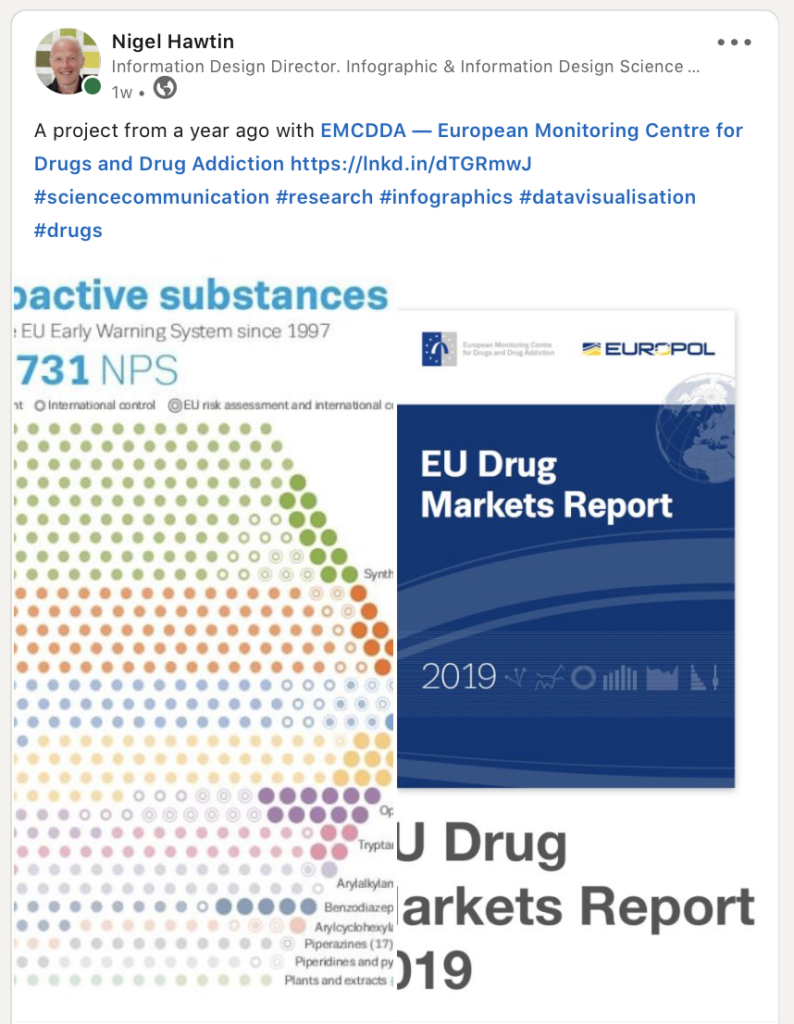
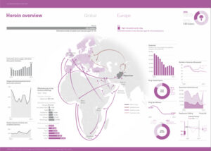
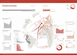
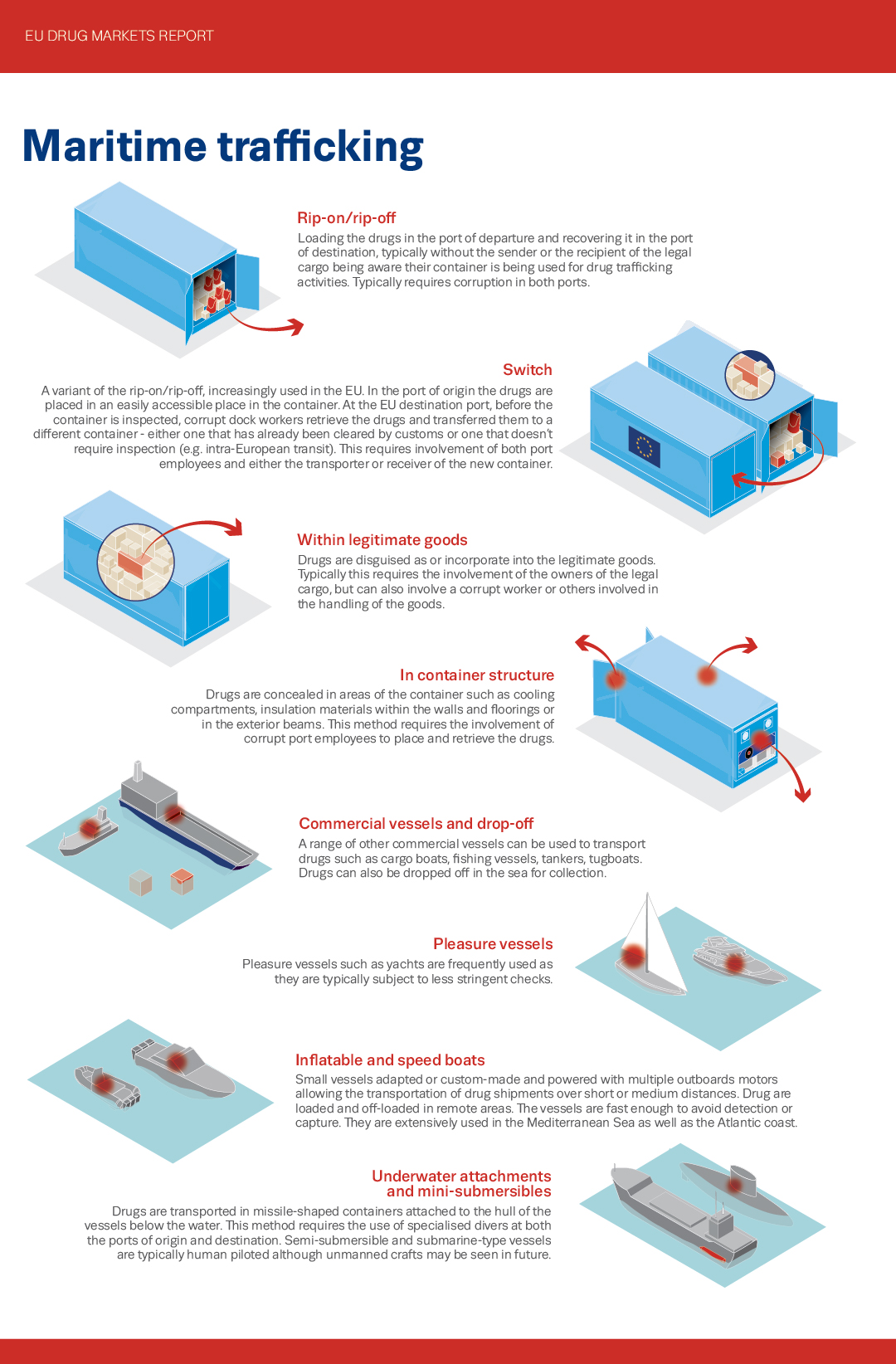
Last week I posted a link to a project that I completed last year, working in collaboration with EMCDDA and Europol – the EU Drug Markets Report 2019.
I posted it because the particular graphic that I show in the preview was one of those projects that really changed along the way from initial idea and sketch to the final look. It was a challenging project and one that I sometimes use as an example of the process in my workshops.See the report here.
A comment from Andrew Cunningham (EMCDDA staff), one of the contributors to the report made me think that showing the progression of the design would be interesting for viewers, so here goes.
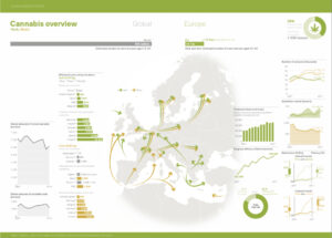
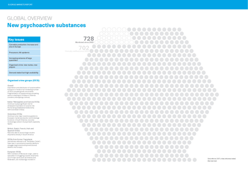
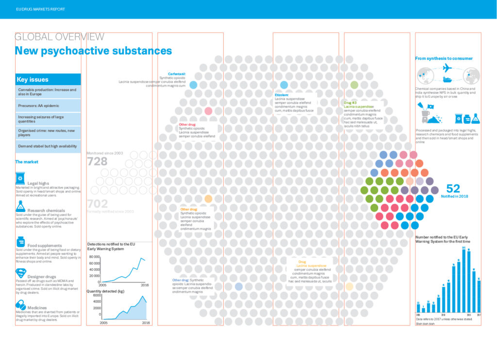
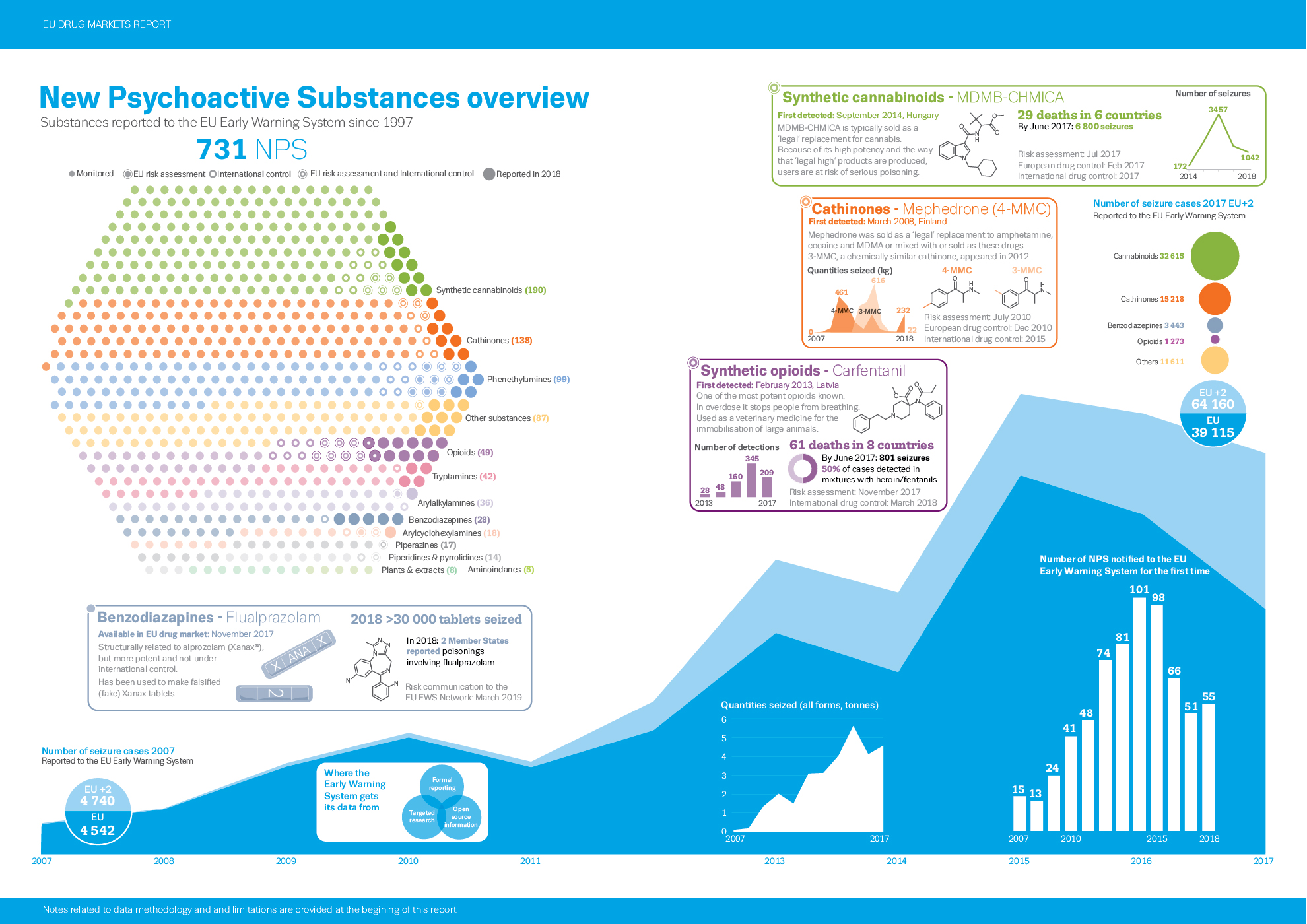
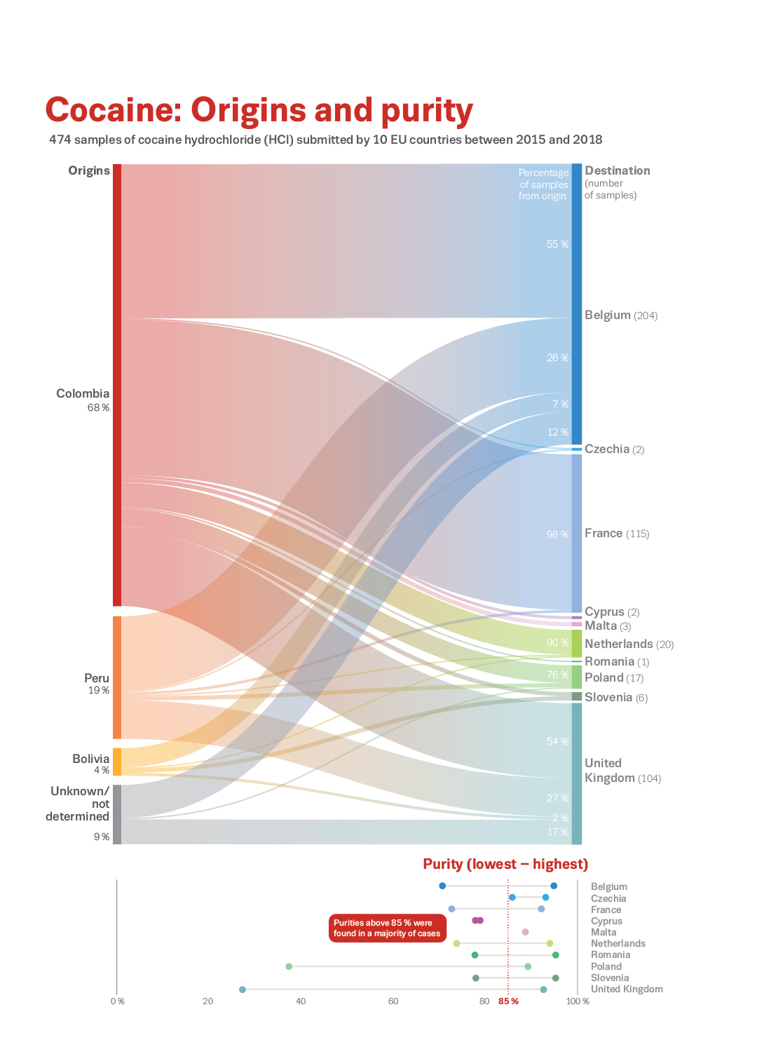
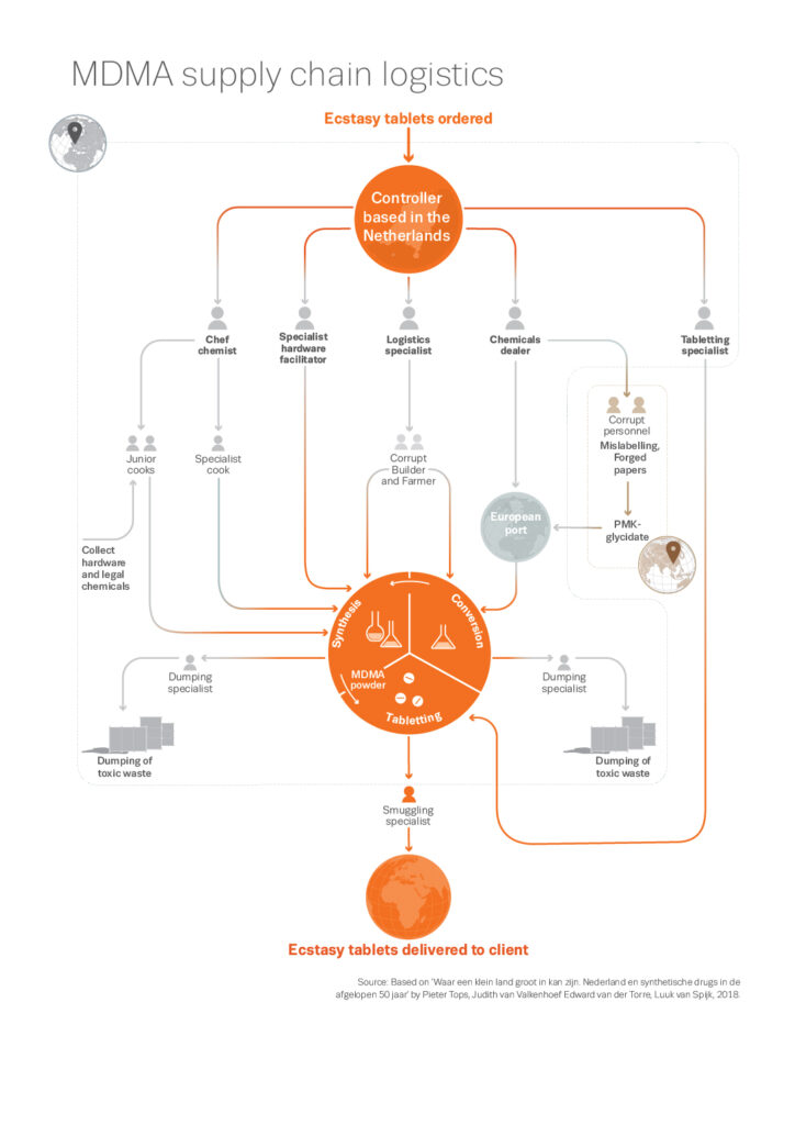
To put this spread into context, each chapter of the Drug Markets Report concentrates on one drug or range of drugs, so we have Cannabis, Heroin, Cocaine, Synthetics (MDMA, Amphetamine, Methamphetamine) and NPS (New Psychoactive Substances) Each chapter has a main spread graphic, along with its chapter colour, summing up the particular drug and looking at its sources, distribution, price, purity etc around the world as well as across Europe.
We tried to keep to the same format for each drug graphic so that the reader would know what was being shown in each position.There is a central image surrounded by many data graphics – generally world data on the right and EU data on the left page. I have included the other drug spreads here so you can see what I mean.
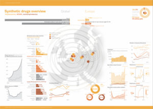
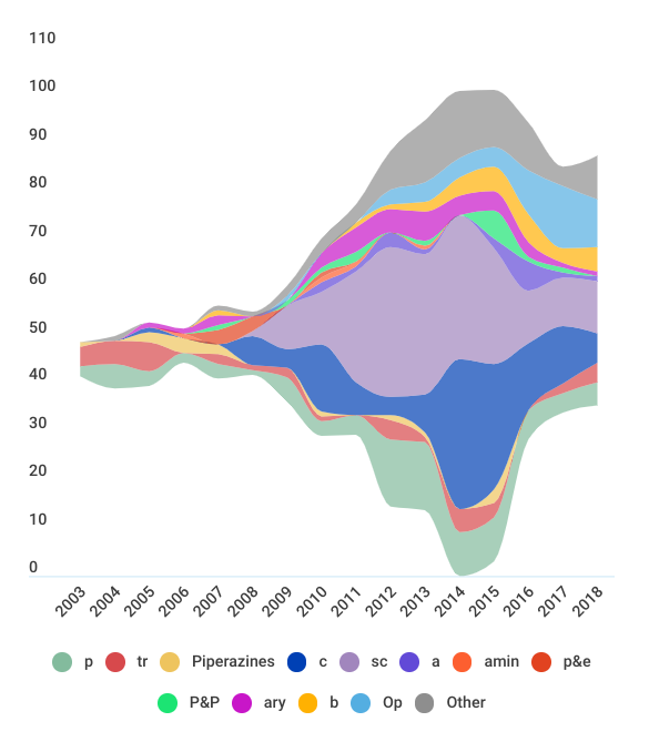
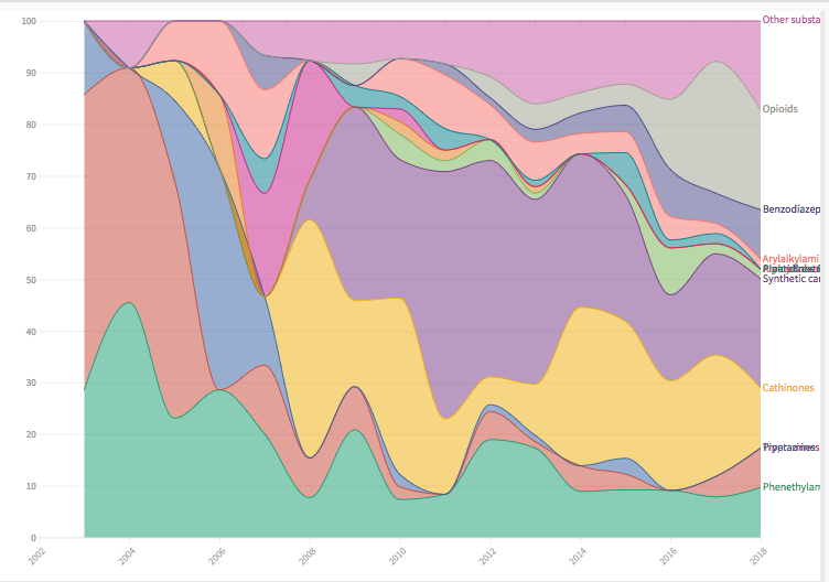
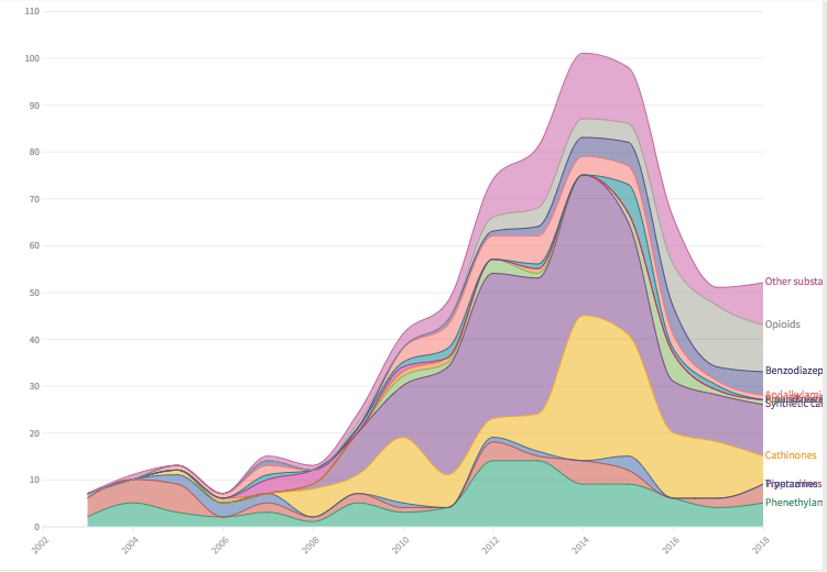
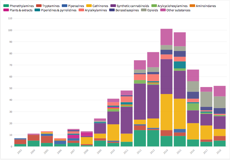
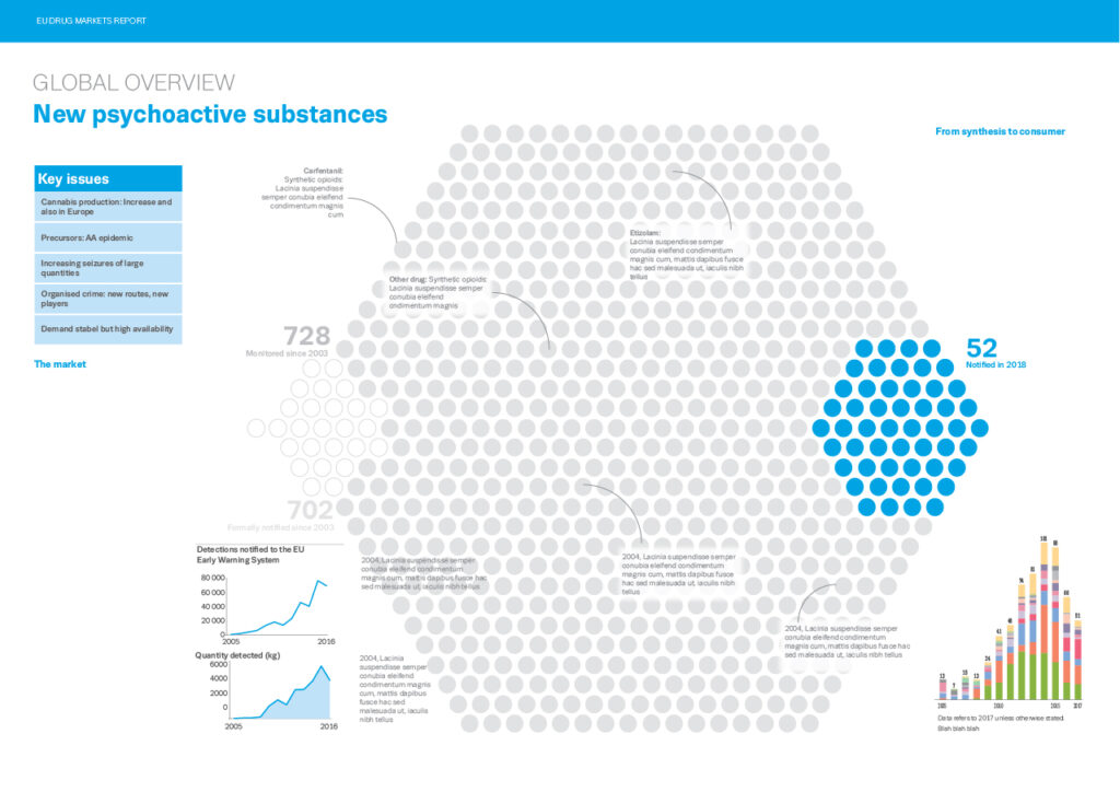
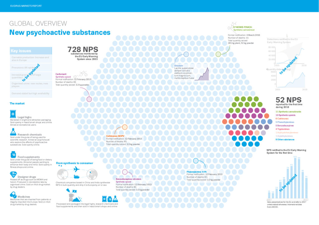
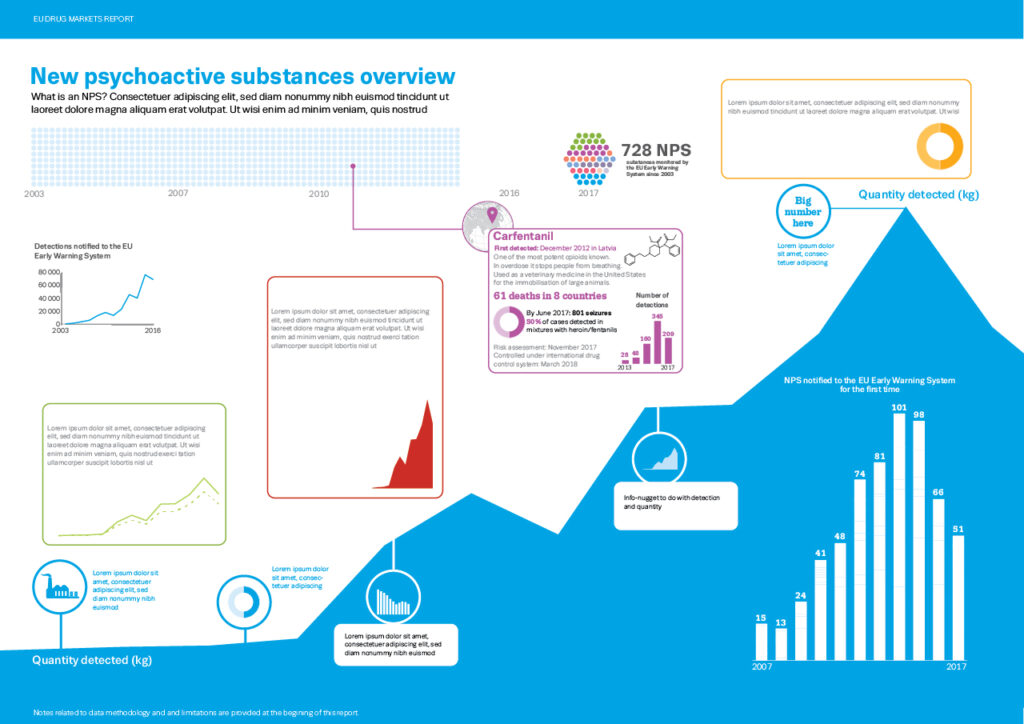
With NPS we have a range of drugs that cover many of the other drug categories but in man-made chemical form, so the way the data was collected and needed to be presented was very different. Trying to keep up with the new (sometimes very similar) chemical formulas and drugs is a major task. In our initial discussions the huge number of drugs recorded and monitored by the EU early warning system seemed to be very important and we agreed that this was something that should be shown. For instance in the last year of reporting – 2018 – there were approximately 52 drugs monitored and reported out of a total of about 731 (numbers were not 100% accurate as this stage) reported since 2003 – an interesting thing to visualise as we could also show how many of each category were being monitored. Here are some of the trials showing the 731 drugs and the breakdown of what types they were.
I thought if I use each drug as a dot and make it into a hexagon shape, being of significance in the chemistry of the NPS (benzine ring) that would be a great way to show just how many had been monitored in that time and the proportion that had been reported in the last year. Maybe we could have that as out main image and hang the other data off of that.
Luckily the total number of dots fits quite happily into that hex shape (well almost) and so I tried to lay out some of the remaining data along the same lines as the other spreads.
I was hoping that we could pull out and highlight some examples of the drugs over the years to help put them into context for the more general reader, ie where was ‘spice’ and when was it notified and what are the data for that etc so I added some dummy copy boxes over the 700 dots.
You can see here that the layout is six column double page spread.
As with most projects, discussions between colleagues and myself are an ongoing and vital part of the process. Elements are changed, colours are altered and layouts adjusted…
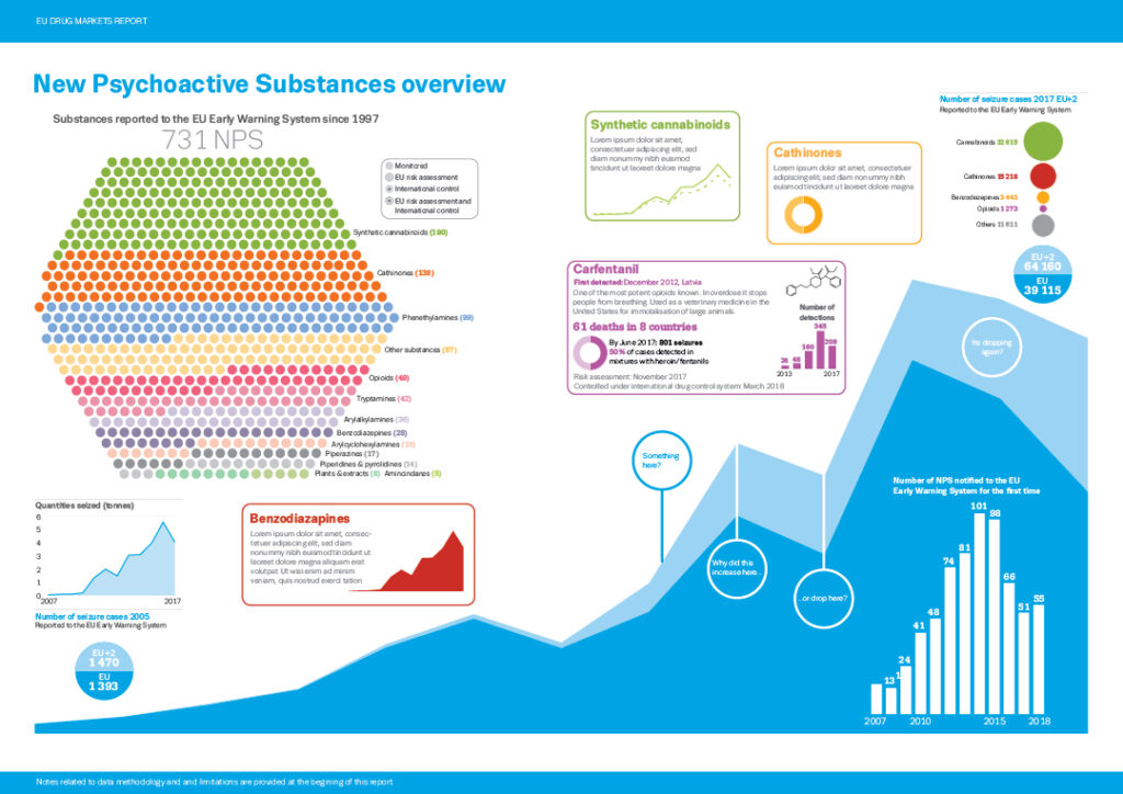
During some of these discussions it was agreed that the number of seizure cases was really the important piece of information – or it was at least as important as the numbers of the drugs – and so we decided that this should be primary focus of the spread.
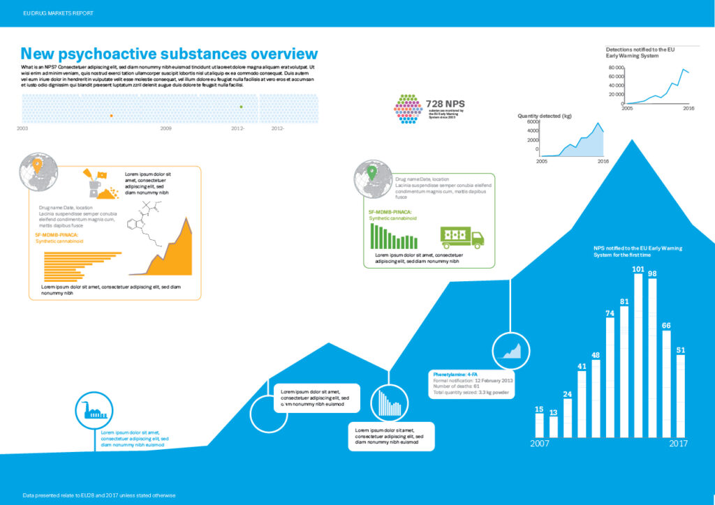
I had the data in a small graphic at the top right hand side and so I redesigned the spread using that information as the focus, now hanging the other data, including the dots, from that. The number of drugs was still an important piece of data and so I tried to incorporate that into the new design using 732 dots arranged in different way, firstly in a row…
…then using my preferred hex shape once again. You can see here I tried other chart types including the histogram like chart but we agreed on the area/line chart in simple colours with the hexagon (700+ dots) as a secondary visual although near to the top of the page so that the reader would see the huge numbers before seeing the quantities.
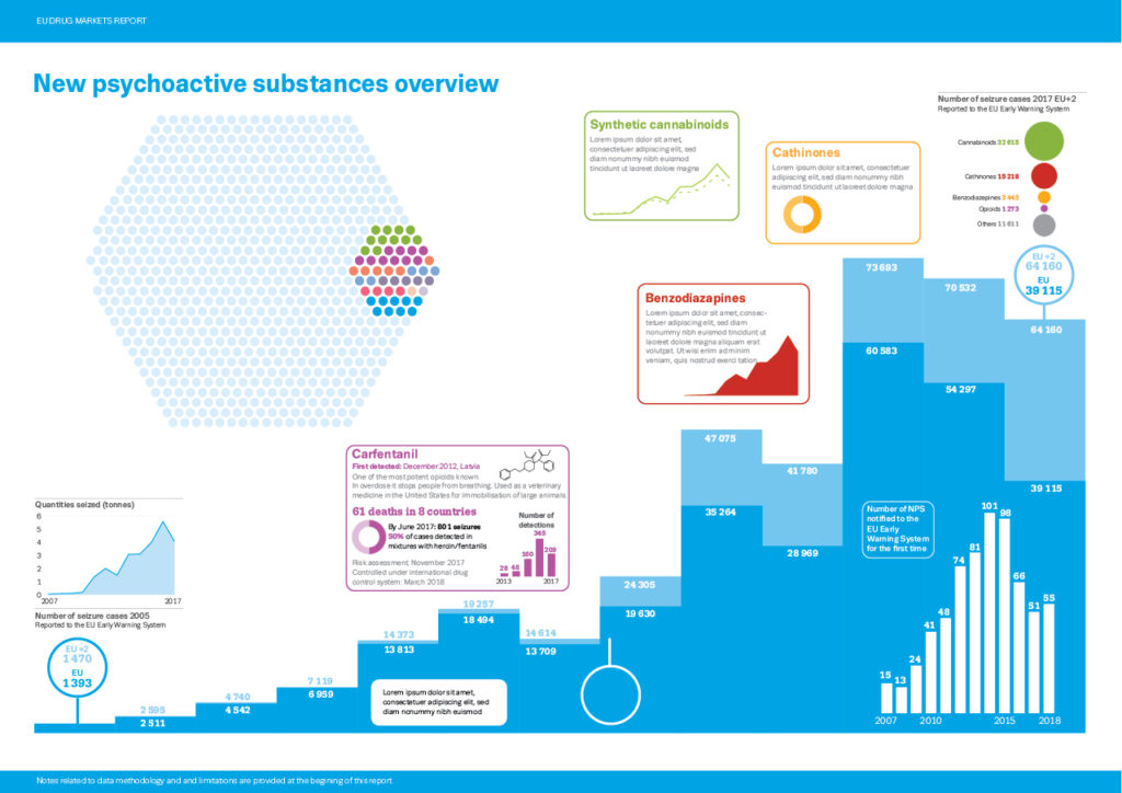
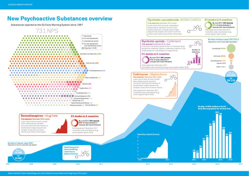
Once we had agreed on the look, it was then time to refine the main chart to add EU and EU+2 data (light and dark blue) plus add the additional information such as highlighting certain drugs and chemicalcategories as well as other relevant or interesting information. You can see I had started to do this above and below.
The key for the 731 NPS dots was a real problem and that particular element went through many stages to try and get it into a state that was acceptable to everybody and understandable to the reader.
Then it was really down to refinement and adjusting text, layout, positioning, white space and incorporating and editing the new data when we got it until we end up at the final version.
Keeping everybody involved (and sometimes not involved!) updated with the process and what was going on was a big job, but luckily at that stage I could spend time in EMCDDA’s office which made the process much smoother.
Making sure everybody involved was happy with the information shown, the text and the placement of the visuals is always a big job and these spreads were no exception.
We got there in the end and I and, hopefully, the team at EMCDDA are happy with the results. Working with a big team is always an involved, complex and sometimes frustrating experience – for them as much as me – but knowing the data and subject matter (they are the experts here), knowing the audience and knowing the reasons for producing the visuals is a vital part of the job and hopefully this knowledge will guide you to a good result.
This happens with every chart and graphic I produce, from the most basic to the complex. Some have more steps and processes, including lots of pencil sketches (which have gone missing here) some less, the process is the same.
These were just some of the graphics produced for the report. There are many more in the report including timelines, drug processes and more icon-like graphics, so head over to the site and download last years and this years report amongst many more.
A big thank you to Rosemary Martin de Sousa (Head of unit), Andrew Cunningham (who’s idea it was to post this) and everybody involved at EMCDDA and Europol – a real team effort.
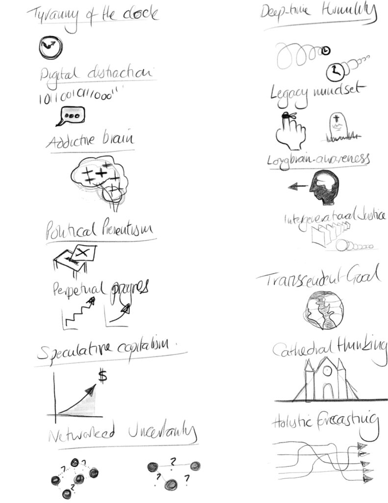
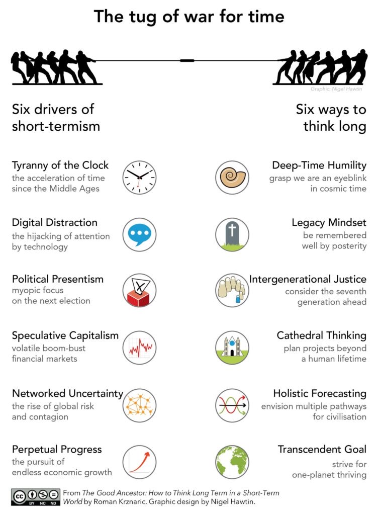
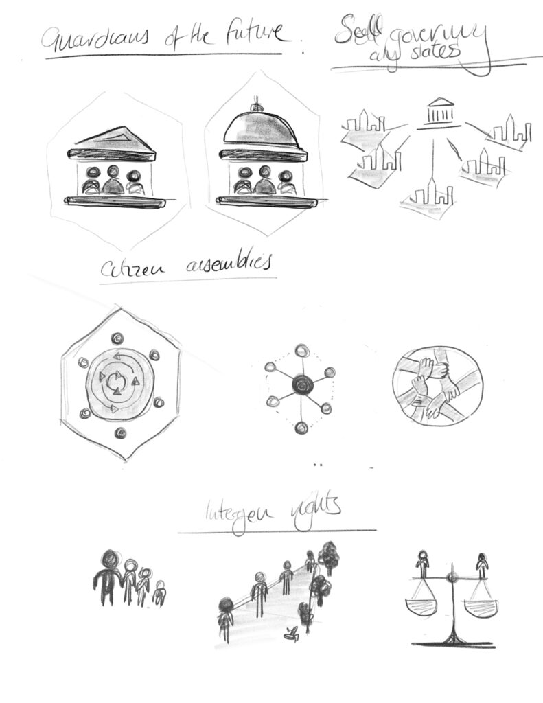
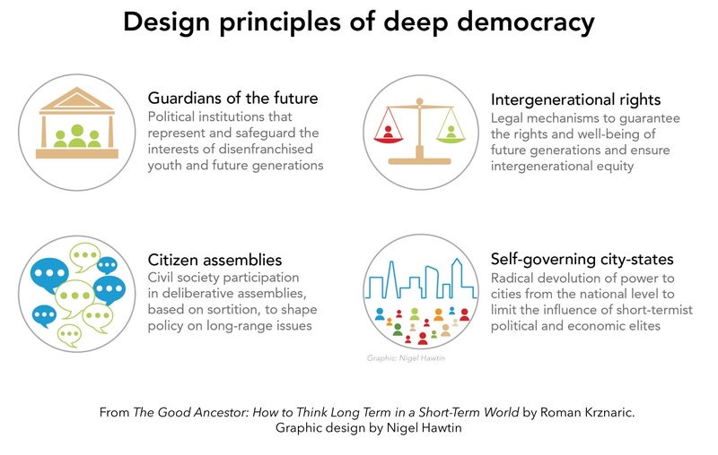
A couple of before and after for icons that I worked on for ‘The Good Ancestor: How to think long term in a short-term world’ by Roman Krznaric, launched this week.
Showing the ideas that were sketched out after discussions and brainstorming between Roman and myself.
Always good to see how things develop and finalise at the final stage. More to come…
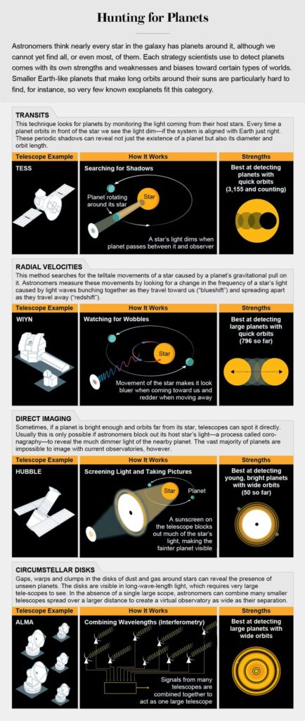
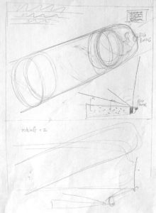
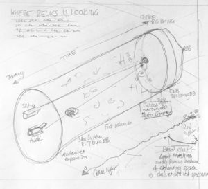
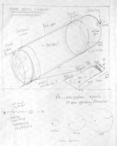
My latest infographic for Scientific American has been released and this month they are making the issue free to read. Go to https://lnkd.in/gVMCHtz to see my graphic looking at Planet Hunting. Always a pleasure to work with Jen Christiansen and Meredith MacGregor.
This month I thought I would share the video of the sketching process I went through after I had read the copy, re-read the copy, doodled and taken notes, finally asking many questions to Jen and Meredith. At that stage I was pretty certain about what we were all trying to achieve in the graphic.
The graphic and video are below. These show my sketching process and build up to the ‘final sketch before committing to the final drawing completed in Illustrator.
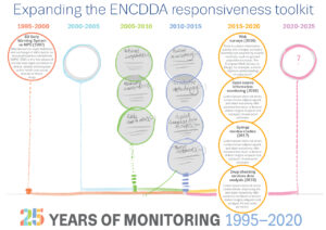
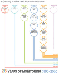
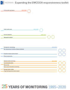
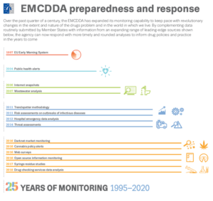
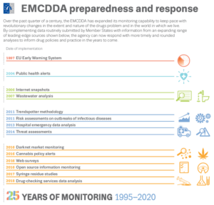
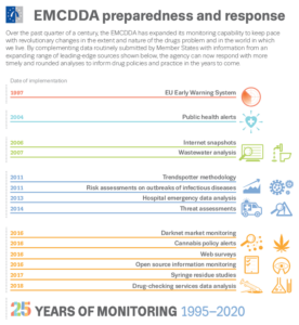
I have been working remotely with the EMCDDA designing graphics for their 25th anniversary. The latest graphic has just been launched looking at the monitoring capabilities and innovation employed to keep up with their remit. I thought I would be interesting to show some earlier sketches showing some steps in the design process and how the icons have been used in the table that follows on…thanks to all the staff.
the final graphic is below with the icons being reused to help the flow of the table.
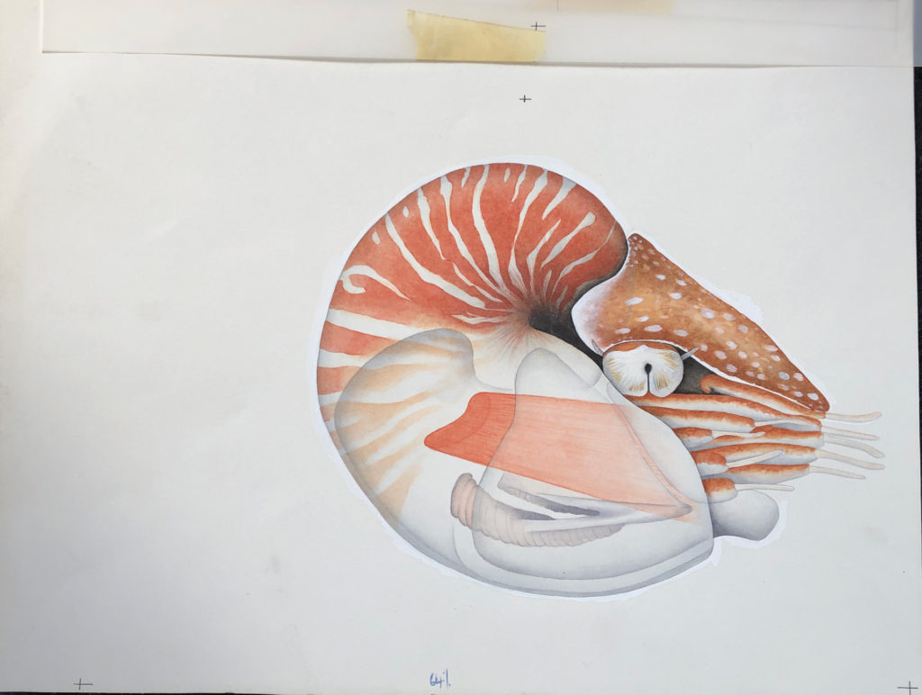
Following on from some of my black and white gardening illustrations here I thought I would also show some of my colour illustrations first produced for New Scientist in 1990!.
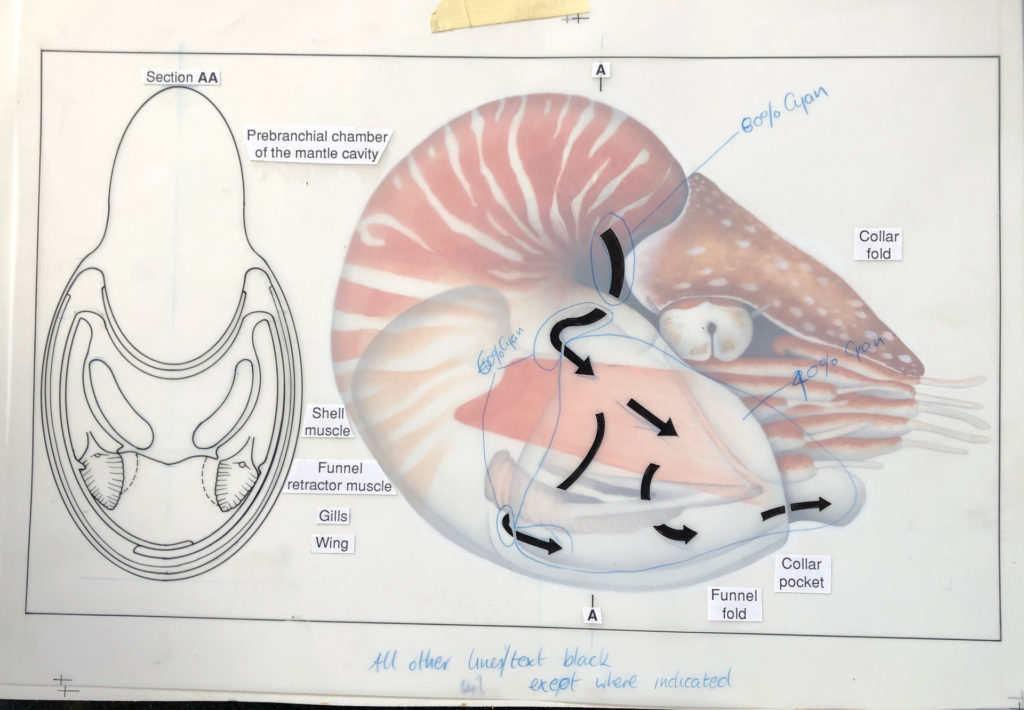
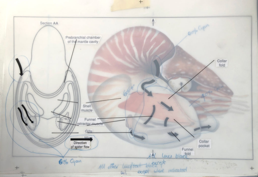
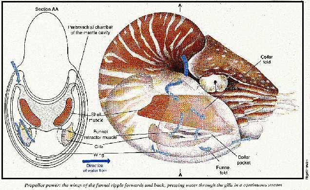
The process was very different and everything was hand drawn, or in this case hand drawn and then painted using watercolours onto watercolour paper…registration marks were placed on the paper…
…we then used an acetate overlay to draw on arrows showing water flow – specified to be 60% Cyan for the printer – plus a front view drawn in ink – to be black. The text was typed and printed from a computer and stuck on this layer using Cow Gum. Registration marks to align with the layer below…
…another layer of acetate was used to show the water flow arrows (60% Cyan) over the top of the black lines black pointers for the text…
…any other particular instructions for the printer were then included on these layers. Only then was it sent off for proofing and printing, sometimes never to be seen until the magazine arrived in the office!
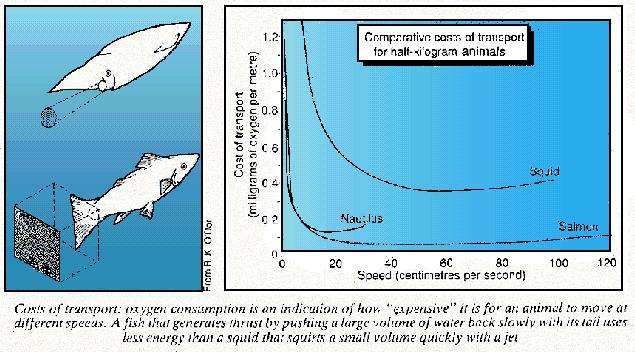
Here is a very bad image (only one I could find) of the printed version from February 1990 along with a hand drawn graphic showing transport costs.
Another example here, showing the same process just as a comparison…
Just an excuse to show some of my old work before the daily use of a Apple Mac was involved.
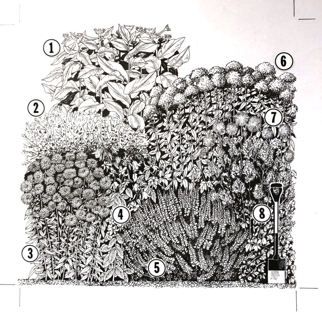
I was working as a freelancer when this was done and I was involved with the gardening section of the Sunday Times at the time. It was always good to see my illustrations on the back page of the garden section. My contact and gardening expert at the time was Graham Rose.
This was taken from sketches I made of actual gardens in-situ (mostly London based) and then drawn up to scale and design on CS10 paper and Rotring pens, with lots of scraping out of ink blots!. The numbers were glued on using the wonderful Cow Gum.
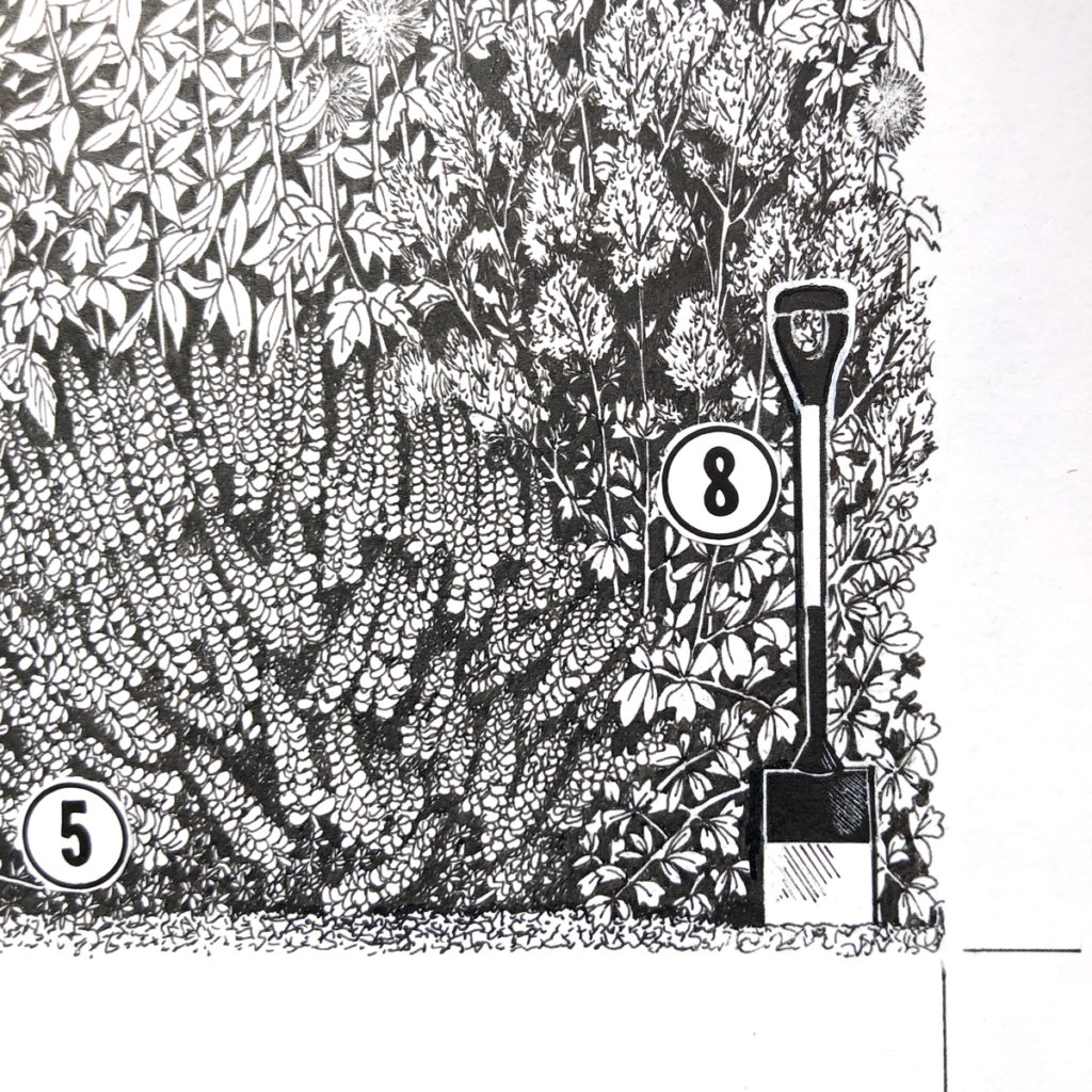
inset to show some of the detail…
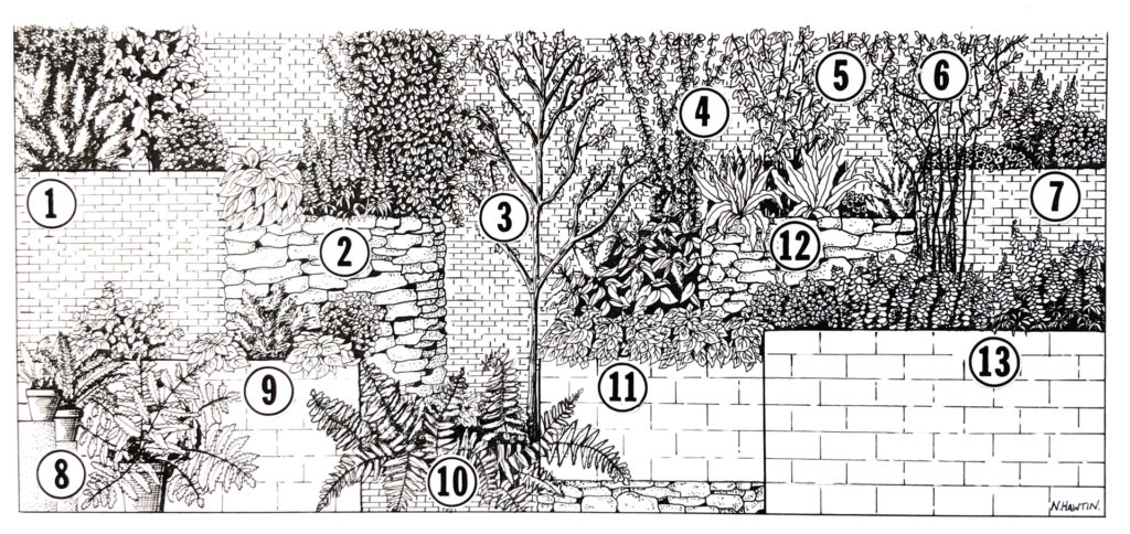
One more…
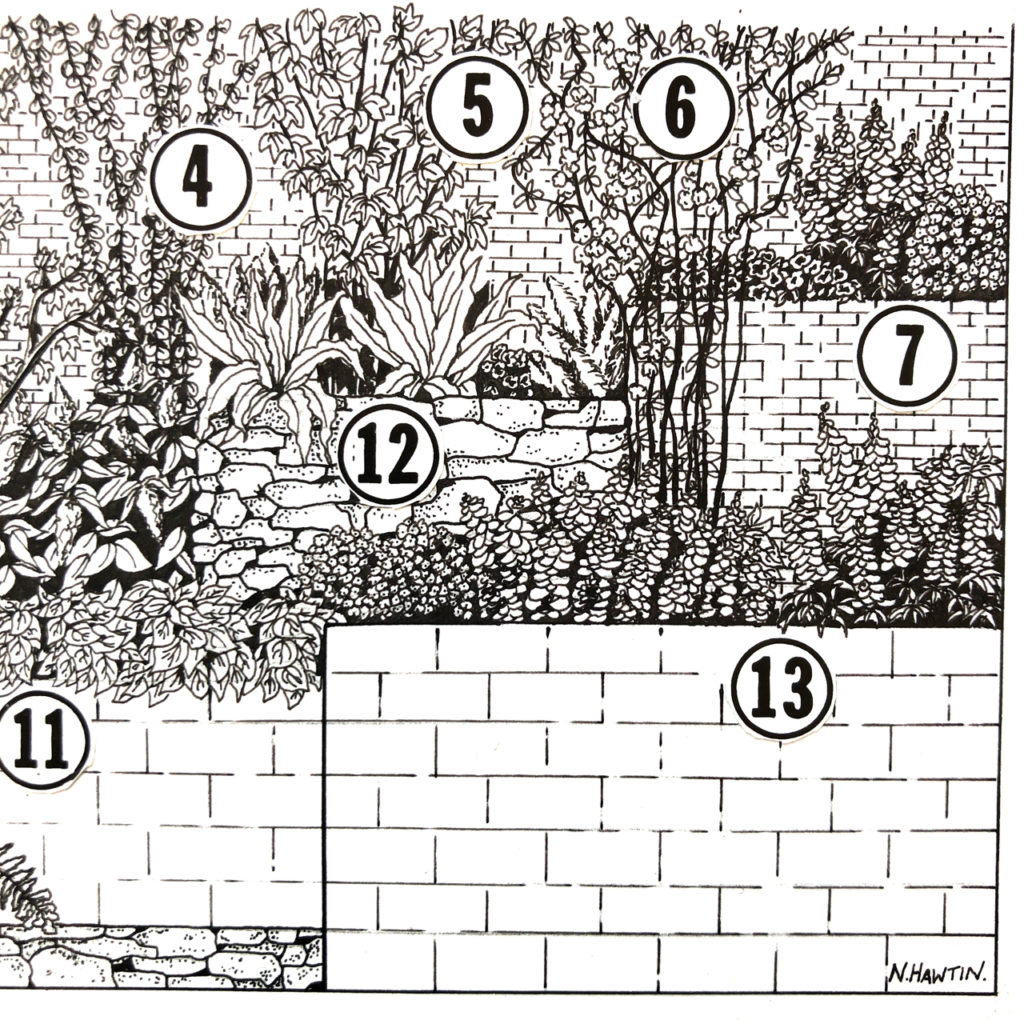
and again, an inset to show the detail.
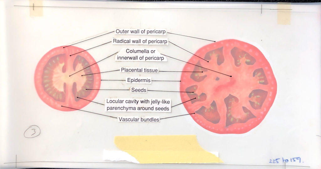
More to come in #2 with watercolours, Tomatoes, overlays, CMYK markups, and a Nautilus…
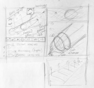
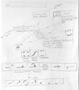
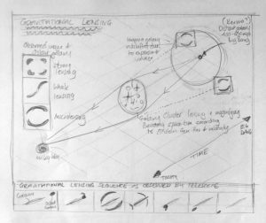
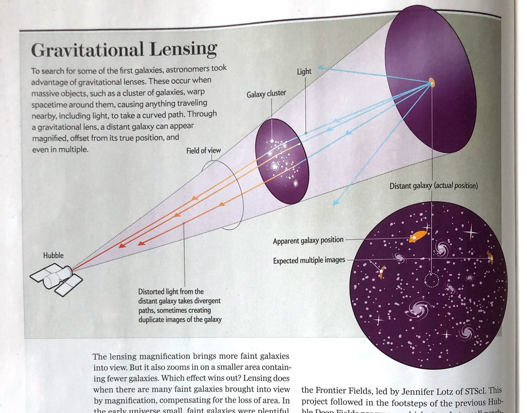
I always sketch my ideas to help me to understand the subject matter, to come up with concepts and ideas for the visuals, and to be able to look back and see what my thoughts and ideas were. Here are a few from a recent commission from Scientific American, published in the November 2018 issue on the subject of gravitational lensing.
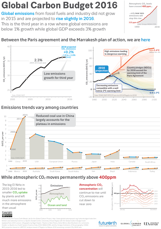
I recently had the opportunity to work again with Corinne Le Quere of the Tyndall Centre for Climate Change Research on updating an important graphic on the global carbon budget.
I worked on this last year and it was proposed to update the graphic to keep with the original style. Updating the data and storytelling between the signing of the Paris agreement last year and the Marrakesh plan of action this year. The graphic was launched at the Marrakesh COP22 conference on climate change.