Last week the EMCDDA and Europol published their latest report on the impact Covid-19 is having on the drug markets. I worked with the agencies on the graphics side of the report. Click on the report cover to download it but here are a couple of the graphics in preview.
The past few weeks I have been producing graphics with Roman Krznaric for his forthcoming book The Good Ancestor: How to Think Long-Term in a Short-Term World It will be published by Penguin in June, but I will keep you updated with its progress. A fascinating and a great read, especially in these times.
More updates to come later, in the meantime stay safe, stay home and stay healthy.
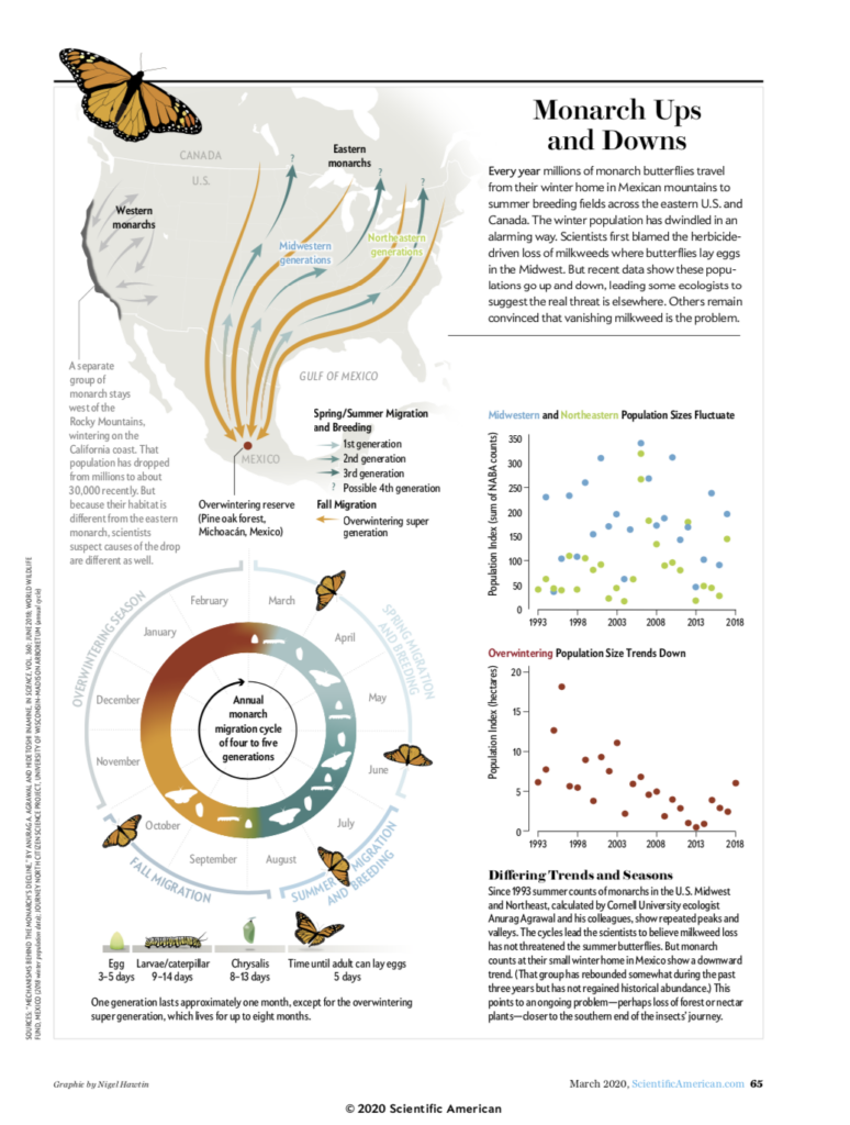
Haven’t posted much on this page recently, have I been busy with many projects. Unfortunately many of them are not for sharing, either ever or just for now as we are awaiting publication. But this was my latest for Scientific American magazine looking at the migration of the monarch butterfly .
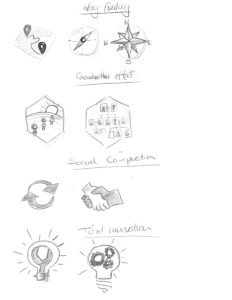
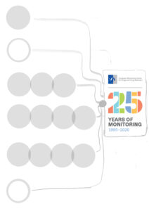
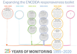
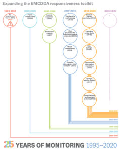
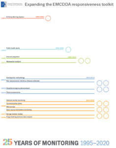
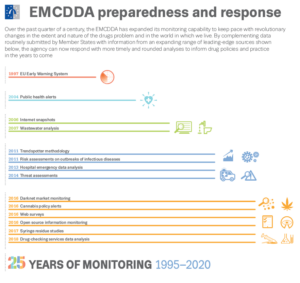
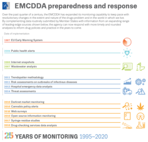
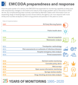
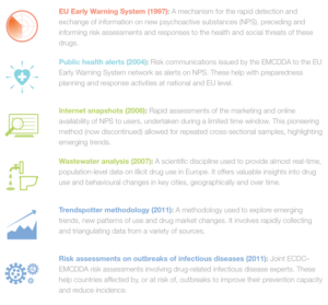
I have been working remotely with the EMCDDA designing graphics for their 25th anniversary. The latest graphic has just been launched looking at the monitoring capabilities and innovation employed to keep up with their remit. I thought I would be interesting to show some earlier sketches showing some steps in the design process and how the icons have been used in the table that follows on…thanks to all the staff.
the final graphic is below with the icons being reused to help the flow of the table.
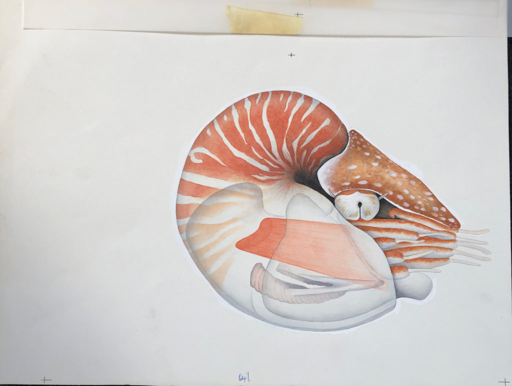
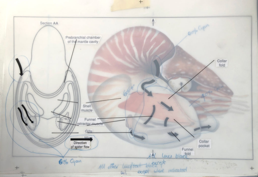
Following on from some of my black and white gardening illustrations here I thought I would also show some of my colour illustrations first produced for New Scientist in 1990!.
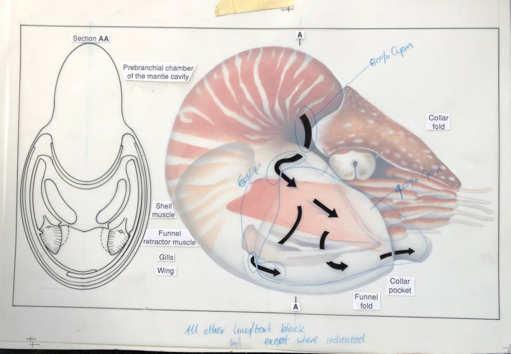
The process was very different and everything was hand drawn, or in this case hand drawn and then painted using watercolours onto watercolour paper…registration marks were placed on the paper…
…we then used an acetate overlay to draw on arrows showing water flow – specified to be 60% Cyan for the printer – plus a front view drawn in ink – to be black. The text was typed and printed from a computer and stuck on this layer using Cow Gum. Registration marks to align with the layer below…
…another layer of acetate was used to show the water flow arrows (60% Cyan) over the top of the black lines black pointers for the text…
…any other particular instructions for the printer were then included on these layers. Only then was it sent off for proofing and printing, sometimes never to be seen until the magazine arrived in the office!
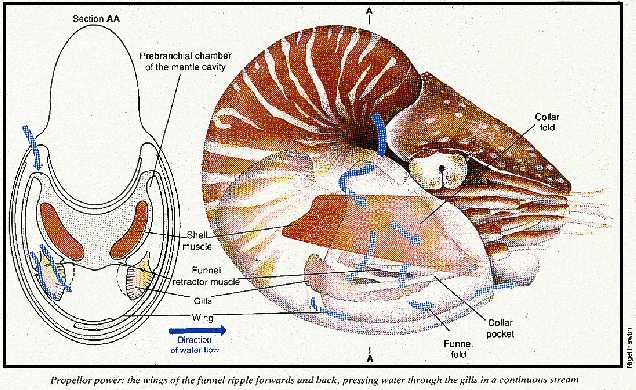
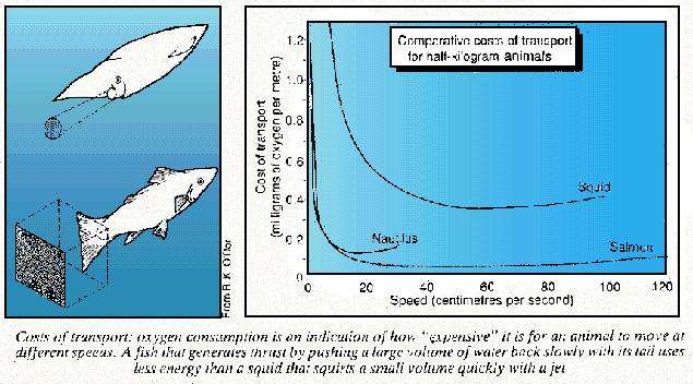
Here is a very bad image (only one I could find) of the printed version from February 1990 along with a hand drawn graphic showing transport costs.
Another example here, showing the same process just as a comparison…
Just an excuse to show some of my old work before the daily use of a Apple Mac was involved.
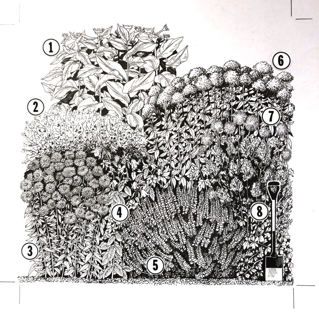
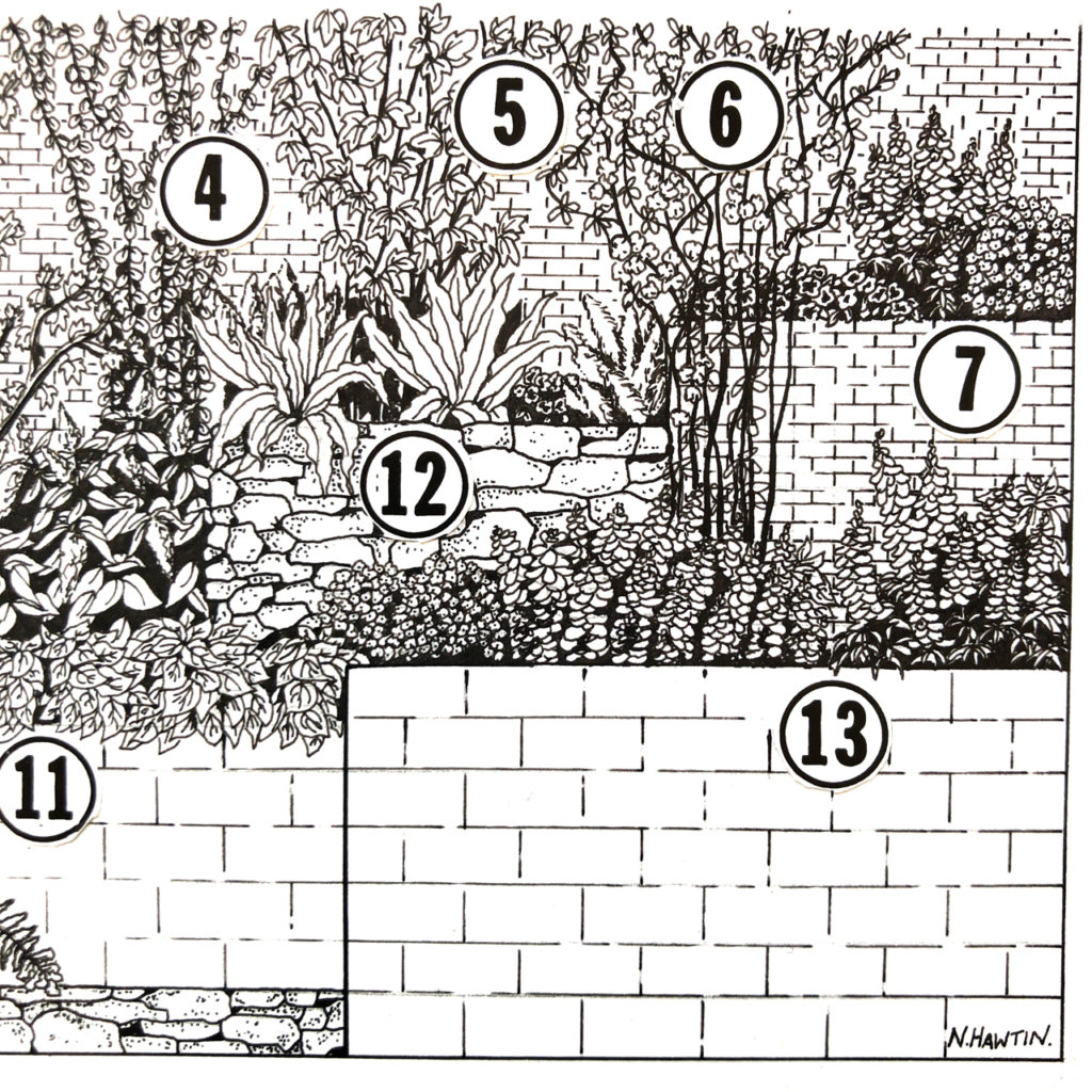
I was working as a freelancer when this was done and I was involved with the gardening section of the Sunday Times at the time. It was always good to see my illustrations on the back page of the garden section. My contact and gardening expert at the time was Graham Rose.
This was taken from sketches I made of actual gardens in-situ (mostly London based) and then drawn up to scale and design on CS10 paper and Rotring pens, with lots of scraping out of ink blots!. The numbers were glued on using the wonderful Cow Gum.
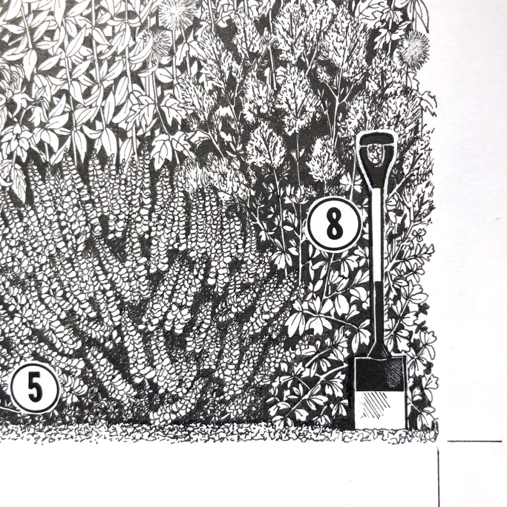
inset to show some of the detail…
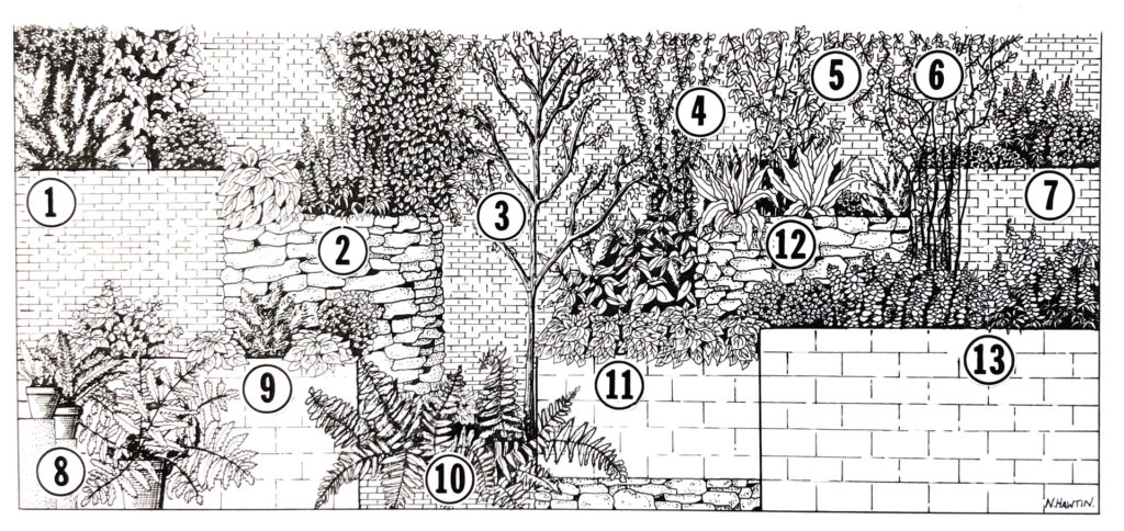
One more…
and again, an inset to show the detail.
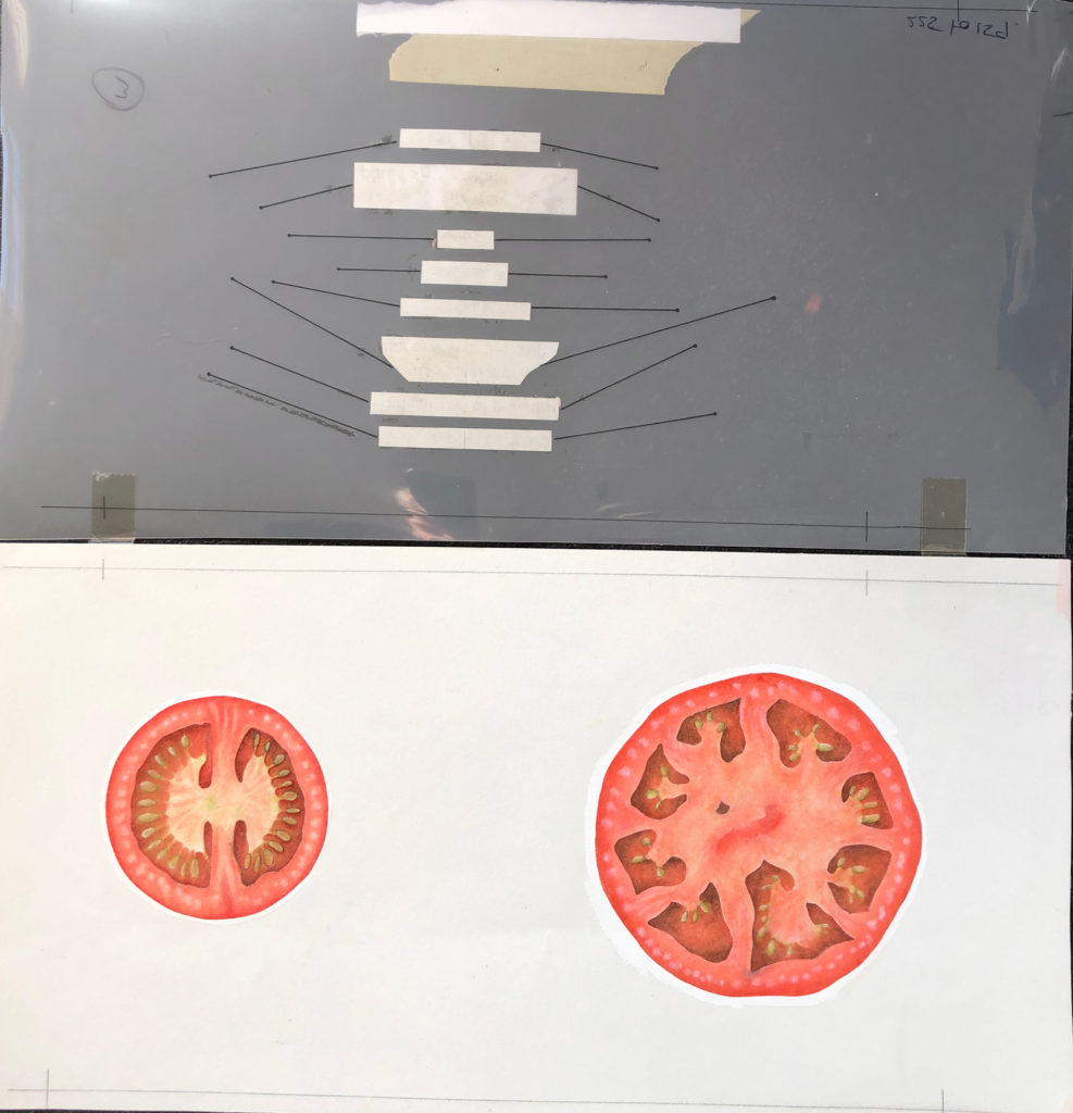
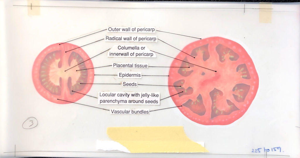
More to come in #2 with watercolours, Tomatoes, overlays, CMYK markups, and a Nautilus…
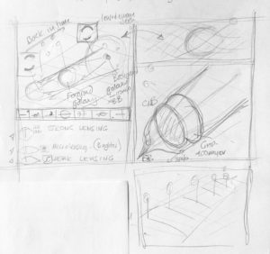
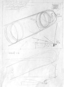
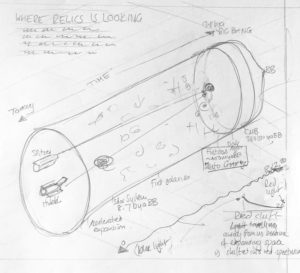
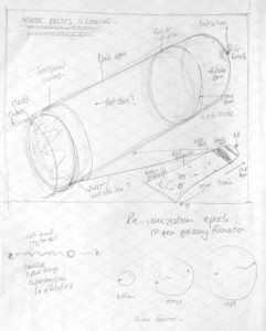
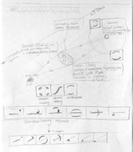
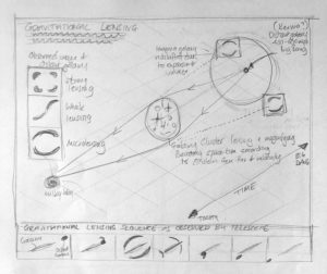
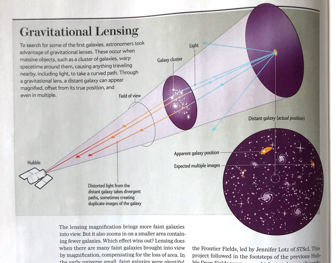
I always sketch my ideas to help me to understand the subject matter, to come up with concepts and ideas for the visuals, and to be able to look back and see what my thoughts and ideas were. Here are a few from a recent commission from Scientific American, published in the November 2018 issue on the subject of gravitational lensing.
An older post from 2017 showing a redesign following a discussion on the website for a Cochrane infographic. Here is the original posting.
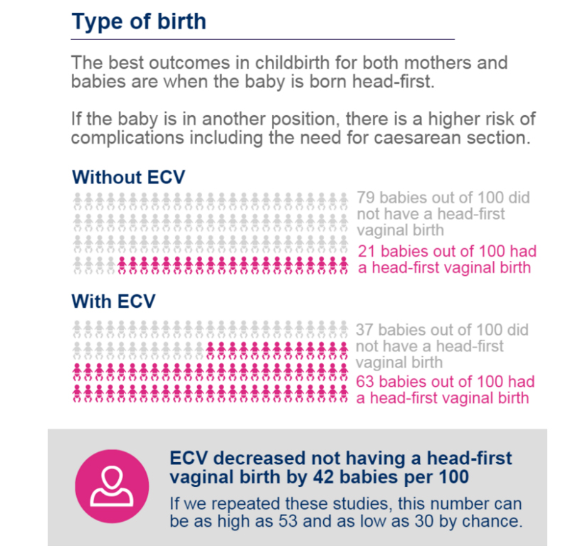
“one part of the graphic showing the number of head-first births and the box under the graphic saying ‘ECV decreased not having a head-first birth…’ was a bit difficult to comprehend at first, being a double negative and so, I have redesigned it a little to show the positive rather than the negative (although that may have been your purpose in this instance), I have also added coloured marking on the text, also to help the reader”
and my de-designed graphics
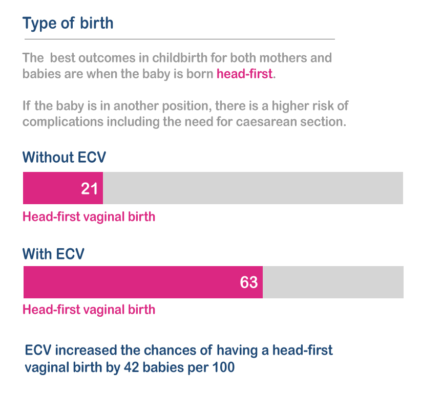
The comments were taken on-board and the redesigned graphic was produced here.
An improvement but still lots to do looking at other graphics on the page.
I have been using Flourish.app for a few weeks now and thought I should showcase some of the chart types it has and what you can do with it using a small data set from the NHS, looking at hospital admissions from drug use.
Same data just different ways of using it and showing what is going on using the stories format.
I see this many times a week when ‘infographics’ are shared on social media.
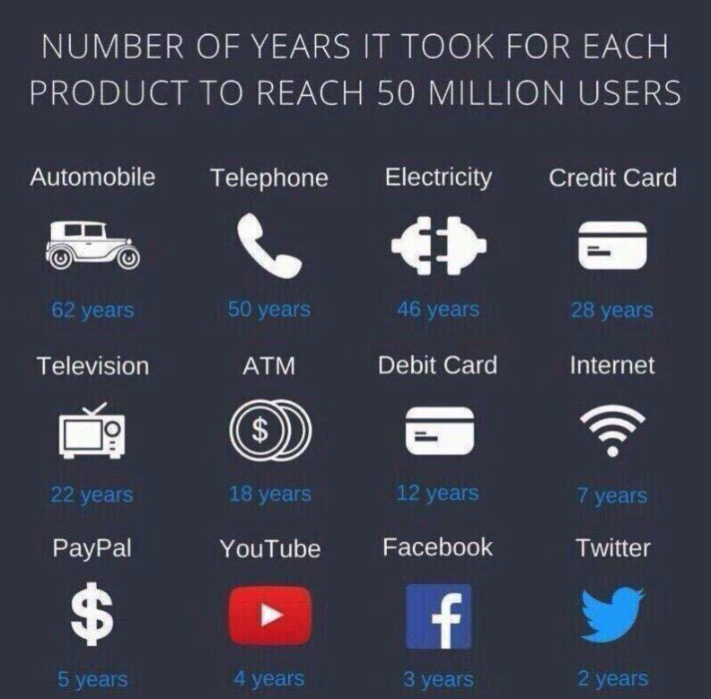
This was shared on LinkedIn recently..what’s missing?
What’s missing is the data, in a visual way. Too much time has been spent on producing the nice icons (which are important for context), making them stand out in white on a dark blue background and the text is white as well. The tile of the graphic is ‘Number of years it took for each product to reach 50 million users’ – so where is are the number of years? They are written numerically, which is ok, but are a smaller font size and produce in a lighter blue on a dark blue background.
The graphic is hiding the data, the important piece of the graphic. That data should be seen first, or at least, seen easily. So why hide it.
Infographic = information + graphic
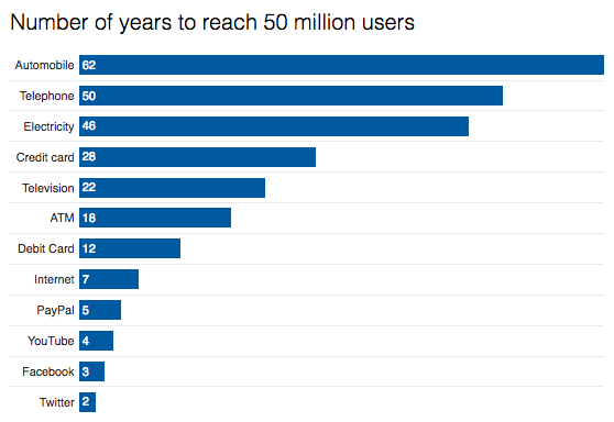
Here’s the data produced in a visual form. IMHO a much neater way of seeing what the graphic is supposed to be showing.
The icons can be added to it to give context if needed, but the graphic should show the information (data) first.