Following on from some of my black and white gardening illustrations here I thought I would also show some of my colour illustrations first produced for New Scientist in 1990!.
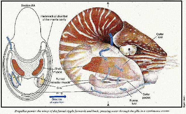
The process was very different and everything was hand drawn, or in this case hand drawn and then painted using watercolours onto watercolour paper…registration marks were placed on the paper…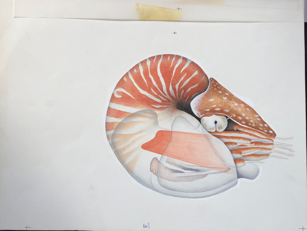
…we then used an acetate overlay to draw on arrows showing water flow – specified to be 60% Cyan for the printer – plus a front view drawn in ink – to be black. The text was typed and printed from a computer and stuck on this layer using Cow Gum. Registration marks to align with the layer below…
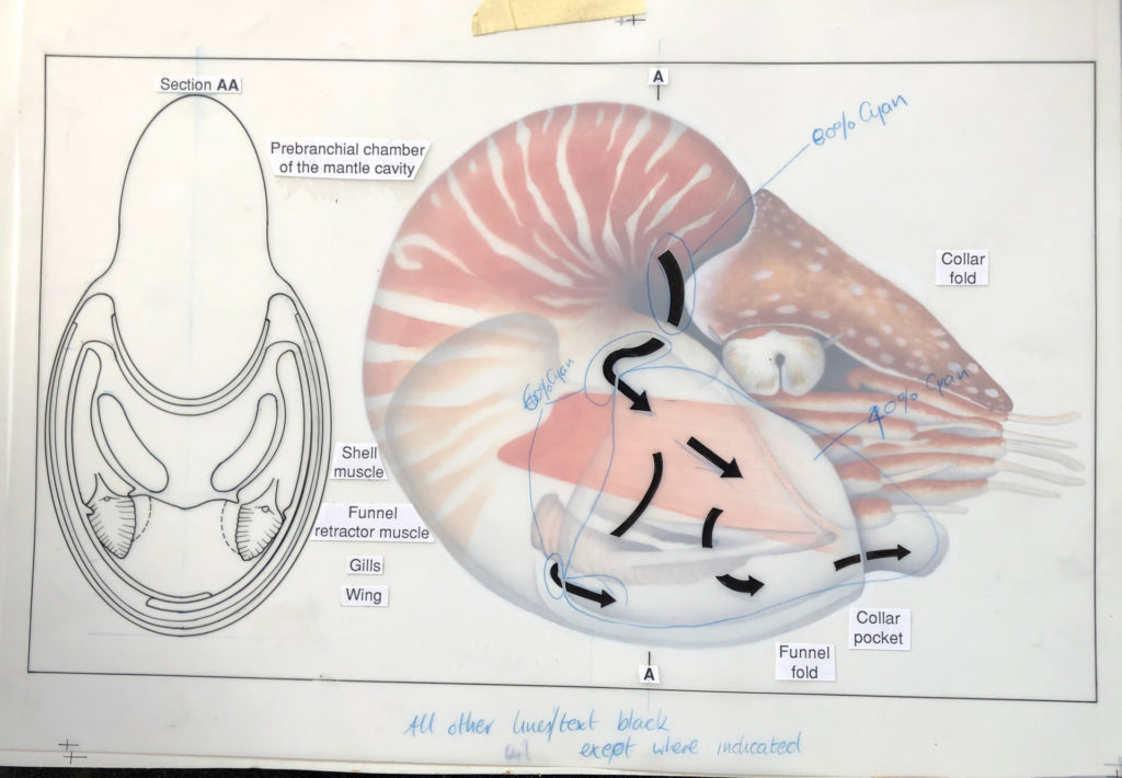
…another layer of acetate was used to show the water flow arrows (60% Cyan) over the top of the black lines black pointers for the text…
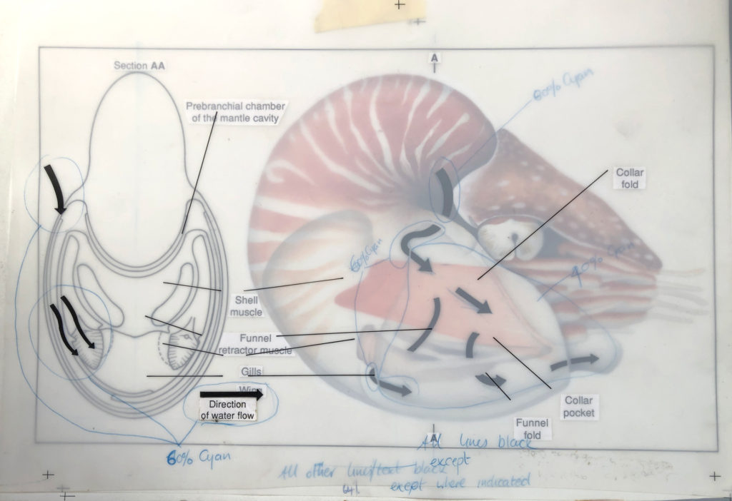
…any other particular instructions for the printer were then included on these layers. Only then was it sent off for proofing and printing, sometimes never to be seen until the magazine arrived in the office!
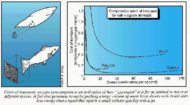
Here is a very bad image (only one I could find) of the printed version from February 1990 along with a hand drawn graphic showing transport costs.
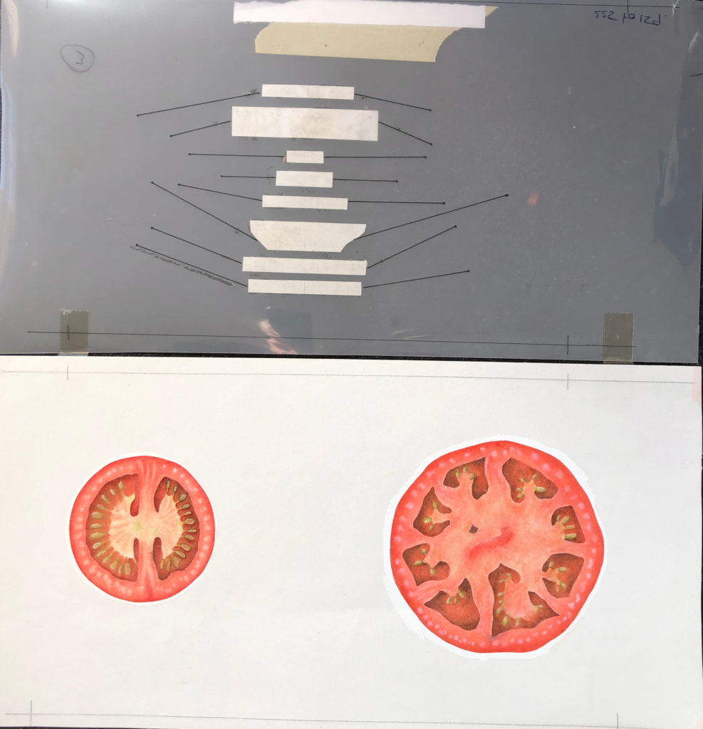
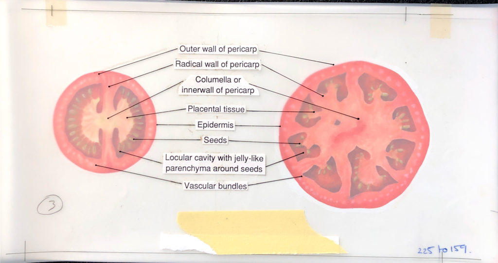
Another example here, showing the same process just as a comparison…
Things seem much easier now…or do they?
05 March 2019