We are always learning…so it’s important to try new things out.
So enjoy, smile, question, ponder, cringe and comment, as I look back at the good, not so good and not to be seen again from 10 years ago.
I thought it would be useful, both for myself and for others, to see what I was producing 10 years ago, whilst I was Graphics Editor at New Scientist.Good, bad and thought-provoking.
Spring (Jan-Mar) round-up 2013
Welcome to my latest roundup of graphics I produced 10 years ago – Jan-March 2013.
Many of the graphics I have chosen for this round-up are based on climate and the world around us. The topic of climate change was gaining traction and so we were running many stories on this subject matter. Obviously we still have graphic looking at stars and space as well as our normal range of subjects.
So let’s start off with our first map of the roundup. Hurricane Sandy was one of the most devastating storms the US had seen when it hit the east coast in autumn 2012. It flooded many areas along the east coast of the US including the areas around New York. The map shows areas that are liable to flooding with up to 6 metres of water. At that stage the calculations were for 1 storm every 100 years but with the warming world we now have that will be a lot more frequent.
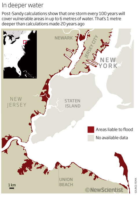
I am not sure the map gives the full impression of the devastation that a storm like Sandy could cause when it happens again. The header and sub-head explain the graphic well and put it into perspective but the areas look minimal on the map and so I think it looses impact. A couple of insets showing smaller areas and the number of people affected would have been useful – maybe even another data set with these numbers on them would have been more impactful. It is a simple map and shows what we are wanting to show but I can see it is a small space in the magazine – a news story – and so we were listed in what we could show. The colour scheme works well for a small space but there are things that I could have done to make it more impactful.
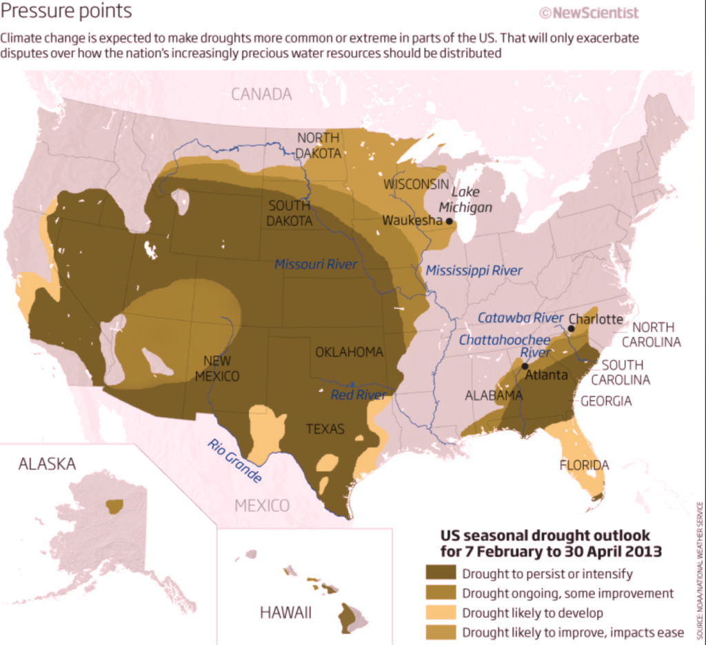
Keeping with the map theme, next we have, again a news story from the magazine, but using a bigger area of the page to show a map of the US showing the US seasonal drought outlook for 2013.
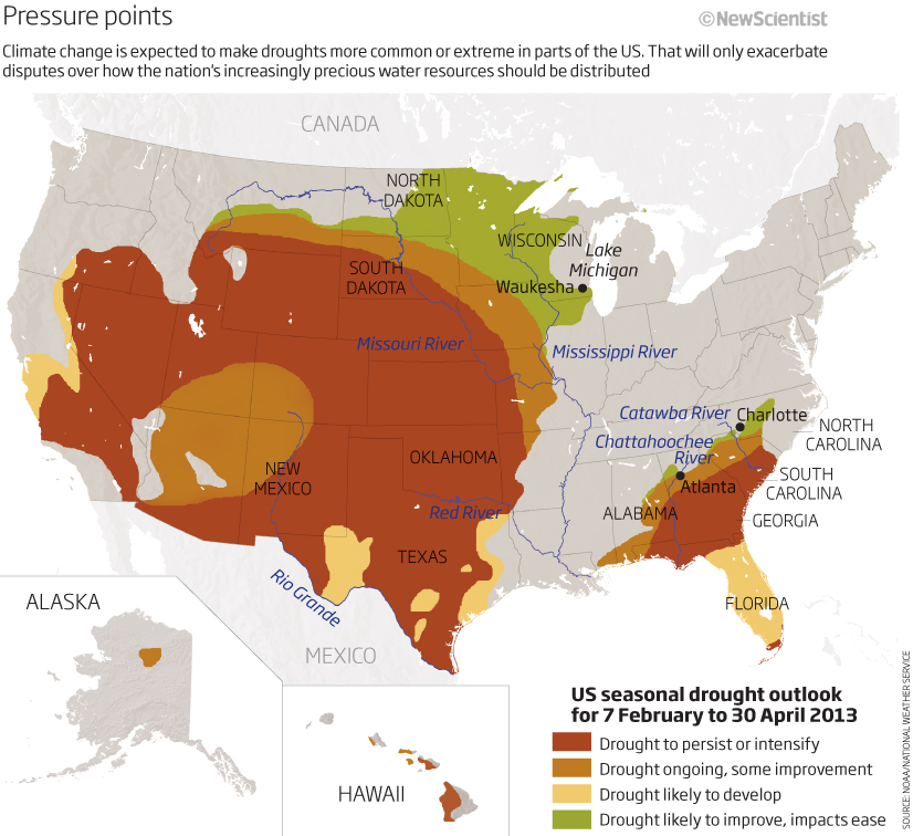
An interesting looking map showing how climate change will effect drought from improving and easing the impacts (green) through to more persistent and intensifying areas (brown). Easily you can see that vast areas of the US will be affected by more intense drought, so it does its job well. The key is easy to follow and we have included some of the major rivers that will be affected. The only thing that lets it down is the fact that the colours are not great for accessibility (ie red/green deficiency) as you can see in the second image. Overall then, not bad but could be improved for inclusivity!
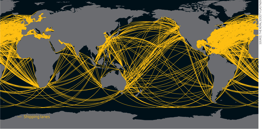
One more map for this section. A world map centred on the Pacific Ocean showing…hmm…ah yes! I see the key now! – a map showing shipping lanes! Yes, it is simple using just black and yellow so it looks clean but as I really has to look for what it was showing and there is no context as to why or what for etc then it is, at best, not an information graphic, just a visual pointer on the page. Maybe this is what was meant? Even so I think the key should either be more prominent and near the top or taken off totally.
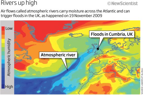
Next an explanatory, scientific, graphic and the sort of graphic I always preferred to work on when at New Scientist – I think this comes down to my scicomm background (scientific and medical illustration). 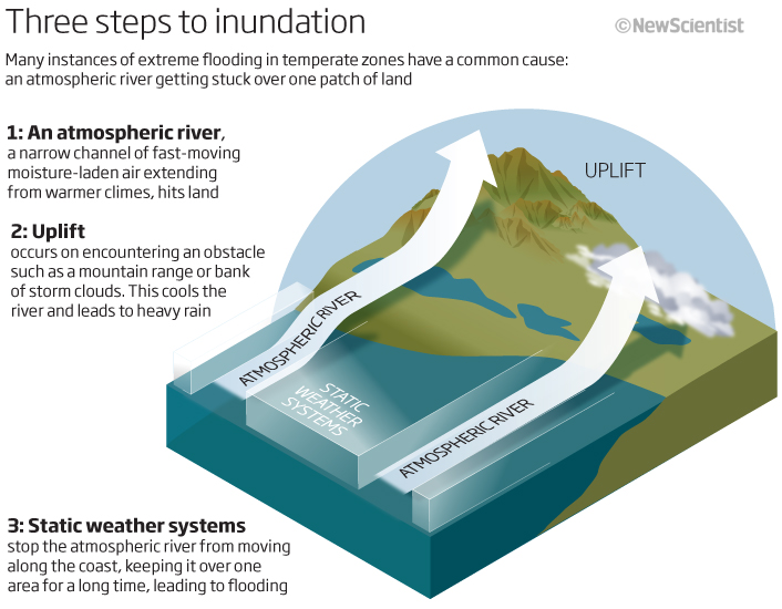
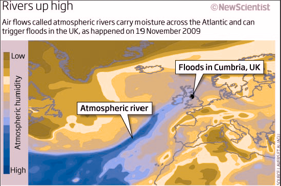
A 3D graphic explains how extreme flooding can occur over land caused by an atmospheric river. This type of graphic needs both the visual elements and the text or explanatory elements and the fact the all elements need to work with each other. So here we have the arrows showing the flow and the numbers showing the process – both working together to explain what is going on. Looking back on it now, maybe it needs a couple of arrows or pointers on the map showing various elements like flooding or non-moving systems or even a couple of extra words! But not a bad effort.
Moving away from maps, here we have a simple chart showing the top 10 health risks across the World looking at which had changed from 1990 to 2010. Looking at which categories had decreased in the 20 year period, you can easily see that pollution was being tackled as both household and air pollution had gone down as well as underweight children, conversely high blood pressure, smoking and alcohol use had jumped to the top.
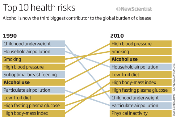
I find the blocky colours a little off-putting and my eye does go to the yellow/green blocks of colour first and then the blue but that may have been the objective.
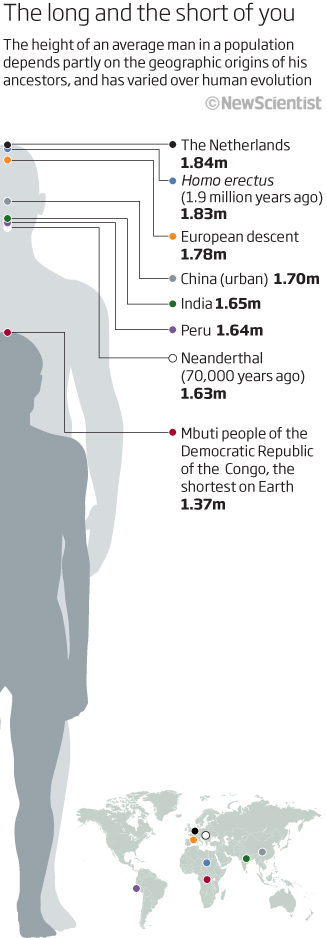
Next a graphic that includes figure icons – something that I find problematic – but in this case there is a reason to include the figures. Here we are looking at average height of a man in various populations. Apparently it’s all to do with geographic origins. Again a simple little news graphic showing the shortest and tallest average and a world map showing where in the world they appear. What is lacking for me is the reason why and where in the world they originated. So a reasonable graphic to look at but missing the vital information the would make into a worthwhile graphic!
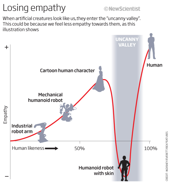
Another graphic (you can see grey is the predominant colour in this period of time) using people icons. This time not for size comparison but to show the ‘uncanny valley’ effect where we lose empathy with things that look just too real! I like this and using the icons helps us to read through the changes in empathy from mechanical robot, through lifelike robot and on to us.
A couple of feature article graphics to end this round-up. Both are pretty good to look at, always an important thing in a magazine, and both include interesting information.
The first is the anatomy of a chloroplast – the photosynthesis cell in a plant that converts water and carbon dioxide into sugars or energy. A full page graphic on a black background using a green colour palette to signify we are looking at plants.
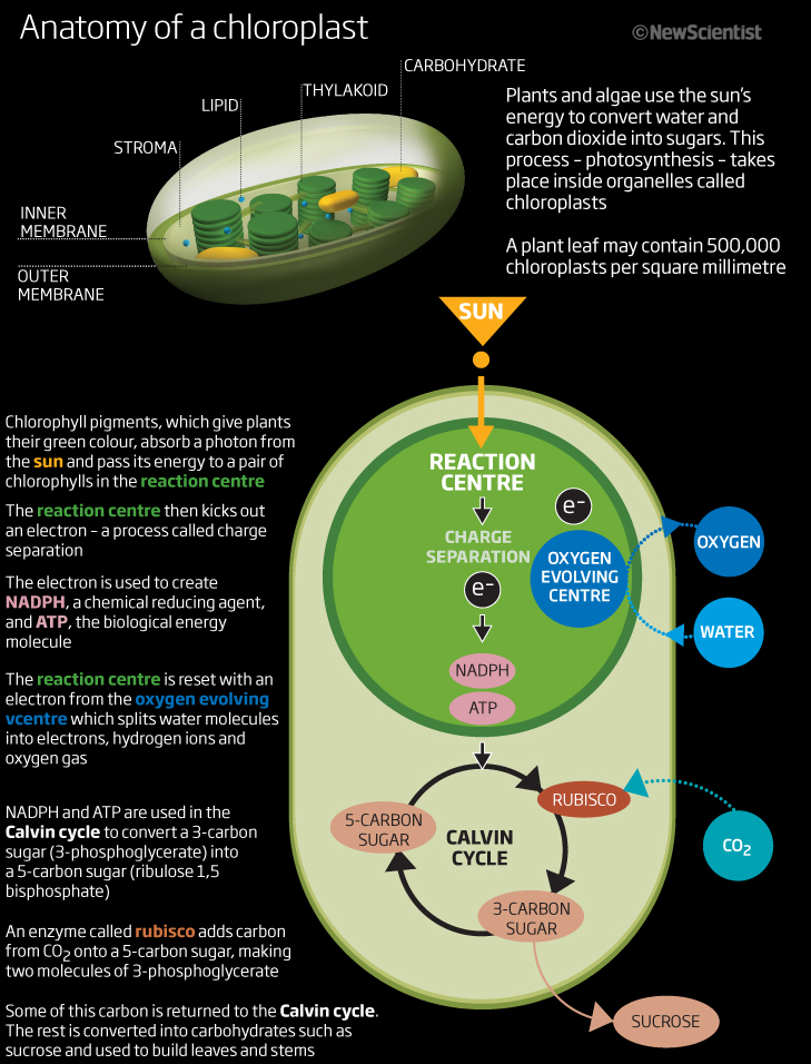
Split into two segments, the top graphic shows the various elements that make up a chloroplast. Below that inset style graphic we ahem a flow graphic showing the process from sunlight to sucrose – from top to bottom. The text on the left hand side tell the story of the flow and explains what is going on in the graphic. Coloured/bold text is dotted throughout this text so that the reader can follow where in the process we are at any point. A good looking explanatory graphic at last!
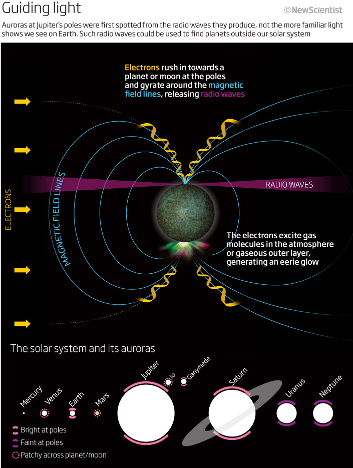
The second is a full page graphic looking at aurora’s around Jupiter and how we detected them from using radiowaves rather than seeing them ,like we see auroras on Earth. Good explanatory text using coloured text again but in this case instead of a key. The lower graphic looks at where we would find auroras on each of the plants in the Solar System. All planets are to scale here and we have a simple key to explain bright, dim and patchy areas of aurora. Nice and simple to follow and a good colour scheme.
With feature graphics I always had more to time to think, try things about and refine the concept and execution than we ever did on news graphics. May even have had a week or so to think about these two full-pagers (along with all the other graphics) in contrast to hours – or less – for more newsy graphics. Overall not a bad effort. For this three month period we actually produced 84 graphics! From simple bar charts to the more complex explanatory graphics we have here…hopefully you can appreciate just how quickly we had to work at times! And so forgive me if some are utter rubbish 😉
Hope you enjoy looking at some of these and, even I, will look forward to seeing the next round-up. Cheers
01 April 2023
Winter roundup 2012
Well, the holiday season is here and the end of another year is racing towards us. I haven’t posted much lately as I have been working on a few projects that I cannot yet share…hopefuly soon though. In the mean time here is a selection of good, bad and hmmmm! graphics from the last few months of 2012, enjoy.
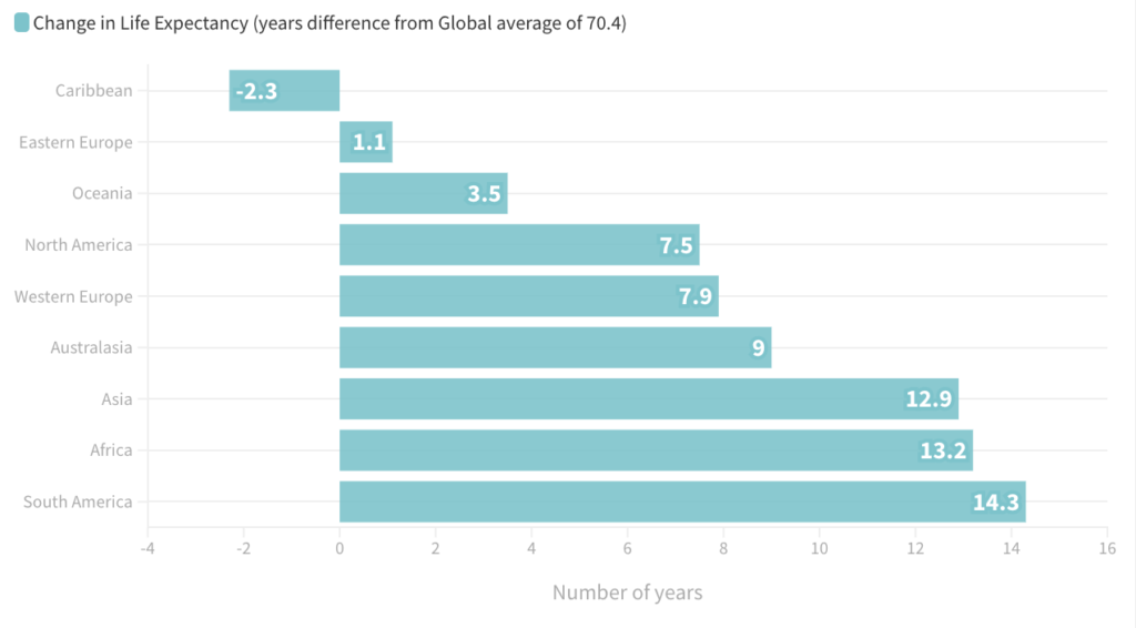
Let’s begin with a great example of how not to show numbers and data on a world map and how to hide information. This is showing me significant changes in life expectancy over a 40-year period…apparently! Well that’s what the title says (once you have found the title) .
Q: Does it? A: No! not really.
The map is coloured by continent with quite bold colours – which is not a good start as my eye tends to look at the continents first – and that is not the point of the graphic. There is a circle at the bottom left stating average life expectancy across the world, which is fine and that is an interesting fact but the main point of the graphic ( I am assuming here) is to show how the figures have changed over those 40 years continent-by-continent – that has been lost. Numbers in this case do not work. It would have been much better to have used a bar chart showing positive and negative values against the global average! Even the boxes of interesting information on, for example, Lesotho or Maldives, explaining why the numbers had changed in a positive or negative way do not really help to take the info on-board. A really good example of how not to proceed with this sort of data!
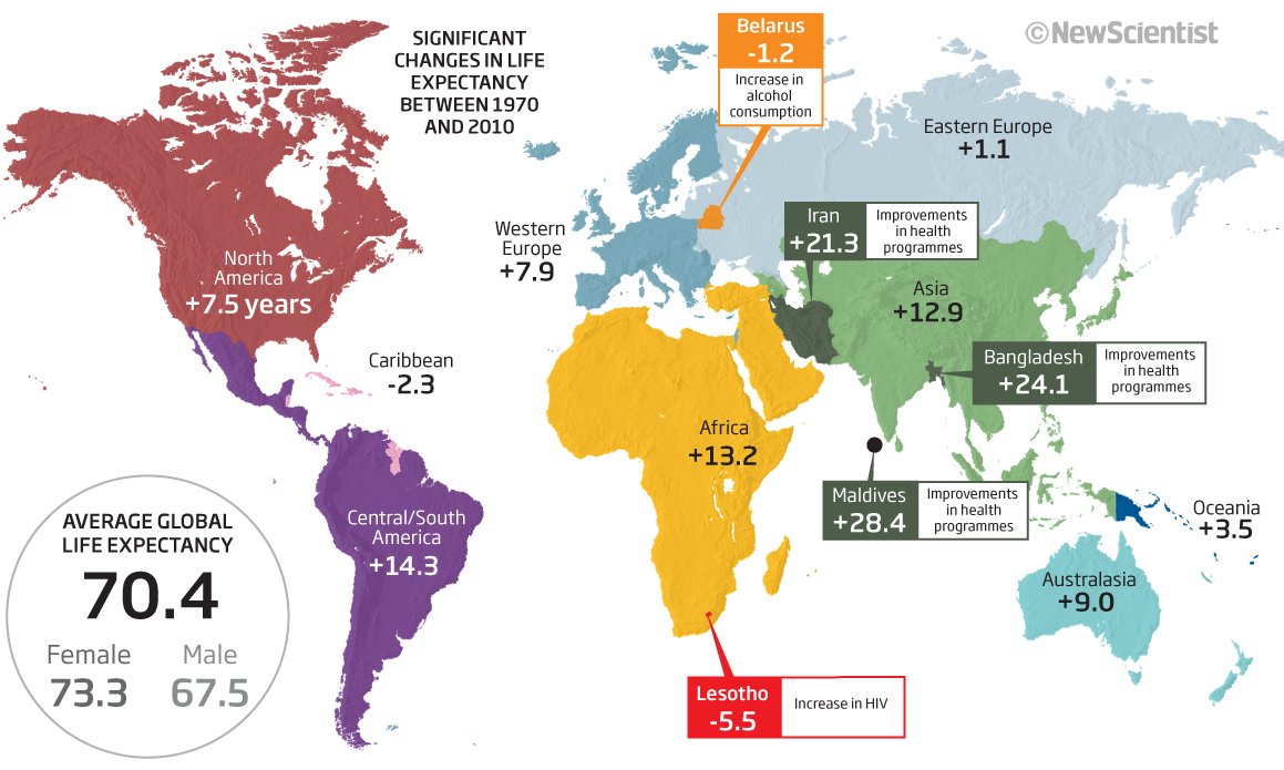
Something along this line would have been more effective.
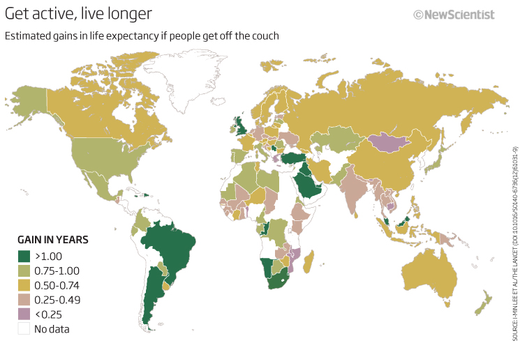
Let’s stick with bad maps for the minute. Here is another again looking at global data but this time looking at how many years you could increase your life by getting off the couch and exercising. Again, I am not sure it does anything for promoting a healthy lifestyle with only (looking as much as I can see) 1-year extra by exercising! Surely this isn’t correct? I will have to go and see where this came from and whether it was an accurate representation of the data…because I am just not sure. At least it has the source on the graphic, (which is something to try and make sure is always included on a graphic) so I can go and find it. Horrible colour scheme as well…
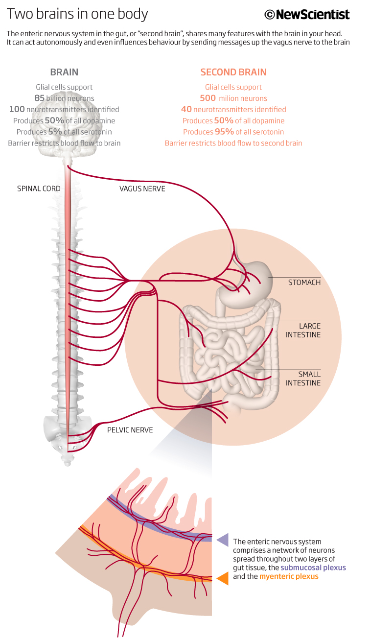
This graphic looks and explains about our ‘second’ brain, the enteric nervous system and how it shares many features with our brain in the head. It’s a good looking and easy to read graphic. The headline tells the reader what the graphic is showing and the sub-head explains in more detail what is going on. The two sides of the brain are differentiated by different colour schemes – grey and pink – with the pull out at the bottom explaining how the enteric system works through the network of neurons in the gut tissue. Overall a good, effective explanatory graphic. The only thing I may alter now (or do differently) would be to make the numbers more visual i.e. maybe add a bar to show the differences between 85 and 500 million neurons, for instance, maybe even mini pie charts to show the percentage differences between the two systems. But it works well and ticks the boxes for what I think an effective graphic should be.
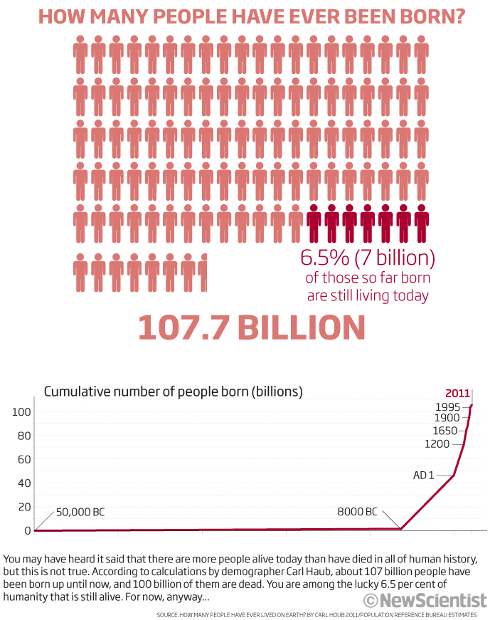
Another reasonable graphic by me! Again, a good explanatory headline, the pictogram people showing you how many have been born compared to those here today. Good colour scheme and a line chart at the bottom showing the cumulative totals and how until recently it was a flat curve. Nice and nothing to really add or change on this one.
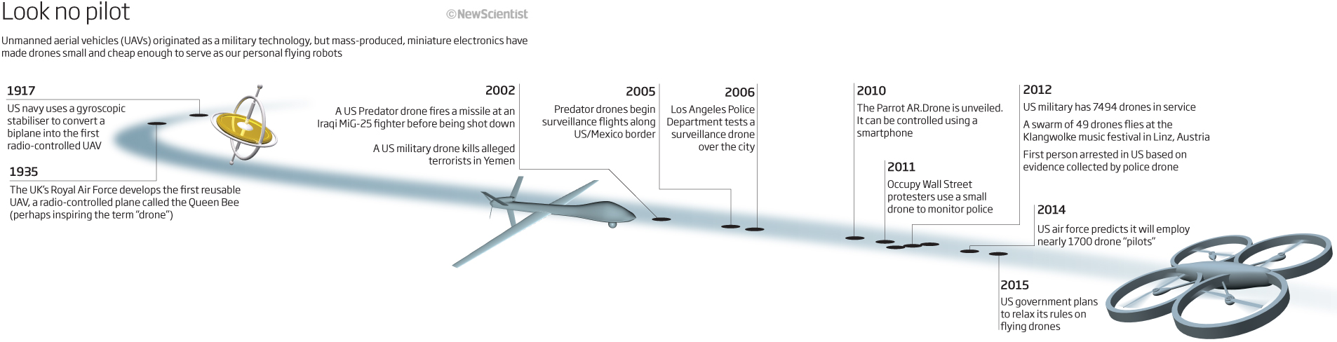
Most of my updates show a timeline and during my workshops the question always comes up ‘Do you have ideas for a good timeline template?’ The answer to that is no! I have drawn hundreds of timelines over the years and really it is all about what you are trying to show – now to then, or then to now – and whether the dates should be accurately portrayed. In this one we are showing the progression of UAVs or drones from 1917 and then looking to the future in 2015! Who would have thought drones would be used as they are today for leisure as well as commercial reasons! A nice simple timeline with icons to represent some of the key events in a dynamic flightpath.
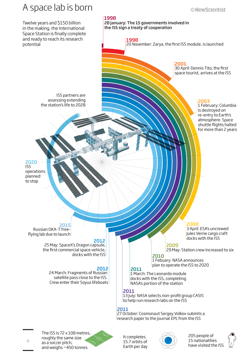
Keeping with timelines, we have a colourful and unusually shaped one here. At first glance it looks good to me…then I begin to take a better look and understand what it is showing…then it begins to fall to pieces. I have many questions about this piece, and I unfortunately, not many answers! The story is about the making of the ISS, the International Space Station, twelve years and $150bn to completion showing major steps along the way from 1998 and the signed treaty, through the completion in 2011 and then on to the end of its operational life that was to be 2020 or 2028 – we know it is still going strong. This is all good explanation from me now but does the graphic show this in a good or even effective way? I don’t think so. I think I got hung up on the circular theme of the graphic – yes its could be a good way to show a time progression – there is a good space to show the ISS in the middle – but not in this case I think. There are too many colours used in the bars, and for what reason? Again I do not have the answer to that. The facts we have used along the timeline seem quite random as well. I also think the circular image gives an impression that the time is closing in for some reason.mI cant see past, present and future in this graphic, which I feel would have really helped. Again a straight timeline would have made for a much more effective way of communicating the information. Thinking back to my time working on magazines, I probably would have tried to get the timeline cross a double page spread, or even more pages but it was always a tussle between layout, pictures, words and graphics and so I think this was why I ended up with this style. On the plus side, I do like the icons and additional info at the bottom but I think I would now place this further up if not at the top. So lots of questions, not many answers and overall it is one of those ‘oh! that looks good’ graphic (which I see many of these days) until you really begin to read it properly.
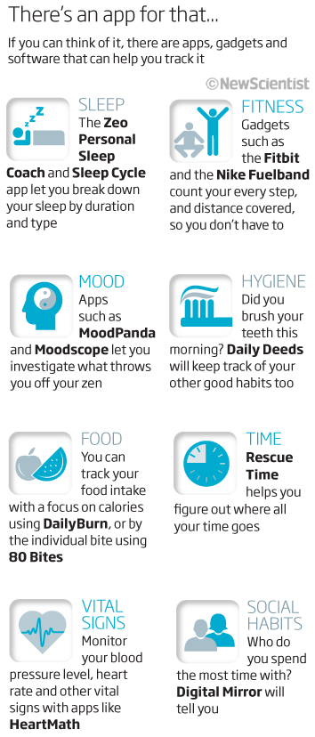
Thinking about what we knew and had back in 2012 and what we are so used to today, I thought I would show this graphic (a list with icons) looking at the emerging technology of apps for your smartphone. Coming up with icons to represent words can take up a lot of my time on some projects. I love coming up with the ideas but it is very time-consuming and therefore not always a good use of time…in this case I think it was the only to do it. The icons are there to break up the text and give the reader a hook to try and show and remember what the words are saying. I like the way we kept to just the one colour.
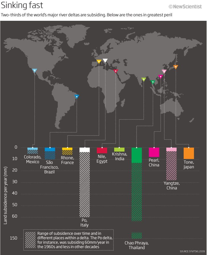
Let’s finish this look back at another map graphic, but this time one that I think looks good and shows the information well. I like the colour scheme looking at subsidence in river deltas around the world. The bar charts below (linking the deltas on the map) dive down to show the subsidence with the (old-fashioned) hatching lines at 45°s showing the ranges of subsidence. I know I have truncated the y-axis to fit in the Thailand data but I think that works as well in this case. Simple, good to look at and effective I think. I have always used the hatching in charts to portray ranges/min/max data or just as a way of showing not 100% information etc and so it is good to see this being used by many in todays graphics and datavisualisations.
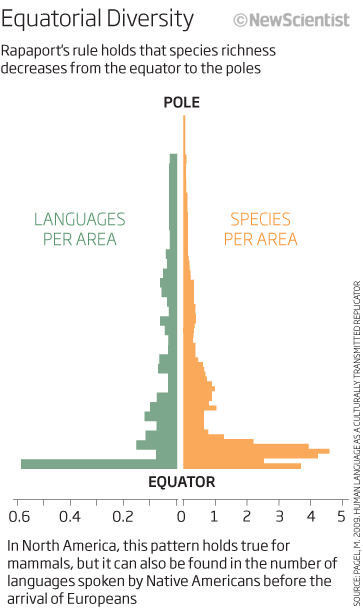
The final one for this look back is a simple population chart backing up something called Rapaport’s rule, that species richness decreases from the equator to the poles. I would change the words so that they stated species changed from pole to equator to tie in with the visual and maybe highlighted the bottom text more to make it clear that we were looking at North America data. Not bad though and shows the richness rule well for languages and species.
I think thats enough for this round up. Some good graphics, some not so good and some that have many questions still to be answered – all in all – a good range.
Thank you for bearing with this years sometimes random posts of looking back. I will keep to the quarterly round up for 2013 in 2023! and hope to show some more interesting, effective and not so effective graphics that I produced at New Scientist.
Here’s to 2023
29/12/2022
Monthly update…
After a couple of years of monthly updates looking back 10 years ago at graphics that I produced and having fun at the bad things, as well as the good, I have decided to change to quarterly updates. The next one will cover July, August and September 2012 and will be the autumn round-up…due end of September.
22 August 2022
March-June – Spring 2012 round up
Thought I should do a spring round-up of graphics from 2012 as I have not got around to doing a monthly ‘Looking back…’ so here we are with a few good and not so good from March through to the end of June 2012.
We will start off with a graphic that I remember very well looking at nuclear waste – where it goes after use and how long it takes to decommission a nuclear site. I remember it because I had one of those great ‘fights’ with the editorial as well as the design department as I wanted it to take a up a page of the magazine as I thought the subject matter and the way I was going to portray it would look impressive and be the best way to show the data and tell the story. As you can see I won and looking back it is still a good looking graphic.
The title explains what it is you are looking at with the subhead giving more explanation and context. The colours are used to try to get through the fact that we are speaking about nuclear waste – so yellow and blacks. The flow works with that which is above ground level and that which is below.
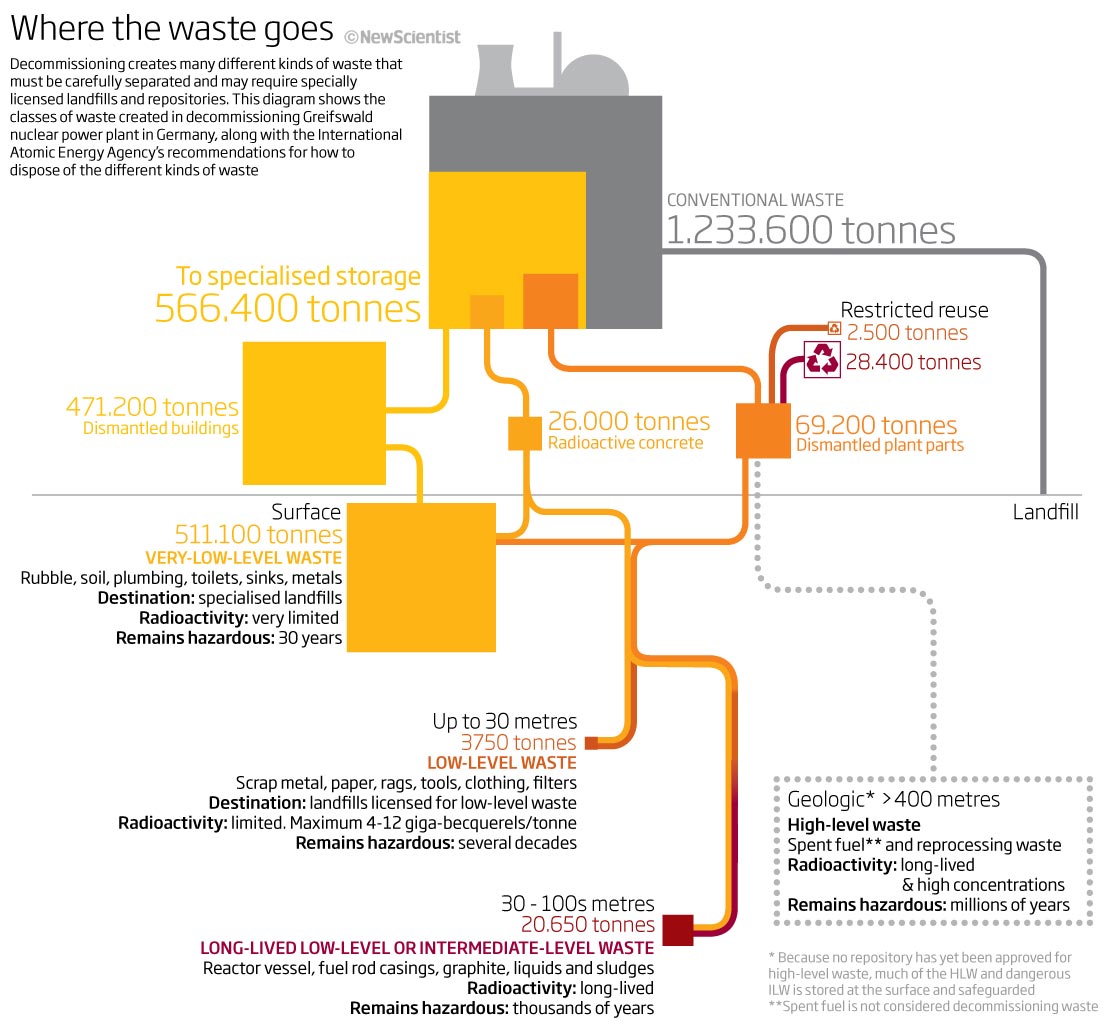
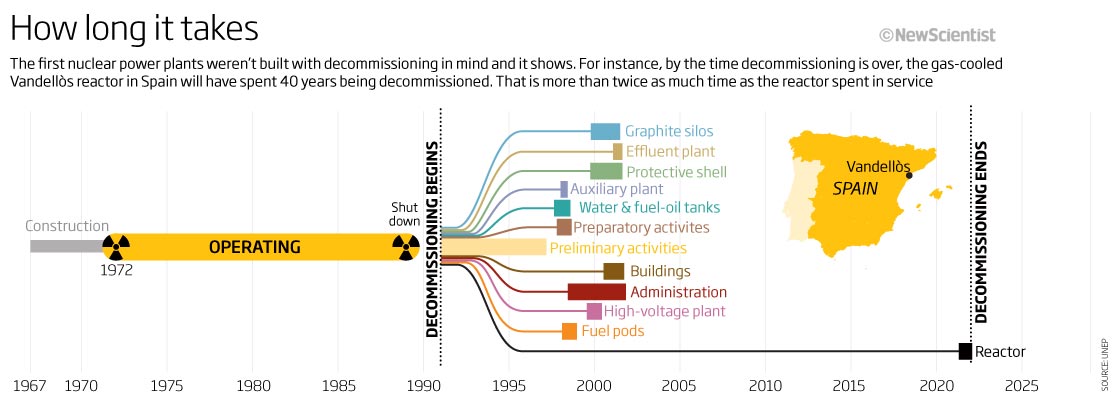
The timeline below it, again using the same colour scheme, shows how long a nuclear power plant takes to construct, its normal operating timescale and then how long it takes to decommission it and make it ‘safe’. An inset map shows the plant we base these data on in Spain.
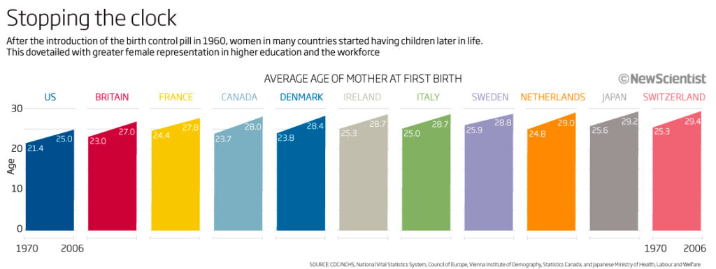
From April 2012 we have a series of area/line charts. A good way to show increases over time between two dates, although now, I think it would have made more sense to put them onto one line chart…surely that would be easier to compare? These show the ages of first child born between 1970 and 2006. The headline says that this dovetails with the rise in female representation in the workplace and in higher education! Not sure why these countries or colours particularly! maybe just what we had to work with. Could be better!
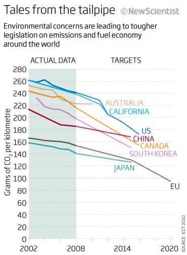
Thinking of what may be a better way of showing the one above, maybe this sort of image would have been better. In this case we are looking at emissions as of 2012 and looking to the future. A simple way to show the comparisons between the data trends and the targets.
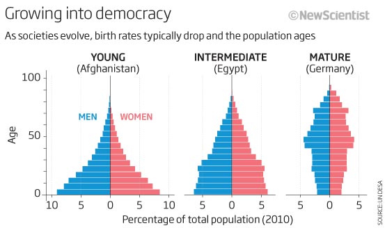
Another example here of a simple to understand chart – a population pyramid. The title and sub-head allow the reader to understand what they are looking at, and good examples of how the population changes in young, intermediate and mature democracies. Probably would choose different colours now.
That is enough of some reasonably good looking and easy to ‘get’ graphics…let’s have a ‘wtf is that’ graphic. How messy can you make a graphic? apparently very! is the answer.
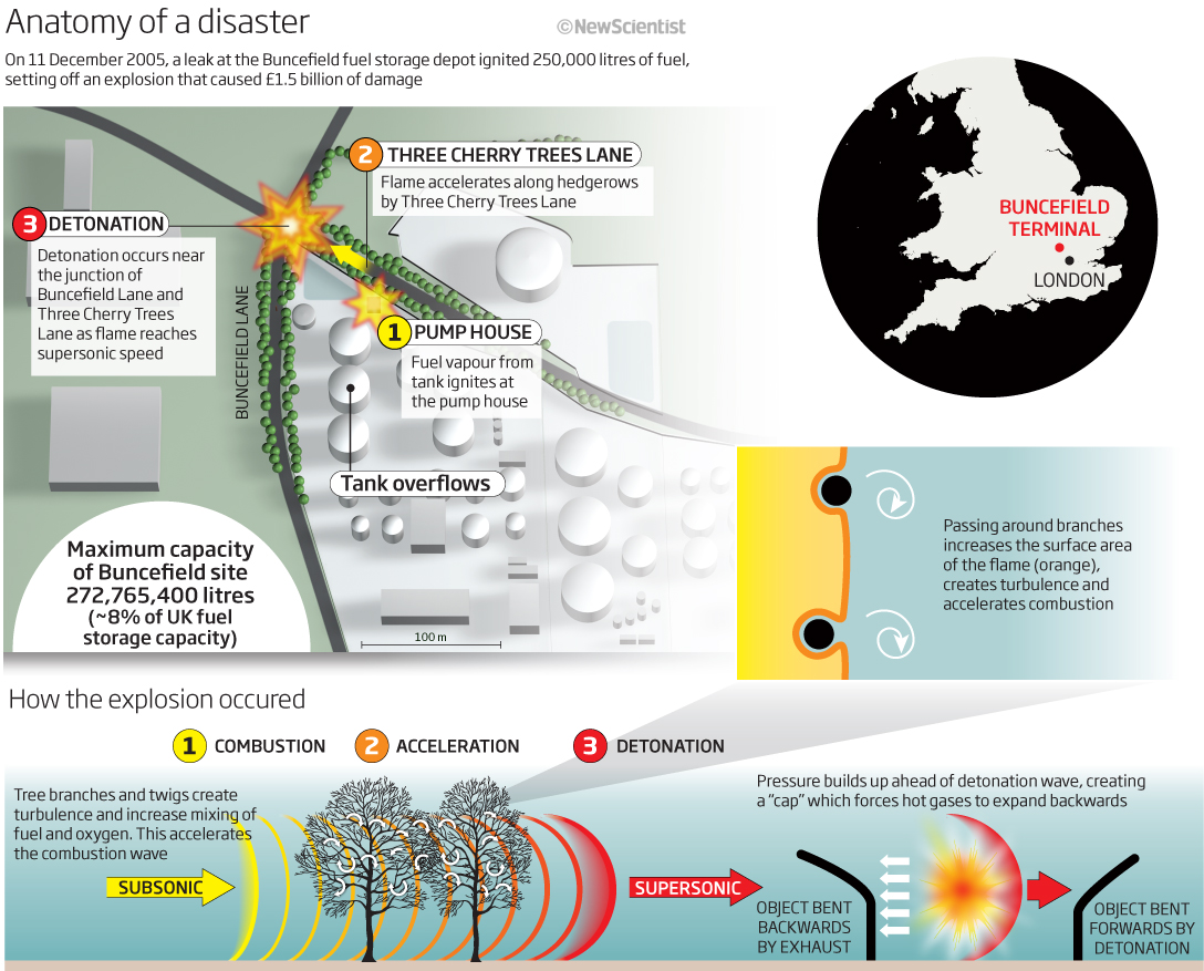
This is showing a serious explanation that happened in a fuel storage depot in Hertfordshire. It caused a lot of damage and disruption. The graphics has no flow and is full of ‘bits’!. I think this is really a case of we need to include as much info as possible but we have no space on the page. Reading all the text does show that we are including a lot of info, but who wants to read the text when it looks like this! My eyes go all over the graphic without knowing where to start or finish or how it all flows together. Too much colour, too much info, not enough space…So much to dislike about this.
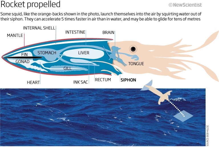
How about a flying squid? why not. I always liked (and still do) getting back to my scientific illustration roots in whatever way I could so here I had a good reason to draw a squid and show how, using its internal organs, how it could squirt water to propel itself out of the water to get away from a predator, for instance. A nice illustration accompanied by a picture showing the squid ‘flying’ over the sea surface.
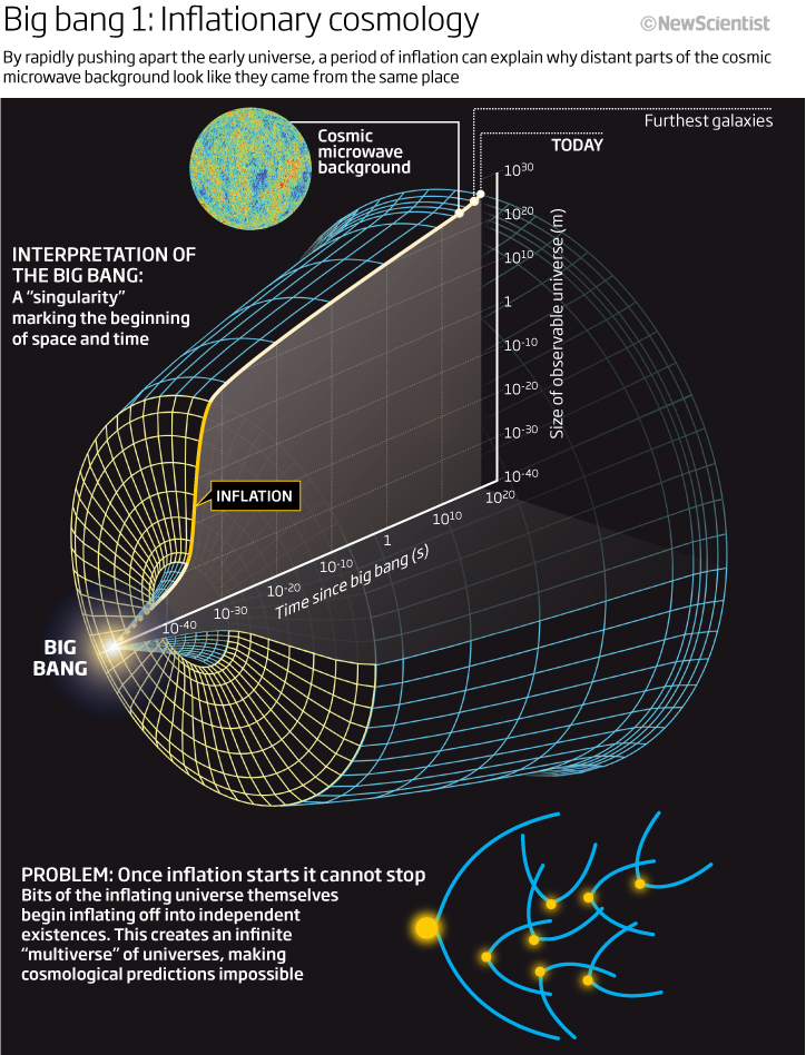
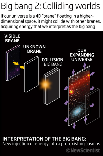
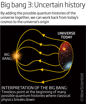
We can end this spring round up with a series of graphics explaining the Big Bang and contrasting theories around what might have gone on 13.8 billon years ago. A subject matter that we revisited many times as our understanding changed has through the years. I like the look and feel of these graphics. The subject matter is always a complex one and so the style I used on the graphics -simple colour schemes and line drawings – are used to try and make the information accessible and understandable without overpowering the reader. Whether this works is subjective, obviously, but I think it does still work and, in fact, the first one was used a couple of times in future graphics and was copied in style by others. The headlines and text explain each of the theories plus additional information is supplied by looking at problems or interpretations of that theory. All in all successful visuals, I think!
I am always interested in any constructive comments and questions, so please feel free to contact me.
Looking at what I see I was doing, I may reduce these to quarterly roundups for a while…but we will see. Hope you still enjoy looking back with me.
07 July 2022
February 2012
Looking back at February 2012 we have a quiet month looking at our atmosphere, our Earth, sleeping and the blues, plus climate science of course.
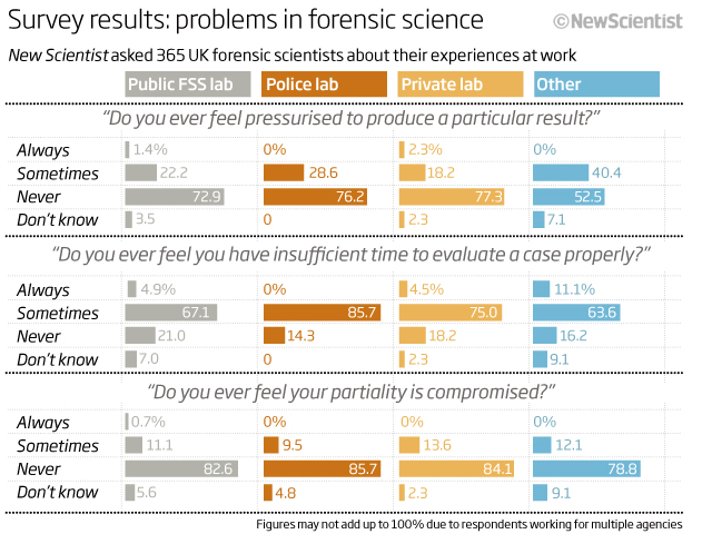
Let’s start with a simple bar chart comparison graphic looking at a survey New Scientist had conducted asking questions of forensic scientists. When you have data like this it is good to keep the scales of all the charts the same (I see this still done incorrectly nowadays!) to easily compare the results side by side without having to look at the data. Colour coding (desaturated colours) and making the questions asked, helps to make this chart useful – I’m not sure why we asked these questions and would like to read the story now but I can see that in most instances scientists find time constraints are a part of their lives although they doesn’t mean they feel pressurised to produce certain results.
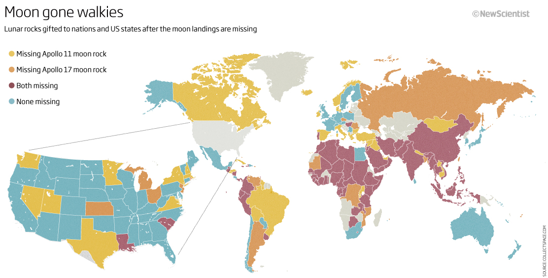
A world map next. This one, again with desaturated colours (must have been the ‘thing to do’ at this time) looking at which nations had ‘lost’ the moonrocks they had been gifted! How careless! Amazing to see how many had ‘lost’ll of them – makes we wonder where they had gone and how many have since turned up in other places or private collections! I do think looking back this could have been done without enlarging the US but hey. One other point – I also think the key may have better to have been ordered from both lost (darkest) to none lost (lightest) in one colour – that may have helped the reader!
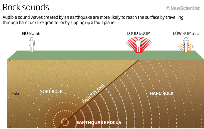
Speaking of rocks a very (in my eyes) old fashioned looking graphic showing how sound waves extend through rocks to reach our ears. It is here to try and explain why we hear loud sounds via a fault, but there is no explanation as to why it works this way! So as well as a very basic graphic looking not very inviting it also fails in telling the reader why!
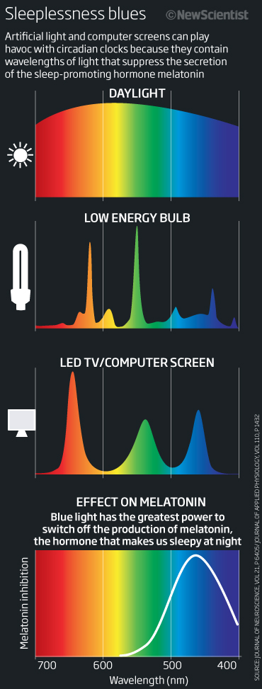
So quickly moving on…a feature looking at light, blue light and sleep patterns. Three graphics from the feature – first a colourful graphic taking up the page depth showing the wavelengths of different types of light – from daylight (sun icon) to computer screens and the effects they have on melatonin – the hormone that makes us sleepy. The headline is already alluding to the problems we have with blue light and sleeplessness and you can easily compare light source by light source with melatonin inhibition as all the charts align vertically. The blue light of screens peaking at the same wavelength as the melatonin, whereas daylight drops off during the day. A useful graphic…
The second and third graphics pick up on the blue theme – helping to reinforce the notion of sleep blues – by using only that colour. The first one showing how teenagers go through the ‘owl stage’ around the age of 20 before this effect falls away and also showing simply how sleep needs fall as we get older.
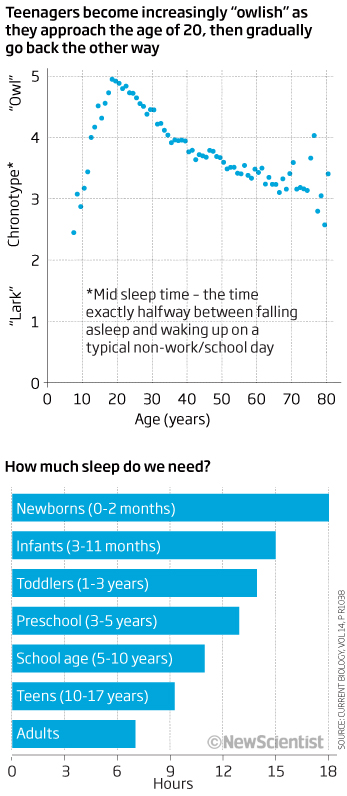
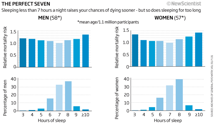
The final one showing that science had worked out (at that stage) that 7 hours were the ideal sweet spot for number of hours to sleep without changing your mortality factor. Two simple bar chart comparisons that work as the colour changes at the same time in all of them as they align vertically.
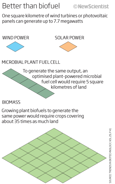
We can’t leave a monthly roundup without mention of climate change or alternative power supplies, so here we show how – very nicely in my opinion – how much one square kilometre of a solar or wind power could produce (back then, 7.7 megawatts of power) and how that would have compared to using plant fuel cells or biomass – a big difference. A clean and simple comparison…those muted colours again eh! The header is telling us what the graphic is showing and so helping us to ‘get it’ much quicker and telling what to look for.
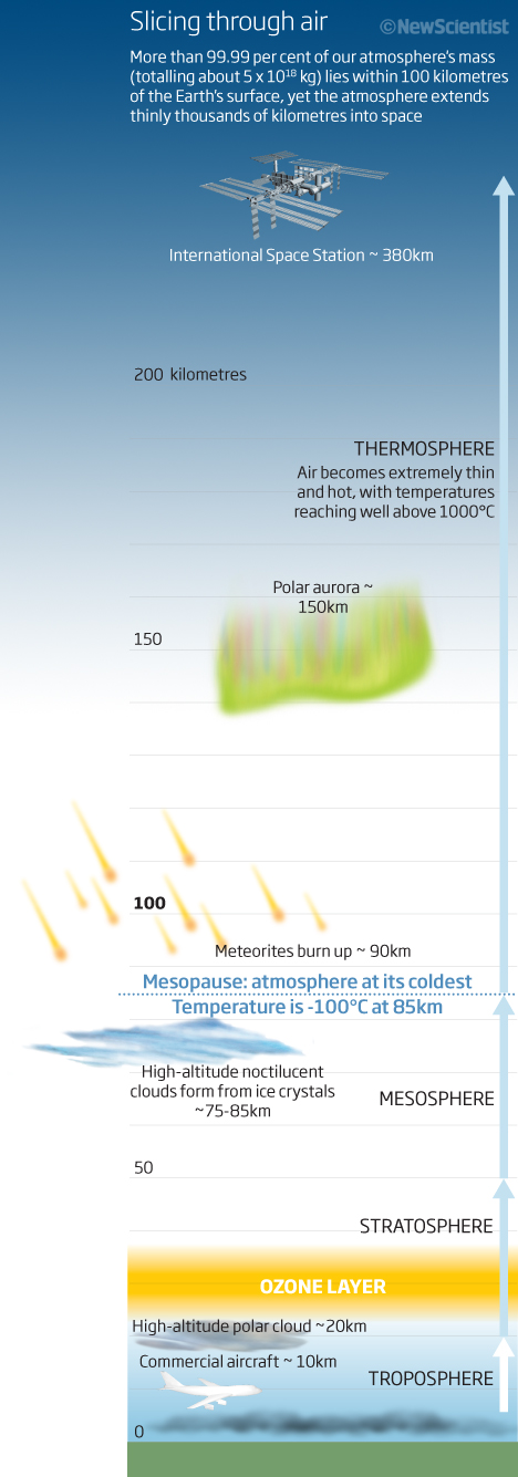
Vertical graphics were a theme in February 2012, obviously, and so a final one looking at the atmosphere that surrounds us. Just an interesting visual reminding us what is where in our atmosphere. Full of interesting information and even looking at this today, it made me go ‘wow’ couple of times! – I didn’t realise the aurora was so far up!!!!
Thats it for February 2012. If we are all here next month, I look forward to seeing what some more good and not so good graphics.
01 March 2022
January 2012
Wow…a new year…so welcome to 2012 and the world of graphics that I was producing whilst Graphics Editor at New Scientist as well as some freelance projects. This month we have diet, tendons, tectonics and, of course, weather and climate.
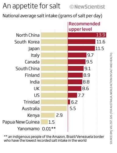
Let’s start with a simple, and I think an effective, bar chart. Nothing wrong with a bar chart (I always say) as long as it shows the data quickly, easily and effectively…which I think this does. The title tells the reader what it is all about – salt intake – and the bars easily show which countries are averaging above the recommended intake per day (in red) – although recommended by who? – this is an important detail that is missing from this otherwise good chart. Yes, I can see its from the BMJ and I can go and find out but thats not the point. An interesting look at salt intake…As of today, the WHO recommends a salt intake of less than 5 grams per day and I can see that the US have increased to approx 9 per day whilst England is at 8!
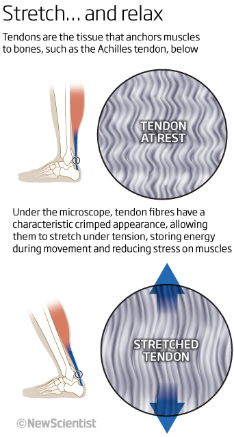
Lets stick with the human body and look at how tendons work and in this case the Achilles tendon. As a squash player I know how it is necessary to warm up before playing, this shows me how the tendons store that energy that I need when playing. Again, simple and effective with colour coding to help point you to the areas of note and a great title that sums up what is happening.
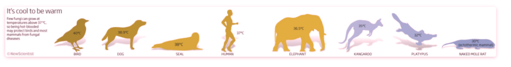
Speaking of colour coding, here we have an example of warm to cool temperatures being shown, relating to mammals and how being hot-blooded may help birds and others from fungal diseases as the fungus cannot grow above 37°C…it even works with a red/green filter.
![]()
Reg/green filter applied…
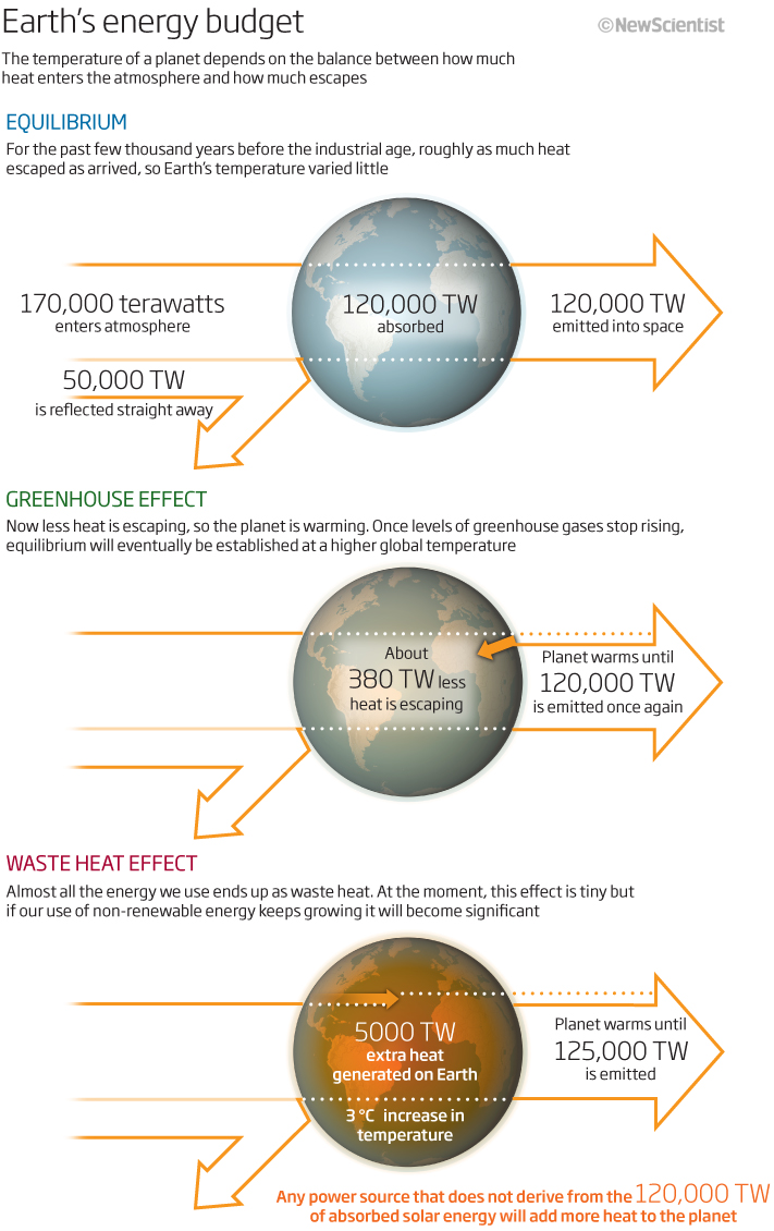
Keeping with the colour theme, an example now, I think, of how it doesn’t always work well. This graphic is trying to explain how the Earth’s temperature is trying to keep in equilibrium between string the heat and releasing it. It’s just too wordy and as much as I read it again (and I do understand what is going on!), the graphic iis not really help me to understand. Maybe just the equilibrium graphic is all that is needed and the rest is just explanatory text? There is a better way than this to explain it…
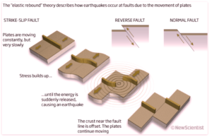
Let’s keep with the planet and look at a more effective graphic and one that explains how earthquakes form at a strike-split fault boundary. We used a 3D graphic here to show what is going on in 4 separate mini graphic sequences. Simple storytelling with the explanatory text guiding the reader along the sequence. Above we have two examples of this in faults.
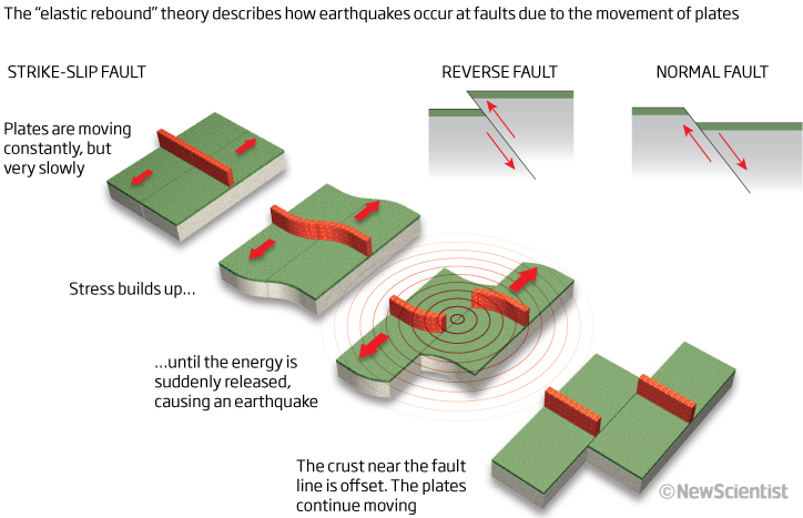
I really should have done better though, than using green and orange as using the red/green filter obliterates what is going on!
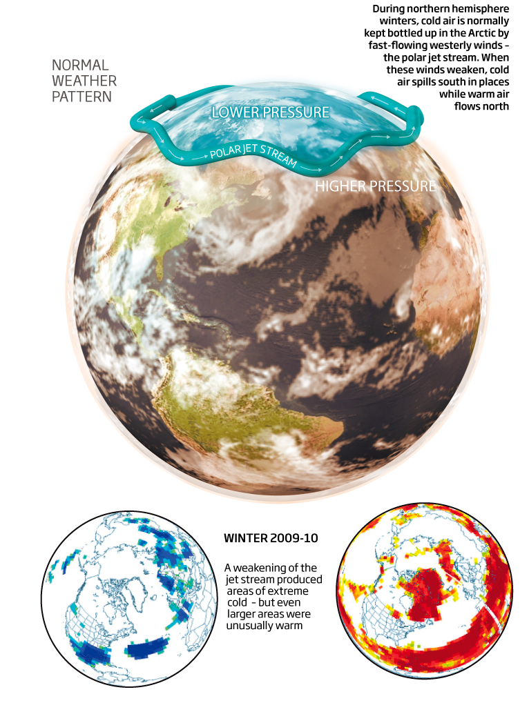
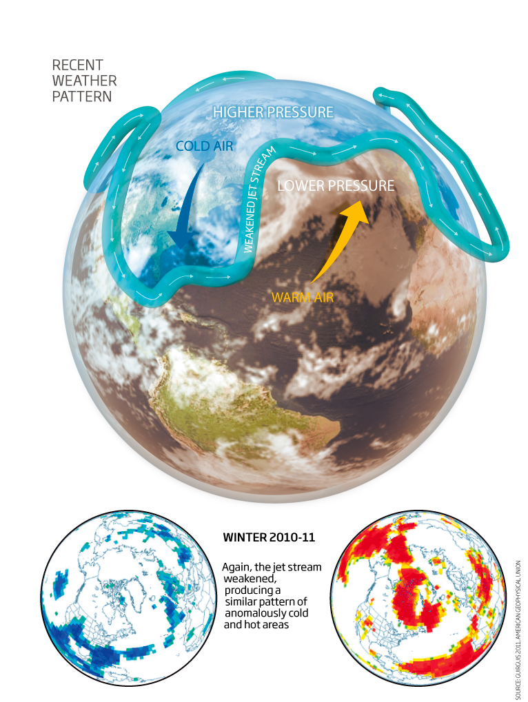
A couple of feature graphics trying to explain how the high-level jet streams that flow around the Earth affect our climate and the weather that we see where we live. Some nice 3D work here (considering its a static graphic) and easy to compare between the two graphics.
I will end this month’s look back ten years with a look back a little longer…more than 14 billion years or so! to a graphic showing a model of our universe and how the Big Bang isn’t necessarily the beginning! I have produced many graphics showing how the universe could have started and what the Big Bang may have been like and where it was in the history of things – always an interesting task to show graphically because of the, sometimes, really way out theories involved! I think this one show two of those theories quite well – the Bang-crunch and the Multiverse models along with a start of everything!
Enough for January 2012. See you for February 2012 next month
02 Feb 2022
November 2011
We find ourselves approaching the end of another year…just the run up to the Christmas issue now for New Scientist back in 2011.So this month we look at historical temperature, weather the number zero, and the our Universe and we look to the future for less corruption and the landing for NASA’s Curiosity rover.
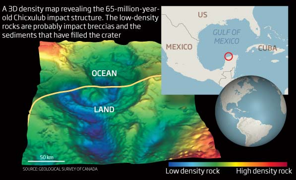
You will often see me comment on the rainbow scale or colours in general on graphics, because it just does look like some designs just use the default given colours without any thought or purpose to them. I have included the map because as soon as I saw it, I automatically thought uh-oh! rainbow! So it was good to see that it actually worked well – and dare I say, even better using a red-green filter over it! Maybe we should design for deuteranopia.
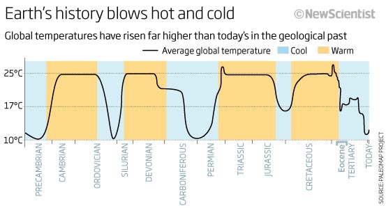
Keeping with Earths climate we have a simple line chart of temperatures going back in time through periods of time to the Precambrian era. An interesting graphic as it shows how warm the Earth has been as well as its periods of ice ages, but very simple not even having a time sc ale along the bottom…I do miss this element and think the graphic would be som much better with a timeline to tell me how long ago the Carboniferous age, for instance, was.
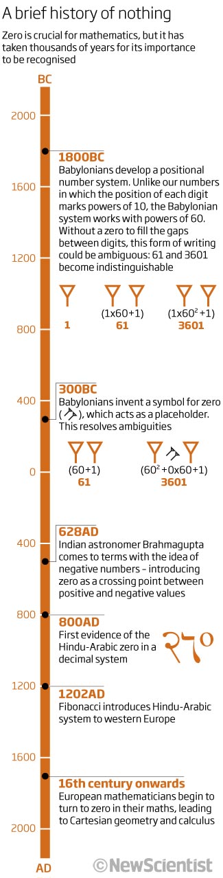
I’ll stay with timelines. I always find timelines a difficult thing to make for an interesting read/look. This one has interesting information behind it…zero . It has a great title, and one that has been used many times before and since. Here we are looking at zero and mathematics. Starting in the past and reading down to get to today…as Simon as I could make it except for the icons that back up the text. Simple and effective.
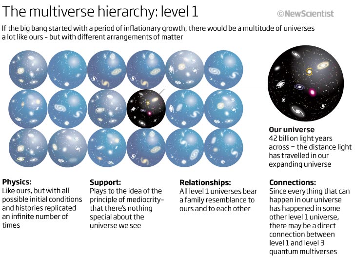
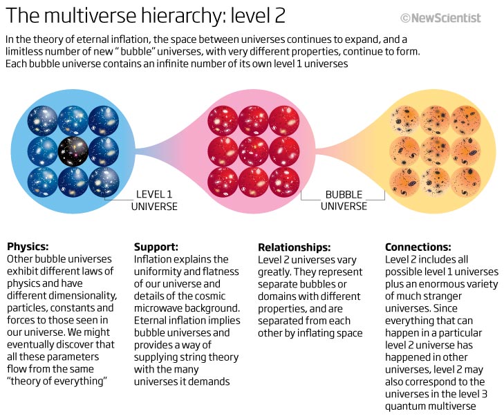
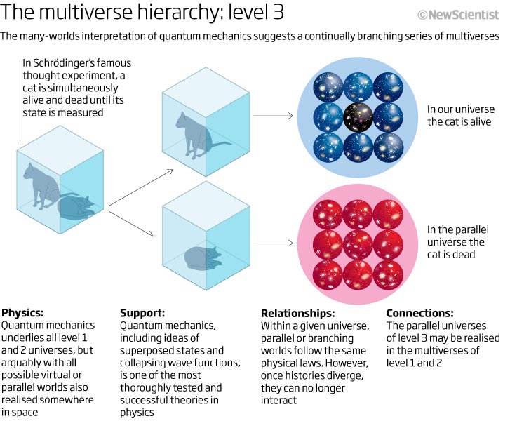
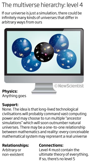
Keeping with timelines or the passing of time, we have 4 graphics here that all relate to a feature looking at the Big Bang and the theories behind the multiverse and quantum cosmology. I have included these because it shows that keeping things similar throughout a feature can help the reader grasp the concept or understanding…I don’t confess to totally ‘getting’ all the theoretical concepts that the graphics are trying to illustrate (I did at the time though!) but at least I can sort of see where we may fit in with these concepts because I know what to look for. In these examples we see how the text and the visuals really work together and both elements are as important as each other. There is a lot of text though…It’s easy to find where our universe fits in with these theories.
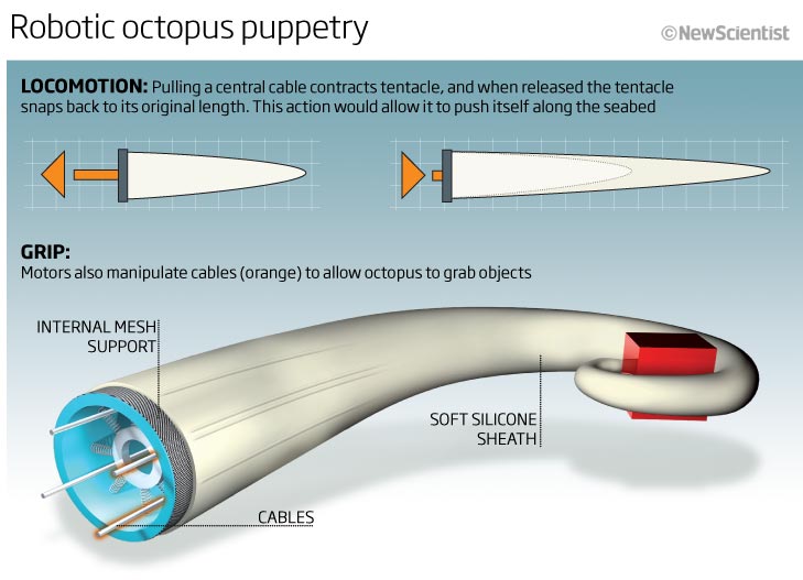
A couple of 3D graphics now. Cinema4D was a staple app at the time and I spent many hours having fun and adding details to many mechanical marvels as well as using it to produce some interesting organic shapes. The first one showing how a robotic tentacle could look and work.
2D graphics show locomotion and explain the principles behind how the tentacle contracts and snaps back to its original position whilst the 3D element show the grip. The dark top extending and fading out towards the bottom of the graphic was a technique that I employed many times during this period..trying to guide the eye from the top to the bottom.
We will end with a great looking graphic, full of information end detail, again using 2D and 3D elements. It is really missing its title! I think that element was part of the ‘layout’ of the page rather than the graphic and so its not shown here…a shame and really show why its important to have everything on the actual graphic for future reference. Another timeline starting with the launch text at the top and then extending along and down the right hand side of the page to the touchdown! If the reader follows the timeline you end up looking at Mars’ surface showing the location of the landings compared to previous attempts. A bit of history then with a simple bar chart (including icons of the rovers) showing how far each of the provers will or have travelled. The main graphic has the Curiosity rover in as much detail as we thought necessary at the time for this particular story, showing the instrumentation.
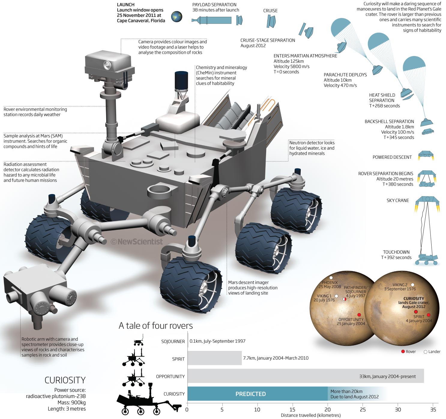
I do know we spent many more hours on this model in the months after this was done and ended up with a very detailed rover model…you never know when you may need all that detail 😉 lots for un doing it as well!
That is enough for this months look back. Its nearing the end of 2011, just December to look at so hope you come back in a month to see what I was producing as graphics editor of New Scientist.
06 December 2021
October 2011 – a climate change special…
Looking through the graphics from new Scientist in October 2011 was fascinating. As I write this COP26, the climate conference is going on in Glasgow, the IPCC and the UN latest climate report has been published and is being discussed and, we hope, acted on.
The graphics are all climate based except one which I thought was worth including from early in October 2011, so we will start with this one.
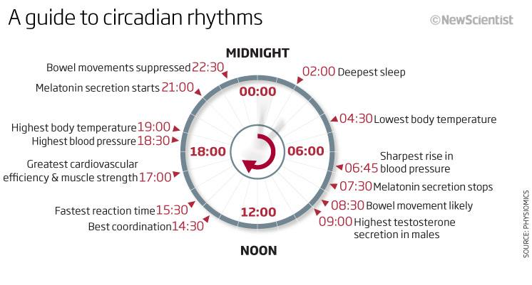
A lovely little graphic – very clear and succinct and more than that – interesting. A guide to circadian rhythms. How our body clock reacts to time and what is is doing. A good simple header and then I started at midnight and worked my way clockwise around… Actually you could start anywhere (6am for instance and do a day!) Simple, clean and easy to understand.
So on to the climate. The remainder of the graphics from this month are all climate based and must have been to do with the release of a special report from the IPCC on. Its interesting to see that even then we and the IPCC were reporting that it wasn’t looking good for our Earth!
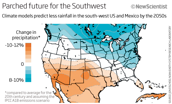
The first one we can look at is a small news story map of the US showing how the climate models then were predicting the changes in rainfall patterns in the south-west US by 2050s. Again a simple clear header telling us what we are looking at, with a simple blue to orange colour scheme of precipitation going south west! – no need to read any further if we dont want to – I get it!
Three very different graphics now, all from feature articles and all relating to climate change.
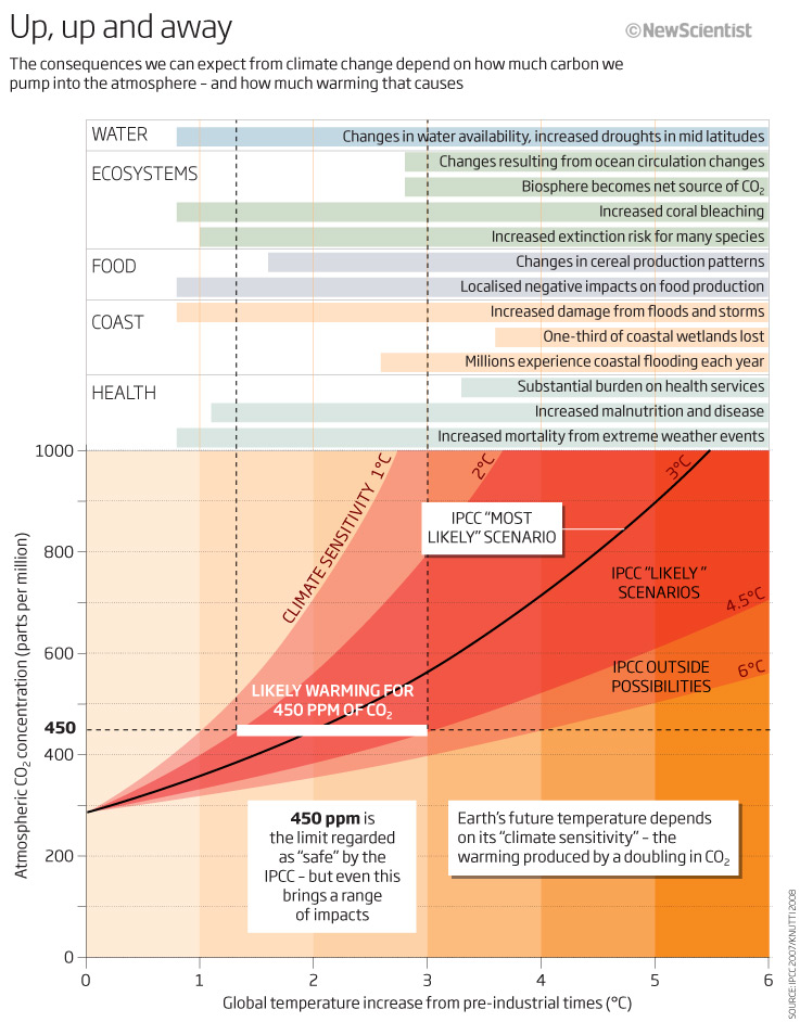
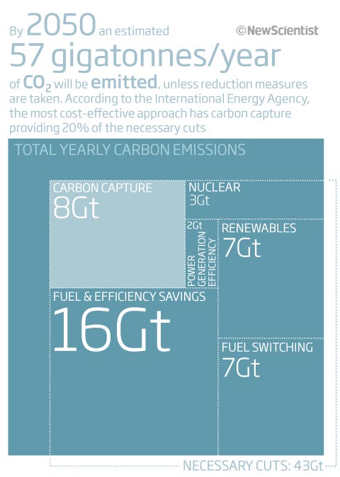
The first one is a text heavy table/area type graphic. The bottom part of the graphic showing a line chart of the IPCC likely scenarios for atmospheric CO2 and temperature increase is one that we all now recognise with the most likely scenarios highlighted. We had picked out what the consequences would be at 450ppm of CO2, regarded as ‘safe’ by the IPCC in 2011! but we are already at 411ppm. The colours are quite ‘in your face’ with orange and red used but I suppose they do give a warning! I do find it simple to read with the extra textual elements.
The chart above this is not so easy to ‘get’ at first look. Well, it took me some time to try and work out what was going on. It shows the consequences we can expect at various temperature increases, looking at various parameters such as water, health etc. because it is based on bar charts, and these start at the right and flow backwards its does take some looking at. I think it would have helped to have some text on this section saying something like ‘bars starting here mean that things begin at lower temperature increases’ or something along those lines. The arbitrary colours are there to try and separate the sections, ecosystems, coast etc but we don’t really need them…some extra white space between the sections would have been better.
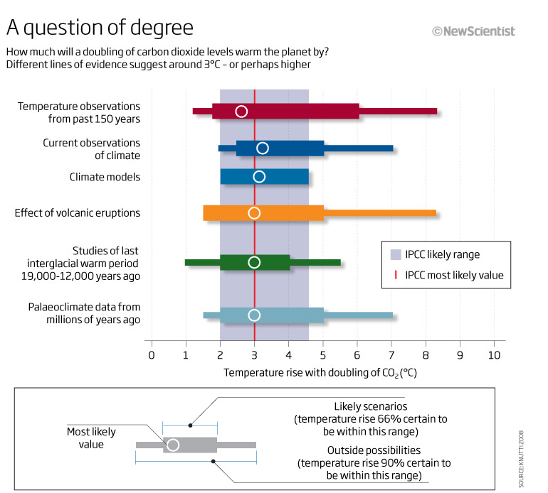
A different take now. This looks at what a doubling of CO2 levels would do to the rise in temperature. Bold colours show the different data sets used at 66% certainty and at 90% certainty whilst the blue in the background shows the IPCC likely range and most likely range. What I do like about this graphic is the explanatory key at the bottom – as this is a graphic type that takes some understanding, and for the non-scientific readers of New Scientist could be a new graphic type, then this is a great way to help the reader engage and understand – we need to use these more.
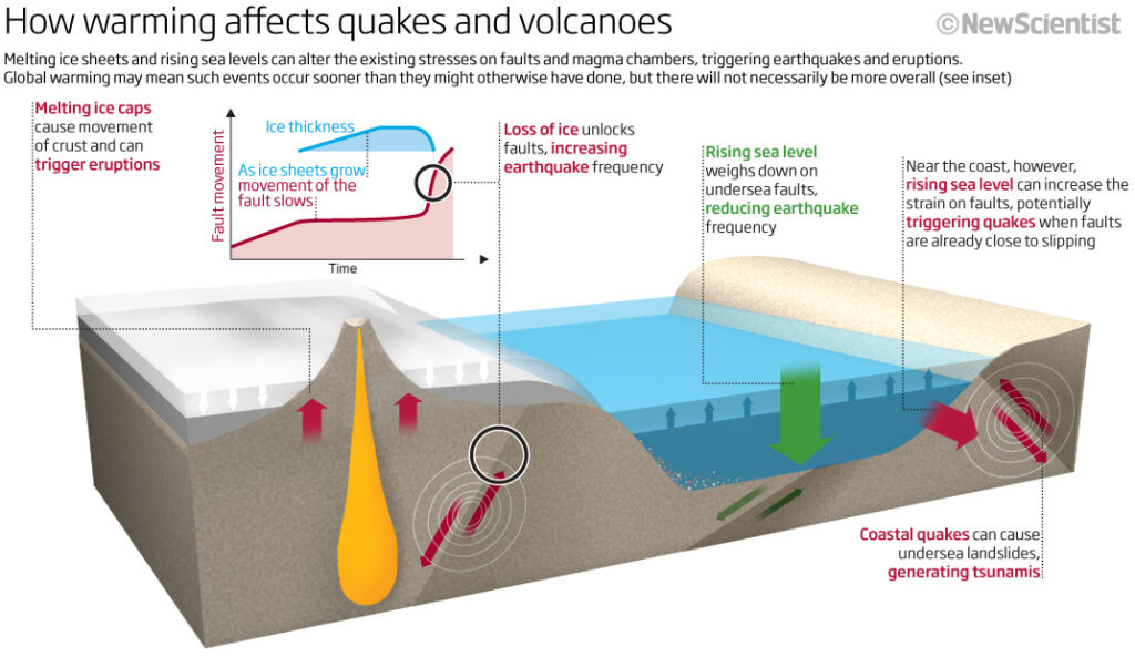
A 3D graphic now showing and explaining graphically and with the text what happens when temperatures rise, ice melts, sea rises and what that does to the stresses on the worlds faults and magma chambers. It could have done with a little more breathing space to allow me to move the text around to be nearer the relevant sections but, as always, page real-estate was at a premium and we were competing with words and at that stage usually lost! I quite like the little pull-out graphic showing what’s going o with the faults. The only thing that doesn’t work is the colour coding as it is not red-green compliant – the arrows merge into one colours under a deuteropia filter.
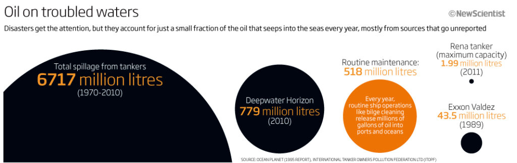
So lets finish this months climate special with something that is not really to do with climate directly but shows the amount of oil that gets into our oceans every year form spills as well as routine maintenance. A very simple circle area chart allows us to show the different amounts from 1.99 million tonnes to 6717 million tonnes. Could have been portrayed many ways, but I think this is a good way to show it and a technique I use many times (for the correct data of course!)
Thanks for looking this month, more in the run up to Christmas!
03 November 2021
September 2011
Apologies for the lack of 10 years ago last month, the month flew by with me taking some time out and a couple of work deadlines. This month we look at what was going on in September 2011. We look at what our world will look like in the future, detecting the presence of life, visiting some of our deepest places, lab cultured meat, the double slit experiment and more…
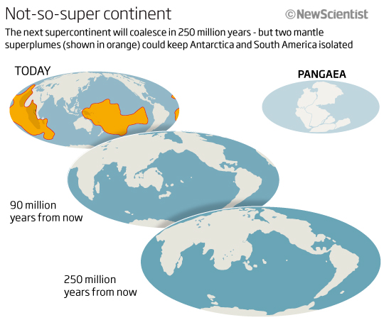
So lets start with a visualisation showing what the earth could look like 250 million years from now. I can only think that we used this projection because it meant we could compare with images used when looking back at what the supercontinent Pangea looked like.
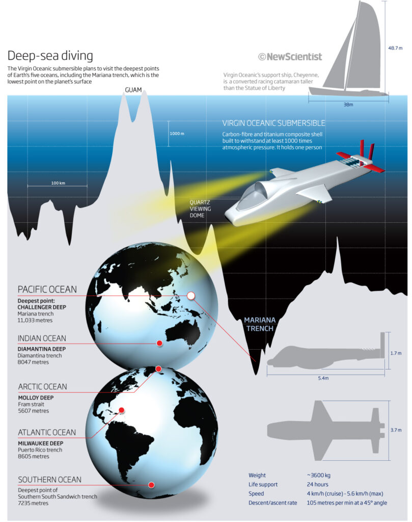
Next, this full-page, feature graphic showing the five deepest places that a Virgin submersible was about to visit at the time. I like that we managed to fit the information into one graphic. The main image shows a cross-section of the ocean floor where the Marianas trench is (the deepest place on Earth) including the two globe images showing the other places to be visited. Clean and simple colour schemes with the sea getting darker as it gets deeper. We also included a 3D look at the submersible showing its size and additional info. A lot of info in one graphic, but I think it works.
Sticking with life and our Earth, another future (full-page) graphic this time looking at the signatures we see when looking for signs of life and habitability on. other planets. A dark background – so more space-like? The central image is a planet-like sphere surrounded by molecules and explanatory text, explaining what we should look for and where – is there too much text? I don’t think so! yes there is a lot of text but there is still ‘space’ around each segment of text and the text is easy to read and understand – so I would say its probably the correct amount of text.
Beneath the main image is a line chart showing the light spectrums from Earth, Venus and mars that we can use to compare with others to see if life could exist.
![]()
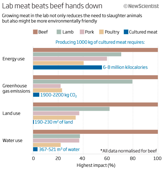
Bar charts should be easy to understand and to ‘get’! This one tries to show us how lab grown meat is more environmentally friendly and kinder to our animals! I find it just too cramped and too full of colours and information for me to easily get the message – that is surely the purpose of a graphic!
So how to make this better? The title mentions beef and lab meat, so why not make these categories stand out? With the title saying ‘Lab meat beats beef hands down’ I, as a reader, am now looking for lab meat to be beating beef but I see its less in all cases! This is something that I do talk about and teach in my classes, the words must help with the visual and vice versa. In this case it doesn’t help or contradicts. If the title had something like Beef is higher, or bigger, or lab meat lessens… etc then that would help me to ‘get’ the meaning of the graphic. The colours don’t help either. Only use colours to inhale understanding, so shades of grey for all meat types and the lab meat in another colour would make the point stand out and then the reader would ‘get’ it easier. Lots of good information here but just needs some thought to make it better.
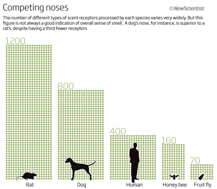
Keeping with simple charts, this one looks at how many scent receptors a range of animals have. The icons help with memory retention and you can easily see that we compare very badly with dogs and rats! Just fascinating information displayed simply.
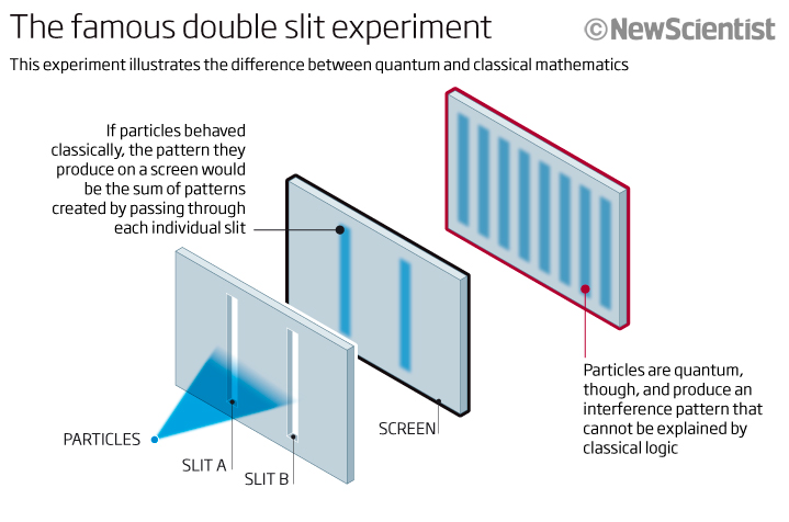
Another small simple and easy to understand graphic. As the title tells me, the famous double slit experiment. Simple, clean and well explained with the supplementary text around it. The only thing I would try now is to put the quantum text in red to coincide with the red surround of that section of the graphic.
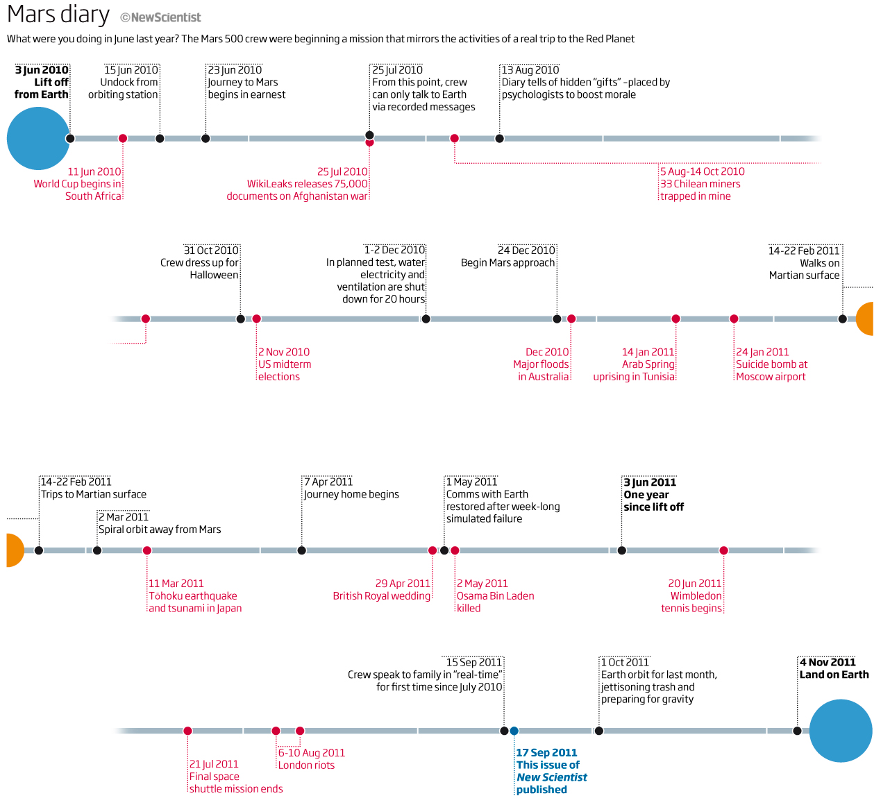
We will finish this months look back with a timeline, well two versions of the same timeline. I think this was an example of how we had to produce more than one graphic for print and online. Here we look at significant things that happened over 500 days between June 2010 and the 17 September issue of the magazine – the amount of time that the Mars 500 crew were virtually away from Earth on the trip to Mars and back, in preparation for the first real trip, whenever that happens. It is fascinating to see what the crew were doing – the black and top text, and what was going on in the world at the time – red and bottom text. A great way for me to remember the significant stories from the past such as when the Chilean miners were first trapped underground, or when the Arab Spring uprising started in Tunisia, through to the final space shuttle mission ending in July 2011! Fascinating and a long time for the crew to be away from their family and the ‘Earth’.

As a magazine graphic we put the timeline across the bottom of 4 pages but for the online version, we produced a screen friendly version and stacked the four elements. A simple line connected with blue dots at each end to show the Earth with orange dots in the middle to signify Mars time – maybe changing the colour of the line to orange when they began orbiting Mars would have helped but hey, there is always something we can improve on!
Thank you for bearing with the lateness of this….hopefully back to normal next month.
05 October 2021
July 2011
July 2011 and it’s summer time. Always a slow period as people take their annual holidays. This month we have graphics covering space, the sea, the Sun and the land from a couple of perspectives.
Let’s start with the land. Here we have a map showing the migration of early humans out of Africa and into the continents of Europe, Asia and beyond.
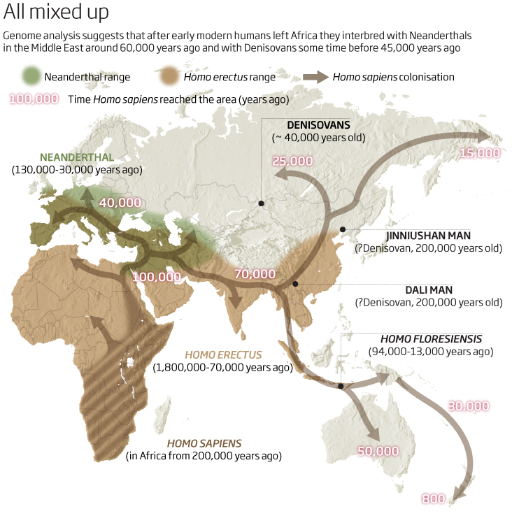
I find it a little subtle as I am not drawn to where I should start to look on the map itself. And so I find myself reading the caption, trying to find out what is happening and where on the map I should be looking. It is, in essence, a timeline and so the reader should know where to begin and the direction of the flow or time sequence…this is not an easy thing to follow here. A logical numbering system, 1,2,3,4 etc or making the dates bigger or bolder would be a great start. The key at the top (always try and have a key – if you need one – near the top of a graphic) has the Neanderthals first but that doesn’t really help either. Once you do understand where to look and what to read first, then it does flow but it’s not an intuitive graphic…looks good though!
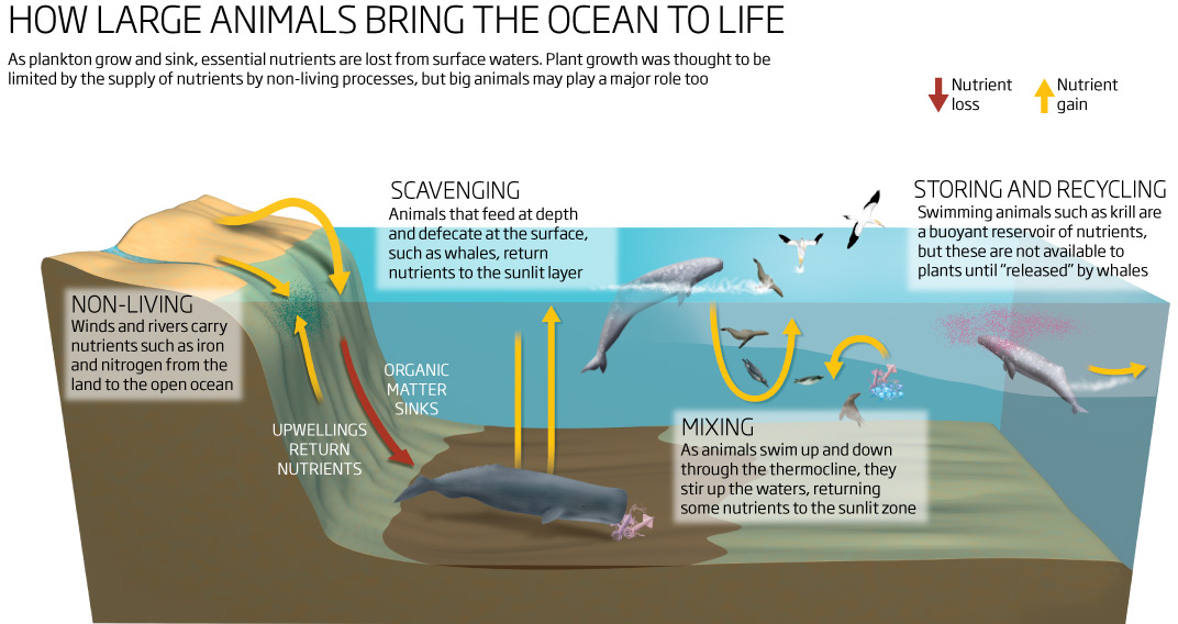
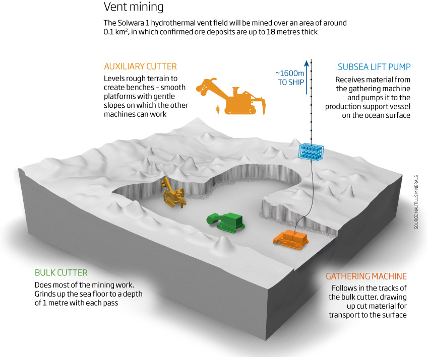
Let us dive into the sea next. Here we have a graphic showing nutrient gain and loss in the ocean due to non-living as well as living organisms and how the big creatures (whales etc) fit in with the flow of the nutrients – keeping the oceans alive. A chance for me to draw some animals and birds (which I always love to do) and to explain what is going on. I think it’s an easy to understand visual and does its job well. The text is where it needs to be and explains the process well.
Keeping with the deep waters, a controversial subject, but one that was being considered 10 years ago and is still being evaluated today – mining of the ocean floors. (see a link here to a recent paper on this subject matter with a graphic) This one is depicting what machinery may be needed to mine minerals from a deep sea vent. Again, a well explained but quite complex graphic involving many stages – some nice 3D models rendered in Cinema4D, this output would then have been put together and refined in photoshop before bringing into Illustrator for the the final adjustments and adding the text. Each process is well explained and using it uses a colour coding system to identify the individual machines and what they do. It would benefit from an inset map to show where this is being considered, but overall a reasonable graphic.
Moving above the oceans and the land to space now, and a news graphic portraying various data from NASA’s space shuttle program as it came to a stop with the final launch of Atlantis. A tall, thin graphic (I would imagine it was to fit into a one-column space and take up most of the page depth) which fitted with the vertical bars showing the distances travelled by each shuttle.
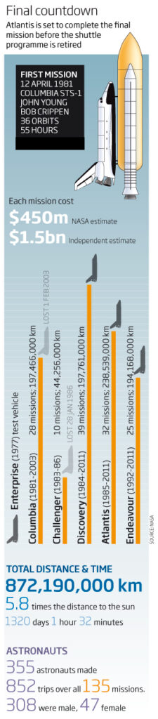
A good use of the bars to show this data as the exhaust for the shuttles, although the other data are a little lost and we could have done more to make these data more interesting and to differentiate the different parameters ie number of people vs time spent!
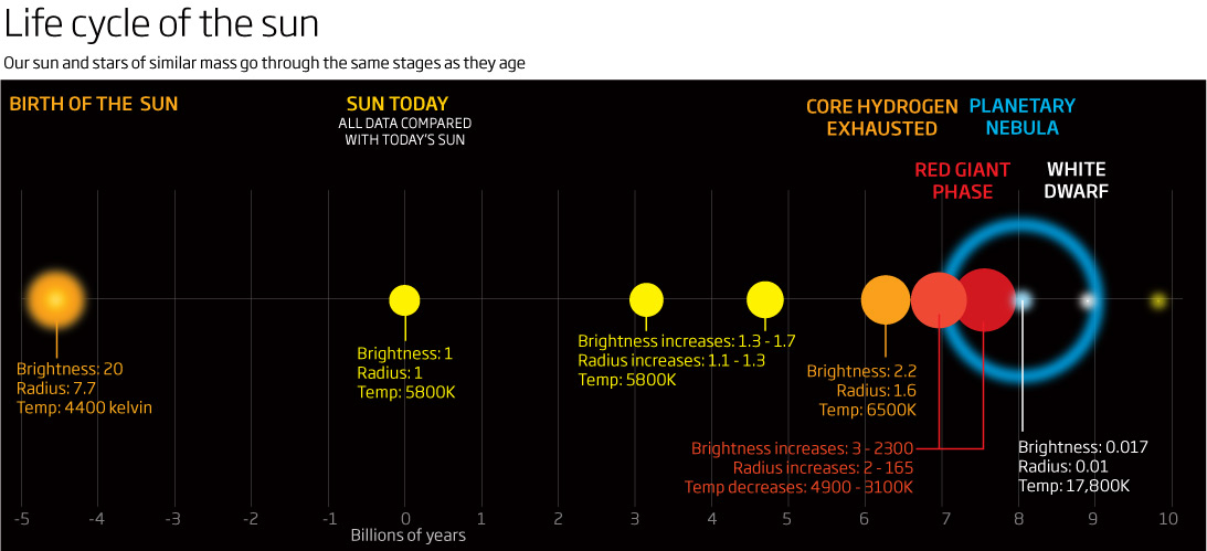
Keeping with the space theme a graphic representation showing the life cycle of a start such as out Sun. From its birth to its eventual death. A simple clean graphic but it does become a little cluttered towards the end of its life because of the scale of what is going on – could probably have done with having a full double-page spread to work on but was probably not allowed to have that much real estate to play with! Still quite like this one.
We will end this months look back ten years to a line chart depicting the proportion of women to men across various sciences as careers change from school exams through to Professorships! A stark fall in numbers compared to men back then…I wonder if it has changed significantly? Or at all?
Things that could be done to improve its effectiveness?
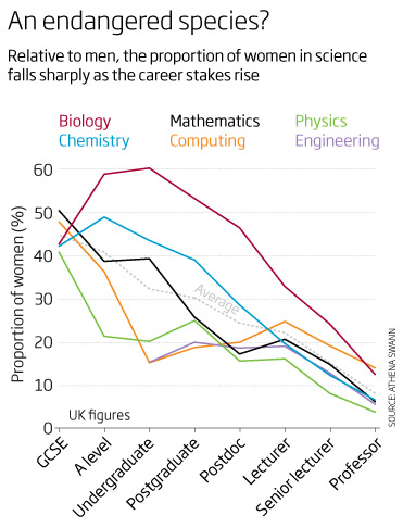
Don’t use a key – instead add the category names to the end of the lines.
Split the graphic up and make it a small-multiple graphic depicting each category on its own.
Use bars instead of lines.
Use filled areas in small multiples.
Good title though!
A small but good example of the styles and scope of the graphics and subject matters from ten years ago.
Thanks for reading…more next month
06 August 2021
June 2011
A varied collection of good, not bad and could-be-improved-upon graphics this month.
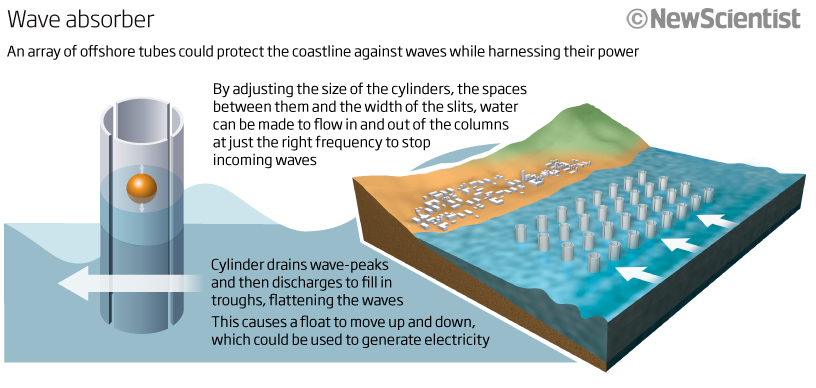
Let’s start with one looking at a pretty neat idea of harnessing wave power while protecting a coastline. A simple, clean, and well explained graphic. If I had to do it again, I would probably ‘mirror image the whole thing so that the story starts with the overall look of the coastline and then explain what the tube does and how it could possibly be used to generate electricity – I think the flow would be better that way.
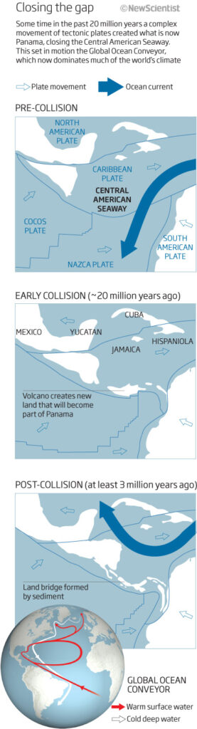
Let’s keep with flow. This time we have a graphic that flows down the page, from top to bottom – explaining how the Global Ocean Conyeyor Belt came about. This flow of warm and cool water around the oceans drives out climate and is a very important element when it comes to stabilising global warming. The graphic shows in 3 panels how the land mass that is Panama came into being. Some slightly better signposting and annotation wouldn’t go amiss here to help drive the story – but overall a decent graphic.
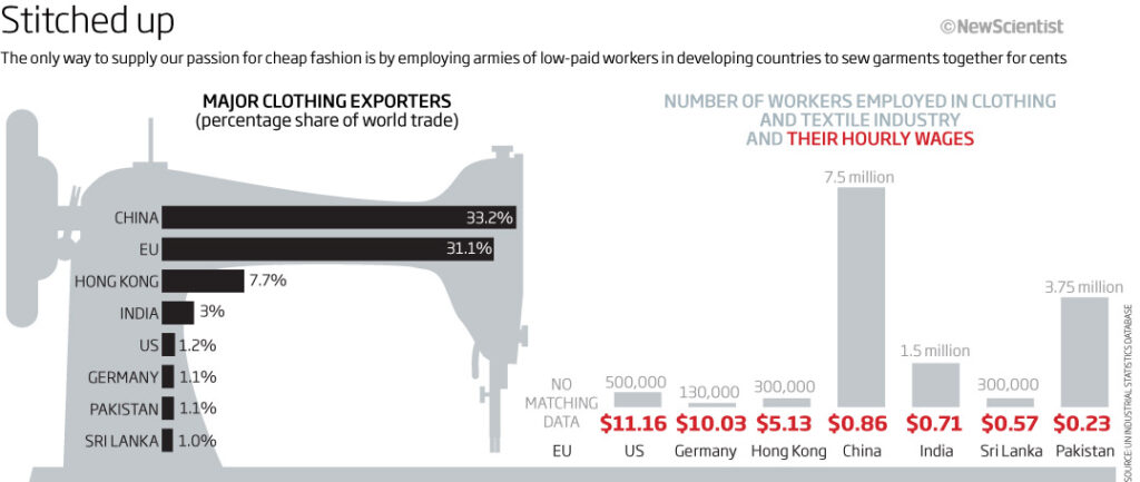
Sometimes, and I do teach this in my workshops, a well placed icon can really help to cement the idea of what the graphic or visualisation is all about. Here, I think, is an example of how it can detract. Maybe its the two bar charts that are distracting…or maybe even the fact that there is no real breaking space between the two charts? What do you think? In any case the sewing machine is very dominating. I think this may be a case of producing two separate charts with their own headers and explanatory text would have been more effective. Could I have made use of a pie/donut chart here to show the percentage breakdown of exporters? I think I could used a cotton reel as well!
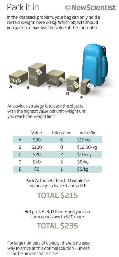
A couple of maths based graphics form a feature. Some good 3D/realistic icon-type images here. The first one showing how a 20kg weight could be packet into a rucksack. A good use of visuals to explain what could be a dry article.
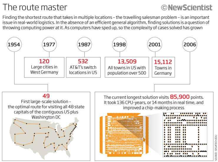
The second one is not easy to follow, and is actually really confusing – almost as difficult to get as the actual travelling salesman problem! A real mess of a graphic. No hierarchy, no real start here message, no real flow at all and with everything having as much emphasis as everything else. This is how not to make a flowing, easy to understand graphic.
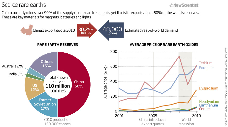
Keeping with the messy or could-be-improved-upon graphics then – this next one is not one that I would invest time with. Just too much going on (even if it is quite simple) – too many colours, arrows going left and right and a small China map that doesn’t do anything particular. Another case for producing more than one graphic and telling the story that way. It is actually an important data set looking at rare Earth elements and China’s dominance of that – but you just don’t get that fact! A big failure then, and one that would certainly benefit from being redesigned.
We will end this month’s look back 10 years with a timeline. And not the best one I have seen either. Some lovely drawings though – any chance to draw something natural is a bonus!
The headline and sub-head explains that cephalopods are much older than mammals and birds…but can you see that easily from the graphic? No! For a start the reader has to start at the bottom to see that cephalopods do come before mammals and birds..and then only by reading up from the bottom to the top.
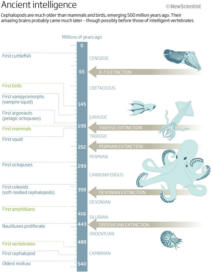
Show your viewer where to start: If you want your reader to read this way then signposting is vital…you really need a ’Start reading here’ symbol or bold text or something at the bottom – an arrow that points up would be a good start. Or start with the oldest dates at the top of the graphic and then read down. At the minute the big arrows signifying when extinction events took place are the dominant feature and that’s not really the point of the graphic. The colour scheme could have helped the flow and accessibility – the graphicacy. One colour for the cephalopods (the dominant colour) and another for the mammals and birds would, surely, have been a good idea! What was I thinking? You win some you lose some and this has both elements in it.
I could go on but enough for this month. Thanks for reading and please comment if you agree or disagree or want to redesign any of these for me!
See you next month for July 2011’s efforts.
06 July 2021
May 2011
Dots, circles and a colour spectrum are amongst the graphics in this month’s look back at what I was making 10 years ago whilst at New Scientist.
Lets start with what I would consider to be a good example of telling a story and getting a lot of information into a small graphic for a news story. A 1-column news graphic lookinf=g at what a robot found when it was allowed to enter a chamber in the Great Pyramid of Giza. Good simple infographic with about as much info as I could possibly get in. 2D, Isometric and an image all in the same graphic…nice!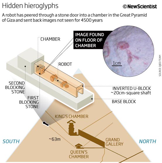
A first of a couple of very tall graphics. One column and full-page depth. This first one is more of a time-line as well, looking at when we domesticated various animals, where they originally came from and the reasons we took them in. Really quite a god way of getting all the information into small space and I like the subtle colour schemes and small multiple maps. How to improve? well how about some drawings of the animals? that would rally have helped the reader!
Circles now. This one looking at numbers of bacteria that use out bodies to live in and on. Circles as a measure can be both useful or not. This can be dependent on what you are trying to show and why. In this case because we have a relatively large difference between the smallest and the largest number of bacteria…and because we are looking at bacteria…I decided to use circles over a outline of a body, placing the circles roughly where you would find them. Again, a subtle colour scheme, trying to concentrate on the circle size (comparison) and not the actual number.
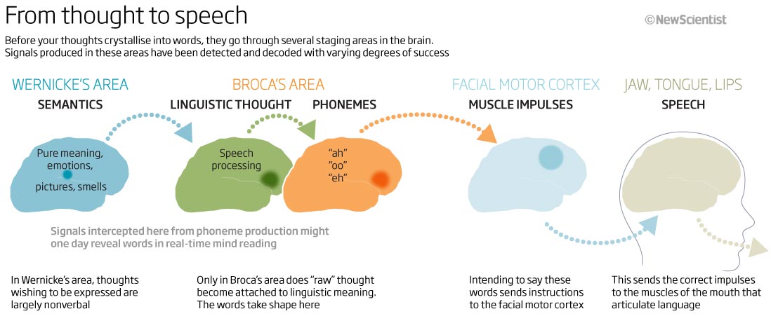
Text and annotations on a graphic are as important as the visual, the headline or anything else. Here we have a sort of a flow chart. Explaining how our brains go from thought to speech. As we read left to right the flow should really go the same way to help the reader with the flow of the graphic. I think this works quite well, showing the process, the area of the brain involved and ultimately to the jaw and mouth for speech. The additional text underneath each segment adds more information about what is going…maybe this could have been slightly lighter in colour to make not not so intrusive?
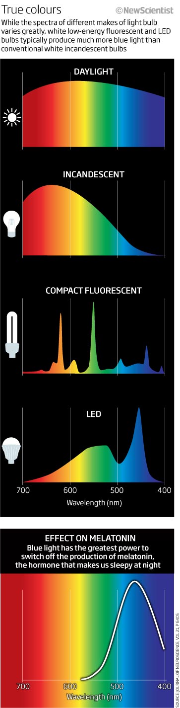
Sticking with the full-length or full width graphics, let’s look at light spectra and the type of light emitted by various bulbs and light sources. We were mainly using incandescent light bulbs back then and so here we look at the difference in spectra from daylight to LED lights. At last! a use for a spectrum scale!
After a couple of graphics that work quite well and are, in my eyes, still informative and worth looking at, we end with something that is just messy and seems unfinished.
. This graphic using number of dots to show the data. I find it all a little confusing as there are just too many dots off various different sizes. We have the planet and exoplanet sizes in scale (Earth, Jupiter, super Jupiter etc) as well as the dots counting the data…to dotty! Also, where is the title? what am I looking at? Why am I looking at it? What am I supposed to take away from this? and to top it all off we have (physically) large numbers doted around.
After that one, I think we should leave it this month. June 2011 is around the corner.
4th June 2021
April 2011
This month we have cats, cold fronts, cosmology, carbon and more.
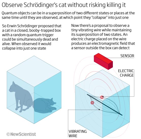
Beginning our look back this month, we start with a simple graphic trying to explain Schrödinger’s cat and quantum theory. Something I have probably drawn 6 or 7 times over my period at New Scientist. This one looking at a vibrating wire. Even if you don’t totally get Schrödinger’s theory , I think it’s still understandable as a graphic. Lots of text but it is as needed as the visual – one that needs both with both being as important as each other for understandability.
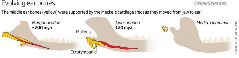
I always enjoyed freehand drawing, and here we look at the evolution of the middle ear bone using some simple drawings of the jaw, cartilage and teeth, showing the changes in the shape and size of the ear bones from 200 million years ago to modern mammals. Nice, clean and simple illustration with the important information highlighted in colour, whilst the other information desaturated but still in the background.
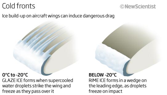
A bit of 3D now showing two types of ice build up on a planes leading wing edge…but what is it telling me? A good enough visual of the the ice forms but the explanantory text doesn’t help me understand why this is important and what happens and how it can induce dangerous drag – as the header states! As a visual journalist, this is a failure and so therefore not an effective graphic. Too many unanswered questions…
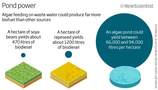
One more graphic that has problems…again, good enough to look at but is it effective and does it do the job it is supposed to do? I am not sure. The headline is ‘Pond power’ and the sub-head states that algae could produce more biofuel than other source – I think in this instance I am emphasising the 3D illustrative elements more than the blue sizes of the biofuel litres per hectare, they are the most important data here. It is important to stand back and make sure that the point you are trying to get across is the one that stands out and not other elements that may be good to set the scene or give context…another graphic that needs to be redone.
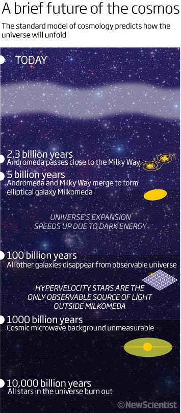
Another time line now – and another one showing the standard model of cosmology and the future of the universe – and another that is using a log scale. Using a log is not always understood by everybody but in many instances it is the only way to get the formation into a relatively easy to read form. Not much to say here expect it is clean, simple and very illustrative with shading that gets darker the further you go forward in time.
I am producing, and have produced, many graphics based around carbon and the climate crisis over the years I have been working, always looking too add to the data we have and know as well as trying different ways of showing whatever I am trying to explain. I have two graphics here from a feature about carbon. I don’t know any more details as to the reason for producing them – both have no headline!
The first one is just a series of lines and arrows…so really quite useless. The colours are not helping me either! Obviously it’s all to do with capturing carbon, but I don’t really understand why there are three versions of the same looking thing.The lines/arrows are all the same thickness with colouring being the same intensity!
We really do need headlines and explanatory text included on the actual graphic – it just makes it more accessible and understandable – and that’s surely what we are trying to do, whether it be qualitative or quantitative!
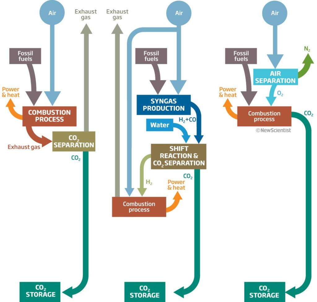
This one is a little more understandable, as it has more text on it and so you can begin to make some sense of the visual…but it’s still difficult and I have to really work at it – again this is not ideal. Much better colour scheme though!
Well, I think that will do for this months look back 10 years ago to April 2011. Hopefully I will be on time next month.
Let me know what you think and if there is anything else you would like to see.
14 May 2021
March 2011
Better late than never! Power, plants, pulses, prizes and more this month.
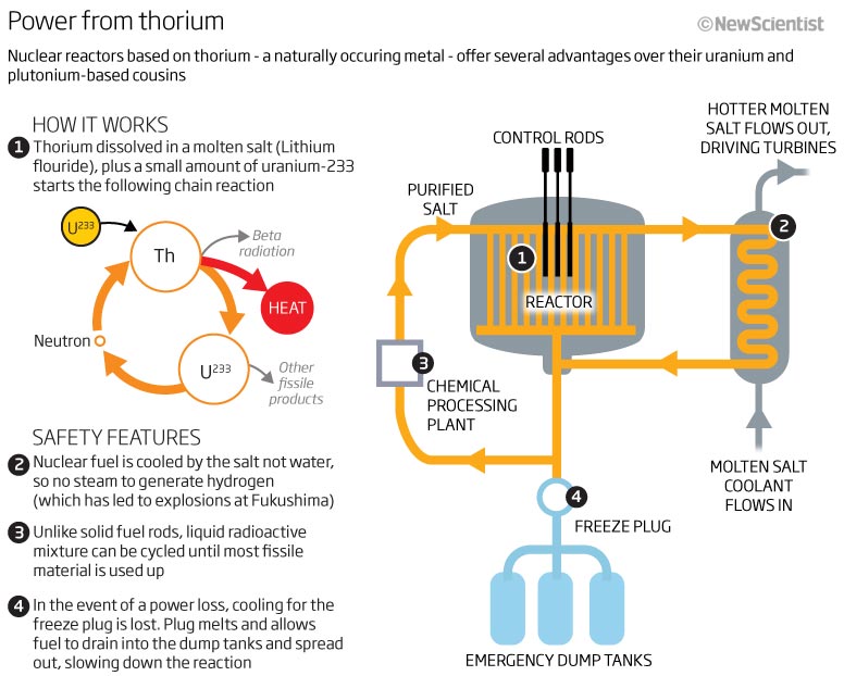
So let’s start with the one I added last week (see below). A small graphic containing a lot of information. An easy to understand title and explanatory sub-head. We then have a 1-4 process showing ‘How it works’ . The flow of info is fine and although we do have a lot of text, it is quite easy to follow. Although it looks quite cramped, I don’t mind it as a graphic. Sometimes the space you have to play with is tight and fitting (editing) in the relevant information without leaving important bits out is difficult – but an important part of the job of a infographic designers role.
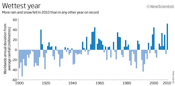
A bar chart next looking at annual worldwide rain and snow measurements. The wettest year, is that true? I think it should have been annotated to show that the bars were showing the annual deviation (dark = increase, light = decrease) but from what? It says average, but is that the average from 1900 to 2010 or another date range? Sometime we should be very clear on what the data are showing – and in this instance that is not the case.
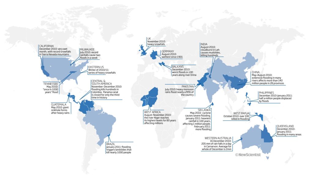
Let’s keep with this feature and look at the map. Again blue to keep with the water theme. I believe this is a map showing major water based weather events in 2010-11 but it would be great to have the headline telling me this…or at least some explanatory text!
So we will pass over that and go on to pulses. This is a nice 3D-effect slice of the Earth showing how, over millions of years, we see a ripple effect on the Earth’s surface caused by hot rock from tectonic plates. Good colours and the eye can follow the time-sequence down the page. An example of a static graphic that would works both as static and as an animation. Tells the story well in the text but reading the text isn’t absolutely necessary in this instance.
![]()
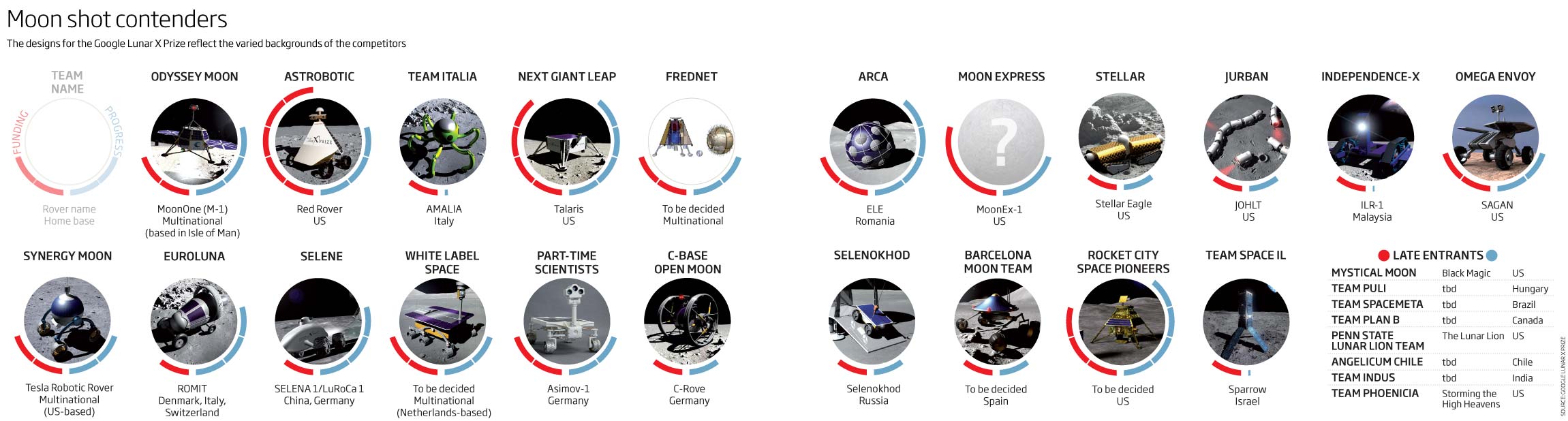
From a vertical full-page graphic to a horizontal double page graphic. The way we read graphics is as important as the look, the information and the design. Here we are showing all the contenders for the Google Lunar X Prize and where they are in the process when it comes to funding and progression of the Rovers. I think it’s an interesting, clean and easy to understand graphic showing as much info as we had for all the competitors. Maybe I would now desaturate and make lighter all the pictures in the middle to highlight the progress more – maybe even draw the rovers if I had the time…but all in all, a good graphic.
A couple of colourful graphics to end this months look back 10 years. A ‘very’ colourful 3D map to start with. Obviously we had very little space available and so this is a good example of how to cram as much into it as possible! Even so, I think it does show the info well. The text explains what is going on succinctly – although why we have to have the 3D global as well as an inset map showing the Gulf of Mexico, I don’t know! Less is more, I always say…although looking at this I didn’t always heed my own advice!
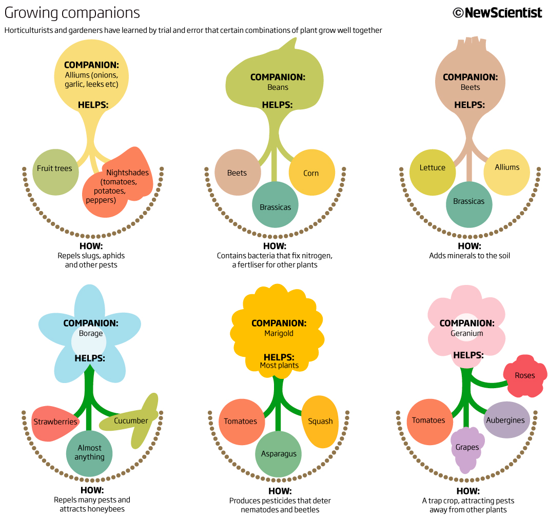
To finish with this month a very simple graphic showing how certain combinations of plants grow better if they are planted near to each other. A kind of plant symbiosis. A clean, simple, iconographic approach to getting the idea across. The headline works well whilst the additional text is very helpful. This was actually printed in the magazine at the time (lack of space) and only used online! Shame as it would have looked great as a full page. It has had many requests from gardeners around the world to use as a poster though…so must be a good way of explaining the information!
That’s it for March 2011.
More next month
12 April 2021
March 2011
Apologies…it’s on its way. I’m busy with deadlines and teaching but hopefully by the end of the week. In the meantime here’s a sneak preview – good or bad?
06 April 2021
February 2011
Looking back ten years ago to February 2011 we have Mars, Exoplanets, Timelines, birds and mechanics! What more do you need in one month.
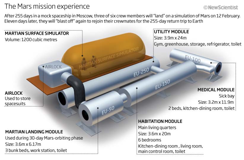
This month we had NASA’s latest Mars rover, Perseverance, land on the red planet. Ten years ago we were looking at an experiment that was being conducted to see how crewmates would survive the long trip to Mars and back living in a mock spaceship for 500+ days. Just a simple graphic showing how the mocked up spaceship looked (Cinema 4D, photoshop and illustrator), showing size and explaining what each module would be used for. Could have been 2D but this makes it more ‘real’ as we can see the flow of each cell as well as the Martian surface simulator that the crew would use. A cramped graphic as we we would have had limited space within a news story.
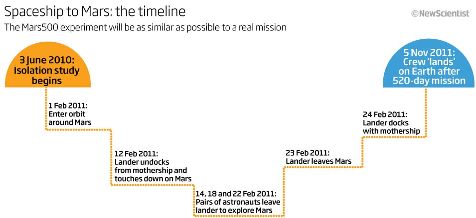
We also have an example of a timeline on the same subject matter. This is a great way of explaining what will go on and how long the crew with spend in each phase and what they will be doing at the time. I particularly like the stepped approach that I took here to give the impression of time as well as altitude as the crew travel and land on ‘Mars’ and then taking off and travelling ‘back to Earth’ .
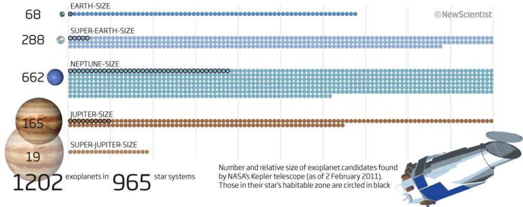
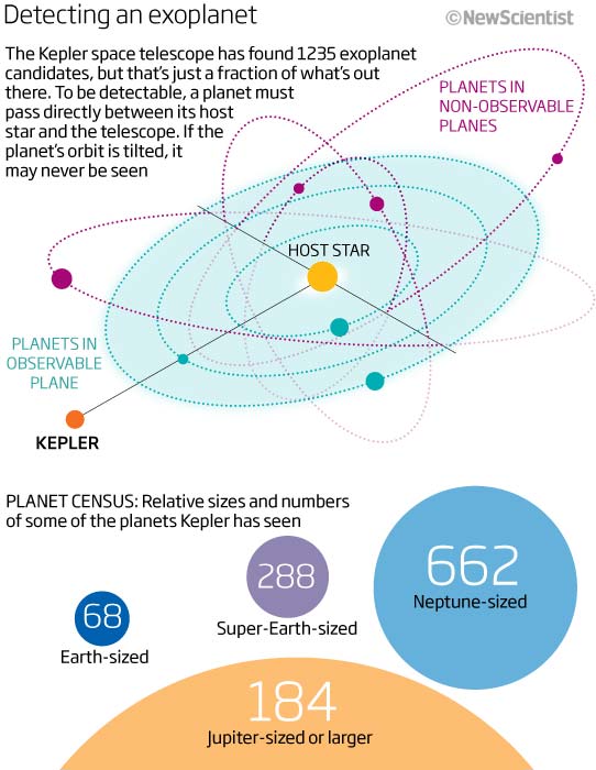
Keeping with space. A graphic looking at how many exoplanet candidates had been detected by the Kepler space telescope. Not the best or most intuitive graphic. The top section is trying to explain that, to be detectable, the planet must pass between its host star and the telescope…I have just explained that in very simple terms whereas the graphic is just confusing – too many orbits, lines, dashes and colours! I think this is a case (looking back now) where two or three smaller, simpler and explanatory graphics would have worked much better with the text.
The bottom half is not much better. I think it sort of works as long as you have read the text but it is confusing to the eye and mind because the big numbers do not correlate to the size of the graphic element! Think this may have been better as a different chart type or maybe two types. A bar chart with number of planets seen with (maybe) a visual cue to show the size of each particular planet, maybe the way to go?
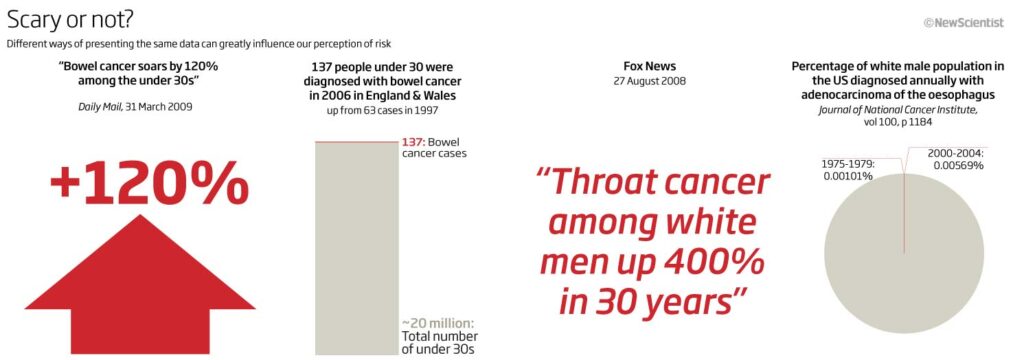
This year we have all become accustomed to seeing lots of data produced in many visual ways…not always to the good! This was obviously a problem back in 2011 as well and so here we tried to show some of these various ways in which data can be ‘sensationalised’ in the media.
We portray a couple of examples alongside what the data could actually mean in a different visual form. An excellent example, of how things can be misrepresented…something we need to think about and be aware of at all times.
Let’s end this months look at my graphics with something based on birds and science. A keen birdwatcher and nature lover, I heard my first woodpecker drumming of the year last weekend – one sign of spring in the UK – and with all three woodpeckers visiting my garden over the year, why wouldn’t I show this graphic.
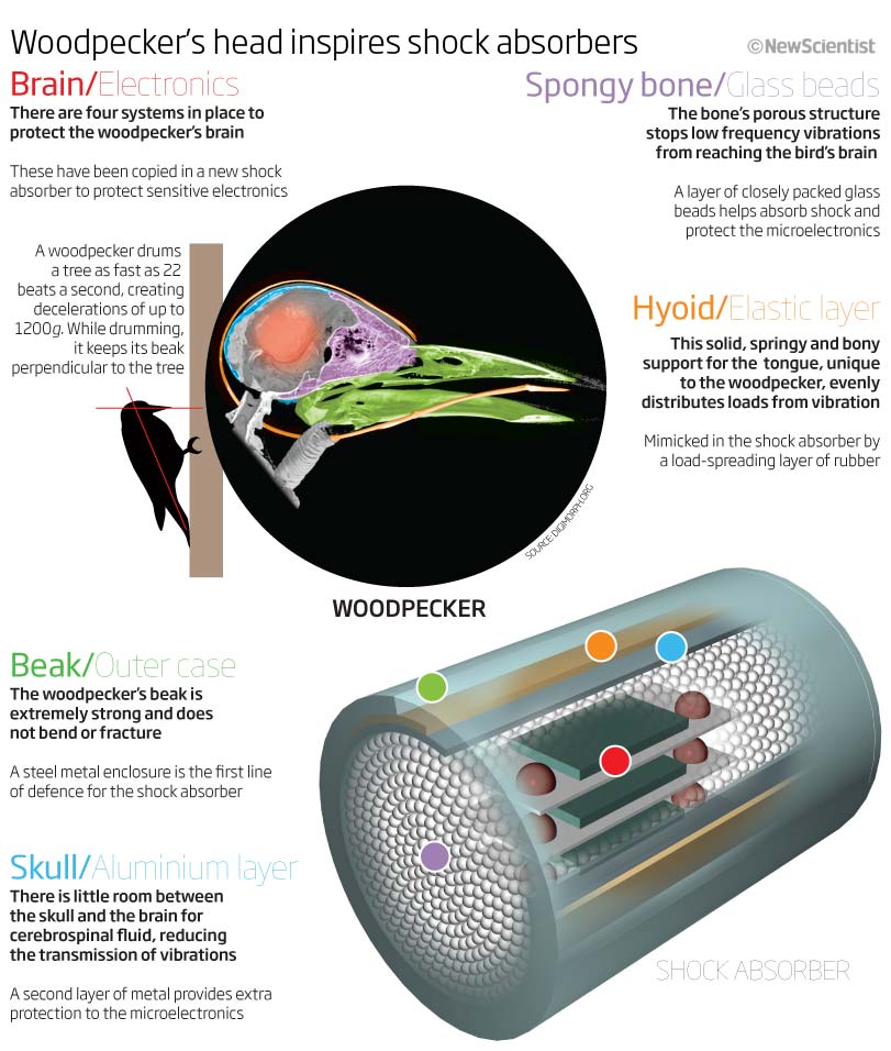
This shows how a woodpecker can drum the wood whilst protecting its brain and head form damage. And then looking to see how this can be applied to a new design of shock absorber. A graphic full of information and explanation and great visuals but just not well designed or laid out.
I really have to read the subhead before I realise that the thing at the bottom is the ‘new’ shock absorber. I can see that I have tried to relate and link colours between the woodpecker skull and the new shock design, as well as using a bold font for the bird and a light font for the shock absorber…but it looses its coherence and flow and these cues get lost. It all just seems to cramped (I may have just been trying to get to much information into to small a space) or I may have just got carried away with the visuals and not thought properly about the information flow…which is paramount in separating an information graphic from an effective information graphic.
Thank you for reading this months looking back 10 years. Let’s see if `march 2011 will be any better
01 March 2021
January 2011
A new year and a slow month. Some examples of why we should try and make every graphic a ‘stand alone’ piece, invisible tanks and alien species are amongst this months looking back ten years at what I was producing as graphics editor at New Scientist.
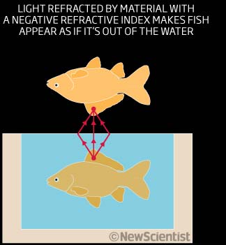
These first few images are drawn from a feature for January 2011, but as they do not include any headers or indeed, much in text or explanation, I am at a loss as to what they really are showing.
I do get something fro these next couple of images as I can now understand how refraction works, but that’s about it! So try and make are that all your graphics are ‘stand alone’.
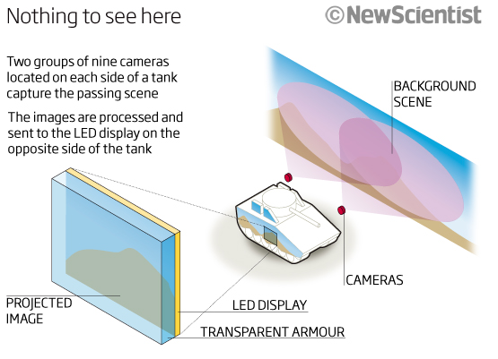
So let’s try with something that has a headline and something that shows or tells the reader what they are looking at and how to interpret the graphic. I like the headline!
A simple little graphic showing how a tank can become ‘invisible’ in the battlefield. Good explanatory text and annotations. Although how it would work from the other side or front, back and top view, I am not sure. Nice idea, although I haven’t seen it deployed in the ten years since I drew this.
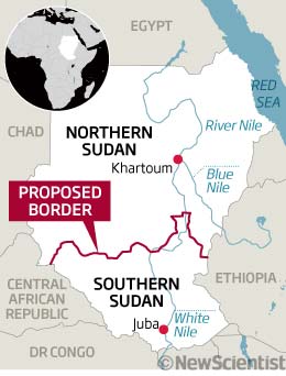
I have included this small map just to show how the recent past is so recent. Ten years ago Sudan was still one country! It is now the Republic of Sudan with South Sudan to the south. No headline still.
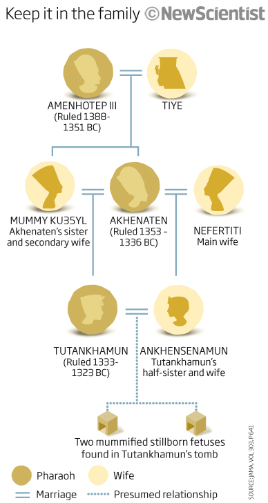
A timeline now. A good use of the imagery (head profiles) associated with the Pharaohs and Egyptian mummies. It is always a good idea to use something that helps to memorise what the graphic is about. Whether it’s colours to signify something like nature or space or desert, or, as in this case, iconography to help who is who in the chain of ancestry. I do wonder what the story was about and why we were running it at the time? I need to do some digging to find out.
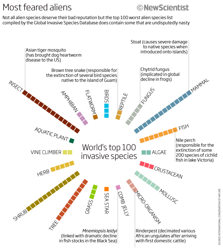
Wen will end this month’s brief look at January 2011 with a feature graphic visualising the number of particularly invasive or nasty critters, creatures and plants from around the world and compiled by the Global Invasive Species Database. It does take a little bit of thinking to work out that each square signifies one species in each category (it would have been better to say this in the sub-head) bit I do like its colours and clean look and the circular layout was probably done for aesthetic reasons as well as to fit into the layout! I do like the pull-out text explaining where some of the nastier ones are. I wonder where they Crayfish is ( I see many of these ‘killers’ decimating our river life on my walks.
So that is enough for this month. I look forward to seeing some real horrors soon, maybe next month! Unless you think any of these is a particular horror…if you do then please let me know. I am always open to discuss a particular. month or graphic. Until March 1st.
03 Feb 2021
December 2010
As was normal back then the final issue of the year was always a celebratory double-issue packed full of fun pieces and so we end on a bit of a festive feel in the graphics department as well. Alcohol, red wine, Turkeys and more to look at.
Let’s start with alcohol! A nice little graphic using the shape of the beer pint glass to show the relatives bitterness values of craft beers. A good use of headline, icon, size (the more bitter and more alcoholic, the more in the glass, and the darkness of the beer, from the paleness of a Bud Lite to the darkness of US IPA. 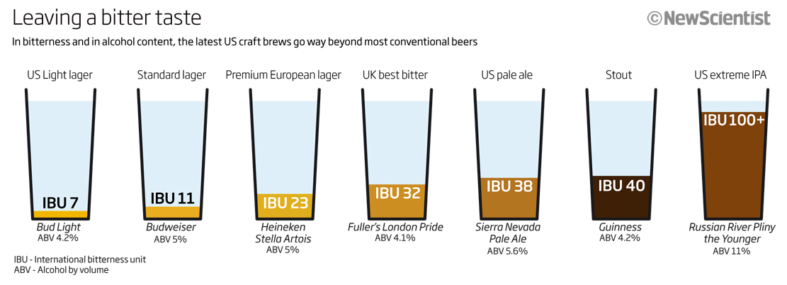
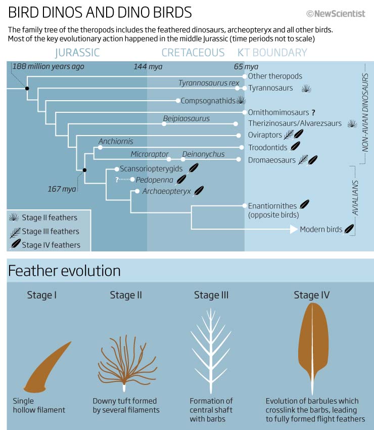
Next we have a timeline, of sorts, Looking at therapods in the evolutionary family tree. A good, simple graphic with explanatory text above and icons on the timeline to help the reader understand the feather evolutionary stages. I like the way we have explained the feather stages (in the key of the main graphic) with an additional graphic below, using the same icons but with more detail. Although the time periods are not to scale (which I hate), at least we have stated that no ambiguity there – we obviously did this to enable the text to fit in the graphic space we had to work with…nice!
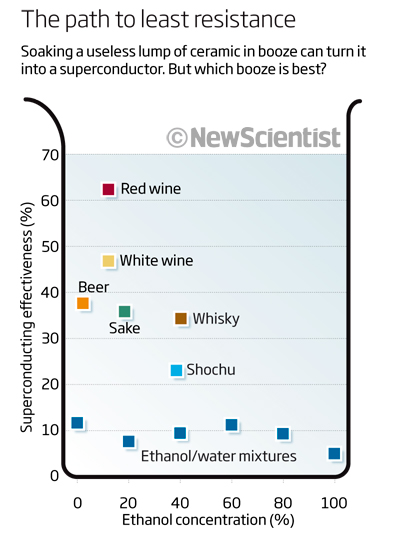
Another festive graphic, this time a simple scatter plot looking at which drink would make a better conductor, from ethanol to Red wine! This doesn’t really need any explanation, again using an icon shape…red wine wins!
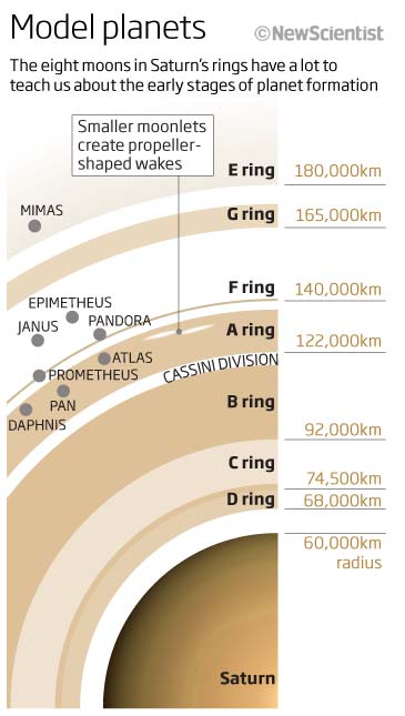
A space graphic in a single column now – so limited space – looking at the eight moons of Saturn. Producing a visual of what is quite a large object but using limited space was, and still is, a perennial problem. ‘How much or how little can I show to get the relevant information in?’ and ‘Will it make sense to the reader?’ are two of the questions we must consider when doing this. These questions as well as thinking about the text needed and the accuracy of the scale are others. I think this worked out well and does show the information of the rings, their names, as well as the distances from the centre of Saturn – and the colours used. All in all a clear, simple and clean graphic.
As that was a clear graphic thought I would show one that doesn’t quite live up to what I complain about daily and speak about in my workshops…using icons just for icons sake or to ‘jazz’ it up a little… seen here, it is not always a good idea! ‘We have some random numbers so come up with something that is meaningful for each’. Not sure it really works and with something like this, often or not, the time involved in coming up with the ideas and then drawing them is not really a good use of time. What do you think? It would be interested to see what others think, so please let me know. I can see what I was trying to do but I don’t think it was a success.
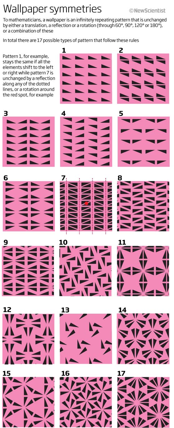
Mathematics and patterns next. Here we have a graphic showing the 17 possible types of recurring patterns of wallpaper. Something good to look at and wonder over whilst you stare at the walls over the Christmas break! All 17 have an unchanged repeat pattern, either by translation, reflection, rotation (60°, 90°, 120° or 180°) or a combination of them…fascinating, and I did end up looking at patterns everywhere I could when I looked at this yesterday, including in nature on my lockdown walk this morning.
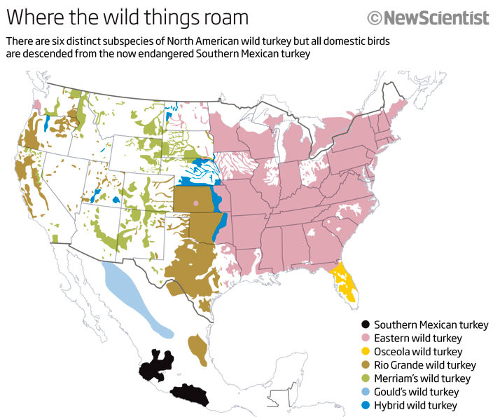
We will end this months, and this years look at the graphics I was making in 2010 with our last seasonal graphic…a map of the US and Mexico showing, in black, the Southern Mexican turkey and the different sub-species of that across North America. I would never have thought that there were so many sub-species of wild turkeys.
And so we finish looking back for the last month of 2010. Who could have foreseen what 10 years in the future would have held for the world! With vaccines on the horizon in the next few months we can only look forward to a much brighter 2021 and to the next instalment looking at January 2011, I wonder what we will find?
Take care and be safe…on to 2021.
30 December 2020
November 2010
The end of this year is fast approaching so lets look back at what I was producing in November 2010. No pandemics, no social distancing graphics charting just how big Google was getting even then.
This month we have bar charts, line charts, treemaps, timelines, 3D graphics and time travel, so let’s dive in…
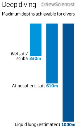
Let us start with a simple, small bar chart looking at maximum depths achieved by divers. Not much to say about this, the bars dive down from the horizontal and are shades of blue to signify water. Simple, clear and easy to take on board information. Maybe it would have been better and easier to remember if we drawn icons for each bar as there are only 3 bars – a scuba diver, a deep diver with atmospheric suit and a liquid lung – all these things matter when it comes to information retention.
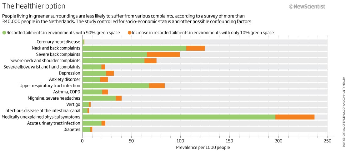
Next we have a couple of graphics from a feature looking at carbon emissions. The first one is a stacked bar chart showing the difference between prevalence of ailments per 1000 people for those with 90% green space and those without. Quite easy to understand but I do wonder what the thought process was (if there was any!) with the order…or lack of order. Why not order ascending or descending or alphabetical? There seems to be no thought in this aspect at all. These, seemingly, simple things that we take for granted, really need to be thought through.
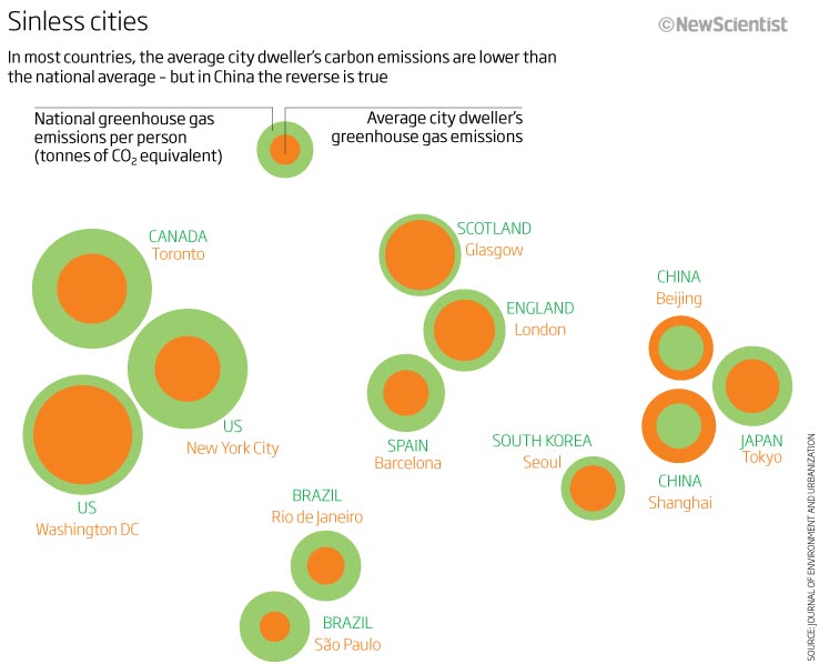
The next graphic from this feature is a map of sorts. This is an area chart based on geographical locations showing cities of the world and how the city compares in CO2 emissions to the national average. It works well in this format and you can certainly see where the hot spots of high emissions per person are. The one thing that doesn’t work effectively, in my opinion, is the colour scheme. The purpose of this graphic is twofold. One to show where most emissions per person are coming from and the places where the average city dweller’s emissions are greater than the national average – one is easy to see, the other is lost in the colour. Using a darker hue or blue against the green would have been better and easier to see.
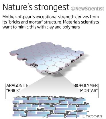
Its always good to see a little 3D graphic. I remember we spent a lot of time learning and refining Cinema4D so that these sort of graphics could be produced quickly – normally within a coupe of hours – using Cinema4D,. Photoshop and illustrator. Simple clear graphic showing the structure of Mother-of-pearl.
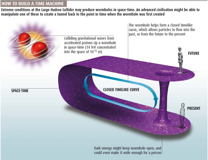
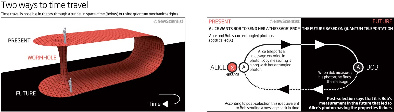
Let’s keep with the 3D graphics and have a look at how we could theoretically travel back and forward in time. I like this graphic (I’m not saying I fully understand it) because of the colour scheme and graphic content. I think it look smart and distinct with just the one colour other than black and white. The only thing I would probably change now would be to change the person at the ‘Present’ side of the wormhole to somebody that represents Alice as in the explanatory graphic next to it. Still find the Alice-Bob quantum entanglement really difficult to get my head around though.
The next graphic is a very interesting one and quite unusual for us at the time. How big is the web that can see plus the web we can’t see…the dark web. This was a double-page graphic! I obviously thought that the visual would be much more impactful to be shown this way and, as in all newspaper or magazine companies, with the real estate being a precious commodity, we must have fought hard to get this much space. Effective!

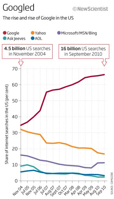
Keeping with that theme, Google was obviously taking its place amongst the search engines, percentage wise. This is pre google the verb! A simple chart showing the percentage rise of Google compared to its rivals at the time like Yahoo, Bing and AskJeeves.
This is atrocious…how not to do a time line! I can see where to start and where we end up but in-between!!! a total failure. Confusing, frustrating and unnecessarily complex – try again!
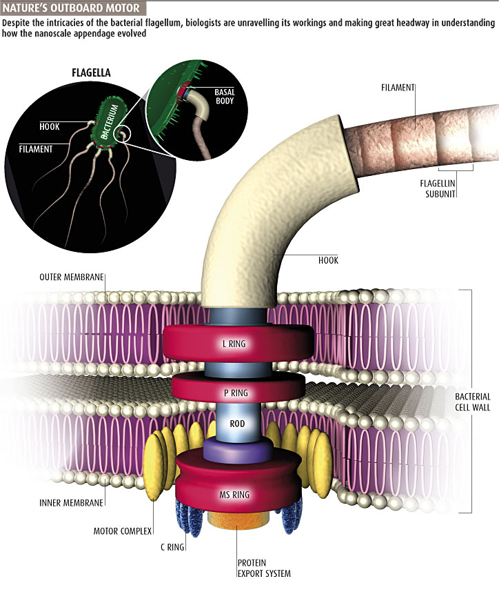
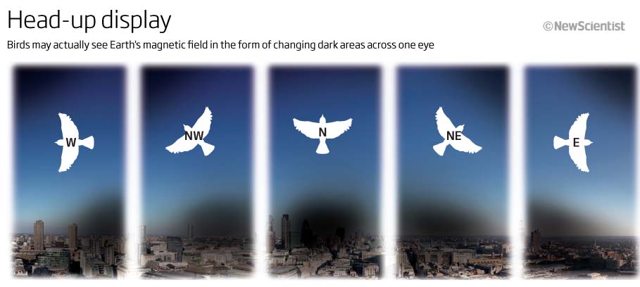
I have included this graphic as it is a subject that I had to revisit recently for the BTO (British Trust for Ornithology). In this one for New Scientist we show how a bird may see Earth’s magnetic field in its eyesight and therefore how it might navigate this way. Using separate panels to show various changes in the orientation was a simple way of explaining what we think was going on in the birds brain. The graphic I produced for the BTO was along similar lines showing how birds navigate using the magnetic field, but also using other techniques such as the sun, horizon, and azimuth as well as the rotating stars and night sky. Again separate panels to explain each theory and icons of the bird to help the reader remember what we are talking about.
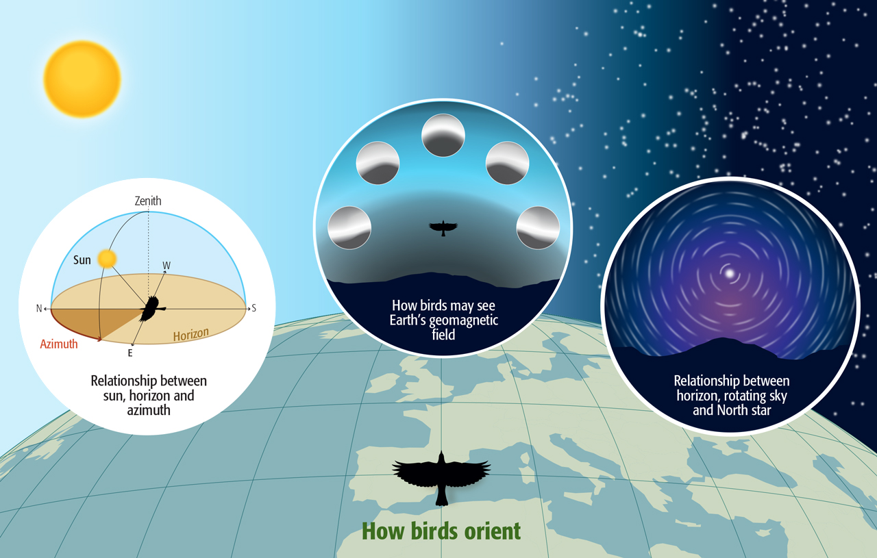
Originally produced for the BTO
The one thing that spans all of these graphic this month, is we have simple, clear headlines and good explanatory sub-heads and text on each.
Onwards to the Christmas and the New Year selection…see you next month
01 December 2020
October 2010
September 2010: Chaotic evolution, supercooling chips, extreme weather, stiff space dogs and more…
I will start the month with a bar or pyramid-like chart. One axis but going in two directions one showing power dissipation and one showing processor speed. What we were trying to show where was that as speed increases the dissipation of the heat needed was also increasing and more or less proportional, which I think this show’s very well. Good to see us trying a new look for the bar chart and not just the normal two bars charts one above each other.
We will keep with heat and have a look at a feature graphic looking at extreme heat and humidity due to climate change. A good example of why we don’t use the rainbow scale on maps or graphics, or at least a range of colours that don’t help in trying to work out which is cooler and which is warmer…this is really confusing and I have just found that it actually works better if I have a red-green deficiency! This graphic is looking at extreme heat and humidity. I am not sure its an easy graphic or concept to grasp and after looking at it for a while (not a good thing to have to do with any graphic) I am still not sure it shows the information in an easy format and especially using ‘Frequency of occurrence’ as a unit means much to anybody especially using 0 to 2 as a scale and not just ‘Less to More’ instead?
I obviously had fun and some spare time to produce the 3D earth jet stream graphic. I do remember that trying to portray all the elements that make up our weather around the world was always a difficult thing to do and even now I do think this is a good way to show it. I think the blue cells around the outside are too heavy and actually the whole graphic needs refinement but for 10 years ago a good start, I think.
I remember that the use of Cinema4D and space-time were a recurring theme 10 years ago. We had decided showing space-time on a flat plane in a 3D view was a good way of explaining quite difficult concepts when it came to black-holes, multi-dimensions and space in general. This is a good example of something that we did many times – although I do wish we had a title to go with it as I don’t really understand why we are showing it. At least the explanatory text is understandable…so not entirely useless!
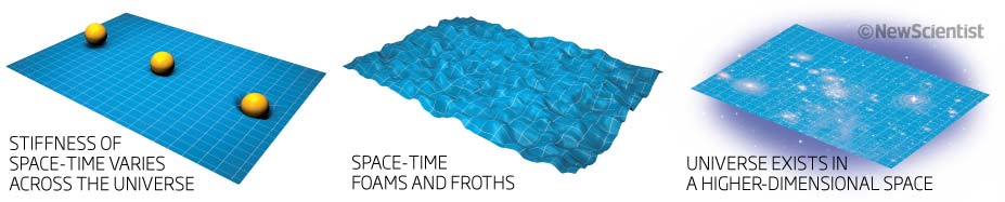
This next graphic is really quite complicated and backs up what the text is saying – that it is very difficult to make connections between the major climate events that have occurred in the past 65 million years – so really this is a summary of this events laid out in a logical and chronological way. A glorified table really containing lots of – very interesting – information. Not sure that it is enticing for a reader, although I would imagine that reading the feature you would want something like this to put everything into perspective.
Let us finish with a couple of simple charts. The first a line chart showing the demand for mobile data growing exponentially faster than the capacity at the time. A simple two lines show the growth and the expected crossover in 2013 between capacity and demand if nothing were done. I don’t think in 2010, people realised just how much data would be needed or used but at least they were looking ahead. Simple and clear graph.
The second chart is a stacked bar chart or tree char – not sure which it is – but its looking at dog genomes and where that places them in four broad categories. Not sure why we were showing this and what use it is but at lest you can see that most dogs are made up of ‘Modern/hunting’ dogs with others all in a secondary category…but no data shown! So not sure if it is any help to anybody!
Not much really innovative or exciting this month, but still, it does show that we were trying new things 10 years ago! – some successful and some less than successful
Hopefully a bigger collection next month with some real goodies or baddies!
04 November 2020
September 2010
September 2010 seems to be a month of circles and too much text looking back at the graphics I was involved in whilst Graphics Editor at New Scientist. This month we cover the sun, cement, satellites and spills
So let’s start off with a map of the artic, well I think there’s a map underneath the swathes of text!! I know we often have to fit in a lot of information on a visual but surely there’s a better way of showing this? Maybe a smaller locator map with a list of the locations and information below it? It could have been so much neater, accessible and understandable. There is no header! So I don’t really understand what I am looking at or why – obviously it’s about oil, pipelines, reserves and spills – but I don’t understand why its important (it must be important because we have produced a graphic – so tell me why I should look at it!). So, for all those people I teach and repeat, time after time why we must have an explanatory header and text on each graphic…here is a great example of how not to do it.
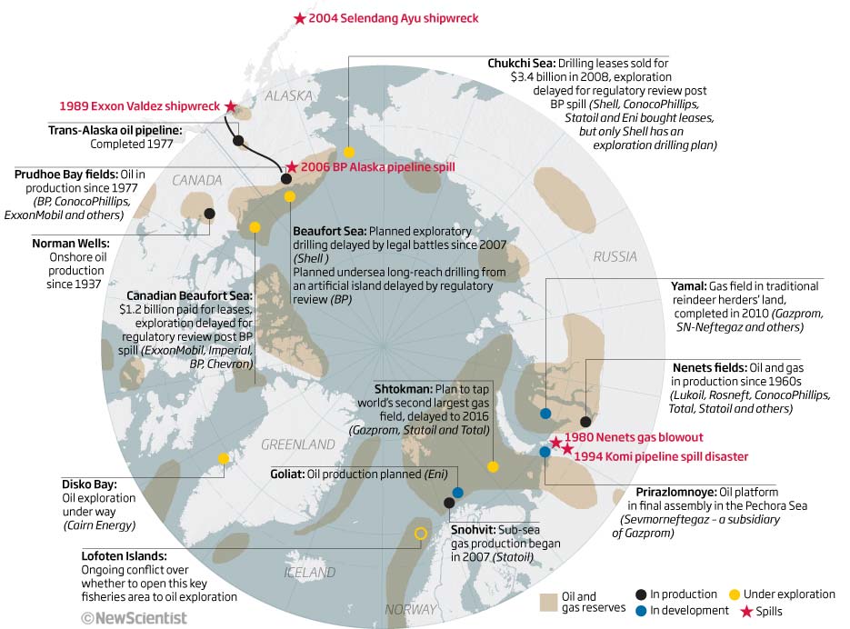
A simple little graphic showing the amount of space debris orbiting our planet. We can easily see that the debris is concentrated in low-Earth orbit and the fact that there had been a collision between two satellites so we are showing the areas where that debris was flowing. Again, we missed a trick here as the orbits we are really interested in should have highlighted in some way within the graphic as well as the sub-head text. A reasonable graphic but one that has been done by many others since then in much more effective ways. Examples of others doing it around this time were Scientific American https://www.scientificamerican.com/article/space-age-wasteland/ there is also a discussion on Edward Tufte’s site https://www.edwardtufte.com/bboard/q-and-a-fetch-msg?msg_id=00004b 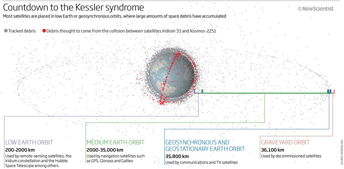
I have included the next graphic purely because it is a rare example of that period in time that uses photographic images and graphic symbols together – and a full page graphic as well, which was also rare as text and photography were very much the main elements for the magazine with graphics coming as a secondary thought or even a space filler!. We were really pushing to give the graphics more prominence at the time but it was always a tug-of-war between all the elements to get on the limited magazine real estate page. Lots of text to read on the graphic and I am not sure it is successful, although I do like the contrast between the photographic image and the icons.
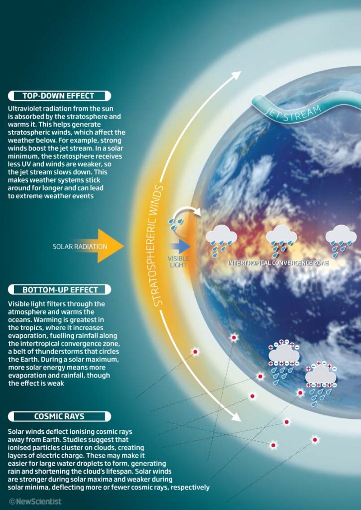
Next a feature graphic looking at emissions produced during the construction of the Burj Khalifa. It had just been finished and so a good building to highlight how much CO2 had been released using the 70,500 tones of concrete needed. The difference between the CO2 emissions and what might have been saved if a ‘green’ alternative had been used is a huge number and so circles (area chart) was a good way to show the visual differences. I think this graphic still looks good and works.
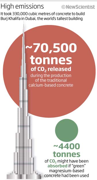
More circles and more maps. The final graphic for this month looks at potential oil pollution from ship wrecks on the seabed around the worlds oceans. The simple map shows the known locations of many of the wrecks (many of which sand during WW2) as black dots on a world map. Keeping with the oil and circle theme we also show the size of some well known oil spills, such as the Exxon Valdez tanker spill from 1989 and the Deepwater Horizon oil disaster that had happened earlier in 2010. I quite like the 1 tonne of oil = 7 barrels = $2300-17,000 nugget of information embedded in this as it does try to give a ‘real-world’ idea of size and costs.
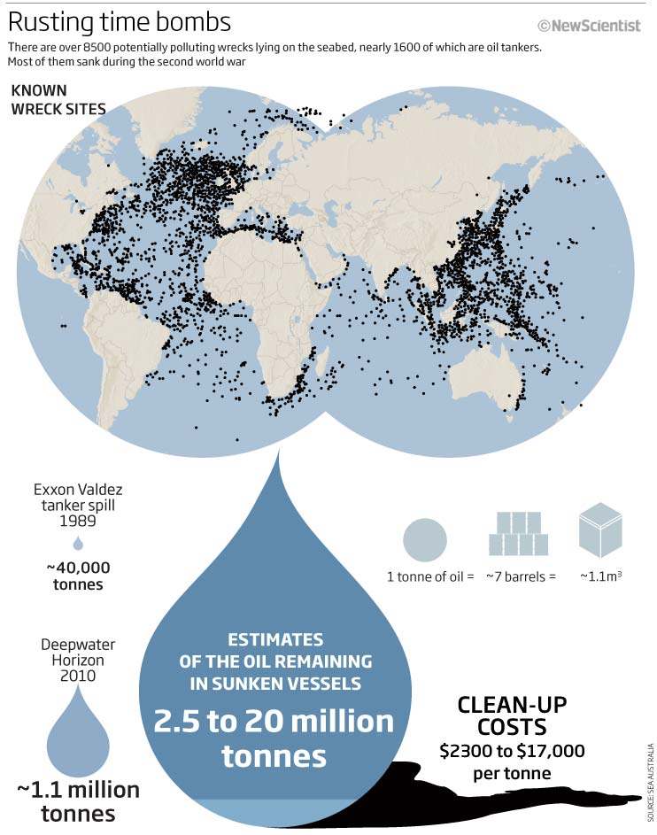
We did actually produce around 25 graphics in September 2010 (still a small number compared with other months) and so this is just a small selection to comment on. Let’s see what next month brings. Stay safe.
02 October 2020
August 2010
Summer and a slow month for graphics, but we have a selection looking at the normal suspects of cloning, obesity, sea ice and the perennial problem of timelines.
So let’s start with obesity. I think this map would look very different 10 years on! The UK and US with decreasing childhood obesity! At least the colours I have chosen work for red/green colour blindness. I think the inset chart is really the most interesting data and think I should have made more of it…I especially like the icon I used for the ‘Levelling off’ category.
Next we have a flow chart type graphic looking at the differences between reproductive and therapeutic cloning. A simple graphic that reads well and explains the differences but would have been good to have an explanatory header at the top rather than just the titles at the bottom – or if it had to be at the bottom then I should have made the font bolder and maybe larger with an explanation – ‘where do you want the reader to start reading?’ A D- for this one! These things are as important and should have as much time spent on them as the lovely 3D graphics and sheep illustrations!
A couple of graphics from a feature now looking at sea ice extent and how it was changing 10 years ago (nothing changes there!)
Both graphics show the same sort of idea – that the sea ice is disappearing. So let’s start with volume. 3D graphics showing volume have their place and I think this is one of them. To see how much of the cube has disappeared is a good way to show what is also being shown in the line chart next to it…backing up the data in a visual way, BUT I really shouldn’t have made the 1979 data red! What was I thinking. The 2009 cube has a red line around it so therefore the 2009 text should also be in red, whereas the 1979 text should all be in black or grey even! Just altering that small thing would have made it much easier to instantly see the difference.
The next graphic based on a map shows the same information but using area rather than volume. The left hand side showing the extent of the sea ice in a line chart, backed up by the right hand graphic showing the extent in ‘real’ terms on a map – simple and easy to see which line relates to which on the map and the chart. Maybe the sea is a little dark or maybe it should be darker?
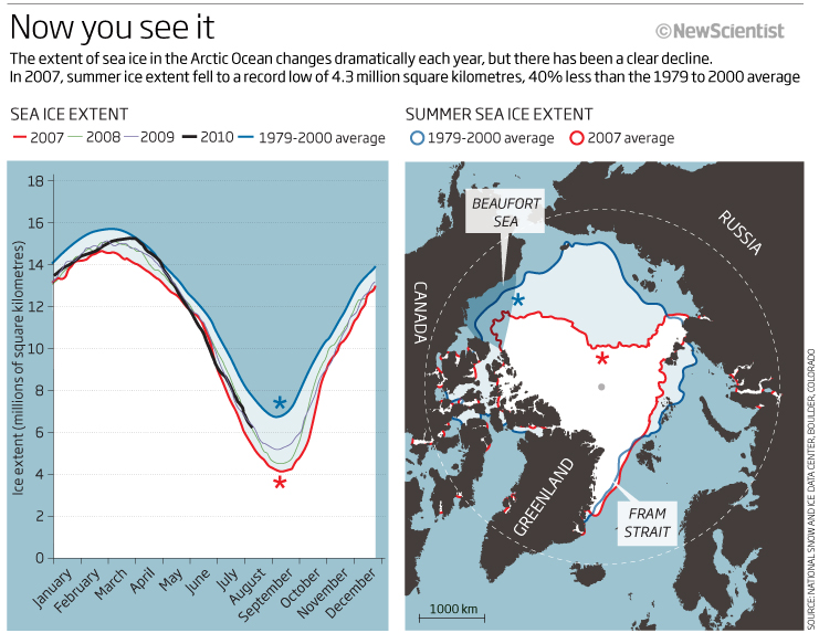
We end this months look back with a couple of timelines. Fundamentally a simple thing but lots of parameters to think about. Fitting in the information is always a difficult task. Do I read left to right/right to left/top to bottom/bottom to top/equal spacing between years or not? Is there too much information? Is the information packed in too tightly? Is it the ideal shape? Should that shape be vertical or horizontal? Sometimes, especially for print, I would want to design it horizontally or vice versa…does that work for the layout? …not much I can do really except make the text logical to read and interesting to look at.
This first one is not that logical and easy to read IMHO. I think there is too much text to take onboard easily and its too cramped. I also think, in hindsight, that the icons could have been coloured and tinted in one colour (don understand why I used these colours) or light to darker tint to signify time marching on or going back in time. These things can help with the flow of the graphic. I’m sure that we only had a limited space to use in the magazine and so that’s why there is so much text being used, even so its a hard to read timeline that doesn’t have much of a logical flow.
The next timeline subject matter is space and rockets and so why not have it vertically? It looks much better aesthetically as it only uses one colour plus black and tints of black. I do want the reader to start at the bottom of the graphic and so something visual or bold to make the eye fall to the bottom would have been good. I do now wonder what my thinking was with the graphic line element behind the icons? What was it meant to indicate? if anything? At lest the flow on this one is better – bottom to top – but the spacing between years is not consistent – one of those things on a time line that matters or not depending on the context and the reason for producing a timeline in the first place.
Thats it for this month. People are on holidays (in 2010 they were…this year its slightly different with Covid-19 still around) and so things were quiet. Let’s see what September brings in the world of science infographics…see you in a month.
02 September 2020
July 2010
July 2010. In this months look back at graphics that I produced 10 years ago we have brains, dinosaurs, brains, satellites, brains, redshift, brains and lots of icons – not a bad selection at all!
So let’s kick off with a donut chart – yes we are all supposed to hate pie and donut charts – and rightly so in many cases, and maybe this one is one of those cases?
 What we are trying to show here are the number of military satellites operated by the top 5 countries compared to non-military and other uses. Using donuts to show the percentage makeup from each country, I think in this case, is a reasonable way to show the information. The donuts sizes are relevant to the overall number of satellites and you can clearly see the % used for military uses. The problem I have with this is that the key is too small (do we need a key at all?) and the colours used are not at all clear using the small dots. Clearly a case for annotating the first chart or using a bigger colour swatch for military uses or keeping the other and non-military uses in grey.
Brains and heads seem to occur many times this month. Here we have a nicely drawn, simple graphic showing the skull differences between juvenile and adult Triceratops plus a look at how the changes in the Torosaurus skull means that it is now believed to be the same dinosaur rather than different species.
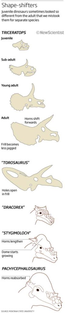
Keeping with the brain theme, the next graphic is again a simple graphic that I still think works, showing the predictive rise (according to the UN) in the number of people suffering with Alzheimers by 2050. The map in the background (Robinson so not the best projection to use) is subtle and is used as a placeholder for the data visualisation – simple two point slope graphs that show the rise continent by continent. As I say, simple and shows simply what we think will happen. The headline and explanatory text also tells the story and helps the reading of the graphic.
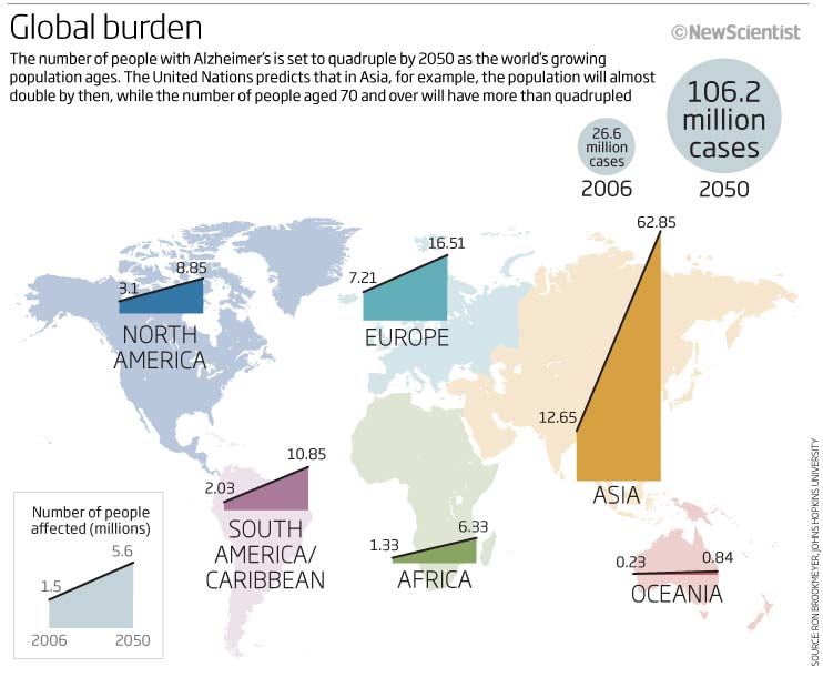
More brains, and again, a good looking and effective graphic? This one is looking at various ways of measuring brain size depending on brain mass, body mass and absolute size. Colours are consistent so that mouse is always red etc. As the headline says ‘Who’s the cleverest of them all?’ The sub-head explains what we are looking at and the reason why. Its very interesting to see how the mouse and the elephant compare looking at percentage of body mass – wow!
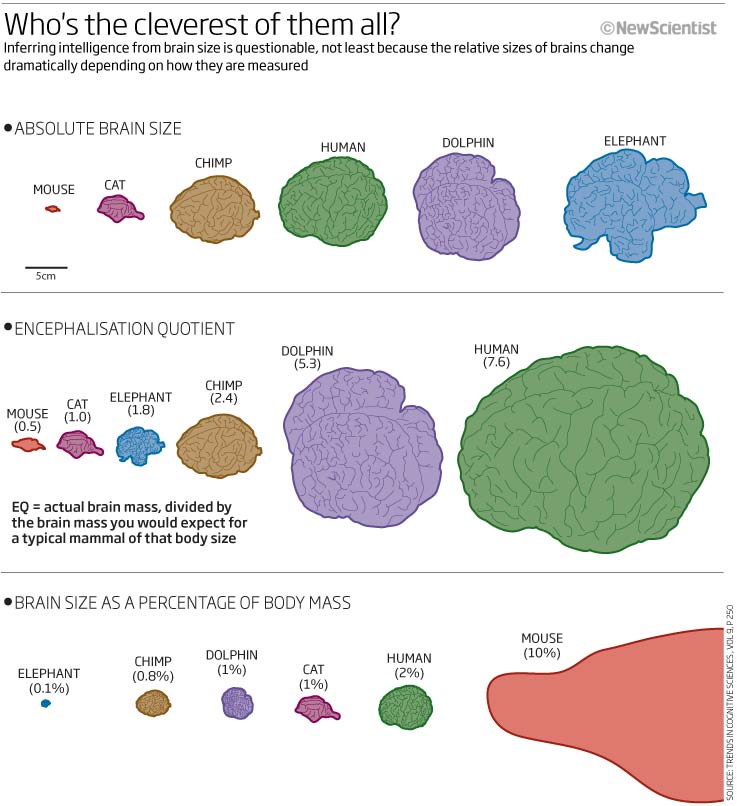
Something little less illustrative and more of a complex network/linking graphic showing where brainwaves happen and what their functions are. A complicated little graphic with, maybe a few too many colours used in the background? It takes a little while to read it and understand what it is saying but I think trying to portray it in a circular way is reasonable and seems to make sense. I’m not sure how Would do it today? but would certainly look at the colours, shadows and look to add text hierarchy/bolding/size somewhat to help the flow.
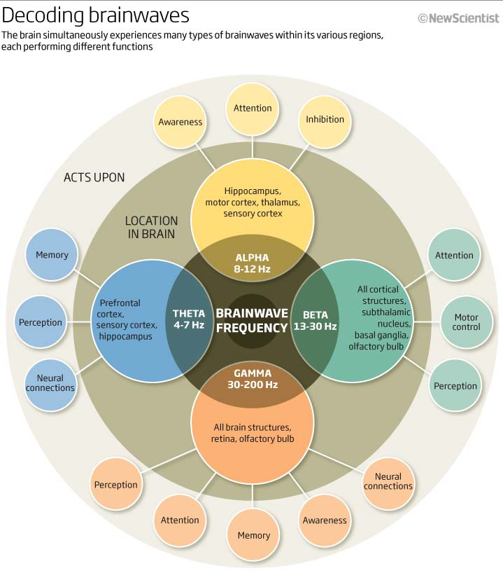
And now for something totally different! A flying submarine. No two weeks were ever the same back in 2010. Here we look at what technologies a flying sub, something the Pentagon were investigating, may have to achieve the aim of 1850km flying in the air and 44km of ’flying’ underwater. Not much substance to the graphic really but a great excuse to produce something in 3D (Cinema4D I believe) that looked good on the page.
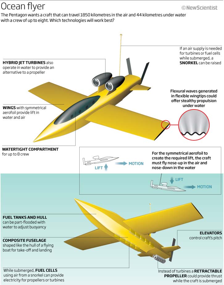
Have included this graphic because once again, we have a visual that doesn’t really help me as it has no headline or explanatory text explaining what and why I am looking at it! When you read the text it does make sense but this particular graphic was obviously used within a bigger page design that incorporated the headline somewhere else, something that I am always moaning about when I see it on social media, so we are all guilty!
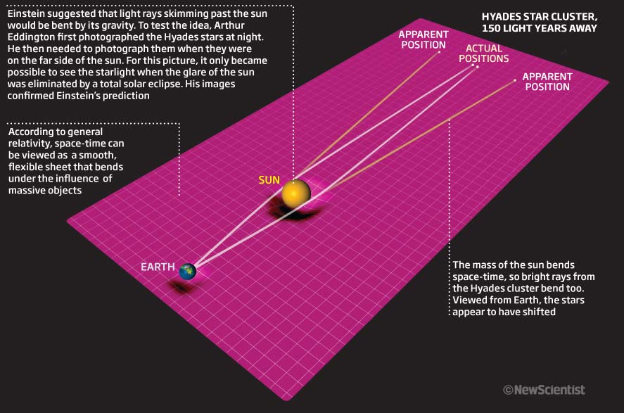
We will finish this month by looking at a range of graphics produced for a special feature on food production. Different chart types, lots of icons and illustrative elements – which I loved doing and still do!
Egg production using egg shapes? Not a bad idea. They are egg coloured and you can clearly see the numbers increasing.
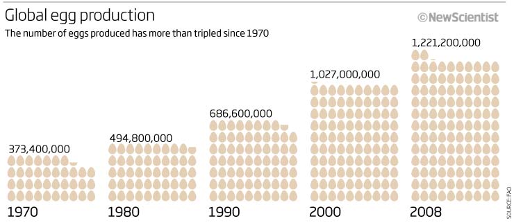
Number of cows and pigs farmed from 1970 to 2008? A line graph showing the trend is an easy way to show the info. Easy to see what we are showing as there are icons fo the animals in the background.
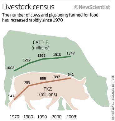
Meat production? Again a slope chart using consistent dates to the above but also using icons coloured in the same way as above to show the increasing tonnage of Beef, Pork and Chicken over the same period, Ok, using circles to show the fdifferences but at least you can see things are increasing so OK to use circles in this instance.
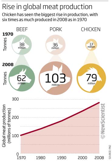
And to finish off another donut chart, this time to show how much of the world is vegetarian by choice or circumstance. Colours help here to differentiate the plant and meat eaters – but what I didn’t get from this instantly was that it doesn’t just show vegetarian vs meat but shows instead that a huge proportion of the world are vegetarian because they cannot afford meat! This should have really been brought out in the headline…something along the lines of ‘Vegetarian but not always by choice’ or something along those lines.
I know its not usual to see more illustrative elements in graphics nowadays but I think they worked well back then helping to cement what we are showing and can still work nowadays to help guide the reader and to allow the information to ‘stick’ and to be recalled in an easier way.
Let me know what you think.
01 August 2020
June 2010
The beginning of summer and we are looking forward to summer holidays and outdoor events. This month we look at timelines, World Cup venues, animal migrations plus the obligatory bad graphics.
So let’s start with something that is a small and could be a simple graphic that I have managed to make unappealing. With so many colours to use why use brown???
We have different cells, two processes (brown and blue), with each process having three ways of reacting – activate, suppress and attack – its just confusing and not something I want to spend time looking at. I assume the reader starts at the top…but I am really not sure. Maybe I had a limited space to fit in the information – that was very often the case – but surely there is a better way of showing the flow between the cells. I should have used very different arrows or other symbols to make clearer the differences between ‘suppress, activate and attack’. Maybe this is a case of showing the information in more than one graphic? It would certainly benefit from a re-think.
Let’s try another form of linear graphic…a timeline. Another good example of how to mask what we are trying to get across. The headline says ‘How long before recovery?’ – the answer to that takes some working out on this graphic. A truncated axis doesn’t help at all. With the colours all having the same intensity your eye wanders around not stopping anywhere. I think we were trying to show that bigger spills don’t necessarily mean more or longer damage but again that is totally lost and the circles showing the spill size are easily missed.
The actual timeline is hidden by so much text. Looking at this again for the first time, it actually took me a while to find what the numbers meant, months, years?? The x-axis text is hidden at the bottom. Variation on text size, weight and intensity of black and colour would have made this a much more effective graphic. The coloured bars at the end/beginning of the text blocks are a waste of ink and there is just no subtlety or thought for what the reader takes from this graphic…a great example of a bad graphic…edit, edit, edit…
The next one is a network graphic that shows the number of times scientists refer to each others work. A simple and effective way of showing this information, clearly showing the main protagonists in the US as well as non-US. Colours help to separate the two categories and although I would probably change the arrow heads to something more elegant but I don’t think I would change much more.
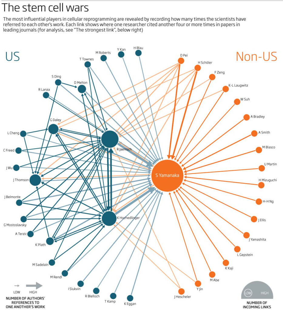
Keeping with circles (areas) to show size, here we have a graphic that does show the data but one that could also have been done many ways. The circles show then amount of gas extracted with shale gas being the darker colour. It is very vaguely placed on a standard map, so that North America is where you would expect it to be and so is Asia Pacific – where I could have improved it would have been to somehow separate the circles a little so that Europe, North America and Former USSR circles were easier to distinguish. Fine, it works but could also have been done as bar charts which would have shown the differences much better – I have quickly shown this in the two small snapshots below.
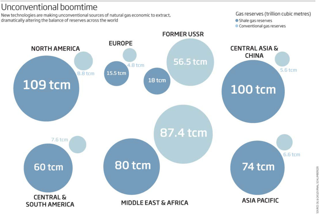
A couple of small graphics showing moth and butterfly migrations. The first showing the silver Y moth (nice to see an image of the actual moth to put it into context) and its route across Europe plus computer simulations of how they would do it. I think the simulations are too large and prominent – but maybe that was the point? – if so, then the main map should have been smaller…its all about thinking of what you are really wanting the reader (me in this case and 10 years on) to take away from the graphic. Yes the information is there but there is no real hierarchy or flow.
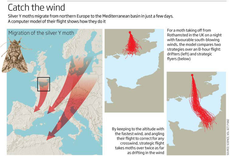
The other shows the migration of the Monarch butterfly. I have included this as I have just completed a similar graphic for Scientific American magazine which shows similar information. Here we are looking at the distance travelled whereas the recent article looks at population size as well as the lifecycle …I know which one works best for me!
Scientific American
Being summertime we have sporting events going on and in 2010 we had the World Cup held in South Africa. This was the first time players would be playing at altitude for many years and we wanted to show where and at what altitude the matches would be played. It was also an opportunity to show the stadiums in 3D. A messy graphic utilising a 3D map as well as heavy 3D bars to show the altitude. I just want to clean it up and reorganise it.
June 2010 was not the best month for graphics from New Scientist. At that time we were producing huge numbers of graphics (500+) for both print and online… and still only 2 people in the role…its not an excuse but I can see that standards are slipping. I hope it improves soon.
01 July 2020
May 2010
This month, whilst the world is still struggling with the covid-19 pandemic, 2 astronauts took off from Florida heading for the ISS, starting private human spaceflight in the US and have docked successfully, so this month we have a timely graphics from May 2010 looking at space travel, eyesight, viruses, internet cabling, Milankovitch cycles and printers of the future.
Speaking of space travel, a timely graphic looking at how Mars could support life when we get there. A news story at the time, this graphic used Cinema4D, photoshop and illustrator and a quick turnaround graphic (within a day) showing how a life-support system (in yellow) would convert waste into nutrients and generate water, oxygen and food – still a good looking graphic. Using the yellow colour you can see the system that we are trying to show and how it fits into the whole life-support process. Luckily we had the Mars Rover already made in Cinema4D and so the other items were really simple and quick to produce. This would have been one of those graphics that was discussed in the news meeting of the day at 10am and ready to send off by 3 or 4 pm! – as I say – quick turnarounds were the norm!
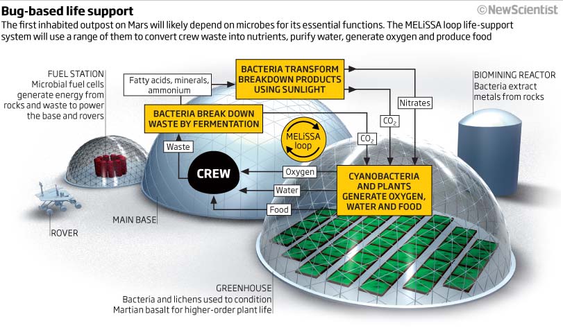
This is another timely graphic considering what has been going on in the UK with people very close to our government driving to test their eyesight!. This graphic is not about focus directly but is shows clearly (I believe) how the Müller cells in out retina refocus the red and blue light so that colours remain in focus. The flow of the explanatory text is very important in showing the process. The subhead is well worded and means that you don’t really have to read the graphic text (although that does flesh out the information).
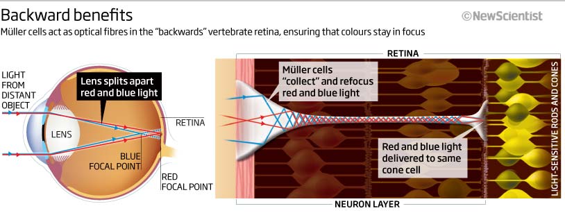
The next small ‘news’ graphic clearly illustrates that more than often we had to fit a lot of information into a small space. In this one we obviously needed to show the cable choke point in the Mediterranean Sea but also fit the information into a limited space horizontally as well as vertically – a normal requirement at the time. In hindsight the sea colour should have been omitted making the graphic clearer (ink/paper ratio) and easier to see what is going on and the ‘inset’ map is too large and maybe shows too much of Europe (one of those minutiae of decisions that can take a long time and can really alter the look and feel of the graphic – like tick lines and grids on a chart or the strength and width of lines)
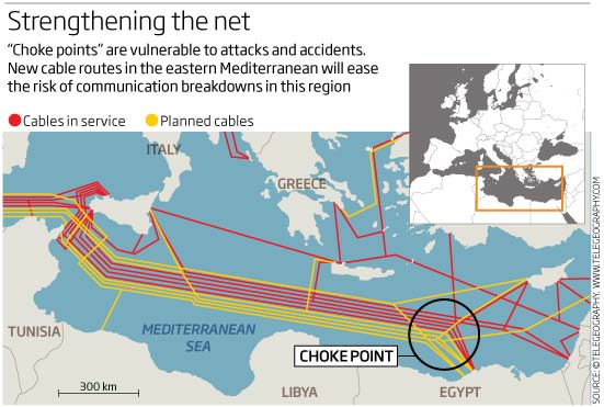
A couple of graphics looking at previous ice ages. A neat and simple graphic explaining the Milankovitch cycle – the tilt, the wobble and the eccentricity of our Earth’s orbit. I think this is a good example of how – and apologies for stating this over and over again – the visuals must always work with, and not against, the text and vice versa.
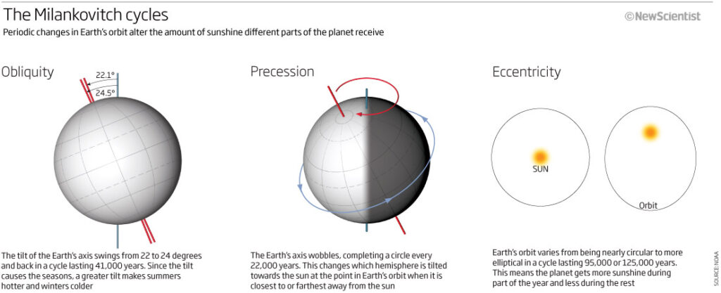
The second graphic is complicated and to be honest, not easy to see what we are trying to show. Some of the categories do follow a pattern quite clearly – Monsoon, CO2 and sea level charts – whereas others are a little less clear! – the colours are atrocious here and unlike the other graphics this month do not work for red-green colour deficiencies. I can also see the monsoon seems to have two or three charts with different colours but without a ket this is meaningless. Maybe this chart should have been done with no colour for the plotting just a colour for the ice age termination (blue maybe!!) – I think this would have made it much more impactful and meaningful.
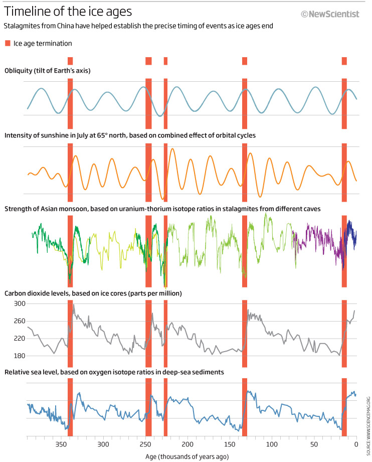
I’ve included this graphic looking at the difficulty of shots in the game of pool, as I think I have made the graphic as difficult to read and understand as some of the shots!!! – even more difficult maybe. I find it an impenetrable graphic. I don’t know where to start reading or looking. Signposting is really important in graphic and this one doesn’t really have any. I am finding my eyes are travelling all over the graphic and not really stoping anywhere. A god example of a badly designed and laid out graphic. I think too much time was spent on making the balls and cue look ‘nice’ whilst forgetting what the graphic is trying to show.
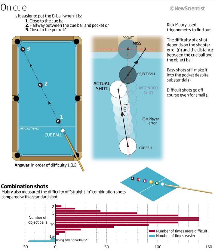
Let’s finish on a 3D graphic showing a 3D printer that could replicate much of itself. The premise for this graphic is to show how much can be replicated but this information is lost by using an atrocious colour scheme! If I was to keep with red then I should have used a red colour in the subhead to help the flow and show the reader what to look for, whilst making all the other parts for the printer grey and/or desaturated and lightened. This would have been more impactful and useful. I think we could have also made it into two graphics – one showing the replicating parts and one explaining how the printer worked.
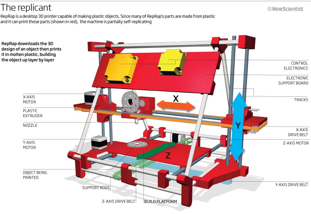
Hope you have enjoyed looking through the good and bad for this month…stay safe and look for more next month.
01 June 2020
April 2010
Another month and the world is still in the middle of the Covid-19 pandemic, stay safe everybody. Let’s have a look at what I was producing in April 2009 whilst at New Scientist.
This month we have kinky air, dodgy perspective, plagues, graphics with no titles and more…
So lets start with one of my pet hates, graphics that do not include a header as part of the actual graphic! Lots of them here so take your pick. Whichever you look at…I have no idea what they are telling me so PLEASE INCLUDE HEADERS IN THE GRAPHIC especially in educational and scientific publications, it really helps.
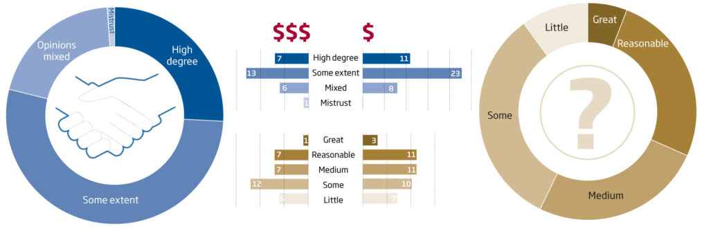
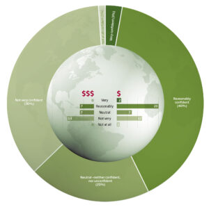
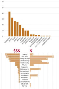
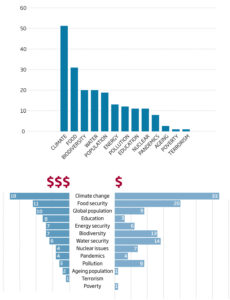
Speaking of titles, we have on here that brings you in to the graphic plus subhead that explains what the graphic is showing. Its something we spent a lot of time on when I was at New Scientist and indeed, something I spend much time on now with whoever I am working with.
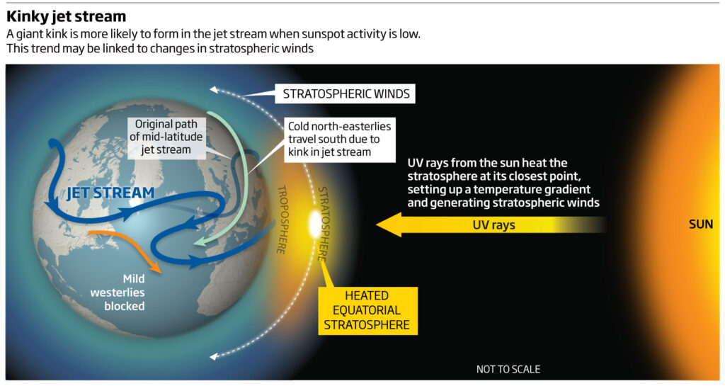
Lets keep with pandemics by looking at this map below looking at a bird pandemic affecting finches. We knew about the Uk and Europe but it was a mystery how it had spread to the US. A simple map but the colours are atrocious for anybody copying it in black and white or having problems with red/green colour deficiency as you can see below.
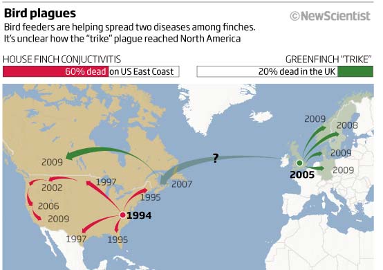
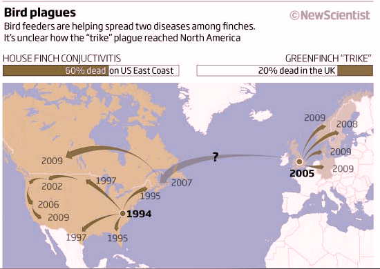
Keeping with maps, how about a 3D map? Well, not really a 3D map more of an excuse to show how I can use isometric projection! And to make it more confusing I have included – using the same circle metaphor – the amount of magma produced and the area covered by the eruptions! Takes some working out I must say. Splitting it into two separate charts and a map would have been much easer for the reader to take the information in -style over substance here.
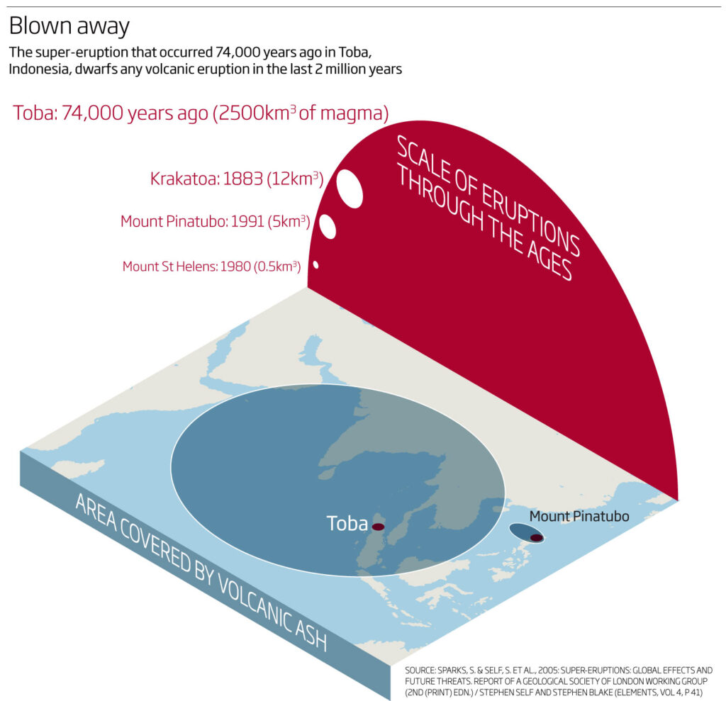
Enough maps. Here we have a 3D graphic showing how scientists are trying to connect artificial electrical networks with natural ones – a nice, easy on the eye, explanatory graphic.
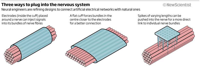
Next we have a virus graphic, I did so many of these while at New Scientist, this one showing how the giant mimivirus can replicate without using the host cell’s nucleus. Again a simple clear explanatory graphic. We have seen many of this type of graphic recently looking at cover-19.
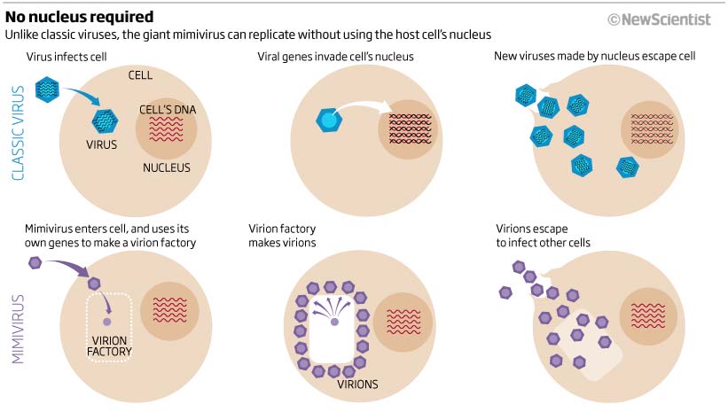
We will finish off this months look back at 10 years ago with a graphic that looks at the number of species on the planet.
It is always a problem when you have a large range in the numbers you are trying to show and want to show or compare that range in a visual way. ‘It depends’ really does matter here. It depends on the number range, it depends on the subject matter and it depends on what the headline is saying and what you are trying to show. Are you showing how different the numbers are, or how close the numbers are together or just wanting to show the numbers as they are. Do you order the numbers ascending, descending, alphabetical or in a different order? It all depends on so many parameters, including the article it is going with and the header. Below we were wanting to show just how many species there were. The numbers are very different and so circles allowed me to show the biggest and the smallest whilst keeping it in a relatively small area for publication on a page of a magazine.
I like the addition of the bar chart in the lower right-hand corner showing (out of 100) the species under threat
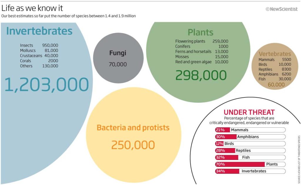
That it for April 2009, see you again for May, 10 years ago
01 May 2020
March 2010
Well, how the world has changed in a month! We are now in the throws of a COVID-19 epidemic with much of Europe including the UK in a lockdown. The rest of the world is following fast on our heels. Unnerving times…so keep safe everybody.
This month we have some bad maps, dodgy line charts, questionable colour schemes plus some nice 3D work, meeting your microbiome and rat explosions.
So let’s start with a bad graphic…or at least one that just looks so bad I don’t know where to start. Apologies for this one. The colours are eye-poppingly atrocious and I have even added the sea in a colour! Then you have big red arrows flowing across and obliterating the map beneath, losing all the information – a great example of how not to produce a map showing CO2 trading emissions – did you even get to working out what it was showing?
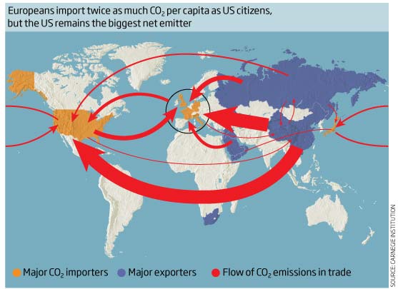
Now for a line chart that should be easy enough to understand, but I’m not sure about this one. OK, it shows consumption of sugar and fat in the US diet from 1970 to 2008 -so that works and you can see that the amount is increasing (which is not a good thing) but then I have introduced two horizontal lines – one showing Man (150) and Women (100) with maximum recommended by AHA – does this just relate to the corn syrup or are they meant for fat as well? So, although it has god information and is initially clear it then confuses. It’s always good to sit back and really look at what you have just produced to make sure it still says what you want it to say in an easily understandable way.
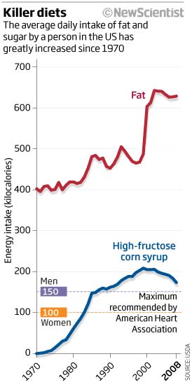
A small and informative 3D graphic showing how a solid-oxide fuel cell works to produce cheap electricity. Simple, clean and explained well enough that I understand it even today. Subtle, clean, crisp colours as well.
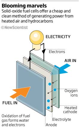
How about a graphic showing how rapidly rats can multiply? This graphic tries to show it but with a very limited space (a news story, I believe) it just loses all the impact. I can’t really see the original, 2 adults dot at all – the numbers are really impressive though and so maybe just those would have been enough…great headline though!
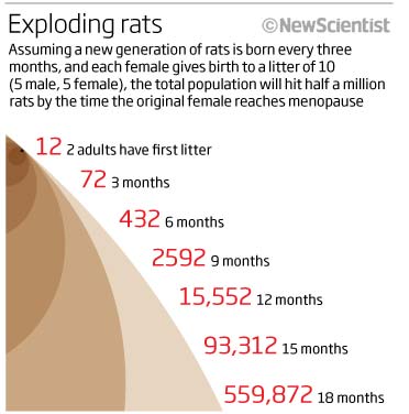
Another simple graphic showing just how much weight we carry around in and around our bodies that can be attributed to bacteria…1.25 kg! Who would have thought that. Not sure about having the body shape in there..maybe a more stylised graphic form would be much better, interesting information though.
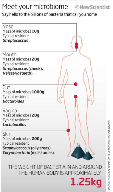
We can’t go a month without something that seems ‘out-of-this-world’ or unfathomable, so this month a graphic that I like. It explains and show graphically the differing characteristics of a multiverse. I think it does quite a reasonable job and I believe I still understand it now – I may, of course, be wrong! I like it anyway.
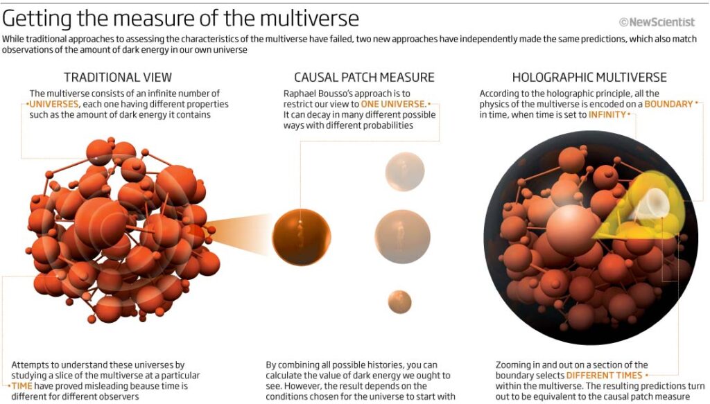
We will end up this month on a couple of ‘green’ graphics. The first one is a scatter plot type graphic showing where on the Cost and Effectiveness scale certain options for cooling the planet come. Simple and easy to understand although the colour scale is confusing somebody with red-green colour deficiency – minus points for the colours then!
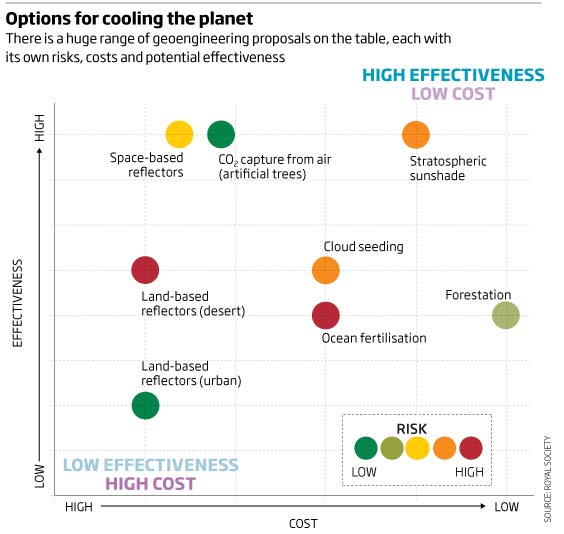
The final one of this month’s collection is a feature on how to reduce your homes carbon emissions in 2008. Many different ways, each saving different amounts of carbon and therefore money. Not sure why they are in the order they are?…and with hindsight I think I would have arranged them in either CO2 saving or money saving and made it clearer that the length of the line related to the ‘payback’ time to recoup the costs. With those proviso’s though, I do like it…just needs a little work.
That’s it for this month’s roundup. Not sure what the next month will bring -but I do hope you stay healthy and safe and we will show more come the beginning of May.
01 April 2020
February 2010
This month looking back 10 years on WiFi, waves, whales, white dwarfs, walls of caves and weddings.
First up is a little chart looking at wifi data speeds and ranges! Oh how things have changed…Not very graphic and just a table with some colours that don’t relate to the table!

General thinking at the time was that wifi could eliminate those unsightly cables around the house. This technology has been here for a while now but when I drew this, it was still very much, an expensive pipe dream. Cinema4D, photoshop, illustrator, and (probably) *Wallpaper and other design magazine used here for inspiration – a great example of spending too much time concentrating (having fun) on the non important parts of the graphic – ie making it look nice – and missing the important data driven aspects that could have done with some graphical cues to make sense of the numbers/ranges etc…nice though!
Sticking with the internet theme, maybe you should sit down for this one…a donut comparison chart! How dare I…actually does show changes but without the overly long explanation, it would be very hard to tell what was going on. Not a good one.
Whales now. A clean, simple graphic comparing current populations with both historical and genetic diversity. I would like to see areas of the world that the whales are hunted in or, at least, the range they are found.
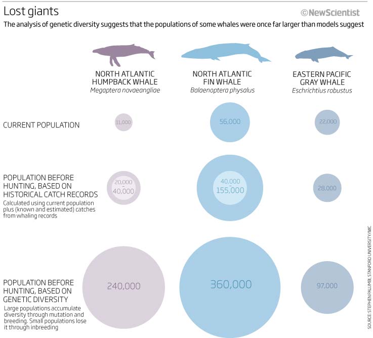
Another simple, clean graphic that varies to show in simple steps what happens to stars as they die…nice. Obviously desaturation of colours was my thing that week!.
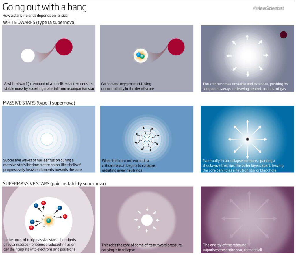
A double page graphic showing cave art and the recurring symbols found on cave walls around France as well as around the world. As the caption says ‘leading some to wonder if symbolic communication arose with early humans’ Indeed…symbolism and visual communication.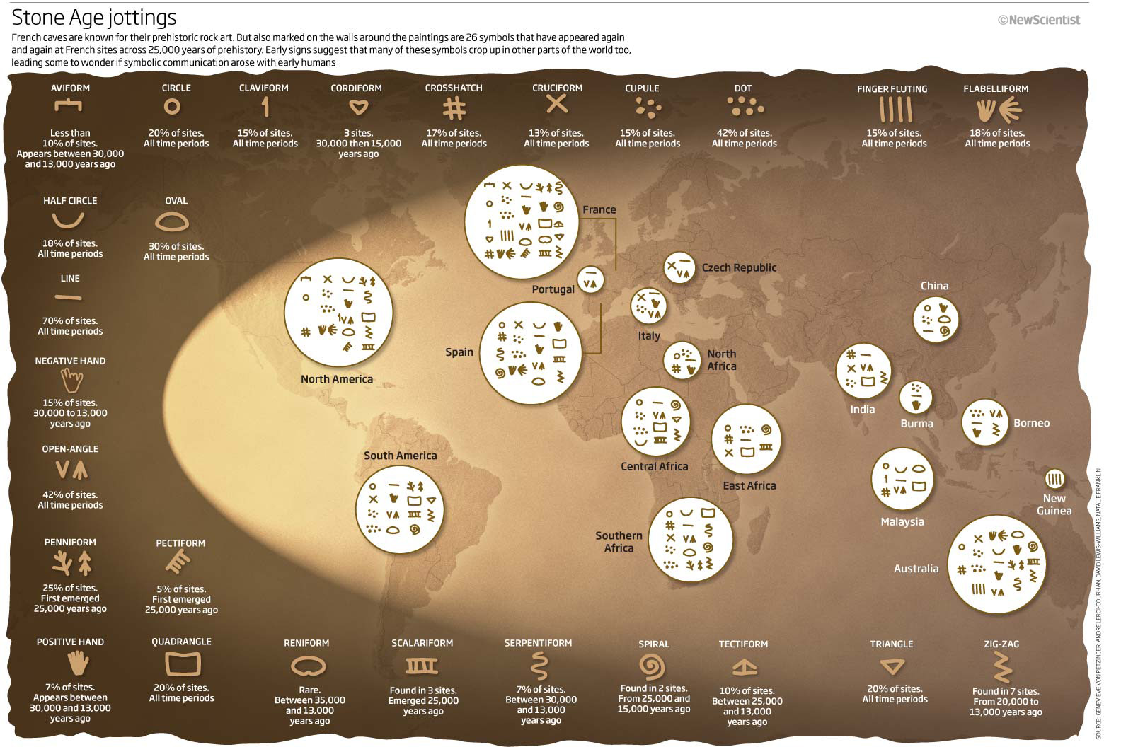
We’ll finish with a couple of graphics from a feature on love, bonding, oxytocin and a couple of New Scientist staff members.
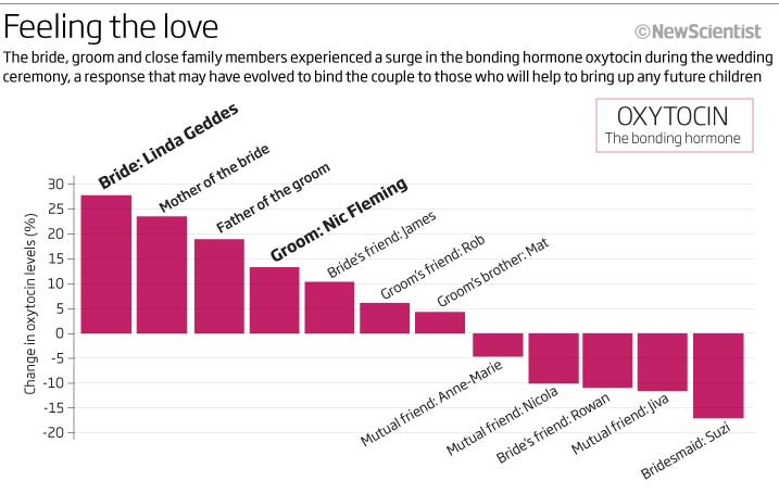
A simple bar chart looking at the oxytocin hormone levels of during a wedding ceremony from close relatives to distant friends and a ‘small multiple’ chart looking at the relationships of 5 different hormones and if they follow the same expectations as oxytocin. Simple, clean, easy to understand (IMHO) and helpful to have the ‘setting’ showning the position of the participants at the wedding.
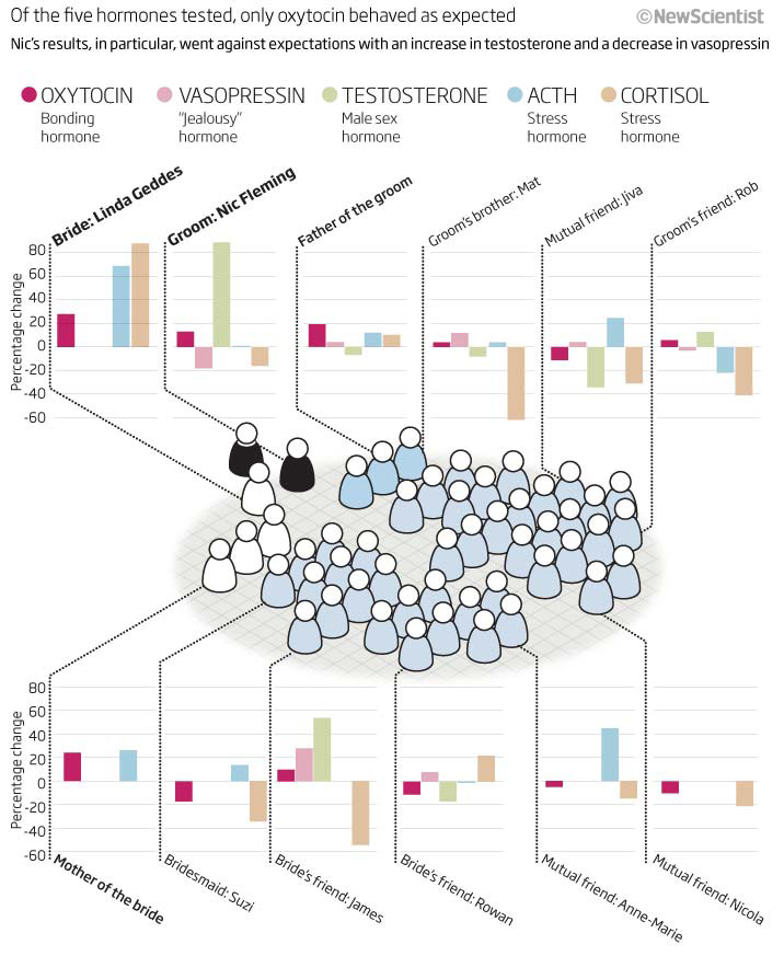
Quite a good collection this month…although there are always improvements to be made…let’s hope I can find some real horrors for next month.
02 March 2020
January 2010
Wow! 2010 already. It’s been wonderful for me to look back and see just what I was doing ten years ago. We all, obviously, look at what others are doing, and try and incorporate the styles and trends of the time within the infographics and data visualisation fields as well as making them fit in with corporate and the specific scientific requirements.
2010 saw, amongst many more events, the devastating Haitian earthquake, Mount Eyjafjallajökull erupting, the Deepwater Horizon oil drilling platform exploding in the Gulf of Mexico, Instagram posting it’s first test pictures, the WHO declaring the H1N1 pandemic over, Christchurch in New Zealand hit by a 7.1 earthquake, COP16 meeting being held in Cancún and Nude, Green Leaves and Bust by Pablo Picasso selling for a record US$106.5 million.
So let’s get on with looking at January 2010. This month we have swine flu, alcohol abuse, fat busting and the number of people accessing the internet.
In January we were in the grips of H1N1 flu pandemic but things were looking to be slowing down, so we took a look at comparing the current outbreak to that of 1958 – an easy to take on-board graphic comparing US with Europe and also looking at how the trends compared to 1958.
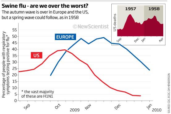
Next we have a little 1-column tree diagram/square pie chart news graphic looking at combat injuries. It doesn’t say where the data is from ie US/UK, world etc but nice colours and easy to take in.
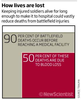
A very colourful map showing number of healthy years lost country by country – not the best colour combination (actually a very bad colour scheme) as it really doesn’t work in red/green colourblindness charts and really doesn’t work in full-colour either!!!
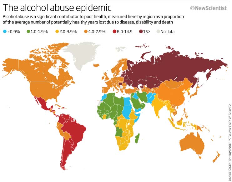
![]()
Would be much better – as I teach in all my workshops – to have been a sequential colour from light to dark…oh well! we live and learn.
Next a simple if a little boring looking table where it rally should have just been kept a table…there is information here but having the same look for each category doesn’t really help me navigate the information. The title seems to want to compare lasers with other measures, so why doesn’t the graphic do the same…lots of things wrong or just not finished on this one and a good one to show how graphics can hide the information
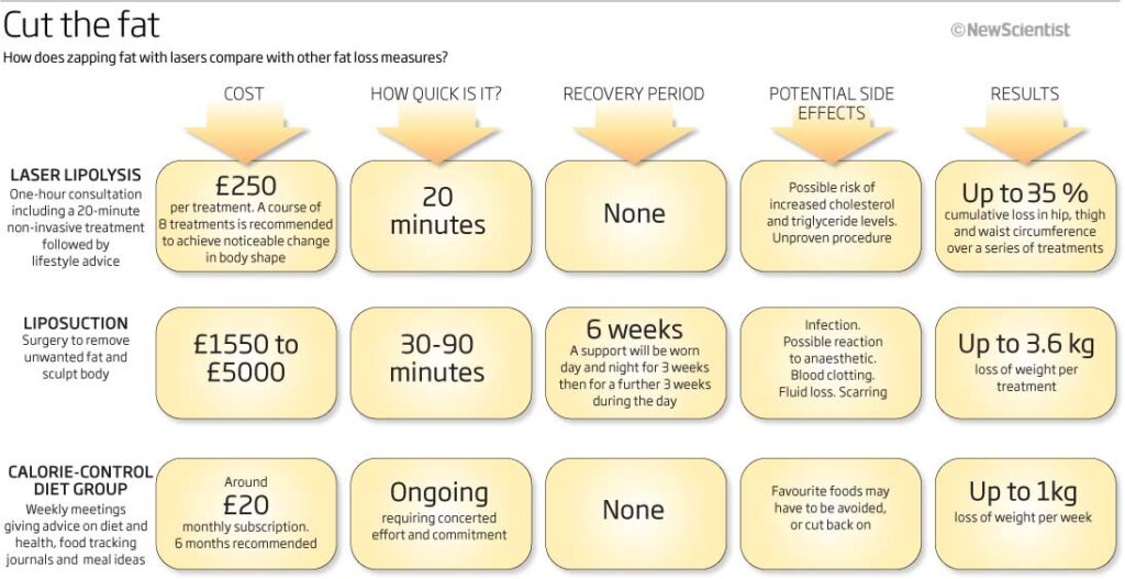
Last one for this month, not much going on in the first few weeks after the Christmas and new year break – this graphic is really interesting as the internet was still a relatively new thing for many people and with speeds increasing all the time and the access to the information becoming easier to get , it was still interesting to produce a chart to show the reach of internet access – still only 20%+ 10 years ago. The latest figures I have seen are 58% overall with a range of almost 40% across Africa and almost 90% in North America and Europe…how times change
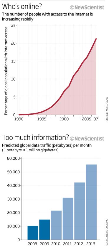
A slow month but still some interesting things to show. Hope February 2010 is a little more exciting to look at
06 Feb 2020
December 2009
The last monthly look back for 2009! December always seems to be a slow month when it came to graphics in New Scientist. Blame the double Christmas issue and the holidays. This month we have farting dogs, super sweetners, synaesthesia and how to cut up a pizza.
So let’s start with an example of how synaesthesia can make hidden patterns easier to find. An effective graphic to show this effect, even using a red-green colour blind test! The text, header and explanatory text are vital in telling the story and explaining what is going on.
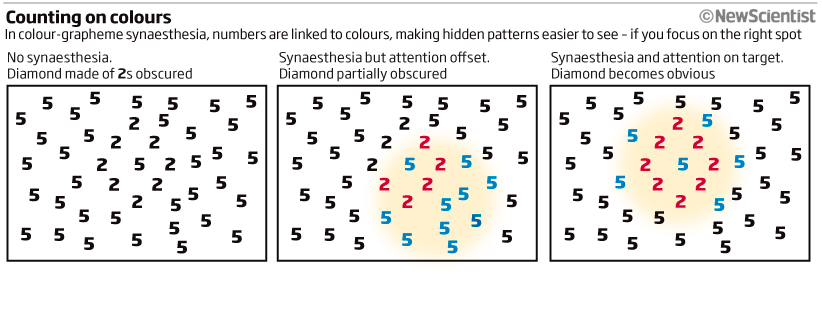
Another simple and effective graphic portraying just how sweet (weight-for-weight) sugar substitutes are compared to the real thing. My only bugbear would be, why the red headline? I automatically look for red in the graphic – think it was just because of the Christmas Issue where every header was red! off-putting though.
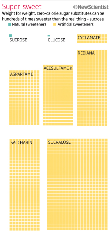
Can’t go a month without showing some 3D work. This month we have super-Earths, peeled back to show how they are composed. Think the composition could have been better with text placed away from the planet surface but I am sure that we had limited space to use and this was the compromise between image, text and available page space (as is always the case).
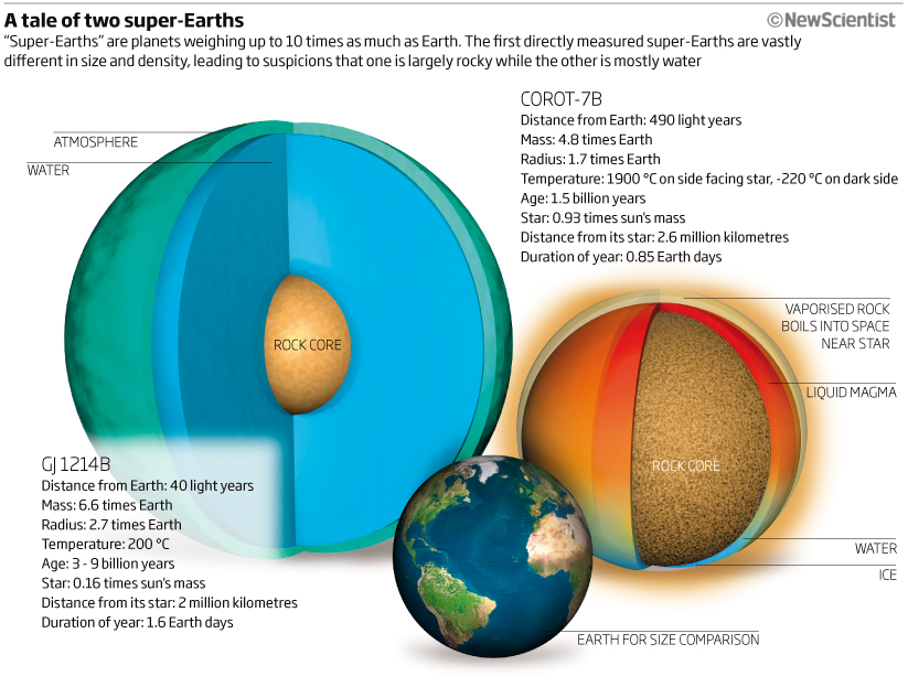 A couple now from a feature looking at oil. The first one showing the oil left for extraction using tar sands, oil shale and extra-heavy oil on a simple location map, followed by a Marimekko chart showing barrels available vs production costs per barrel. Think this must have been one of the first Marimekko charts I had used and a good reason to use this type of chart.
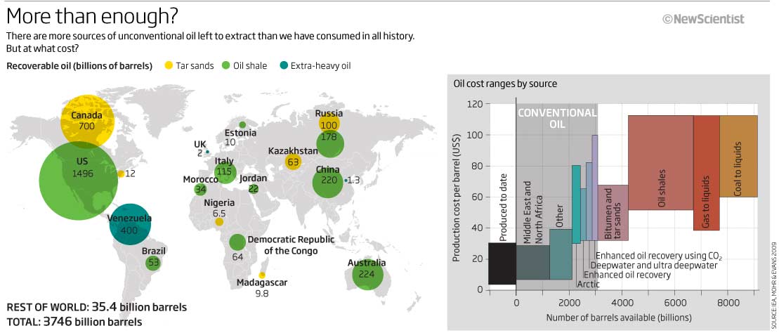
This second graphic shows new techniques used to extract oil from unconventional sources. Illustrator, Cinema4D and photoshop all used here as needed.
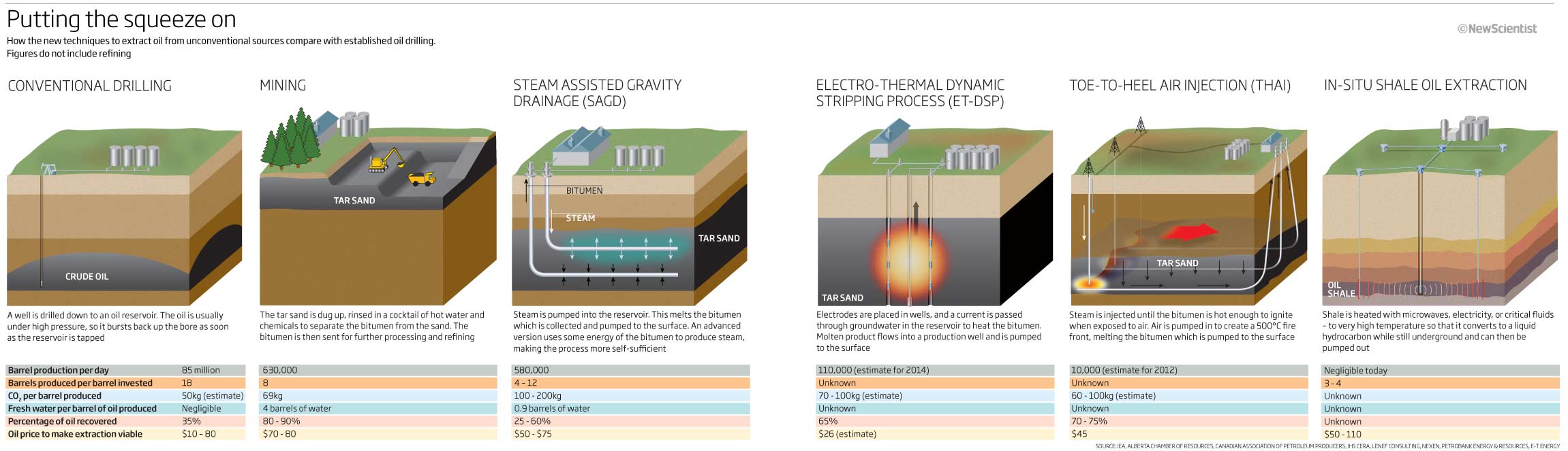
Enough normality, lets get on to some holiday-type graphics…farting dogs! No idea what this was trying to show – or why – but obviously we thought it was important (read fun) to show this in the Christmas issue, and why not! Not drawn very well, I can do – and should have done – much better!
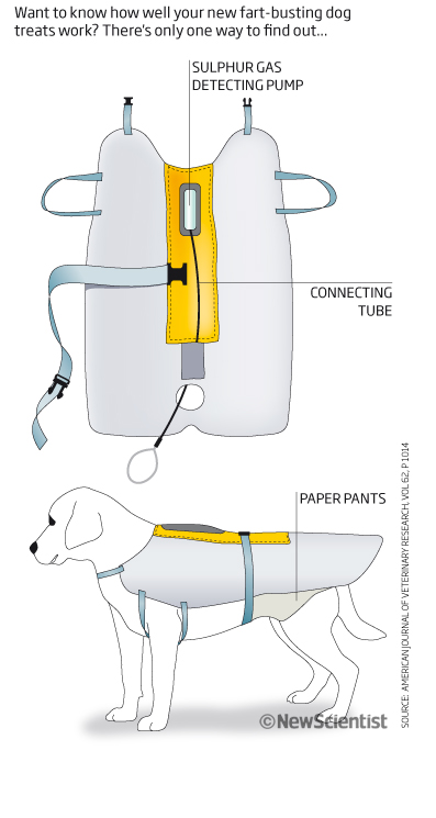
The final one for this month and the final one for 2009 shows graphically the pizza theorem. In elementary geometry, the pizza theorem states the equality of two areas that arise when one partitions a disk in a certain way. SA simple explanatory graphic showing what the theorem is and how it was proved.
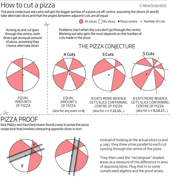
So that’s it for 2009. A new decade dawns and 2010 arrives and so I look forward to seeing how infographics and I change during the next year. Lets see if 3D work and photoshop shadows lessen or what influences me in style, colour and technique…
Happy 2010!
30 Dec 2019
November 2009
Apologies for the late posting due to work commitments…but here goes.
November 2009 graphics, a slow month but including armpit bacteria, UI design, CO2 (again), alien oceans, wino’s and donut-charts!
So in chronological order we start with a small graphic looking at the new and old style displays for aircraft, to see if the new version are easier to read. Simple and clean.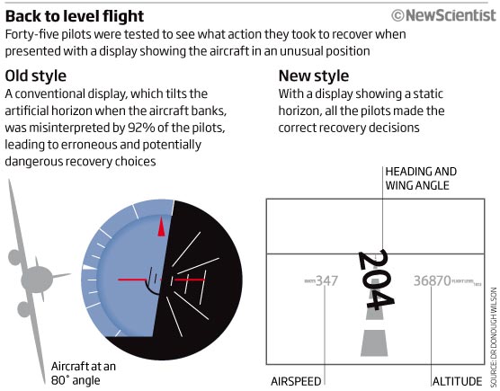
A new month, a new donut chart. I know we are supposed to hate pie and donut charts but I have always used them and still do, in the past not always correctly used either! – but I hope that nowadays I do know when and when not to use them. Not a bad use here and you can see the reason for showing the data this way…still, a bar would still do the job better (maybe?).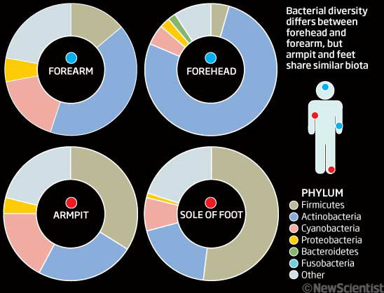
Next up, how to make a map pretty unreadable! Red and green!!! atrocious colour scheme, especially as we are showing seabed, so why not blue or earthy colours! Adding to that we have relief which is unhelpful and just distracting. Then we have loads of text…I could really edit that down and should have done back then! I can see what I was trying to do with the timescale running along the bottom but the colour scheme could really have helped by using shading and limited colours. Did I really need the scale? If so why not make more of it…many things wrong here, or at least, to be improved upon!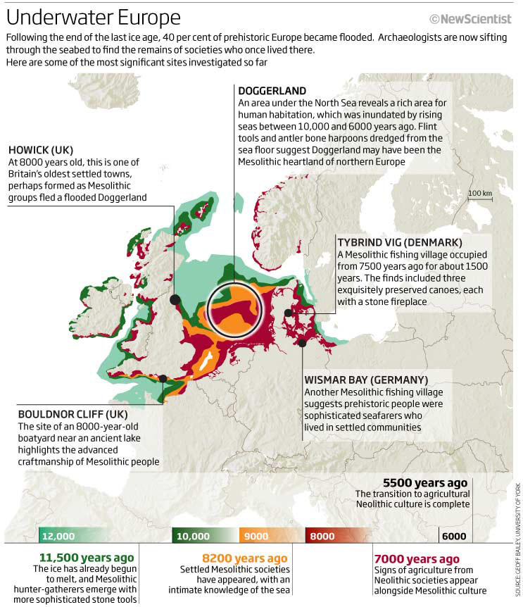
Climate and carbon next, and a graphic that I still like the look of. Looking at the carbon we have used/consumed and the carbon we may have left…and trying to keep to the 2°C limit that the world climate scientist had agreed on…click on the image to get a bigger version. Have seen this style of graphic used again recently so I think back then it was a good way to show the data and to get the message across. Pleased with it.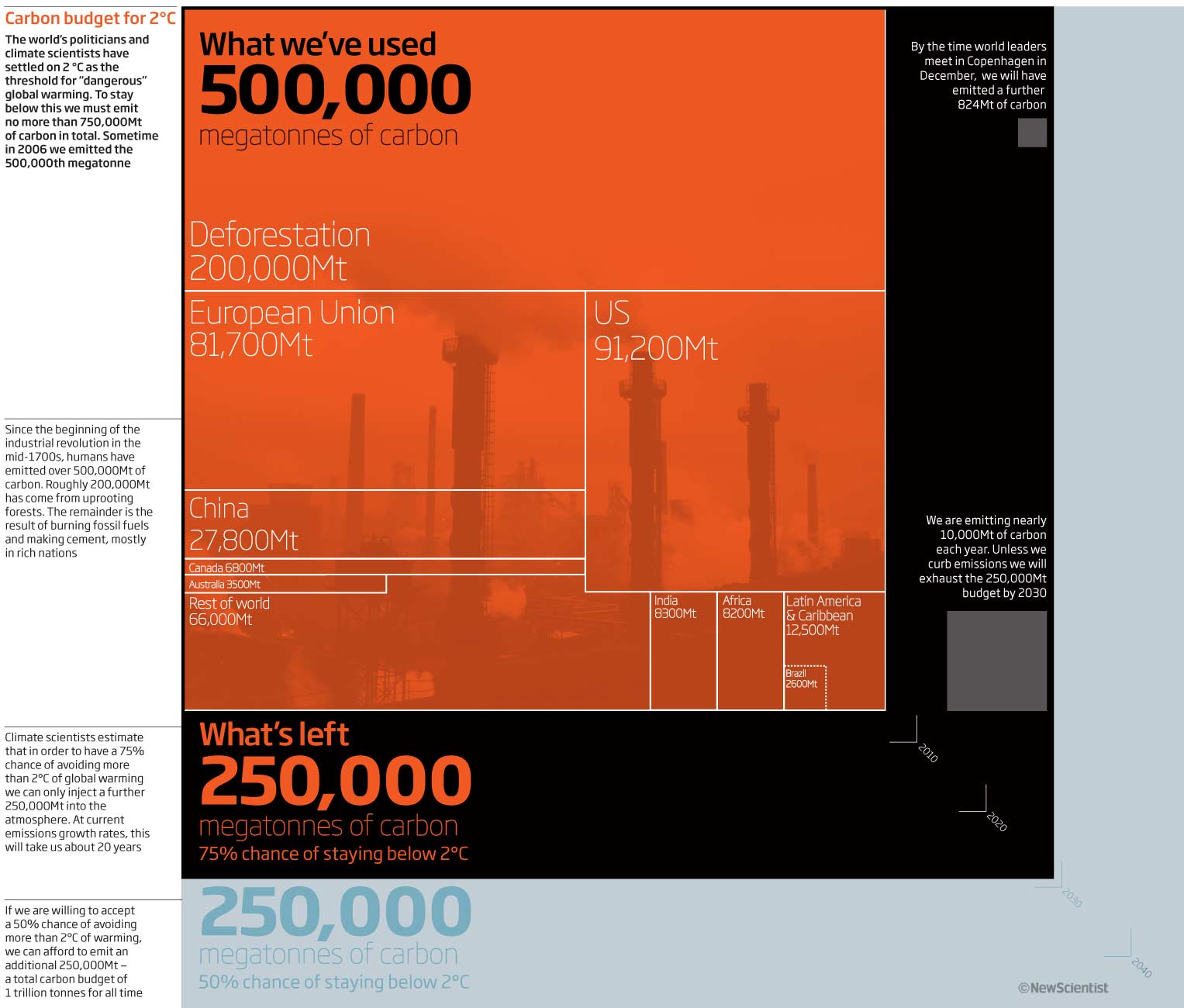
I couldn’t go an issue without a space based 3D graphic. So here we look at four of Jupiter’s and Saturn’s moons top see how much water could be found. Nice 3D Cinema4D and photos work..was always a pleasure doing this sort of work and working with the shapes, data, textures and lighting techniques
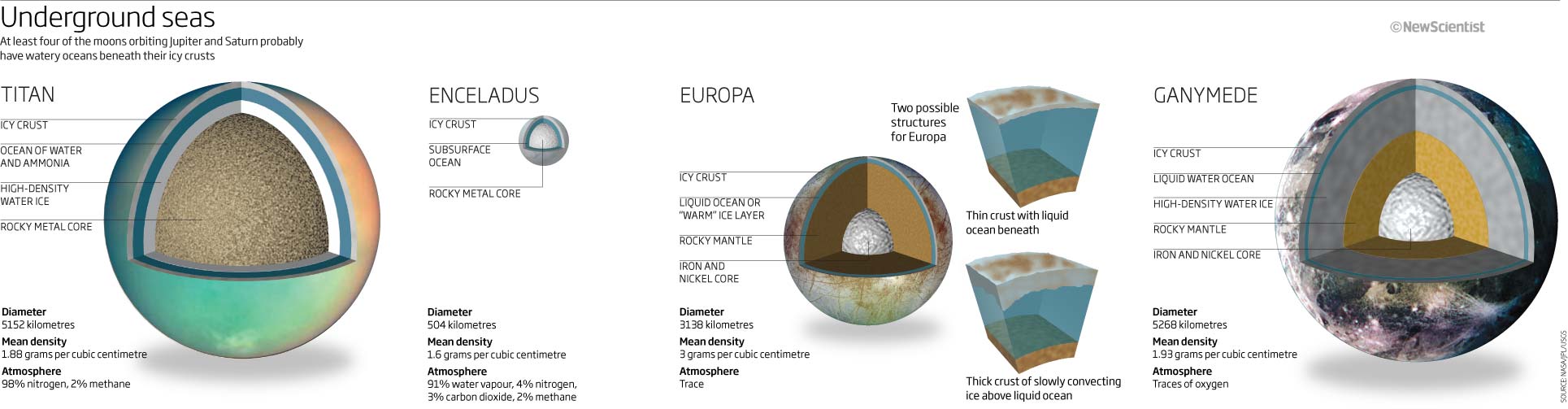
Last one for this month, Wino’s…the particle kind! A nice little handy reference type graphic grouping particles of Bosons and Fermions together in anticipation of what the LHC might be finding on its look out for supersymmetry particles. On second thoughts, a little too colourtastic! …maybe delete those colours I the background and just separate the fermions fromm the boson a little more…
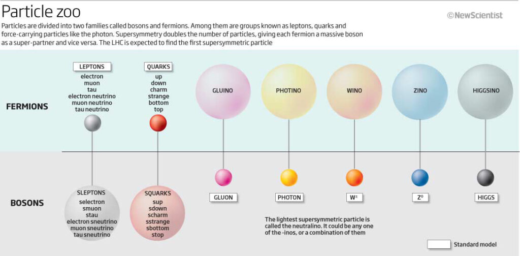
That’s all for this month. I would imagine the December graphics will be quite Christmassy and so I will try and post those over the holiday season…so watch out, thanks.
9 December 2019
October 2009
Penetrating thermal lasers, false positives, fusion reactors and the rise of the smartphone are just some of the subject matters that I was illustrating in graphic form in October 2009…so stay with me and let’s have a look.
Let’s start with that penetrating thermal laser! A 1-column 3D graphic showing the layers of the skin and how far infrared light of various wavelengths can penetrate and cause a burning sensation. What the story was about is a mystery (I may have to go and find it) but the graphic is clear (if a little too pink) with the various wavelengths and layers clear to see. Nice headline too.
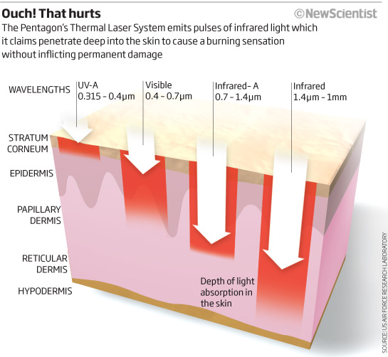
Next we have my take on trying to explain Bayes theorem and false positives. I will leave it to you to decide whether this works or not. I would show this differently today, probably along the lines of the guardian graphic from a couple of years ago… 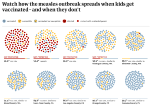
Next is a complicated graphic trying to show how various countries are doing with emissions based on 2020 pledges, Kyoto targets and actual emissions. As the title is not on the graphic it’s difficult to see what we are trying to achieve. There’s certainly a lot of information in one graphic and I am not sure it works particularly well. Even though – and I do like this – we have a ‘how to read this graphic’ key, which is something I always try to get into any graphic that takes some thought, I find it confusing and difficult to compare because of the many data points. Looking at one particular country and seeing how they are doing compared to the Kyoto target and what the pledges are is fine but then trying to compare is not effective. I can see what I was trying to do but obviously failed this time – lack of time would be a factor here, as these sort of things were usually done within a coupe of hours.
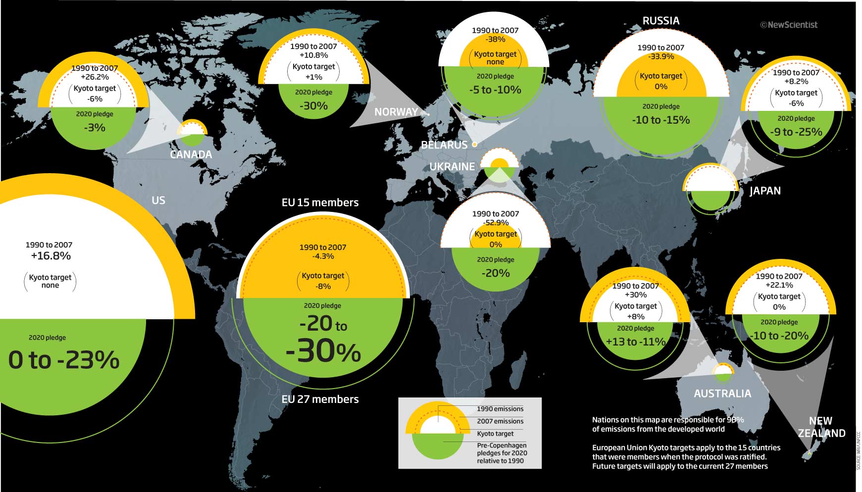
After that, we need a nice simple bar chart. Back in 2009 the smartphone was just emerging! and so we thought it would be god to see just how many people would be using the cellphone 2 years into the future. A nice simple bar chart…OK, a little bit of chart junk, which I don’t mind as it puts it into context, with some additional info attached. Amazing to think that today there are 5.5 billion users worldwide with 3.3 billion being smartphones.
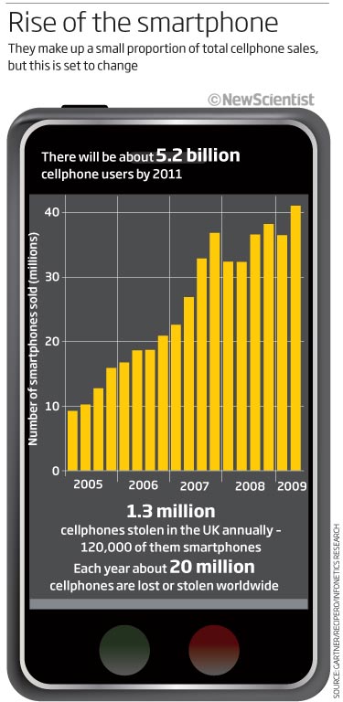
As you know if you have been following this blog, I loved using Cinema4D when I could and the subject matter afforded it. So when I am having to illustrate how a fusion reactor works…then 3D it is. This is a good looking graphic who’s purpose is to show what ITER fusion reactor looks like and how it is made up. The various components of the reactor are colour coded to show this. The inset shows how fusion works (very simply). The main thing I would change now would be the placing of the text pointing to the ports through which the deuterium pellets are fired. having that at the top, allowing you to read down and start there would be better. Nice little man at the bottom to give a sense of scale
.
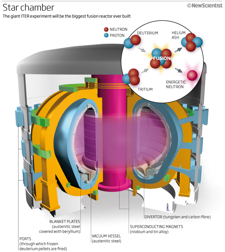
I’ll finish this month’s round-up of graphics from 2009 with a series of charts for a feature on Swine Flu. Swine flu made headlines in 2009 when it was first discovered in humans and became a pandemic. The WHO declared the H1N1 pandemic over in August 2010 but it has continued to be part of our lives.
This first chart is simple, clean and easy to see what is going on in the flu cycle. Comparing seasonal flu to the H1N1 (swine) flu.
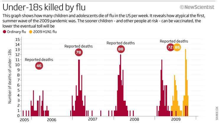
This second chart is again simple and clean but this time we are looking at an historical perspective, looking back at past pandemics around the world.
![]()
The final graphic, keeping to the overall colour scheme, shows very clearly that the H1N1 flu strain was affecting the younger population rather than the older generation as was normally the case.
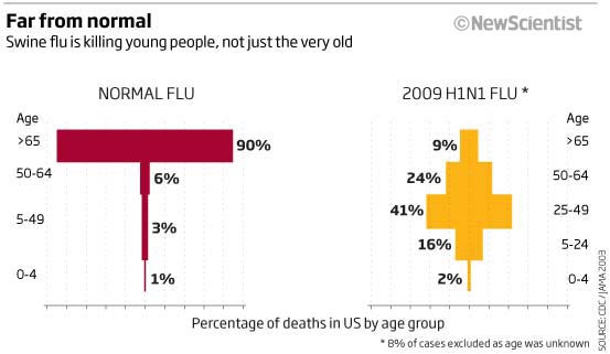
That’s it for this month’s look back 10 years ago. It’s always interesting seeing how far things have changed in the short 10-year period, especially when it comes to the internet and cel phone technology and the uptake of it! Thank you for reading, hope you enjoyed it and more next month.
2 November 2019
September 2009
This month back in 2009 we have graphics looking at geoengineering, scanning the sky for asteroids and Bee dancing amongst others things.
So let’s begin with a scatterplot with a few extra parameters thrown in. This one on geoengineering proposals assessed by the Royal Society looking at cost, effectiveness and safety. I think its just a little too contrived to have colour (which does not pass the red/green test) size and placement on the same graphic – at lest I tried to help he reader by adding High effectiveness/High affordability and the opposite in the relevant corners so you can see what’s good and bad. 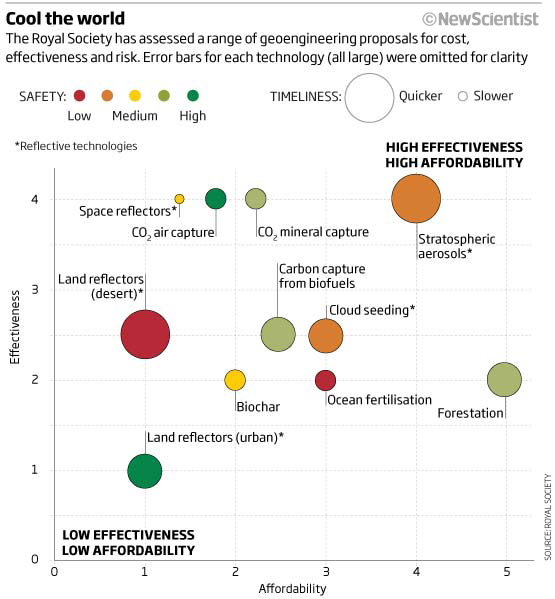
Here’s the version under dueteranopia filter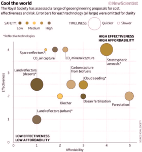
I was really enjoying Cinema 4D at the time and took any opportunity to try and increase my knowledge of the application, so why not draw a self-righting vehicle in 3D! I’m not sure what it gives me but sort of like it with the graphic below the 3D model showing how it could hop over ground. Maybe something to scale it correctly would be a useful addition?
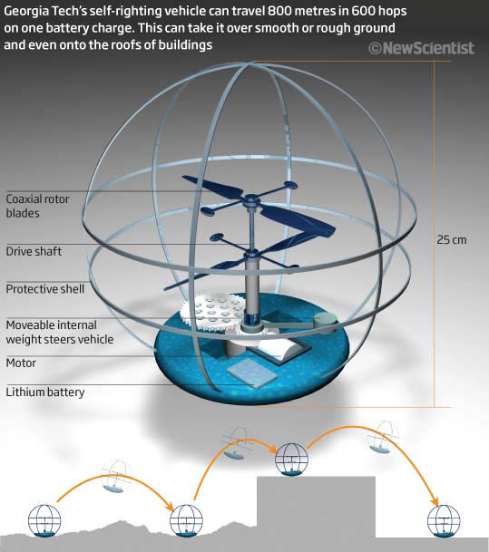
An interesting little map/graphic next to show just how little of our skies were being scanned fir near-Earth asteroids and other foreign objects – simple and stark…
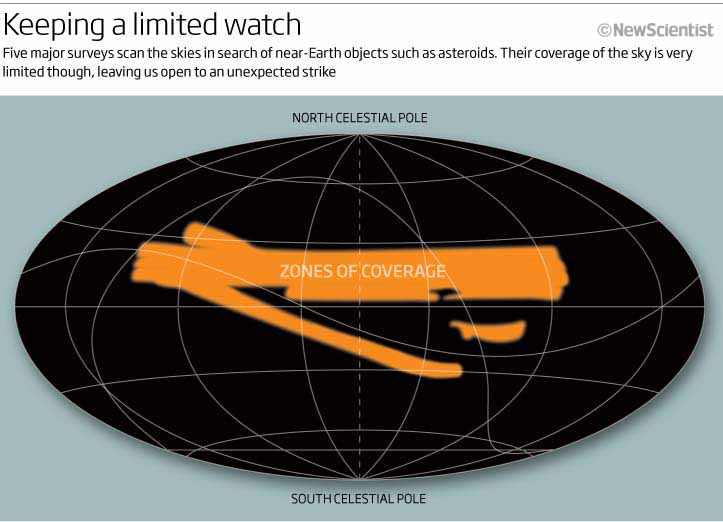
Those of you that have followed this series will know that I love nature and all things natural and so I am always looking for the opportunity to draw a plant, a bird or an animal of any description. Here we have bees and their intricate waggle dance, looking at what could be one of its purposes ie where food is. Some nice bee illustrations, graphical explanations and a great title!
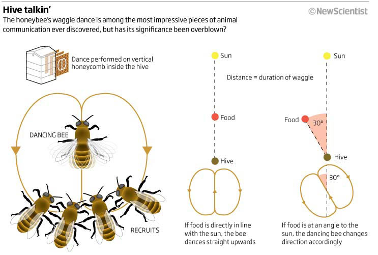
A big one to end this months look back at 2009. An uber busy type of dashboard! A feature looking at how to make the World a better place by looking at different parameters that could be measured. Obviously we had limited space and wanted to get everything in!
So much that could be improved – the thumbs up and thumbs down could be better sign-posted for a start (as that seems to be the crux of the graphic)…looking for positives…the colour scheme is consistent, there are some nice nuggets of information, the donuts are drawn correctly…not much more to say apart from it need to be redone and I tried ?
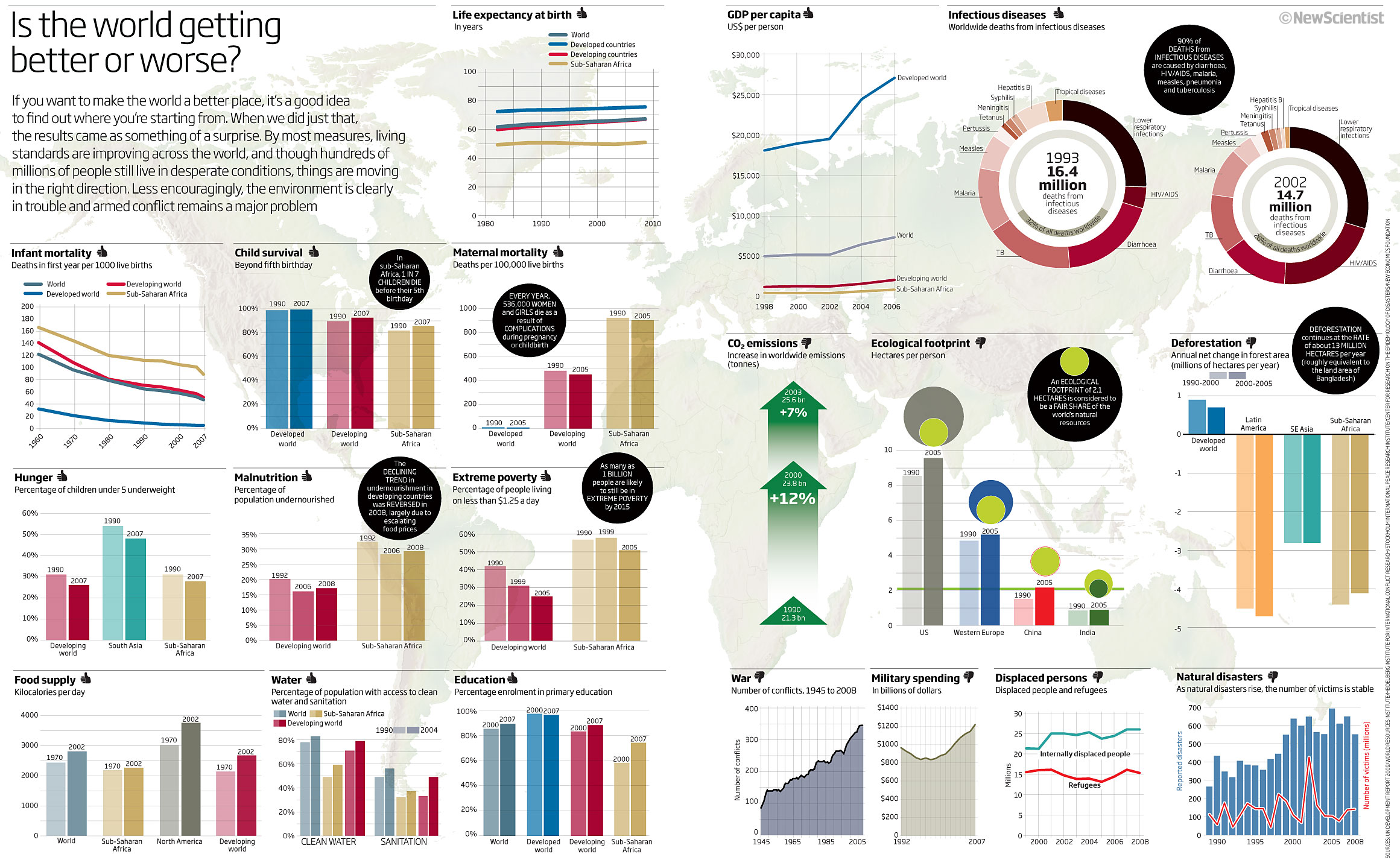 Just had a look at next months examples and I’m impressed with the look of some innovative looking graphics…
2 October 2019
August 2009
Summer holidays are over, so let’s have a look at graphics from August 2009 showing life expectancy, internet access and the rise of the smart app, a divided Europe and 3D pie charts…so nothing changes then!
Let’s start with a simple graphic looking at life expectancy, focusing on the US and its health spending. A good looking chart that shows you the information easily. Maybe I should have gotten rid of the grid behind and changed the colour slightly to make sire the US stop out…but a good start to this months look.
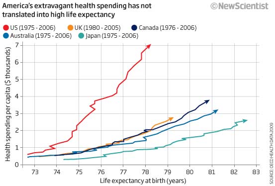
Now let’s get the 3D pies out of the way. Yes they are bad and very deep and bright colours and ‘ Not at all’ seems to be the most important sector as its darkest and stands out most! Just not good and it detracts from the subject matter of the H1N1 flu pandemic that was affecting the world at the time…next
The internet was still really in its early years and governments around the world were trying to work out how to restrict access to certain sites for political as well as social reasons. We tried to show this in a graphic using colour coding as well as a score using numbers of circles. A nice try although I hate the lines I used to try and pinpoint the countries we are showing…surely there’s a better way to do this? Just keeping the pointers nearer to the countries would have been better than trying to fill the space…white is as important as the other colours!
In 2009 and the first year of the iPhone App Store we were showing how many apps had been downloaded and how they were changing lives. Not sure what I think of this but it is bright and I certainly had fun coming up with ides for app icons, trying not to impinge on nay copyright issues. More of a glorified table.
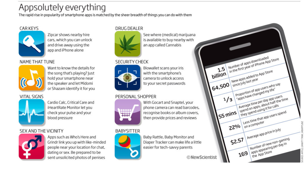
Another map, this time just confusing. I suppose the reason in producing this was to show how Northern and Central Europe had different allergies to Southern Europe when it came to apples. Well, I seem to have hidden that fact very well as the only thing I initially see are the three circles showing different types of allergy hotspots across Europe. Its only when I read the text on the left (which is colour coded – so that’s a good idea) I see what the colour are for on the map. Too many colours that have no meaning and weedy pointers, plus the fact that it fails the reg-green colour deficiency test!
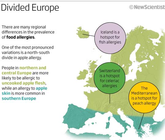
Let’s end with the sort of graphic I loved doing at NS. One where we are trying to explain the general reader something that is simple in principle – space time – but takes some real explanation for real understanding! I think the sub-head says it all ” Light takes time to travel through space, so the sun we see now is the sun as it was 8 1/2 minutes ago”… Love it and hope that it makes sense to you.
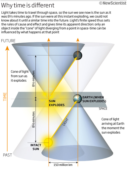
02 September 2019
July 2009
This month (or last month, 10 years ago, to be exact) we celebrated the 40th Anniversary of the moon landing, a look at Orang-utan numbers, calculating the power of lithium batteries, facial recognition, climate change and racing around the world.
So let’s start with my interpretation of what a good 40th moon landing graphic needed to show. We went with a location map of the near and far side, showing which countries been where, and a timeline indicating, again countries, but also additional information in the key such as whether it was crewed (even then we had got rid of ‘manned’), sample collecting, had crashed or other interesting info. A nice attempt with lots of icons…very busy but still ok for a double page spread in the magazine.
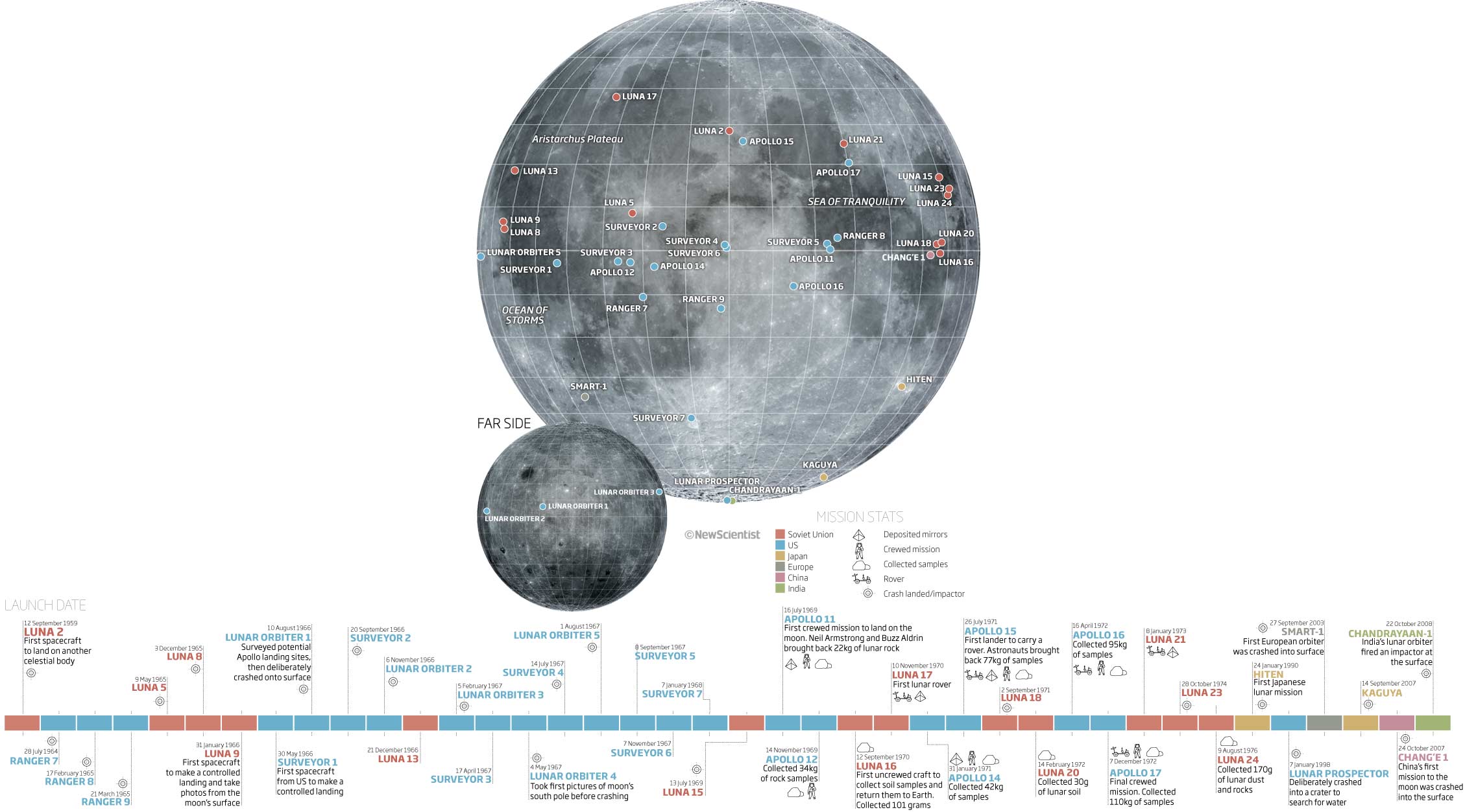
Lets get back to Earth with a look at dwindling Orang-utan numbers in Sabah due to palm oil deforestation. Very colourful!!! (Read not a good colour scheme that does just pass the red-green test but still is far to bright) map and why we are highlighting a particular sanctuary, I do not know! If you highlight something on a graphic, please let the reader know why! The premise of the graphic seems to be how conservationists must work with companies to link the habitats together but this doesn’t show this well…so a failure in its reason to be a graphic. Also, not sure that the circles was a particularly effective way of showing the numbers – 4584 to 11000 does not look like a big increase, whereas as a bar it would be much better.
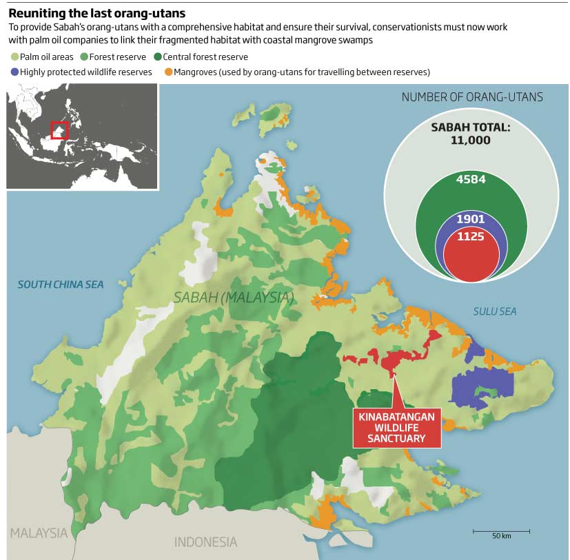
Next, a nice little scatter-like plot. The headline relates to the graphic as it has the same wording. The words ‘lithium-ion’ could have been bold but still easily understood, I think…arrow head are a little cumbersome but they do their job.
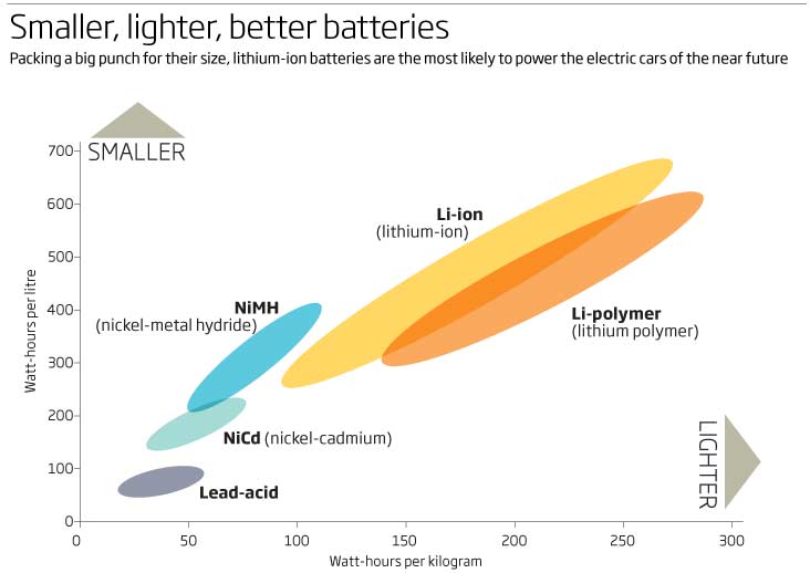
Facial recognition is everywhere now, from allowing you to open your phone to ageing your latest selfie via an app. Back in 2009 the technology was still in its infancy and so we thought it would be good to show how the computer works out if you are smiling or surprised – simple and clean graphic, although some arrows showing the changes may have also helped.
Climate change and its effects now seem to appear in almost every look back. July 2009 was no exception. Here we look at the antarctic ice shelfs and what would happen if they started to melt. In 2009 they were stable (unlike today https://www.nationalgeographic.com/environment/2019/02/antarctic-greenland-ice-melt-less-bad/ ) but vulnerable to collapse and so we were calculating how much it could add to sea levels.
A busy graphic, a little confusing and hard to follo, with all the colours and text dotted around. To add to the complexity it also incorporated an inset map and two other graphics explaining how the ice sheets could be affected.
It would have been better to have split the graphics and therefore the narrative up into the map, the area vulnerable, why it is vulnerable and finishing up with the scenario of what would happen if we had warmer seawater.
Lets go out of this world…to the planet of Pluto…or is it a planet? This looks at what the definition of a planet is according to the International astronomical Union. A interesting looking double-spread graphic showing the solar system out to Pluto and its sister dwarf planets with a 3D size comparison of these and our moon.
Keeping with space, we’ll finish this months round-up with a simple graphic looking at 3 hypersonic craft in development trying to slash journey times between London and Tokyo, and Sydney to LA, compared to Concorde and the Boeing 747 ‘Jumbo jet’. I missed a great trick here by not using the orange and red squares to show the relative length of time (effectively a bar chart) Would have been good to see 12h 47 compared to 1h 9 minutes and 10h 7minutes compared to 54 minutes!
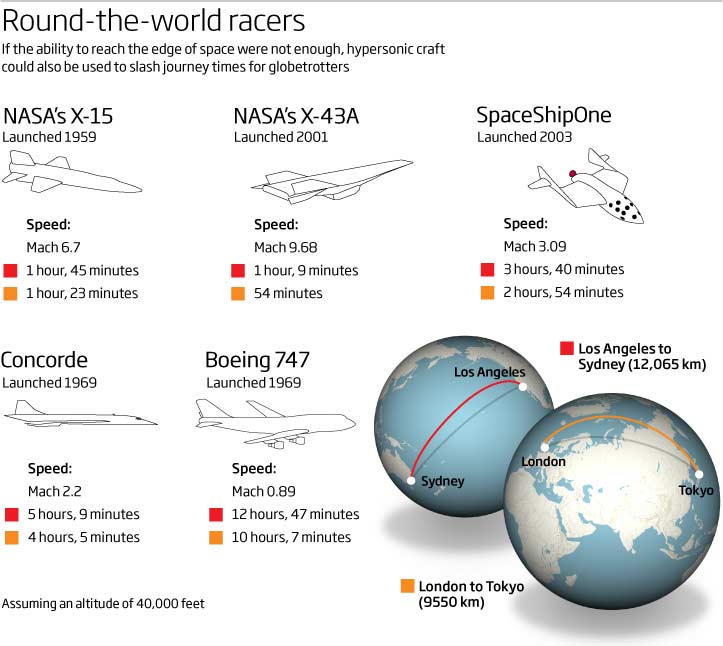
Enough for this month, enjoy and lets look forward to a 3D donut chart next month!!!
02 August 2019
June 2009
Summer is swinging into play and, as usual, things seem to be slowing down. Looking at some of this month’s collection of graphics, so has my brain. We have timelines, maps, the recession and a ‘too-bad-to-miss-out’ 3D donut chart comparison! You’ll just have top wait for that one.
Let start with a world map looking at the nuclear world, except this graphic (which fails the colour-blind mode) has no hierarchical text and no real hierarchical graphic elements. My eyes go all over the place. There is a title of sorts although it seems to be trying to hide from the reader.
At the top we have a key to the map but below the map we have another key for the coloured dots! We also have a bomb symbol with a number in but no real explanation of what these are – we can assume they are declared nuclear weapons – but graphics should mean we have to ‘guess’ what we are looking at. Would have been better to incorporate the two together at the top so that we could see what we were looking at before we get to look at the graphic.
We then have an additional bar chart with its own title, but again this is hidden as the text is not that much larger than the body copy! Not a good start…
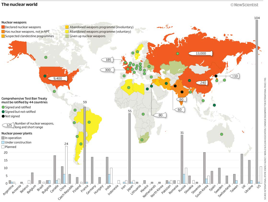
A much better effort of a graphic showing a portion of the periodic table and where we were in the numbering of the elements. The latest element to be recognised was element 112, Ununbium with others up to 118 Ununoctium, under consideration Nice to see a ‘how to read this graphic’ key explaining what everything means in the table (always a good to thing to add especially in the periodic table). Since then we have accepted these latest events with 118 now being called Oganesson.
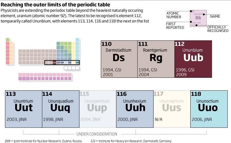
A nice little graphic of the surface of the moon and how NASA will scan it, filtering out unsuitable surfaces, to ensure astronauts will only land on flat sites.
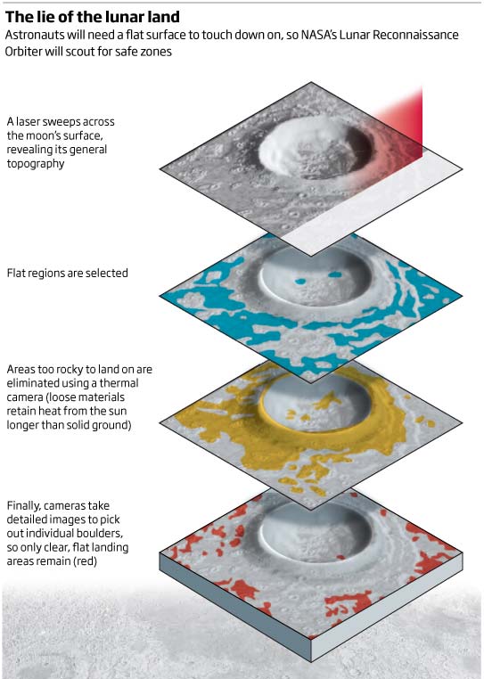
Timelines are always difficult to get right as well as interesting. Here we have one looking at mass extinctions since life began 3.8 billion years ago. I quite like this one, I can see that the early extinctions are ‘further’ away and therefore have smaller earth-like icons…getting larger until we get to the future predicted extinctions. There is a nice header and explanatory text and a key at the top explaining that the coloured earths are showing.
A bar chart looking at unemployment and national debt between the UK and the US during the start of the recession. Looking back this should have been a slope graph, as its very hard to see whats going on.
Actually both national debt and unemployment are rising, but can you see that? I cant. But done as a slope then its plain to see. Although I would actually label the lines and not have a keys in the first one.
Lets end with the 3D exploded donut I mentioned at the beginning…I don’t know what to say EXCEPT that we learn all the time and here is a prime example of what NOT TO DO!
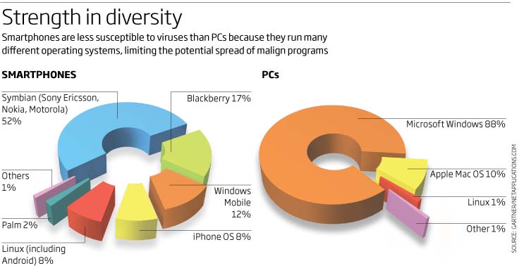
I hope you enjoyed that, let’s hope July is a better month in the world of graphics from 2009!.
01 July 2019
May 2009
A little later than normal, so apologies for that, but here goes. This month we have ‘Swine flu’ , unicellular eukaryotes, bar charts, treemaps, pie charts within donut charts, area charts, the female ‘prostate’ and more.
So we’ll start with a good looking (IMHO) 3D flu virus graphic, looking like its been made of clay but hey! still a nice try. There was much in the media about swine flu at the time and this graphic is a good little explainer with extra nuggets of information explaining the differences between this new strain and previous strains.
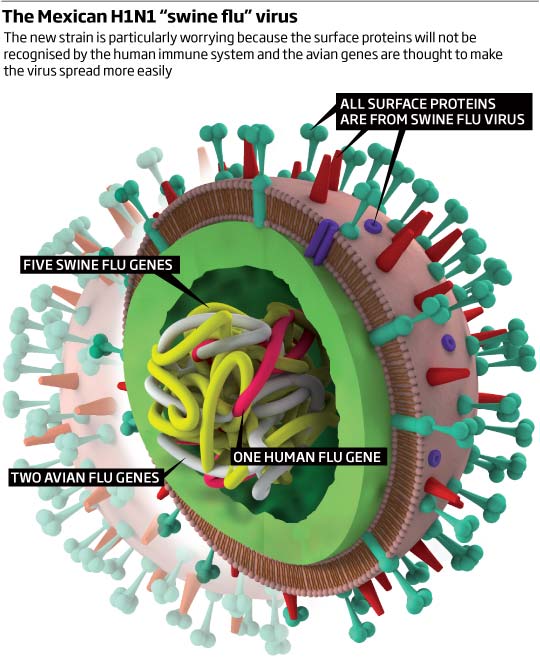
Whilst I am in the 3D, realistic-type-graphic mood, let’s have a choanoflagellate graphic! Choanoflagellates are considered to be the closest living relatives of animals. This graphic doesn’t have a header or explanatory text, which I hate about it, and this backs up what I say all the time during workshops – keep a header and text within the graphic- I had to google the article it to find out what was actually going on! It shows how a multicellular animals evolved from a single-celled organism in six major steps. Discuss!
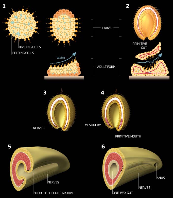
Less 3D more data now. This looks at PTSD and I decided to use squares to show the part to whole differences – probably because I had had enough of pie charts and it fitted the space we had to utilise! Sobering colour scheme as well. Often or not, back then we were given a ‘slot’ in the layout and had to use that space. Pleased with the look of it though.
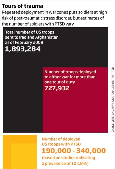
A subject matter that is still at the forefront of climate scenarios, and that of rising sea-levels. This graphic looks at low level islands vulnerable to sea rises and particularly the Maldives. A basic map showing the locations and a nice chart below showing the historical variations in sea levels for the Maldives over the 1993-2009 mean. Again, with many of these climate change graphics the changes can be seen quite clearly – in hindsight, I would probably do more with the blue colour of the chart to emphasise the changes – but then again, not changing the colour to make it darker or more intense still shows the change and keeps the graphic more neutral.
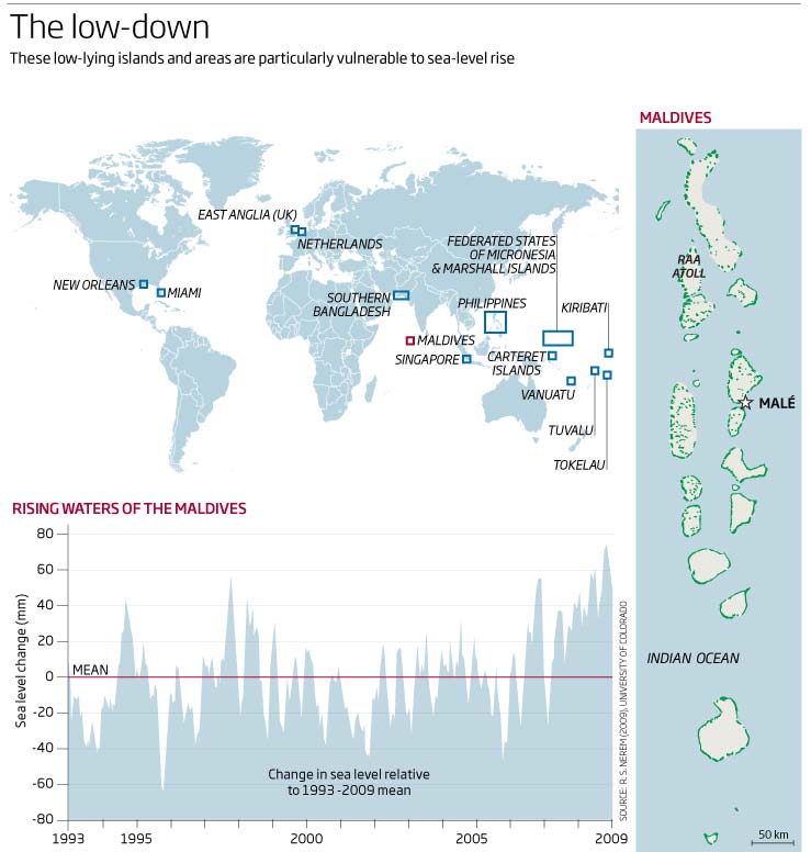
An interesting look at the internet of the time with who is using it and for what. I see that spam accounted for 78% of all emails! I wonder what that is now? Streaming was only 8% of traffic back then – will do some research and look at the comparison now. We were also thinking about the make-up of the web looking forward to 2012!
A nice ‘how to read the graphic’ graphic at the top, especially as we had pie charts within the donut charts! And a little time series of maps at the bottom of the spread showing the rise of China. Would be interesting to see what people think of the pie within the donut.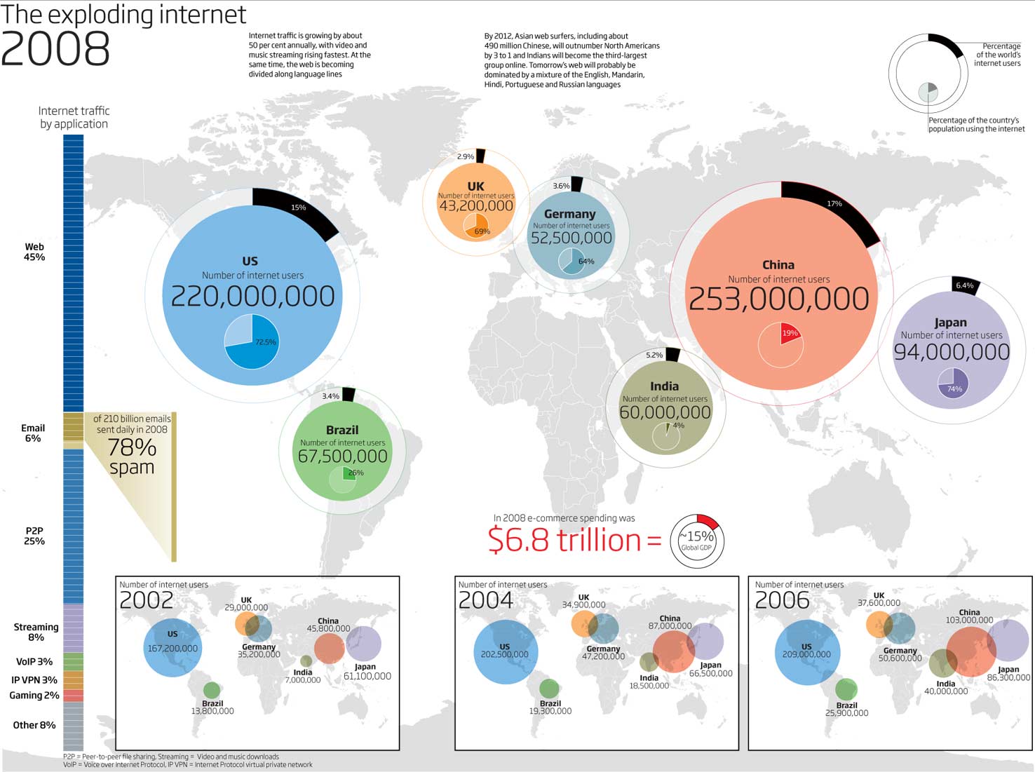
I had to cover many areas of science back then, with biology being one of them. As I trained as a scientific artist, it was always good to get some more artistic graphics every now and again. So here is one looking at the female body and the possibilities of the female prostate gland.
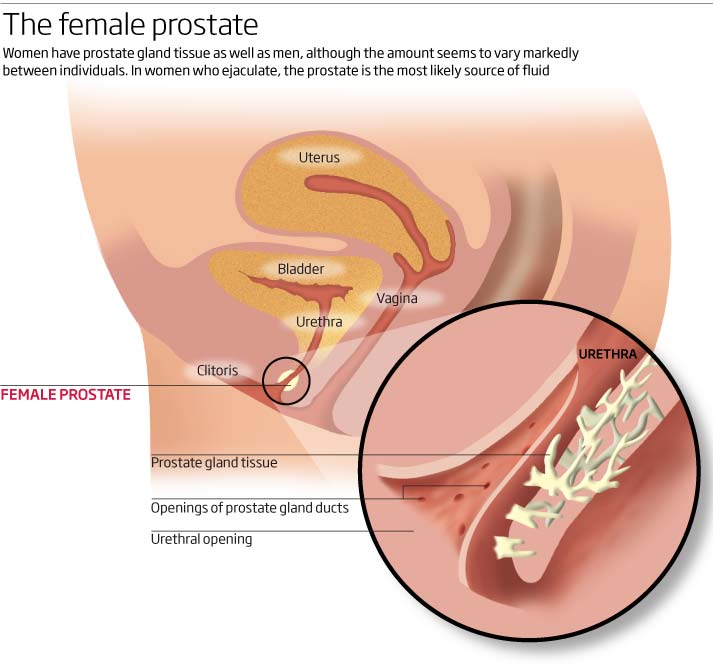
To finish this round up of what I was drawing in May 2009, we have this months look at black holes. With the announcement recently from the Event Horizon team of the first picture of a black hole 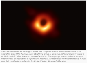
I was showing what the radio telescopes around the world would be looking for and how they would synchronised to show the picture above 10 years later! What an achievement!
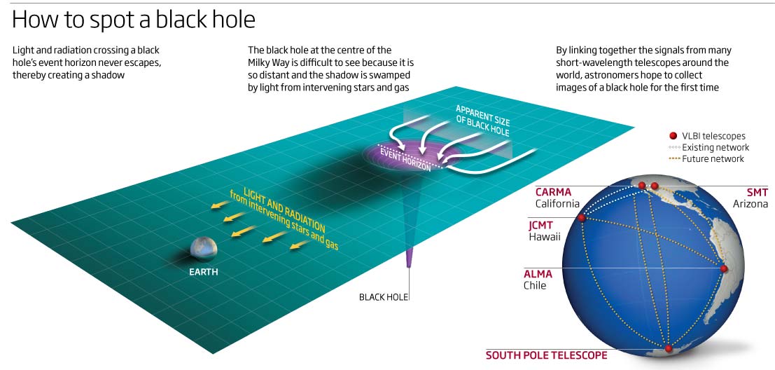
Enough for this month, lots of 3D work and some good looking graphics as well, so lets see what June brings.
10 June 2019
April 2009
Graphic 3D, realistic 3D, bar charts in 3D and maps in 3D this month!!! I had obviously got my head around the 3D programme and went all out using (and learning) it. Subjects for this month range from robots to Antarctica.
So lets start with a bit of graphic 3D looking at the latest (at the time) in hear-sensing space telescopes. Quite like this, with its clean style and back and white graphics showing the telescopes. But it’s missing a couple of tricks here – we mention mirror diameter – so maybe the circles could have been to scale and the colours of the circles could have been adjusted to show the wavelengths that the telescopes would be measuring or a scale to show the range – but nice clean graphic overall.
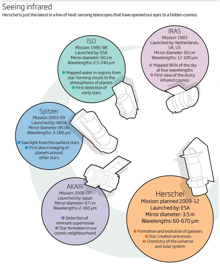
Next up a nice explanation of why we loose the ability to see red as we dive deeper into the ocean. Easy to see that the visible spectrum narrows the deeper we go and with some extra information about the differences between reflectant and fluorescent colour.
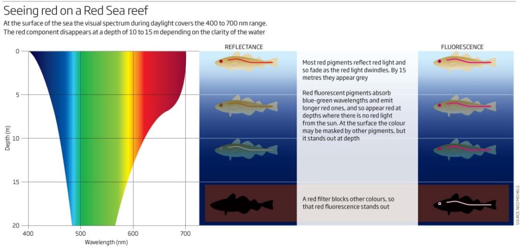
Two graphics now from a feature looking at Antarctica’s ice sheets and what we can find out by drilling down 1100 metres and 19 billion years. Would be good to have the title and subhead attached to the map but that was done by art and so not attached! A locator map to start with showing the mass and the ice sheets and where the drilling will be done. I obviously got hold of a high resolution picture and managed to use that. Under the map graphic we have a side view to show the land under the ice.
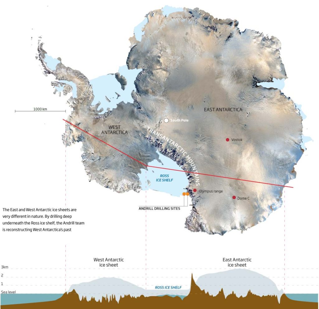
Moving on to the 3D drill core graphic – again a header and explanatory sub would have been good and allowed us to know what it was all about – I did include a detailed explanation at the bottom of the core explaining what had gone on over 19 million years though. One of the very few reasons to have a double axis on a graphic – depth on one side and the age on the other. Like this one.
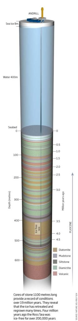
Right lets get the 3D map over and done with! I can see what I am trying to do here using the 3d image but just too many elements on the page, too many fighting for prominence and no hierarchy. The cut away of the earth just looks weird – like and upside down heart. Then you have a 3D arrow with shadow and a ‘curtain’ effect that joins the cut-away land to the 3D map…too much wrong with this but enjoy it and use it as something not to do in the future.
![]()
Now as the title for the jpg says a ‘Rubbish Table’. 3D gone mad here. Made even worse by the opacity of the colours in the blocks, so that you can’t really see which level you should be looking at – another example of what not to do and why we shouldn’t make 3D bar charts.
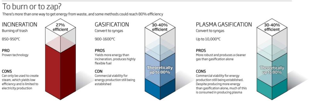
Lastly for this month, a robot for climbing on ceilings. Intricate and realistic 3D modelling, including lighting on the 3D graphic element. Text pointing out eh various elements to the robot. On the right hand side we have a graphic animation showing how it moves whilst always keeping 8 of its 16 feet stuck to the ceiling. Quite nice and clear although if this is really for the ceiling, then why haven’t I drawn unit hanging upside down? Answers on a post card!
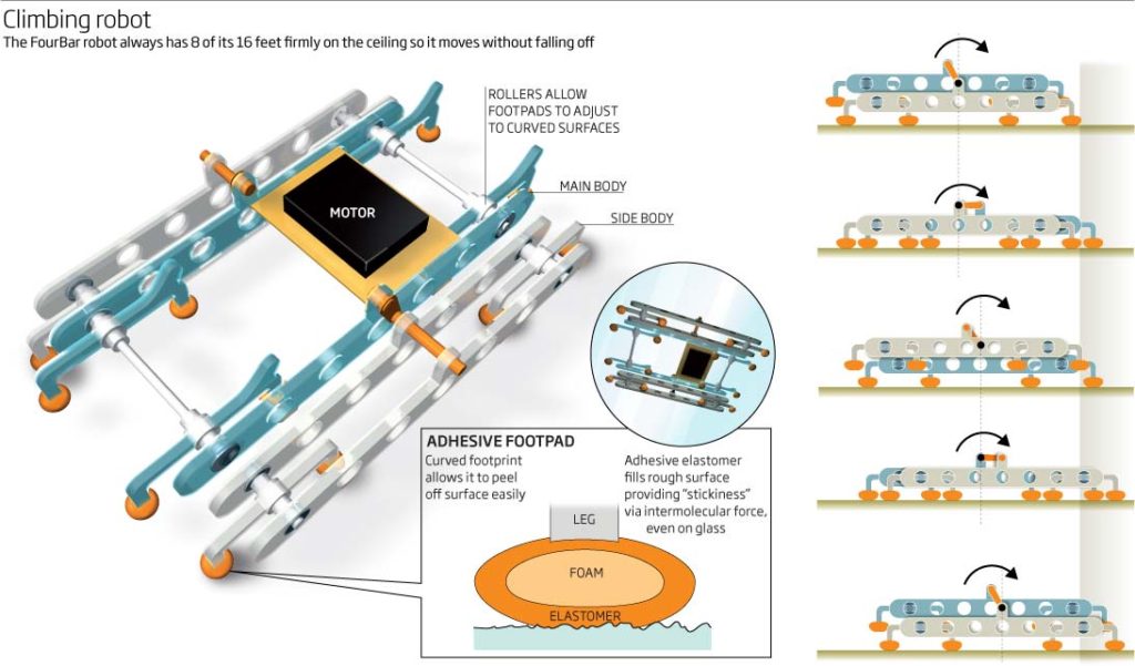
Enough for this look back at 10 years ago. Even I look forward tot next months episode.
1 May 2019
March 2009
Bar charts, line charts, brains, branes and dinosaurs are amongst the subject matter looking back at March 2009.
Thought I would start off with this bar chart looking at colonies and particularly colonies of corals…but where are they? The header states that cross are some fo the oldest colonies so why didn’t I flag them up!!! If you want the reader to see something in the visual then show me!!!
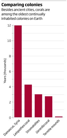
and please add titles to the graphics as an integral part of the graphic. A great example here…no idea what I am really looking at. A header would really help me…
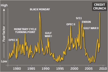
I seem to have drawn brains many times over the years and so this graphic looking at déja vu seem so familiar!!! and a little basic today. Again a 3D application that took a lot of time to create in the first place and so we ended up using it many times. The shading is atrocious and doesn’t follow the contours of the brain at all! Terrible
A very different type of brane, this time a 3D gravity brane. Quite like the look of this one trying to explain hidden dimensions…but not sure I understand it fully after all this time. 3D Cinema was still the thing to do at the time though.
To end with, a nice graphic graphic . Simple and to the point, How big were some of the biggest dinosaurs, compared to an Elephant, a Giraffe and Man? Improvements easily doe to this but saved a purpose back then.
That’s it for this month. Hopefully April 2009 will be a little more exciting or have some graphics that I can hate or love with conviction.
03 April 2019
Will follow very soon, but I am attending Malofiej infographic summit and so the update may be delayed a couple of days…come back soon though.
February 2009
Vaping, time, good, bad and just creepy faces graphics in this month’s look back on what I was producing in February 2009.
A simple 3D graphic showing how an electronic cigarette would work. How vaping has come along since then!
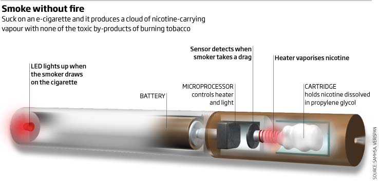
Sometimes the simple ones are the best. A line graph with upper and lower estimated values (not done often back then!), looking at the costs of eliminating HIV in South Africa.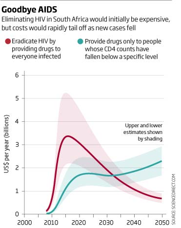
Next up we have some creepy looking faces plotted as a scatter plot asking the question ‘Have you got the look?’ – a good title and a nice way to show whether the particular face looks dominant, trustworthy, or not…creepy!
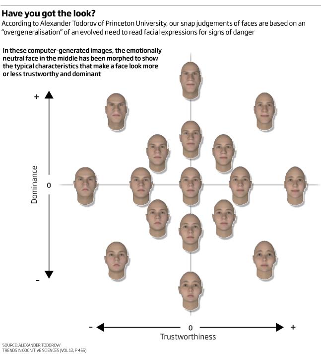
A nice one, even after 10 years. Lots of information explaining the feasibilities of geo-engineering technologies along with a good way of portraying the effectiveness, costs and readiness as a graphic key-like element. Was still loving Cinema4D at the time! Would put the key at the top to help with the flow and understanding.
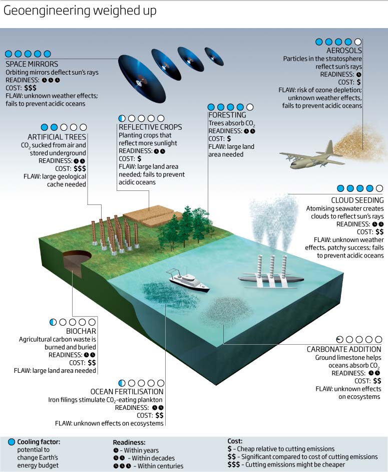
Googling this now I see that either it started a trend, this was done in 2009! or many of us were thinking along the same lines! Nice to see the variations though
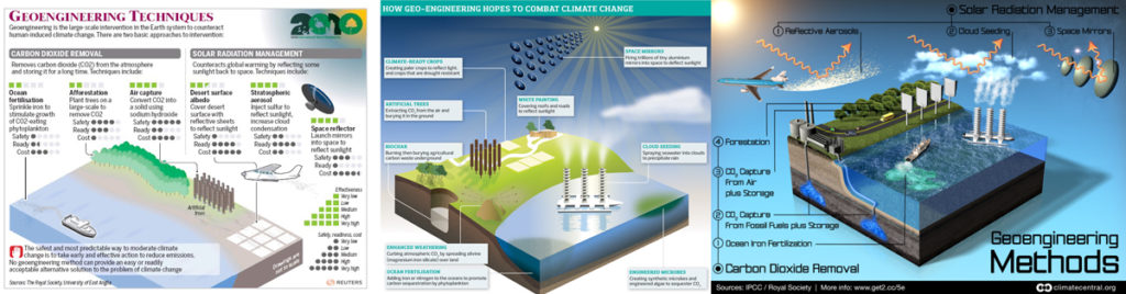
Not a nice one. A brief history of timekeeping…so why not do it as a watch? Well, you can see why! Many time scales, some at the top then the inner ring on the watch is 1600 to 1899…then the outer ring is 1900 to 2010 – a bad idea then OR a reasonable idea but not very well executed and too much time spent not eh details rather than the data/important information and dates. Timelines are always notoriously difficult to do differently though.
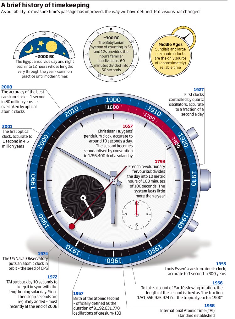
And to finish off this months look back, we’ll stay with one of the big subjects (if not biggest) of the moment i.e. climate. A double page looking at the world at 4°C warmer and what would have to change. Again, the key at the top would be better and of course, the colour scheme of reds, greens and yellows would be atrocious for anybody with a red/green colour problem!!! But hey, I know better now and should have known back then!!!
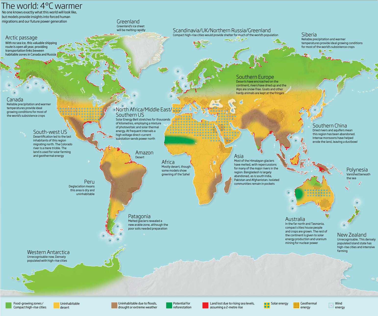
Thank you for looking. More next month.
Always happy to hear comments and suggestions
2 March 2019
January 2009
2008 left us with lots of photoshop filters being used along with importing of Cinema4D files, all put together before outputting to Illustrator for final changes.
As we are in the depths of winter I thought I would start off with a graphic showing sunlight shining through the Pantheon’s oculus and lighting up the front courtyard. Would have liked to have seen a calendar of sorts and maybe a compass, nice, simple explanatory graphic.
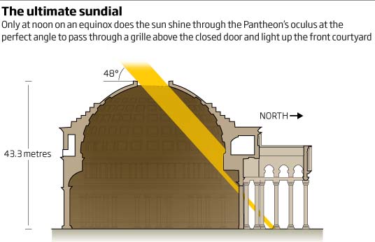
I often see double-axis charts and wonder why they are not easier to read, so here is one of my not easy to read charts. A colour coded axis would have helped, and I wish I had used better colours! Black and dark red!!! At least the headline also wonders if cause or coincidence are involved, which is always the case with using double axis.
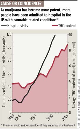
If you include statements or questions in the graphic header then show me where to look to see or discover the answer in the actual visual! This fails on so many levels. Where is the halfway mark and which are the developing countries? Plus, do I really need so many nuclear symbols?
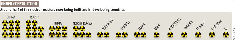
A simple look at aircraft wing efficiency. Again simple and clean. Not sure how many winglets are made from shape-memory alloy but at least the technology has improved efficiency nowadays.
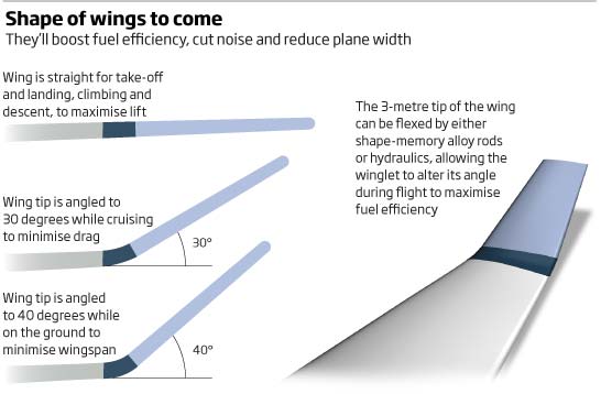
Carbon scrubbing was the the future technology that was being looked at in 2009, so a complex graphic looking at three ways of scrubbing CO2. Lots of information in both 3D realistic looking form and 2D graphic explanatory form.
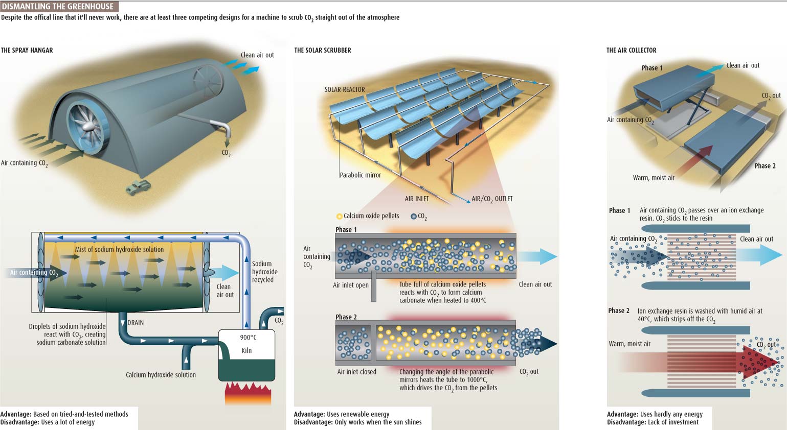
Two graphics looking at peddling across the Atlantic in a fish-like submarine. The hook we had for this was ‘sub-human’. The first one showing how the machine would propel itself – nice technical drawing type grid effect on blue. The second graphic is really just an excuse to show what we could do with Cinema 4D and filled a double page spread with text around it. It could do with some movement effects on the fin though. Ted Ciamillo went on to develop the monofin!
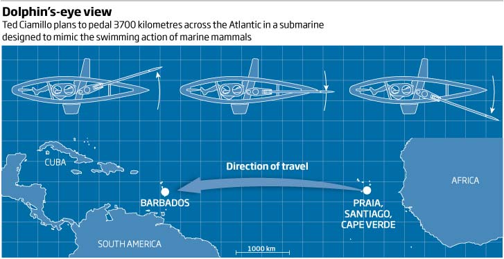
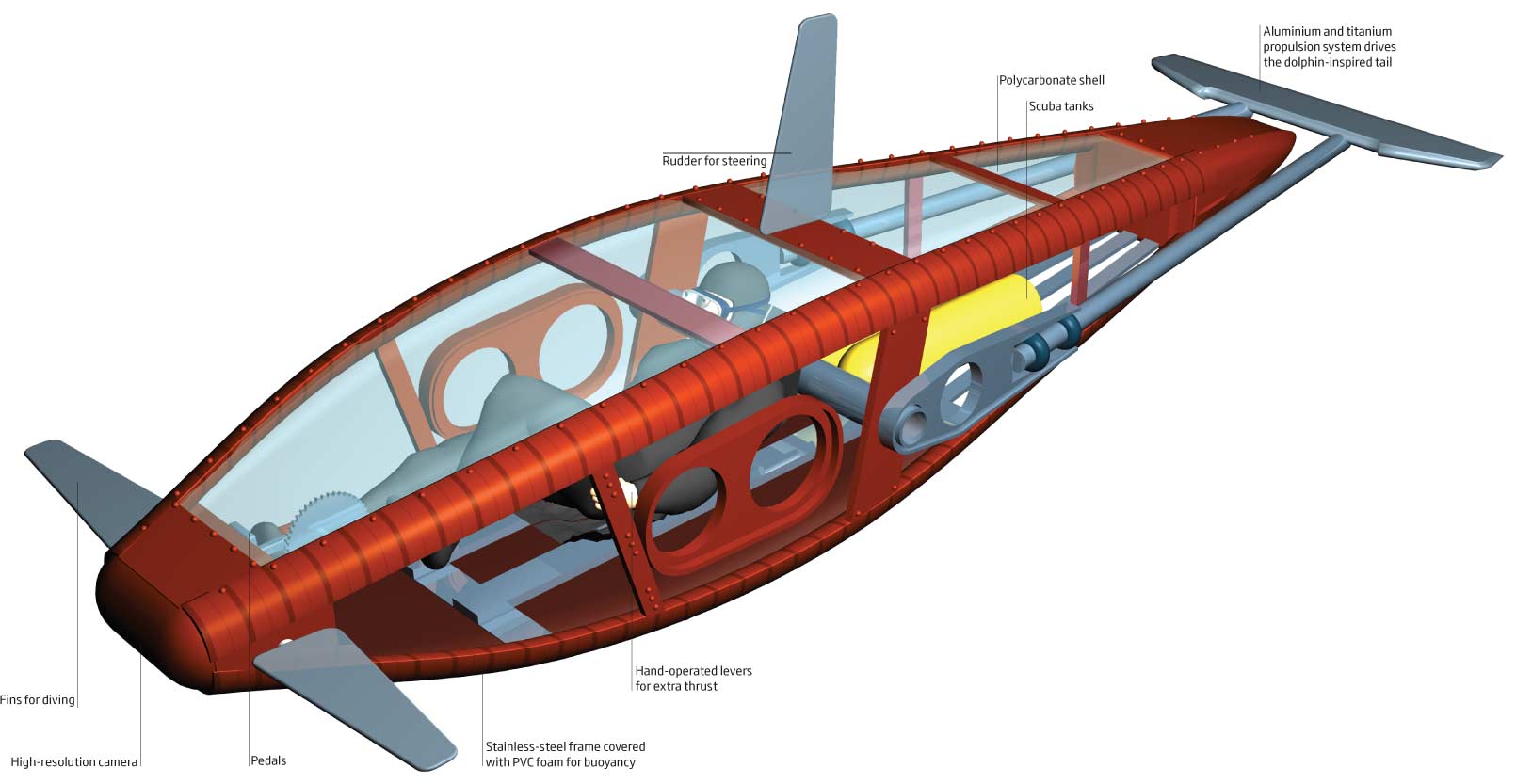
I see a change in headline style over these few graphics so maybe we are beginning to update the style guide? Will see if it persists in next months graphics…
01 Feb 2019
December 2008
The final month for 2008. The final issue of the year was always a double issue, which meant fewer graphics (normally) but some more festive and fun ones if we could.
So for December 2008, we have off-grid electricity, cosmology, wine tasting, present packaging, and the world’s first computer from 65BC.
So, lets start with a donut chart. Yes, we all like to moan about these, but I do use them when appropriate. So an example of when not to use them – a bar would have made it much easier to see the data and the differences, plus the colours are atrocious!!!! No coherence, nothing to let me know why that segment is red or that one purple…bad
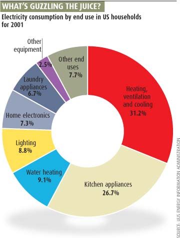
A graphic that I am slightly happier with here. Cinema4D put to good use showing renewable tech within a household…nice!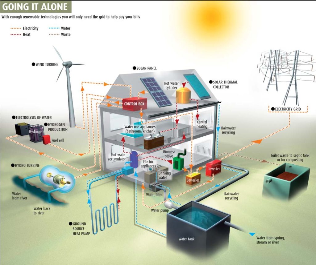
Some cosmology now. I remember this as something that took a lot of explaining to me, and much gnashing of teeth, to get the concept across. It’s a subject matter that I go back to many times in my career…and am still revisiting now. Quite nice and helps to expain the details int he story.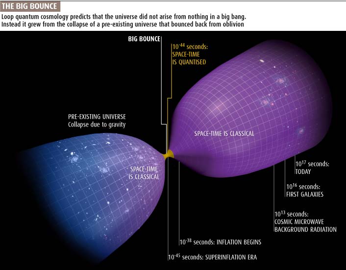
A reminder that in 2008 we were looking at the costs of mobile phones and text messaging…well before 4G and wifi was really accessible to everybody easily.
A good attempt at showing this overlap between the reproductive years of mothers across species. Can think of a few better graphic choices now to show this overlap…but not a bad start
Let’s look at a couple of graphics from the Christmas issue. The first is a bit of Christmas maths using mince pie and Christmas pudding icons (or chart junk, depending on how you look at it) to show how to pack things in the most efficient and smallest parcel size. The second, one of my favorite subjects, wine. Can you make your cheap plonk taste better or more palatable by zapping it with electricity?…
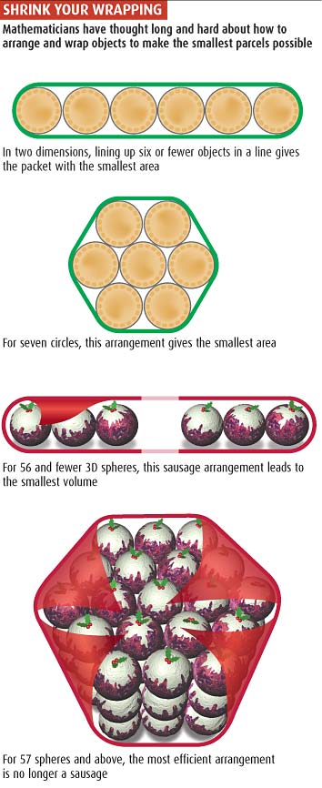
…apparently so by zapping it with 600V/cm for 3 minutes!. Don’t think I’ll bother… but nice glass illustrations and I like the star ratings. I do think the voltage symbols are too large and overshadow the results stars. 3D rules in 2008!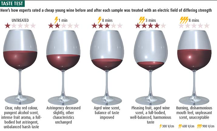
Hope you enjoyed the last one for this year. Happy holidays and I look forward to sharing more in 2019…cheers
November 2008
Looking through the images, November was obviously a slow month. Subject matters range from creepiness, through energy, to relativity…
A little bar chart type thing that is trying to show our perception of creepiness when comparing different creatures – from spiders to butterflies. I like the fact that that it was split into the different creatures but feel that little icons would be of more help, rather than having to look at a key all the time.
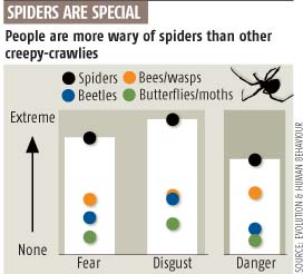
Keeping with the natural world, a 3D ‘star wars’ type chronological chart looking at the evolution of flowering plants. Quite like this. I was trying to get the feeling of going back in time (which is always a problem when looking at our Earth’s history, and the fact that the images are trying to look like fossils!
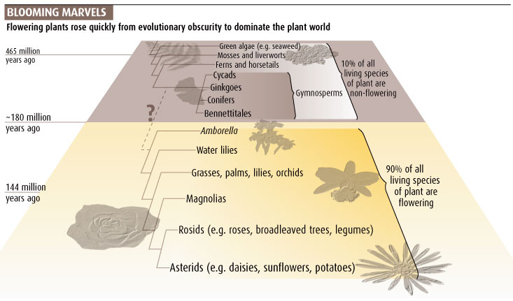
Still in its infancy, we look and explain what reCAPTCHA is all about. A reasonable piece of explanatory visual storytelling, explaining what goes on in the process. Think I missed a trick with the coloured bars at the bottom – 83.5% vs 99.1% – as they could have been done to scale to give more of a visual cue.
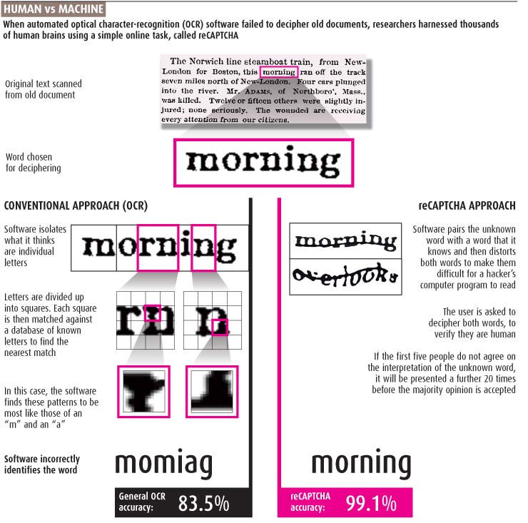
HIV testing. Have included this graphic as a good example, in my opinion, of how not to do something. There seems to be many ways that this could have been done in a way that would help me to take on board the information. It is done chronologically but the key is redundant as I could have put the text next to the section it refers to. There are countries mentioned so it could have included something map-like to help. Lots of numbers mentioned that could have been visualised, male and female mentioned plus the colour scheme doesn’t work for red/green colour deficiency…so there you go…lots of room for improvement!
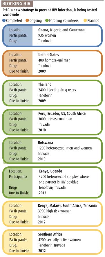
Can maths reproduce Einstein’s relativity? More gratuitous use of Cinema 4D, (and why not?) in trying to portray and explain Relativity…enjoy this one and see if you can understand it (answers on a postcard please…)
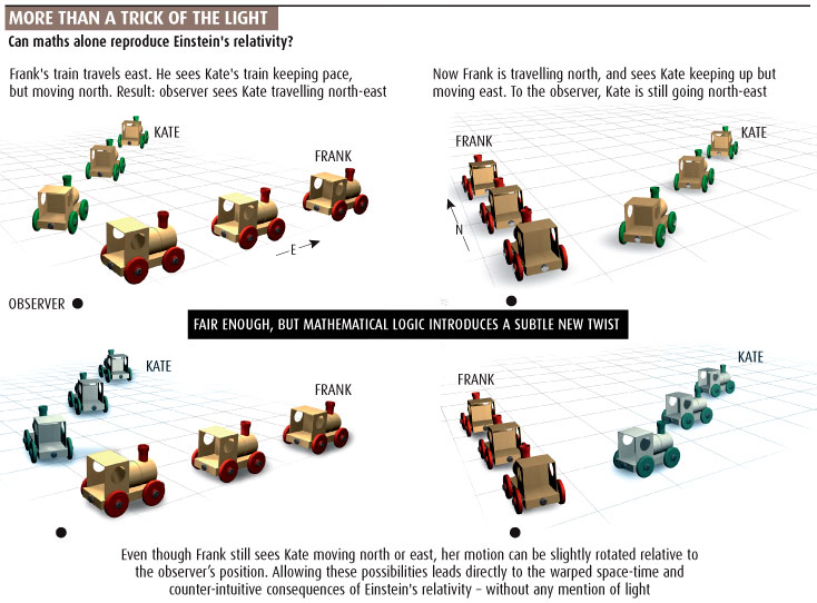
More next month for the run up to Christmas…
October 2008
Looking back at what I was producing in October 2008.
We have Anyons, brain regions, landfill breakdowns, search engine history, and cancer drugs.
So let’s start off with a bit of gratuitous 3D work and some physics that I find hard to work out – I obviously understood it at the time! In physics, an anyon is a type of quasiparticle that occurs only in two-dimensional systems, so therefore I drew it in 3D
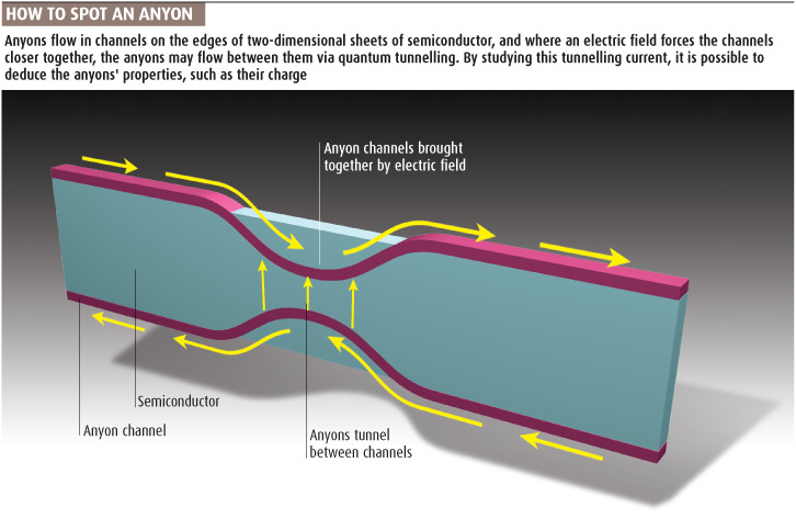
The human brain and its complex regions linked with exceptional talents. I used this model of the brain which we originally made in Strata, many times. Again that grey background so common in 2008!
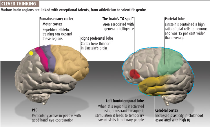
Quite like this use of 3D. What goes into a landfill site? Look at the proportion of paper…would be interested to see this data now. This one based on data from a site in Sweden. A stacked bar chart would have worked as well but wouldn’t have had the truck and the gulls flying around at the top to put it into context.
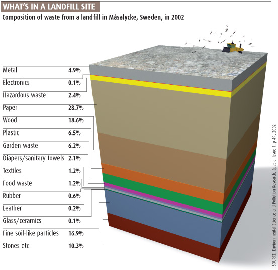
How things have changed! A table/timeline of the history of search engines up to 2008, including the launch of Google
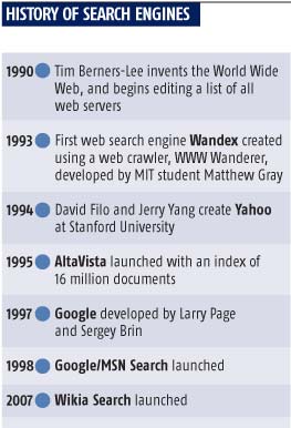
And to finish off with this month, a double-page graphic looking at cancer and its target-specific drugs. Lots of work went into this, getting the look, feel, accuracy and layout working with the text around it
Thank you for looking, comments always welcome. Looking forward to seeing what I came up with next month from November 2008
September 2008
September flew by and we are now into October and so time to look at what I was producing ten years ago.
This month we have sea-level rises, genetic make-up, Hubble’s repair mission and a look at a the popularity of a podcast.
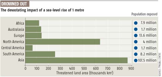
Can’t work out why the chart, or indeed the population numbers, are in the order they are! Ordering on a chart is important so what was I thinking, plus missing a big opportunity to show the population exposed to the sea-level rise
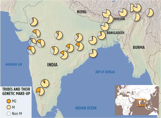
Small multiple pie charts..never thought I would say that in a positive way – but think these work quite well…comments please.
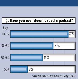
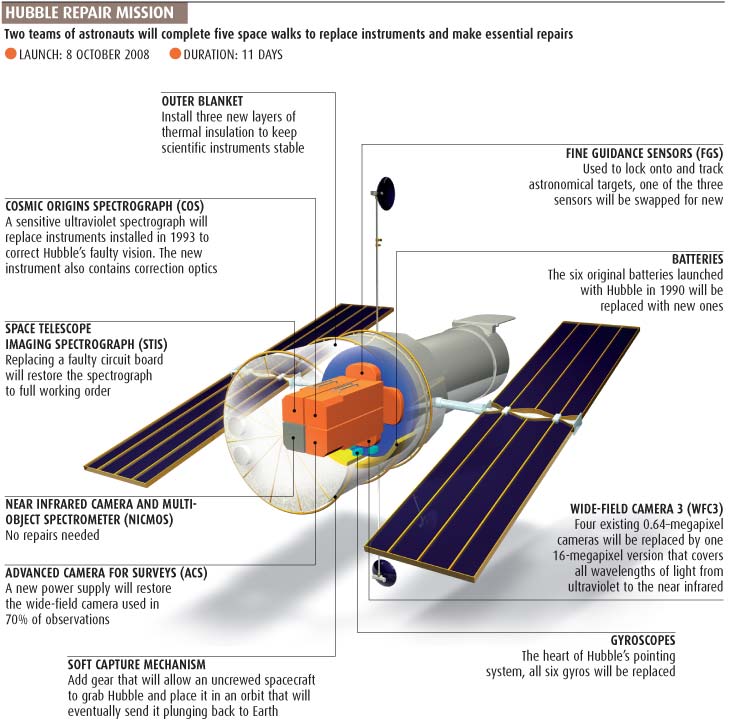
3D effects still a popular thing to include in graphics! The early days of podcasting and we were wondering if they would take off in popularity
An effective graphic looking at what was to be replaced or repaired on the then, upcoming Hubble space telescope repair mission
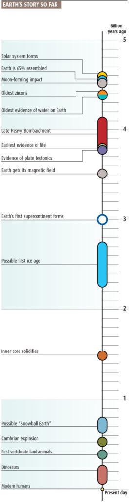
And to end with, a simple, clear, history of Earth. Could probably do with a ‘Earth starts here’ pointer but hey…
More soon
August 2008
August always seems like a quiet period with summer holidays but I have found some good and bad infographic examples from way back in 2008. This month I was visualising sleep patterns, sea surface temperatures (again!) and the Large Hadron Collider.
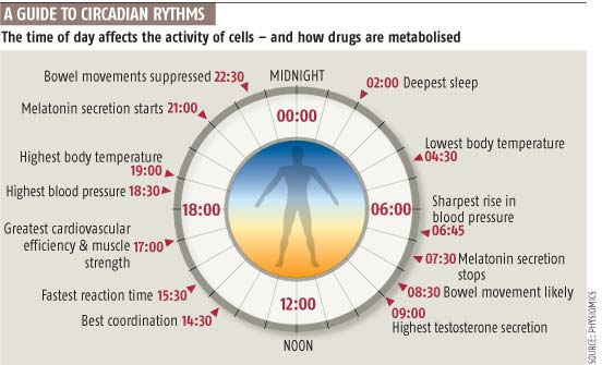
The spelling of Rythms in the headline obviously got through the system back then! Graphic looking at the body’s circadian rhythm – simple and clean. You can’t go wrong with a 24-hour clock look.
3D blocks and cutting the y-axis…obviously trying something new AND trying to fit it all into the space I had been allocated once I had produced the chart – not the best way to proceed.
A good try but a few things that should be done more effectively. Lines on both the PDO and the Global temperature in the first graphic, are too bold and overpowering. The key could be better with temperature next to the right-hand axis, for instance. The bottom graphic showing AMO index is trying to show correlations between the data but again it needs more refined lines and colours, I am also looking for more details for the rainfall and hurricanes lines – what are the scales here?
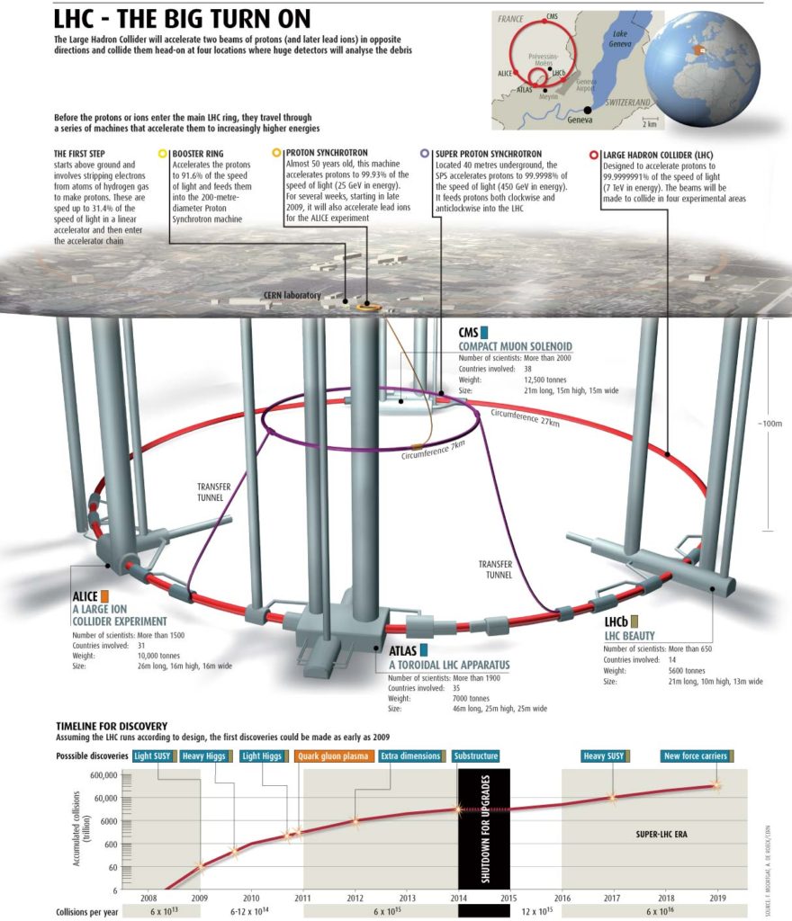
I still like this one. A full-page graphic telling the story of the LHC, where it is located, the size of it and what it does. I made the model in Cinema4D, rendering it there, before bringing it into photoshop and then ultimately into Illustrator to pull everything together. It was always a struggle negotiating a full-page graphic within the constraints of a weekly magazine with the editors wanting to fill the pages with words rather than visuals, but I obviously put up a good fight here and won. I am still pleased with how it looks 10 years on. The line chart at the bottom follows the story of the experiments through time from 2008 to the future.
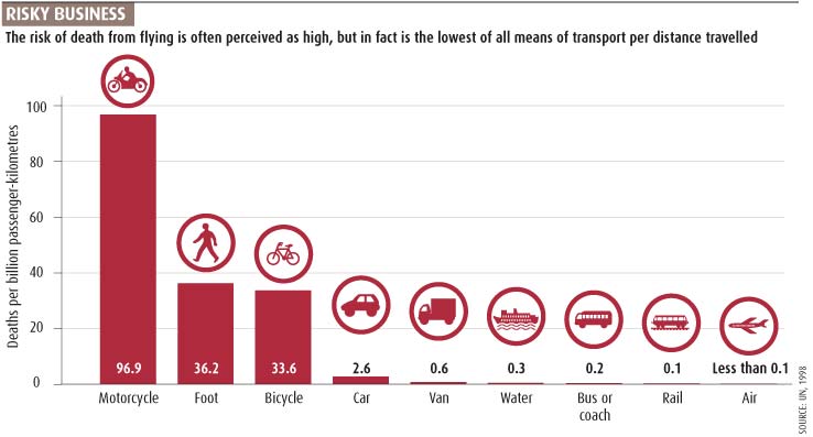
Even a simple bar chart can always be improved. I should have made the flying data more prominent, as it is mentioned in the headline (make the others grey, for instance). Do we need the y-axis and the data points? In this instance I should have deleted the axis and just gone with the data as numbers on the graphic…
Let’s see what September 2008 holds…
July 2008
Looking back at what I was producing from July 2008, we have an evolutionary fishy missing link, tidal power generators, chemical elements and the Big Bang, bird migration, and a dodgy looking baby illustration.
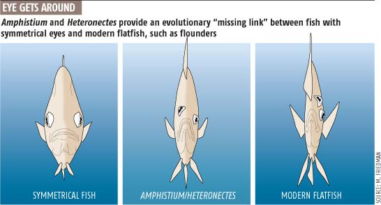
Quite like the absurdity of what these fish look like front on – simple, clear graphics. Song reference in the headline!
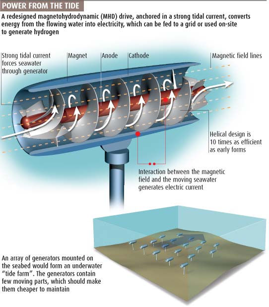
Using Cinema4D, Photoshop, and Illustrator to try and show how energy could be generated using tidal currents. Annotations really help the storytelling here, adding additional text to help the understanding.
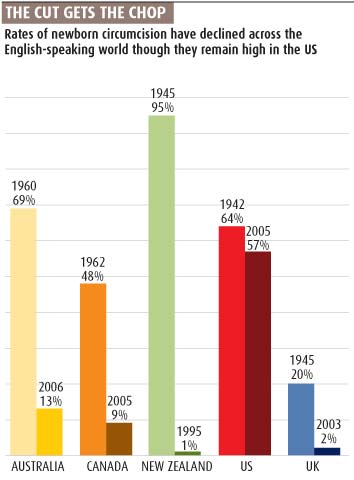
A terrible pun in the header. We were trying with ‘sticky’, ‘funny’ titles at the time. Not sure they work but at least we had an explanatory sub-head! Too many colours…my eyes go everywhere at the same time… urgh! Slope graph would be better…
Gratuitous use of the ‘drop-shadow’ effect, a much-overused effect of the time! Missed the obvious by not colouring up the bird silhouettes in the same colour as the tracks and because of that we had to use a key! On the plus side, it does show the long ranges these birds cover, but again text on the graphic could have cut the sub-head text.
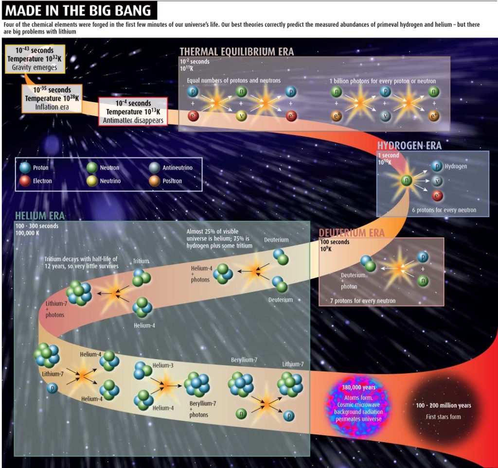
Have produced so many graphics based around the Big Bang over the years. The sheer scale, time-wise, is always a problem. Log scales are always a useful vehicle. Not sure this works, or indeed, actually shows what I was trying to…there will be many more to come in this series, so will be interesting to see what I did.
And finally for this months look back…
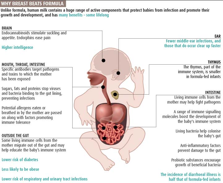
A look at the benefits of breastfeeding over formula milk. Good use of the coloured text in the sub-head that correlates with the coloured text in the graphic. Think the alignment of the text boxes and therefore the lines going all over the graphic is the best way. Would certainly try softening up the rigid approach here! The baby graphic is a bit off-putting to me. Don’t know what it is but would certainly try making the internal organs less ‘real’ or not so blood red. Would also draw the baby in a more realistic and ‘alive’ state!
Enough for this month, lets see what August 2008 brings
June 2008
Opioid abuse, how a pitcher plant captures its prey, a warmer planet in the past and the food drain. Some good, some bad again this month.
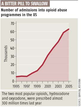
A simple filled line graph using the design of New Scientist at the time.
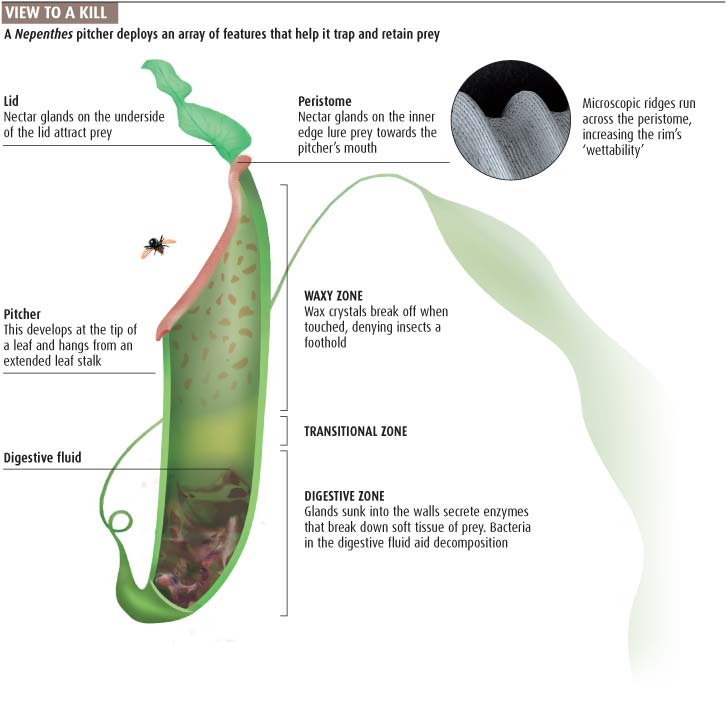
Still like this graphic showing how a pitcher plant uses various ways to catch its prey. Illustrator, photoshop and a picture used together to explain how it works. We liked catchy headers in 2008!
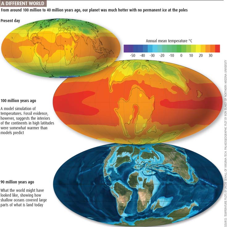
Not sure I would use a rainbow colour scheme today..divergent or sequential would work just as well if not better.
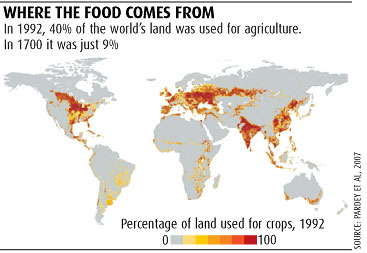
Three graphics from a feature. Not much to say about the first one. What was I thinking about in the second one! Certainly shouldn’t have used a double axis as the timeline is not consistent!!! The third one is quite interesting but not sure the 3D blocks show the data particularly well. The data should be much more prominent and less made of the ‘lovely’ icons.
May 2008
Climate change, Autism, Mars and the rise of data tagging.
Back in 2008 we were wondering just how high global temperatures would go, with 3-4°C being the most likely. A simple chart that would benefit from no background colour (but had to fit in with magazine style).
We were looking at how to mitigate carbon emissions, looking at carbon sequestration as a viable option. Lots of photoshop as well as illustrator use here. Trying to show the differences using bubble size but really achieving the effect – obviously spending too much time on the 3D image and not so much on the actual data which is interesting. Combining these two elements with data from the subhead would be good.
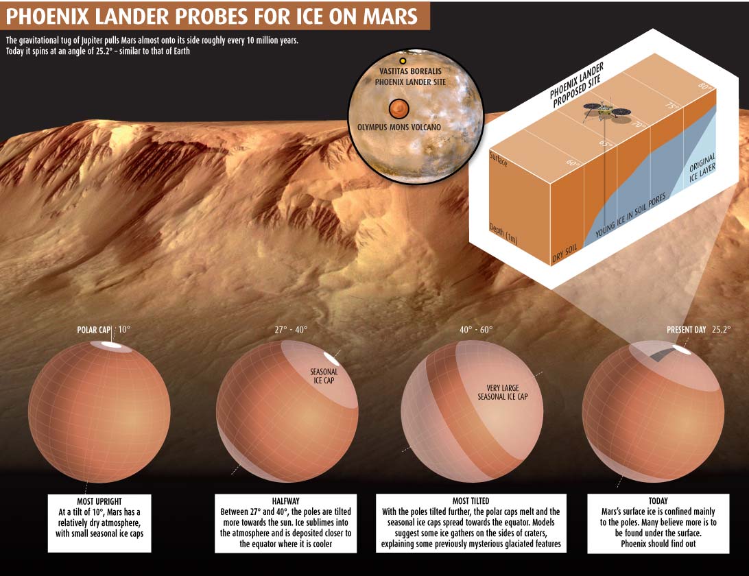
With NASA’s Mars Pheonix lander about to descend to the surface (it landed on 25 May 2008) I looked at Mars’ ice caps. Illustration using illustrator, photoshop as well as official photographs.
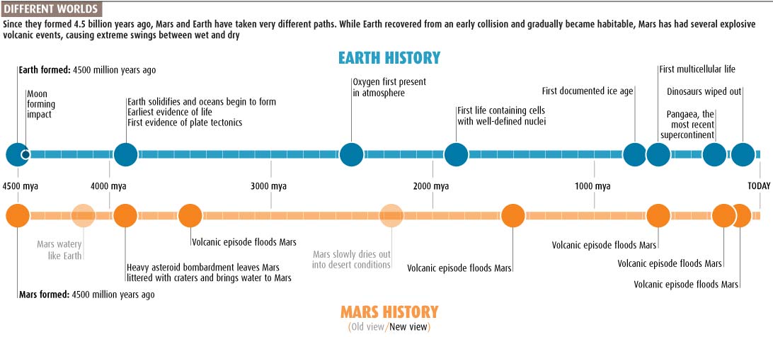
Another timeline, this time comparing Earth history to Mars. Clean and simple. Fitting in text on a timeline is always a compromise.
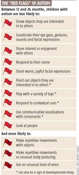
Interesting use of red and dark red flags! I can see what I was trying to show here, but not really a graphic, more of a fancy list.
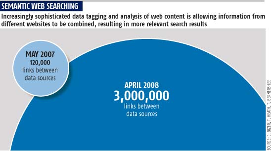
Using circles to compare numbers is always problematic. At least in this instance, there is a marked difference. Wonder what the 3 million number would be now – but the web was still in its infancy back in 2008.
April 2008
Timelines, photoshop bevels, 3D work, Global warming, US election and more from April 2008.
Producing timelines for a science magazine is always something that is required frequently. ‘How can you make it look different from the last time?’ I was often asked. Fitting all the information into a small space was always a problem. A very basis timeline here looking at what is known about antimatter. Not my best!
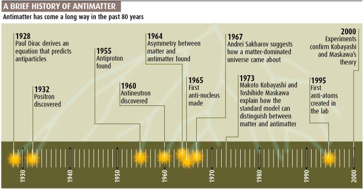
An attempt to show the flow of carbon credits and the emerging carbon market. The arrows were trying to show the amount of the flow by using the width of lines but that 3D chart at the bottom! Wouldn’t do that again.
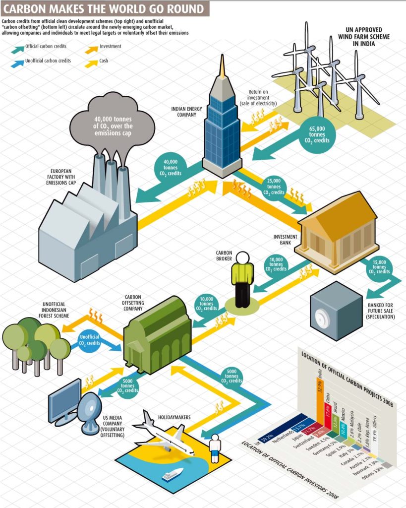
Not sure how much this would change if done today! Still using drop shadows!
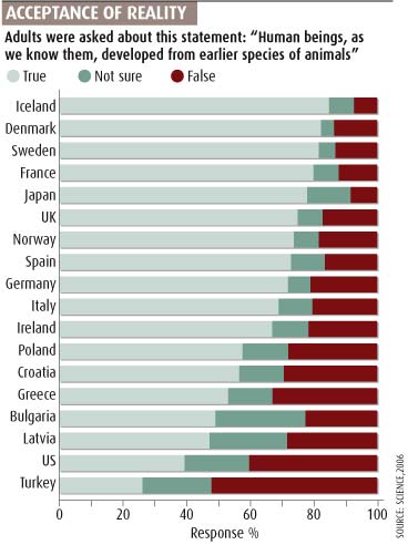
A look at the 2000 US presidential elections and how the voting in Florida helped George W. Bush to victory.
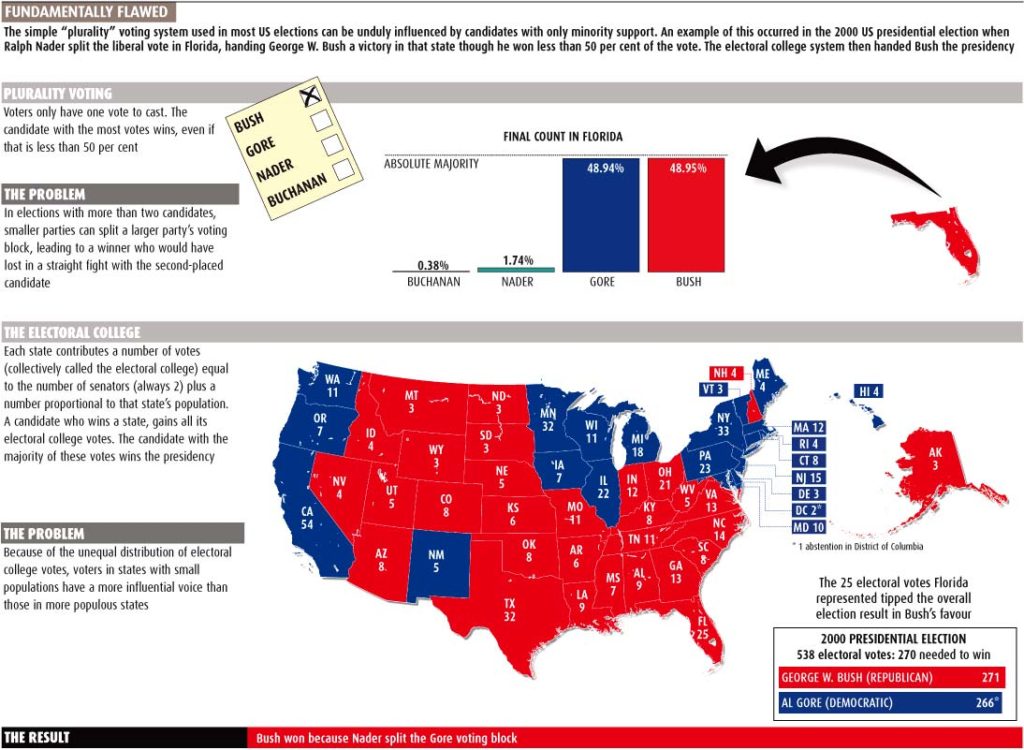
Context and science in a flow chart, showing the methods, and dangers of producing methamphetamine. A clean, easy to follow graphic. Lots of Cinema4D use here!
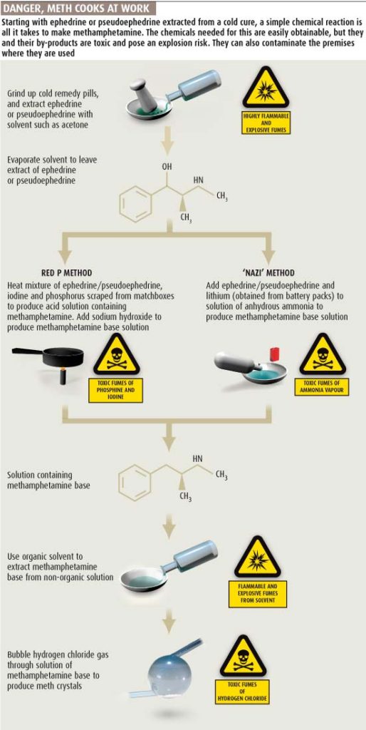
Not sure about the colours used here. Would have been easier to read without the key at the top – would annotate the lines now! and speaking of the line chart, I’m sure that a histogram would be a better way fo showing it.
March 2008
Sea creatures, nanotubes, quantum theory, the rise of blogging and more from March 2008
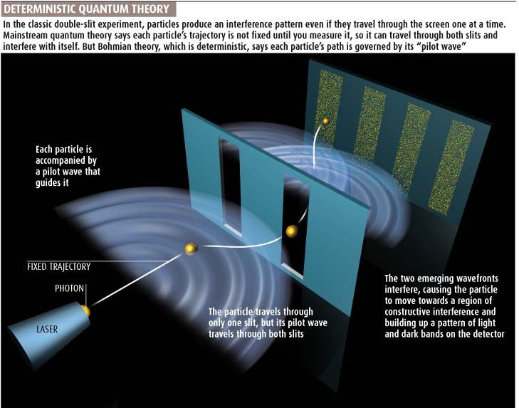
February 2008
These from February 2008